Building a Hierarchical Quick Links Web Part with SPFx
Have you ever needed to organize quick links in a hierarchical structure within SharePoint? The standard Quick Links web part is great for displaying links, but what if you want to show them in a tree-like, expandable hierarchy? That’s exactly the problem I set out to solve with the React Quick Links Hierarchy web part.
The Challenge
Organizations often have complex navigation needs that go beyond simple flat lists of links. They need:
- Multi-level categorization of resources
- Expandable/collapsible sections for better space management
- Visual hierarchy to help users understand relationships between links
- A clean, intuitive interface that works well on modern SharePoint pages
The Solution
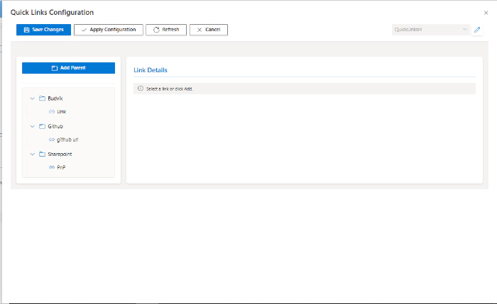
I built a SharePoint Framework (SPFx) web part that displays quick links in a hierarchical, tree-view format. The web part allows users to organize their links into parent-child relationships, making it easy to navigate through complex information architectures.


Key Features
Hierarchical Structure
The web part supports multiple levels of nesting, allowing you to create deep organizational structures for your links. Each parent node can be expanded or collapsed, giving users control over how much information they see at once.
Clean, Modern UI
Built with Fluent UI React components, the web part seamlessly integrates with the SharePoint modern experience. It’s responsive and works beautifully on both desktop and mobile devices.
Flexible Configuration
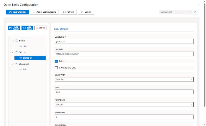
The property pane provides an intuitive interface for:
- Adding, editing, and removing links
- Organizing links into hierarchies
- Setting link titles and URLs
- Defining parent-child relationships
Performance Optimized
The web part uses React best practices including:
- Functional components with hooks
- Efficient state management
- Optimized rendering to handle large link collections
Technical Implementation
Tech Stack
- SharePoint Framework (SPFx): The foundation for building SharePoint web parts
- React: For building the component-based UI
- Fluent UI React: Microsoft’s official component library for consistent UX
- TypeScript: For type-safe development
Core Components
1. Main Web Part Component
The main React component manages the overall state and renders the hierarchical structure:
const ReactQuickLinksHierarchy: React.FC<IReactQuickLinksHierarchyProps> = (props) => {
  const [expandedNodes, setExpandedNodes] = useState<Set<string>>(new Set());

  const toggleNode = (nodeId: string): void => {
    const newExpanded = new Set(expandedNodes);
    if (newExpanded.has(nodeId)) {
      newExpanded.delete(nodeId);
    } else {
      newExpanded.add(nodeId);
    }
    setExpandedNodes(newExpanded);
  };

  return (
    <div className={styles.container}>
      {props.links.map(link => (
        <LinkNode
          key={link.id}
          link={link}
          level={0}
          isExpanded={expandedNodes.has(link.id)}
          onToggle={toggleNode}
        />
      ))}
    </div>
  );
};
2. Link Node Component
Each link is rendered by a recursive LinkNode component that handles both parent and child nodes:
const LinkNode: React.FC<ILinkNodeProps> = ({ link, level, isExpanded, onToggle }) => {
  const hasChildren = link.children && link.children.length > 0;

  return (
    <div className={styles.linkNode} style={{ paddingLeft: `${level * 20}px` }}>
      <div className={styles.linkHeader}>
        {hasChildren && (
          <IconButton
            iconProps={{ iconName: isExpanded ? 'ChevronDown' : 'ChevronRight' }}
            onClick={() => onToggle(link.id)}
          />
        )}
        <Link href={link.url} target="_blank">
          {link.title}
        </Link>
      </div>
      {hasChildren && isExpanded && (
        <div className={styles.children}>
          {link.children.map(child => (
            <LinkNode
              key={child.id}
              link={child}
              level={level + 1}
              isExpanded={expandedNodes.has(child.id)}
              onToggle={onToggle}
            />
          ))}
        </div>
      )}
    </div>
  );
};
Property Pane Configuration
The web part includes a custom property pane control for managing the hierarchical link structure:
protected getPropertyPaneConfiguration(): IPropertyPaneConfiguration {
  return {
    pages: [
      {
        header: {
          description: strings.PropertyPaneDescription
        },
        groups: [
          {
            groupName: strings.BasicGroupName,
            groupFields: [
              PropertyPaneTextField('title', {
                label: strings.TitleFieldLabel
              }),
              PropertyFieldCollectionData('links', {
                key: 'links',
                label: 'Quick Links',
                panelHeader: 'Manage Quick Links',
                manageBtnLabel: 'Manage Quick Links',
                fields: [
                  {
                    id: 'title',
                    title: 'Title',
                    type: CustomCollectionFieldType.string,
                    required: true
                  },
                  {
                    id: 'url',
                    title: 'URL',
                    type: CustomCollectionFieldType.string,
                    required: true
                  },
                  {
                    id: 'parentId',
                    title: 'Parent Link ID',
                    type: CustomCollectionFieldType.string
                  }
                ],
                value: this.properties.links
              })
            ]
          }
        ]
      }
    ]
  };
}
Building Hierarchical Data
One of the interesting challenges was transforming the flat list of links (with parent IDs) into a hierarchical tree structure. Here’s the algorithm I used:
private buildHierarchy(flatLinks: ILinkItem[]): ILinkItem[] {
  const linkMap = new Map<string, ILinkItem>();
  const rootLinks: ILinkItem[] = [];

  // First pass: Create a map of all links
  flatLinks.forEach(link => {
    linkMap.set(link.id, { ...link, children: [] });
  });

  // Second pass: Build the hierarchy
  flatLinks.forEach(link => {
    const currentLink = linkMap.get(link.id);
    if (link.parentId && linkMap.has(link.parentId)) {
      // Add to parent's children
      const parent = linkMap.get(link.parentId);
      parent.children.push(currentLink);
    } else {
      // Root level link
      rootLinks.push(currentLink);
    }
  });

  return rootLinks;
}
Styling with Fluent UI
The web part uses Fluent UI (formerly Office UI Fabric) to maintain consistency with SharePoint’s design language:
.container {
  padding: 20px;
  font-family: "Segoe UI", "Segoe UI Web (West European)", -apple-system, BlinkMacSystemFont, Roboto, "Helvetica Neue", sans-serif;

  .linkNode {
    margin: 8px 0;

    .linkHeader {
      display: flex;
      align-items: center;
      gap: 8px;

      a {
        color: $ms-color-themePrimary;
        text-decoration: none;

        &:hover {
          text-decoration: underline;
        }
      }
    }

    .children {
      border-left: 2px solid $ms-color-neutralLight;
      margin-left: 12px;
    }
  }
}
Best Practices Applied
Throughout development, I followed several SPFx best practices:
1. Separation of Concerns
- Components are split by responsibility (presentation vs. logic)
- Data transformation is isolated in helper functions
- Styling is modularized
2. Performance Optimization
- Used React hooks efficiently (
useState,useMemo,useCallback) - Implemented proper key props for list rendering
- Avoided unnecessary re-renders
3. Accessibility
- Proper ARIA labels for expand/collapse buttons
- Keyboard navigation support
- Semantic HTML structure
Getting Started
Prerequisites
- Node.js v16 or v18
- SharePoint Online tenant
- SPFx development environment
Installation
- Clone the repository:
git clone https://github.com/pnp/sp-dev-fx-webparts.git
cd sp-dev-fx-webparts/samples/react-quick-links-hierarchy
- Install dependencies:
npm install
- Build and serve:
gulp serve
- Deploy to your SharePoint tenant:
gulp bundle --ship
gulp package-solution --ship
- Upload the
.sppkgfile to your App Catalog and add the web part to a page!
Configuration
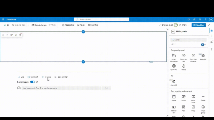
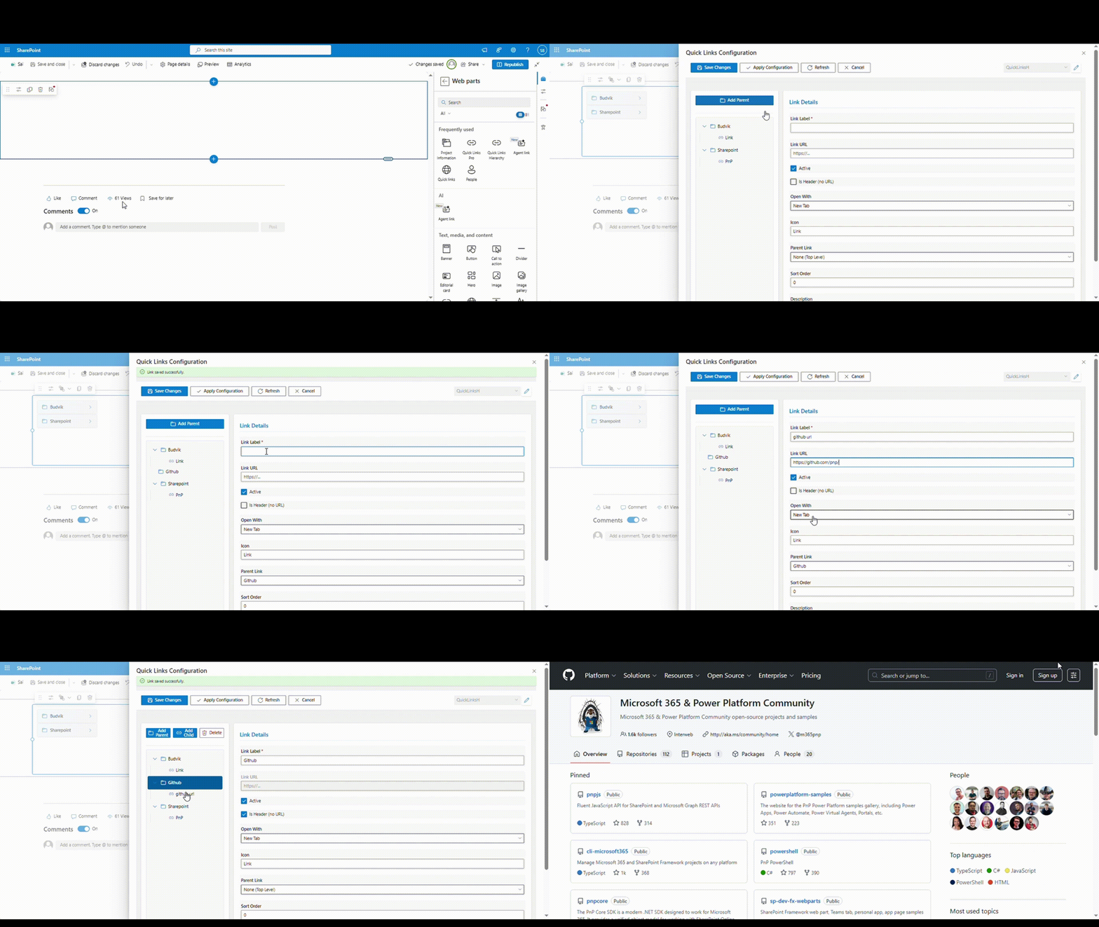
Once added to a page, configure your links through the web part property pane:
- Click “Manage Quick Links”
- Add your links with titles and URLs
- For child links, specify the parent link’s ID in the “Parent Link ID” field
- Save and enjoy your hierarchical navigation!
Contributing
This is an open-source project, and contributions are welcome! Whether it’s:
- Bug reports
- Feature requests
- Code contributions
- Documentation improvements
Visit the GitHub repository to get involved.
Resources
Here are some helpful resources for SPFx development:
Conclusion
Building this hierarchical quick links web part was a great learning experience in working with React, SPFx, and Fluent UI. The web part solves a real problem for organizations that need better ways to organize and present their navigation links.
I hope this inspires you to build your own SPFx solutions or to try out this web part in your SharePoint environment. Remember, the SharePoint community thrives on sharing and collaboration – so don’t hesitate to contribute your own ideas and improvements!
Happy coding! 🚀