How to call and show Graph API data in SPFx Adaptive Card Extensions(ACEs)
In this article, we will learn how to get data from Graph API and display it in SPFx Adaptive Card Extensions(ACEs). if you are new to ACEs then I would recommend going through my previous article where I have covered the concept and basics of ACEs along with step by step tutorial on understanding how the ACEs components work together especially Card View and Quick View.
Scenario
In this tutorial, we will cover the below use cases
- We will get the current user’s email message from the Graph API call and then show it in Card View with the previous and next button to navigate between emails
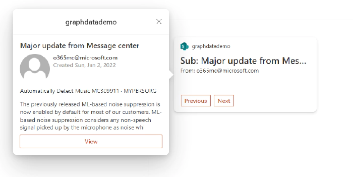
- We will modify Quick View to display email detail on click of any Email from Card View.
Step – Install latest SPFx Version
As of writing this article, the latest beta SPFx version is v1.14, use the below command to install the latest beta version, you can also install stable version SPFx 1.13.1
npm install /generator-sharepoint@next --global
Step – Create a new SPFx solution
Go to the targeted path in your command prompt where you wanted to create a new SPFx solution, run the below command
yo @microsoft/sharepoint
We will be asked a series of questions, you can choose/enter below for our sample

Once completed you would see below
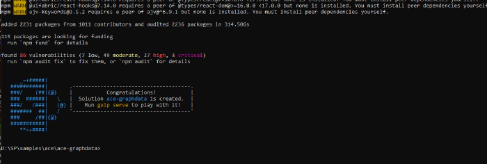
Step – Create Required properties/attributes to handle required state object
Based on what we are trying to build we will need 3 attributes
Go to src\adaptiveCardExtensions\graphdatademo\GraphdatademoAdaptiveCardExtension.ts
emails – to store an array of email messages which will be retrieved by Graph API
currentIndex : to hold current email item’s index
currentEmail : to hold current email object returned by Graph API to use it in Quick view to display details of email when clicked.
Modify the ACEState interface to below
export interface IGraphdatademoAdaptiveCardExtensionState {
    emails: any;
    currentIndex:any;
    currentEmail:any;
}
Next, modify onInit method to initialize
public onInit(): Promise<void> {
    this.state = {
        emails: [],
        currentIndex:0,
        currentEmail:{}
    };
    this.cardNavigator.register(CARD_VIEW_REGISTRY_ID, () => new CardView());
    this.quickViewNavigator.register(QUICK_VIEW_REGISTRY_ID, () => new QuickView());
    this.getOutlookData()
    return Promise.resolve();
    }
Step – Create a method to get data from Graph API
Go to src\adaptiveCardExtensions\graphdatademo\GraphdatademoAdaptiveCardExtension.ts
Import the MSGraphClient using which we will make Graph API calls.
import { MSGraphClient } from '@microsoft/sp-http';
Add a new method getOutlookData to make Graph API call and set State of currentEmail and emails from the return object.
private getOutlookData(){

    this.context.msGraphClientFactory.getClient().then((client: MSGraphClient): void => {
        client.api("/me/mailfolders/Inbox/messages").get((error, messages: any) => {
        console.log(messages);
        this.setState({currentEmail:messages.value[this.state.currentIndex],emails:messages.value});
        });
    });
    }
Step – Modify Card View to show data using the State object
Go to src\adaptiveCardExtensions\graphdatademo\cardView\CardView.ts
Modify data method to set primaryText and description as we have primary text card template.
We will use state object to read the subject and from the email address.
public get data(): IPrimaryTextCardParameters {
    if(this.state.emails.length >0 ) {
    return {
        primaryText: "Sub: " + this.state.emails[this.state.currentIndex].subject,
        description: "From: " + this.state.emails[this.state.currentIndex].from.emailAddress.address
    }
    }
    else{
        return {
        primaryText: "Loading",
        description: "Loading"
        }
    }
    }
Step – Modify cardButtons methods to add 2 buttons to navigate through email using previous and next
Go to src\adaptiveCardExtensions\graphdatademo\cardView\CardView.ts
public get cardButtons(): [ICardButton] | [ICardButton, ICardButton] | undefined {
    const buttons: ICardButton[] = [];
    if (this.state.currentIndex > 0) {
        buttons.push({
        title: 'Previous',
        action: {
            type: 'Submit',
            parameters: {
            id: 'previous'
            }
        }
        });
    }
    if (this.state.currentIndex < this.state.emails.length - 1) {
        buttons.push({
        title: 'Next',
        action: {
            type: 'Submit',
            parameters: {
            id: 'next'
            }
        }
        });
    }
    return buttons as [ICardButton] | [ICardButton, ICardButton];
    }
Add onAction item method to handle the submit action type of previous and next button
Note here using a case statement to increment or decrement the index, this will change the state object by modifying currentIndex and currentEmail and forcing to re-render the card view component.
public onAction(action: IActionArguments): void {
    if (action.type === 'Submit') {
        const { id, op } = action.data;
        switch (id) {
        case 'previous': {
            this.setState({ currentIndex: this.state.currentIndex - 1 , currentEmail:this.state.emails[this.state.currentIndex - 1]});
            break;
        }
        case 'next': {
            this.setState({ currentIndex: this.state.currentIndex + 1 , currentEmail:this.state.emails[this.state.currentIndex + 1]});
            break;
        }
        case 'default' : {}

        }
    }
    }
Step – Modify Quick view adaptive card JSON template to display details of the email
First thing we need to do is modify the QuickView Adaptive Card template json object. I have used https://adaptivecards.io/designer to design the adaptive card and set the dynamic properties to set based on how the email object is coming…
Modify src\adaptiveCardExtensions\graphdatademo\quickView\template\QuickViewTemplate.json to below
If you notice here
- We would be using message object from state to populate the dynamic values…
- For user photo, we are using the userphoto.aspx page and passing the sender’s email address. this is one of the way to get photo
- We have also added one button in Quick view which will take user to target outlook email link, this we get from webLink property of email object.
- To find list of properties returned by the email object, you can refer to this link
{
    "type": "AdaptiveCard",
    "body": [
        {
            "type": "TextBlock",
            "size": "Medium",
            "weight": "Bolder",
            "text": "${message.subject}",
            "wrap": true,
            "style": "heading"
        },
        {
            "type": "ColumnSet",
            "columns": [
                {
                    "type": "Column",
                    "items": [
                        {
                            "type": "Image",
                            "style": "Person",
                            "url": "/_layouts/15/userphoto.aspx?size=S&username=${message.from.emailAddress.address}",
                            "size": "Small"
                        }
                    ],
                    "width": "auto"
                },
                {
                    "type": "Column",
                    "items": [
                        {
                            "type": "TextBlock",
                            "weight": "Bolder",
                            "text": "${message.from.emailAddress.address}",
                            "wrap": true
                        },
                        {
                            "type": "TextBlock",
                            "spacing": "None",
                            "text": "Created {{DATE(${string(message.sentDateTime)}, SHORT)}}",
                            "isSubtle": true,
                            "wrap": true
                        }
                    ],
                    "width": "stretch"
                }
            ]
        },
        {
            "type": "TextBlock",
            "text": "${message.bodyPreview}",
            "wrap": true
        }
    ],
    "actions": [
        {
            "type": "Action.OpenUrl",
            "title": "View",
            "url": "${message.webLink}"
        }
    ],
    "$schema": "http://adaptivecards.io/schemas/adaptive-card.json",
    "version": "1.3"
}
Step Modify QuickView to pass the message object from state to Adaptive Card
Go to src\adaptiveCardExtensions\graphdatademo\quickView\QuickView.ts
Modify IQuickViewDate interface to hold the message object
Step Modify QuickView to pass the message object from state to Adaptive Card
Go to src\adaptiveCardExtensions\graphdatademo\quickView\QuickView.ts
Modify IQuickViewDate interface to hold the message object
export interface IQuickViewData {
    message:any
}
Modify data() method to set and return the current message object from state property currentEmail
public get data(): IQuickViewData {
    return {
        message: this.state.currentEmail
    };
    }
Step – Testing the ACE component
Testing the ACE component would be similar to how we test our SPFx web part, we will have to run the gulp serve command then open workbench to add the component created on the Page.
Run below command
gulp serve -l --nobrowser
Open a SharePoint Workbench in the browser
https://yourtenant.sharepoint.com/sites/mysites1/_layouts/15/workbench.aspx
Click on Add icon, Click on the graphDataDemo,
We should see something like below
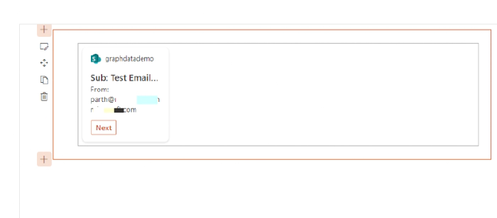
Notice here that once you click Next, it loads the next email but it does not show the Prev button, this is because by default the Card Size is set to Medium in ACE properties configuration, click on Edit web part and chase the Card Size to Large
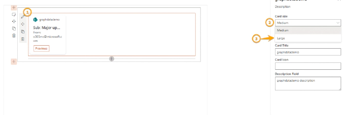
Now you should see something like below
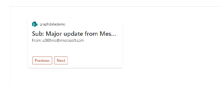
You can use Previous and Next to move around different emails. If you would have noticed we have written logic to handle that previous and next buttons will be visible based on item index and total email counts(by default we will only get 10 from Graph API). You can make this configurable in the property window and use this number to pass to Graph API GraphdatademoAdaptiveCardExtension.tx file
Click on any of the emails and we should see the email detail

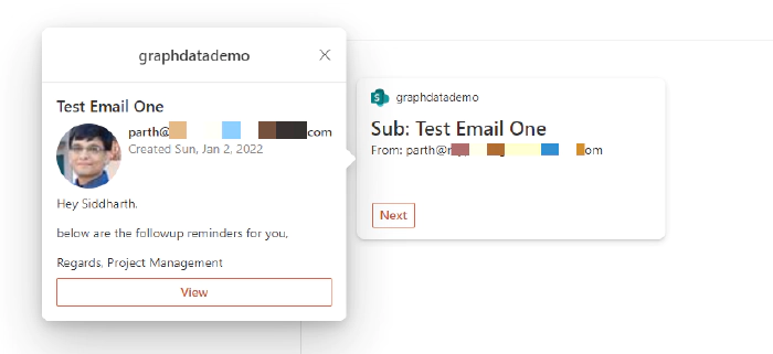
That’s it for this article, Hope this helps..!!!
Happy Coding..!!!
The source code for this article is available on GitHub location for quick reference.