Let's build a timer app for teams meetings
Introduction
Wouldn’t it be nice to have a timer at meetings, so that everybody can see how much time has passed and how much is remaining? A timer for everybody to see. To make this transparent and accessible to everyone, I wanted to build a timer app which you can use in Teams meetings.
And since we all get better at delivering and receiving virtual meetings, workshops and events, we all discover different techniques on delivering content. In a lot of agile techniques, time plays a relevant role. If you’re familiar with agile software development, Scrum in general or Stand-up meetings you know how effective timeboxing can be.
So I build a timer app and made it Microsoft Teams ready 😁
I’m gonna share, how I build it, so you can build something similar with the timer control, which caused the whole idea.
You can also just download my sample, I’ve published on M365 PnP Power Platform Samples. You get all the images and all the code to use and improve it (tag me if you did, I’d love to see if this thing can grow ;)). It’s all for free y’know?
I will split this blog into two parts:
- Building the app
- Make it available in Microsoft Teams meetings
Prerequisites
To build this app you just need access to the maker portal of PowerApps). You don’t need any data source or premium connectors.
When you want to make the app available in Microsoft Teams meetings you need the administrative rights to upload custom build apps in your Teams.
Any code editor will come in handy (I prefer Visual Studio Code), but don’t worry, you don’t need to know how to write code or anything.
About the app
Before we start, here’s a picture of the finished app.
[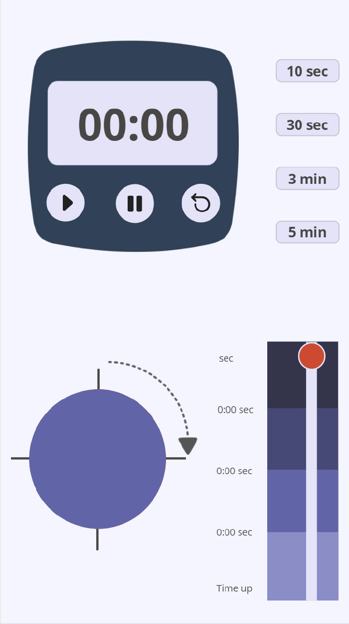
I build this in the portrait orientation, since I want it to be used in Teams meetings. That means, it has to fit in the meeting side panel.
In the upper half you see a classic timer which shows the remaining time and three buttons: Start, Stop and Reset.
You also have four buttons to set the timer to a certain duration. In this case I went for 10 seconds, 30 seconds, 3 minutes and 5 minutes.
In the lower half you see two things:
- A slider indicating the remaining time and a bar turning from blue to red as the time runs out.
- A pie chart divided into quarters to visualize the remaining time
Accessibility Note
I’d like to make it very clear in the beginning, that the colors are no coincidence. Initially I started with a classic color scheme: red and green. But then I realized that red-green colorblindness is one of the most common visual disorders. I switched the colors to make sure that everybody can see everything on the screen. Learn more about accessibility.
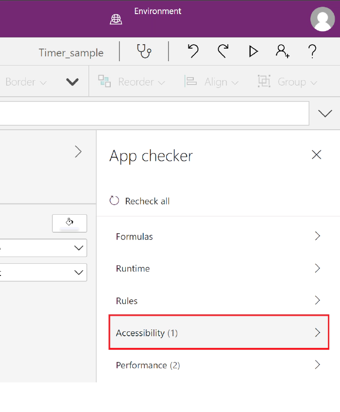
On all the Power App applications you can find the checker symbol in the upper right corner. It’s a very easy step to make sure that your product (app or flow or slide or whatever) reaches more people. We want to include everyone, correct? Correct!

Building the app
We have three steps to set up this app:
- Build the timer in the upper half of the app.
- Build the visualization in the lower half of the app.
- Make it look pretty.
Build the timer in the upper half of the app
At first you start with inserting four things:
- One timer input.
- Three buttons for controlling the timer.
- Four buttons to set the timer.
You will use the buttons to start, stop and reset the timer (think about renaming your controls in the tree view to remain an overview over all your components). Here is how to edit the parts:
Timer input
**[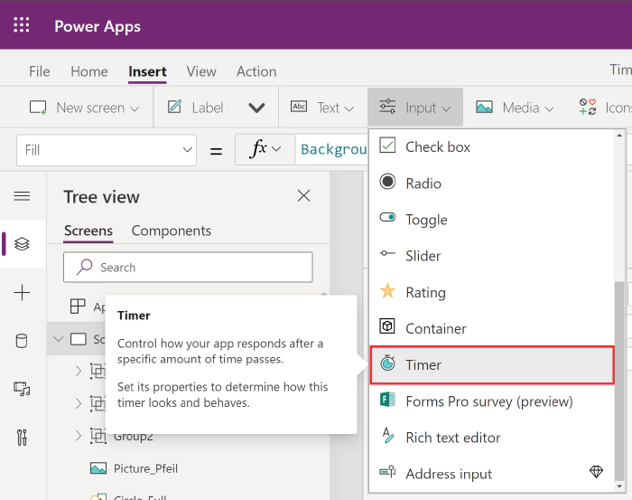
Start by changing the Duration into a variable. I called it “Dauer” (sorry for the german, but you can call it whatever you like). The timer shows now the duration we put into that variable.
By default, the timer starts counting upwards, but since we want to show the remaining time, we have to customize the Text property:
Replace the default function
Text(Time(0, 0, Self.Value/1000), "hh:mm:ss")
with this function
*Text(Time(0, 0, (Timer4.Duration-Timer4.Value)/1000), "[$-en-US]mm:ss") *
Now the timer shows only the minutes and seconds and starts on whatever is written in the variable “Dauer”. And it’s ticking downwards. Not bad.
Buttons to set the timer
Now we have to work further with that variable Dauer we set the timer
on.
You add four buttons and change the text to “10 sec”, “30 sec”, “3 min” and “5 min” (remember to use the “”, because the text is just a string ;))
The magic happens on the OnSelect property. Set it for each button to the following function:
10 sec button: UpdateContext({Dauer:10000})
30 sec button: UpdateContext({Dauer:30000})
3 min button: UpdateContext({Dauer:180000})
5 min button: UpdateContext({Dauer:300000})
The timer control works with milliseconds, so you have to type your desired duration in milliseconds. When you select e of the buttons, you change the variable “Dauer” to the specific value and since the timer value show whatever the variable Dauer is set to, you can choose the duration.
Now let’s take a look at the three buttons we want to use to control the timer.
Start Button
We set the OnSelect property to this function:
UpdateContext({ClockTicking: true})
We are initializing a variable named ClockTicking and set the value to
true. When we’re already on it, we use the same variable for the Stop
Button.
Stop Button
We set the OnSelect property to this function:
UpdateContext({ClockTicking: true})
This way we have buttons to control the variable here. Logically, we have to tell our Timer input that it has to use this variable to start and to stop.
Timer input
Change the Start property to ClockTicking
Since we want the timer to not automatically reset at the end, but to control it with the button, we set the OnTimerEnd property with this function:
UpdateContext({ResetIt:false}); UpdateContext({ResetIt: true})
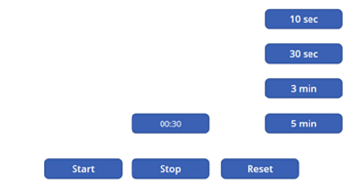
Now we have a timer that can be set to the values of the four buttons on the right side AND we can control it with three buttons. Neat!
Next stop: the visualization.
Build the visualization in the lower half of the app
We have two parts here: the slider on the right side and the pie chart on the left. We’re going to start with the slider
Slider Control
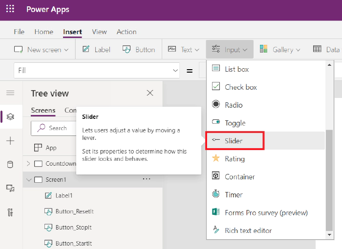
To build this, start to insert the slider control.
[
Now it’s time to flip it over.
Change the Layout property to Vertical
Set the Max property to Dauer/1000. This way it shows,
whatever Dauer is.
And to link the position of the handle to what your timer is showing set
the Default property to (Timer1.Duration-Timer1.Value)/1000
Now you already have a slider whose handle slowly moves down while your timer counts down.
How cool is that?
Before we make it pretty, we set up the last element.
The pie chart
This chart consists of five icons, put on top of each other. You will need the following icons:
- Circle (2x)
- Quarter circle (1x)
- Half circle (1x)
- Three-quarter circle (1x)
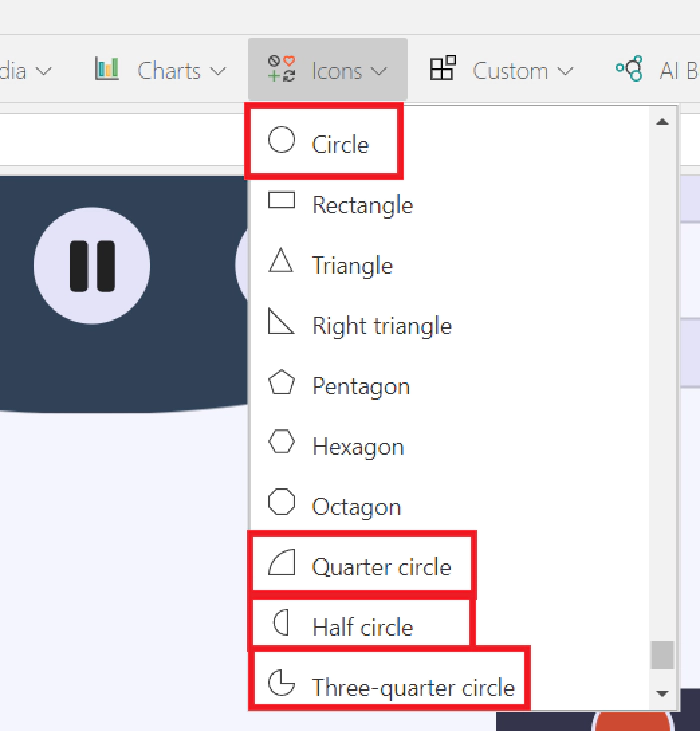
You need to layer these in the following order:
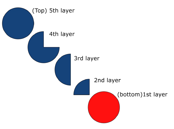
Set the Fill property to of the top four elements to some blue, the full circle at the bottom is going to be red. The exact colors don’t matter at this point. We will beautify the app in the last part, don’t worry.
Don’t worry about the looks, we will change them in the last chapter.
As the timer and the slider count down, you will, step by step, let the single icons disappear by setting the Visible property to the following function:
Full circle on top: If(Slider1.Value >=22.5,true,false)
Three-quarter circle: If(Slider1.Value >=15,true,false)
Half circle: If(Slider1.Value >=7.5,true,false)
Quarter circle: If(Slider1.Value >0,true,false)
When the timer reaches the value 22.5 the full circle on top will disappear, revealing the Three-quarter circle. That indicates that only three quarter of the time remains. It is important to place the circles on top of each other.
That is all you need to do. What’s left to do is, to make this whole thing pretty. Are you ready?
Make it look pretty
I will split this part, again, in three parts:
- The timer in the upper part
- The slider and the chart in the lower part
- The background
The timer in the upper part
I added a picture of a timer I’ve made myself. You can download and use it with the whole sample from the PnP Power Apps samples github repository.
You select Insert > Media > picture to use that picture in your app. Now place it in the middle of the screen (Power Apps helps you with snapping it to the middle if you drag it near the middle).
Now you can remove the border and background from your…
- Timer input
- The Start Button
- The Stop Button
- And the Reset Button
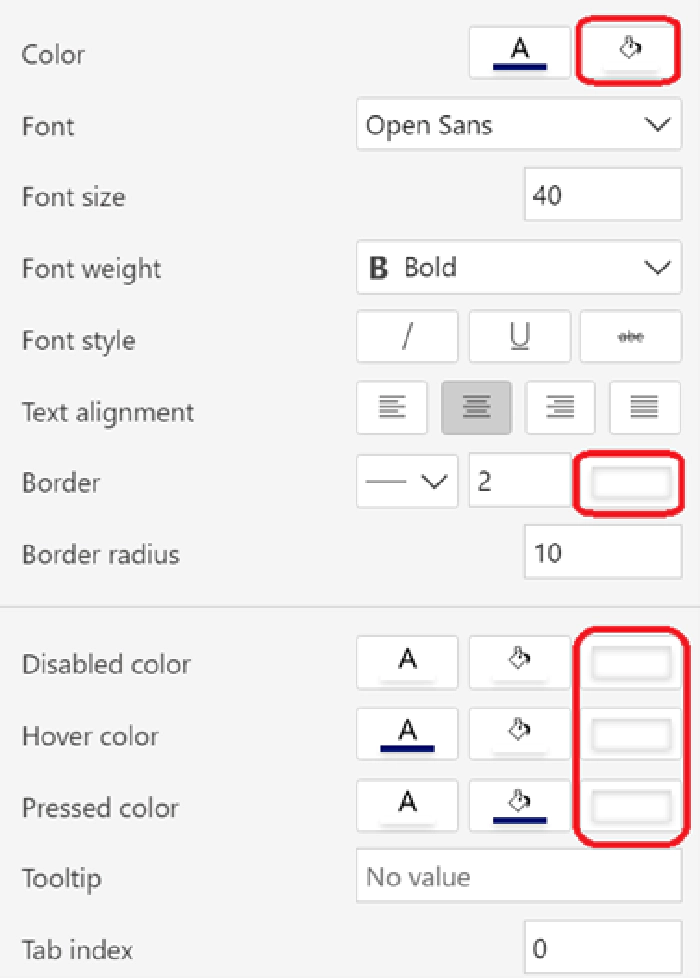
In the Timer properties, change these values to transparent:
[
I did the same for the Start, Stop and Reset Button and placed them in the middle of a circle icon, I’ve added (Insert > Icon > Circle). Place the button over the circle icon and align it in the middle and in the center. You do that by right-clicking on the button and use the align feature. With Reorder you can also place the icon under the button.
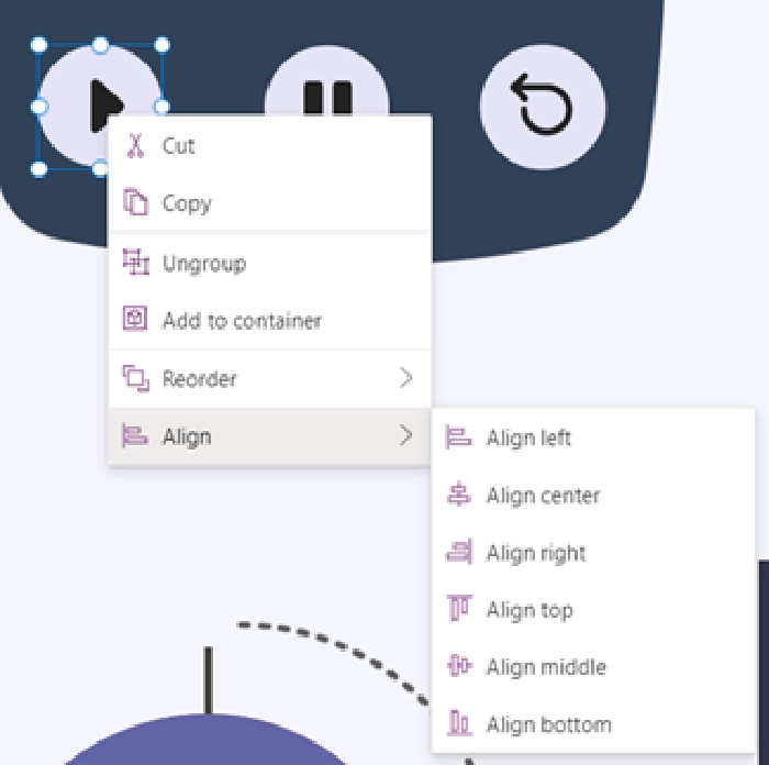
Now select the icon and the button and group them (Ctrl+G), so you can place them in the spare holes of the timer picture.
In the end I group the whole timer pictures and all controls and labels to place them easily.
The slider and the chart in the lower part
I set the size and position values of the circles like this, but you can place them wherever you like:
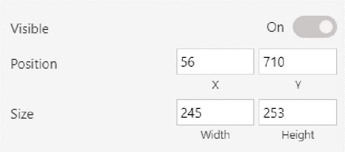
Now for the slider. Set the size and position values like this:
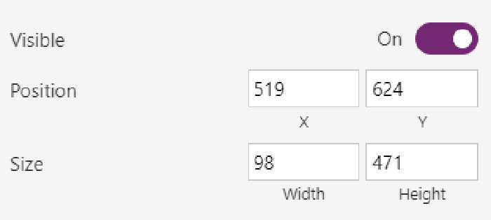
Set the Handle size value to 50.
Set the Rail value to 20.
The four-colored scale behind the timer are four rectangle icons that I placed over each other.
The colors
Now there is one last step, you have to set all the correct colors, And of course, I have another little trick, if you are lazy (like me).
I like to set all the colors I’m going to use in an app in a variable. Then I can set the Fill or color value for each element to the name of the variable and don’t have to remember the hexcode for every color over and over again.
You want to set those variables on the OnStart property of the app itself, so the colors will show when, you start the app.
[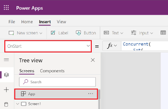
Here is the function that I used:
Concurrent(
    Set(
        Background_color,
        ColorValue("#f4f4fc")
    ),
    Set(
        Font_color,
        ColorValue("#484644")
    ),
    Set(
        Element_background,
        ColorValue("#e2e2f6")
    ),
    Set(
        Element_color,
        ColorValue("#484644")
    ),
    Set(
        Button_hover_Fill,
        ColorValue("#464775")
    ),
    Set(
        TheRed,
        ColorValue("#cc4a31")
    ),
    Set(
        Blurple_lightish,
        ColorValue("#6264a7")
    ),
    Set(
        Blurple_light,
        ColorValue("#8b8cc7")
    ),
    Set(
        Blurple_medium,
        ColorValue("#6264a7")
    ),
    Set(
        Blurple_darkish,
        ColorValue("#464775")
    ),
    Set(
        Blurple_dark,
        ColorValue("#33344a")
    )
)
Here is an overview on variables and their purposes.
Background_color: the background of the app Font_color: Color property of the timer Color property of the Duration buttons on the right Color property of the scale labels next to the timer Element_background: Fill property of the duration buttons on the right Fill property of the buttons to start, stop and reset the timer ValueFill property of the slider Element_color Color property of the icons around the circles Button_hover_Fill HoverFill property of the timer HoverFill property of the Duration buttons on the right HoverFill property of the buttons to start, stop and reset the timer TheRed HandleFill property of the slider Fill property of the red circle Blurple_lightish Fill property from the bottom rectangle behind the slider Blurple_light Fill property from the next larger rectangle behind the slider Blurple_medium Fill property of the blue circle on top Fill property of the three-quarter circle Fill property of the half circle Fill property of the quarter circle Blurple_darkish Fill property from the second largest rectangle behind the slider Blurple_dark Fill property from the largest rectangle behind the slider
The result should look a lot like this:

As you can see, I added Fluent UI Icons on the buttons of the timer (if you don’t know how to use them, have a look at this awesome blog from Luise Freese), four lines around the circle to indicate quarters and halves and an arrow to make it look nice.
The lines around the circles are arrow icons.
The round arrow, is an image I uploaded. You can find it in my sample on PnP Power Platform Samples (you can also find the timer image and the icons. Everything’s included).
Next steps
Of course, I have a few more ideas in mind. I’m planning on adding two more steps next:
- I would like to set the timer by just typing a duration into it. Or into a label somewhere around. I want to set the timer to any duration I like, instead of choosing from just four buttons. But I have no idea how to do that. Help!
- I would like to visualize the circle in the lower half differently. Currently it disappears at three quarters of the elapsed time, at half and at three quarters. I would like to see the circle count down a little bit smoother. But for this I still lack the idea for the implementation
I’d love to hear what you think about it. Do you like it? Do you think it’s going to be helpful for yourself or your business? Do you think I should add a few more things?