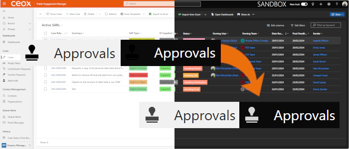
Preparing for Model-Driven Apps Dark Mode Icons - Improved
In my previous blog post on how to implement svg icons to work with dark mode for model-driven apps, I showed how to edit the SVG file to work in both light and dark mode using a SVG style. This method is used by many of the out-of-the-box Dynamics table icons.
However, there’s a better way that’s documented on learn.microsoft.com in Change model-driven app custom table icons:
"Where possible, remove any hard coded fill color attributes and use the `currentColor` keyword to avoid contrast issues."
With a further reference to Working with Scalable Vector Graphics (SVG) [in model-driven apps].
The change is straightforward - it is standard practice to create icons with a black fill colour (#000000):
<path ... fill="#000000" ... />
This needs to be changed to:
<path ... fill="currentColor" ... />
Which gives the same result for light vs dark mode as the style approach:
