Professional SPFx Solutions: Unlocking the secrets of your web part manifest
SharePoint Framework (SPFx) is an extensibility model for Microsoft 365 enabling developers to build different kinds of extensibility for Microsoft Viva, Microsoft Teams, Outlook, Microsoft 365 app (Office), and SharePoint. SPFx has multiple benefits like automatic Single Sign On, automatic hosting in the customer tenant, reuse same code across the service and industry standard web stack tooling.
- I prefer to use SVG images to create scalable assets that look good at any resolution. Is it possible to use SVG icons for my web parts?
- How can I build web parts that look less “custom”, and more professional to encourage people in my organization to use my web parts?
- How can I prepare my web part to publish it to the marketplace?
- How do I control how my web parts show in the Add a new web part toolbox?
Great questions! You can use your web part’s manifest to control how your web part appears (or doesn’t appear, in some cases) in the web part toolbox.
This blog post is part of a month long SPFx series for January 2023. Each business day we’ll publish a new blog post covering different aspects of the SPFx.
- Previous blog post in this series - Using reusable open-source controls within your SPFx solution
- Next blog post in this series - Professional SPFx Solutions: More web part manifest secrets
What is the web part manifest?
Web part manifests are .json files that describe the web part, its capabilities, its default configuration, and how it should appear in the Add a web part toolbox.
Every web part in your SPFx solution has manifest file called [YourWebPartName].manifest.json next to the [YourWebPartName].ts file (where the code for your web part resides).
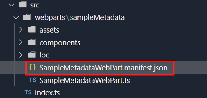
A web part manifest must follow the client-side web part manifest schema; if you ever wonder what values are allowed within the .json file, you can open your manifest and click the URL in the $schema node to find out the rules that your .json file must follow.

The first time you open the manifest file with VSCode, you may notice that there are a few comments to help you out, but they are highlighted as errors. Don’t worry, you didn’t do anything wrong: technically, .json aren’t supposed to have comments, and VSCode likes to remind you of that fact… but you can safely ignore errors related to comments.

If you don’t want VSCode to highlight comments as errors in your manifest, you can follow this simple trick
A word about testing changes to your web part manifest
If you want to try any of the changes described in this post while you’re running gulp serve, just remember that some changes require you to refresh the workbench page, while other changes will not appear until you start and stop gulp serve again.
Some other parts of your manifest
(for example, the properties in the preconfiguredEntries node), require you to remove the web part from the page, refresh the page, and re-add the web part before your changes take effect.
Controlling how a web part appears in the toolbox
Web parts can have pre-configured properties such as title, description, toolbox group name and icons, which all affect how a web part appears in the toolbox.
You’ll find these properties in the preconfiguredEntries section of your manifest – because page authors and/or organization admins will have the ability to change the values you provide here as needed.
title
The
titleproperty controls the name of your web part in the toolbox.Required
It should clearly describe the information the web part presents, instead of what it does.
Avoid including the words “web part” – they’re all web parts!
titleis a localizable string: you can have a different title value for every locale you wish to support, but you must have adefaultvalue. For example:"preconfiguredEntries": [{ ... "title": { "default": "Color wheel", "en-ca": "Colour wheel", "fr-fr": "Roue chromatique" }, ... }]
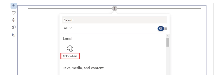

- You should consider making the
titleproperty configurable through the web part’s property page; even better, you should use the WebPartTitle PnP Reusable React control to allow page authors to easily change the web part title.
description
The
descriptionproperty is another localizable string that briefly describes the web part’s functionality and value description. For example, here are some descriptions of the standard SharePoint web parts:Web part description Call to action Add call to action text and an image paired with a clickable button. Divider Add a line to divide areas on your change. Image Add an image, picture or photo to your page including text overlays and ability to crop and resize images. Spacer Add vertical space between areas on the page. Required
This value will be displayed to the user in the toolbox.
This value will be searchable, even if it is not displayed in the toolbox grid view.
A dictionary must contain a
defaultkey, but can support more locales, as needed."preconfiguredEntries": [{ ... "description": { "default": "Add an interactive color wheel to your page." }, ... }]This description should be used in the Toolbox tooltip and other display areas.
The organization admin and page author will have the ability to change this description as to suit their needs.
Don’t confuse the
descriptionfield with thedescriptionunderproperties; one is the web part’s description, the other is a sample property that is created when scaffolding your web part.

groupId
The
groupIdis a GUID that determines which modern group to place the web part in the toolbox.Required
The SharePoint Framework reserves group ids for predefined groups:
Group Id Group Name Description cf066440-0614-43d6-98ae-0b31cf14c7c3 Text, media, and content Includes web parts that display text, multi-media, documents, information from the web, and other rich content. 1edbd9a8-0bfb-4aa2-9afd-14b8c45dd489 Documents, lists, and libraries Includes web parts that organize, group, and filter content to help users discover information. 75e22ed5-fa14-4829-850a-c890608aca2d Feeds Includes web parts that facilitate information sharing, team work, and social interactions. 1bc7927e-4a5e-4520-b540-71305c79c20a News, people and events Includes web parts that empower team productivity with the use of planning and process tools. 4aca9e90-eff5-4fa1-bac7-728f5f157b66 Data Analysis Includes web parts for tracking and analyzing data, and for integrating business flow with pages. cfc8bda5-cb9b-49e3-8526-2ee6e52b256a Regional information Includes web parts that display information based on current region and geographical location. 5c03119e-3074-46fd-976b-c60198311f70 Advanced Includes web parts not in other categories. You can use any of the predefined groups, or specify your own.
If you specify an id that is not in the predefined groups, your web part will appear in the Advanced group.
If you want to support hosting your web part in a classic page, remember to also set the
groupproperty. If you do not provide one, your web part will appear in the miscellaneous group.
tags
This field is used to tag a web part with keywords that are different from the web part group name, title and description. Tags can be used when searching of web parts.
It is an array that can contain up to 10 string values:
  "preconfiguredEntries": [{
    ...
    "tags": [
      "Hue",
      "Saturation",
      "Pantone",
      "Grayscale",
      "RGB"
    ],
    ...
  }]
officeFabricIconFontName, iconImageUrl, and fullPageAppIconImageUrl
There are two types of icons:
Web part icon: displayed in the Toolbox, defined by
officeFabricIconFontNameoriconImageUrl.
App page icon: Displayed when users created a single part app page. Defined by
fullPageAppIconImageUrl.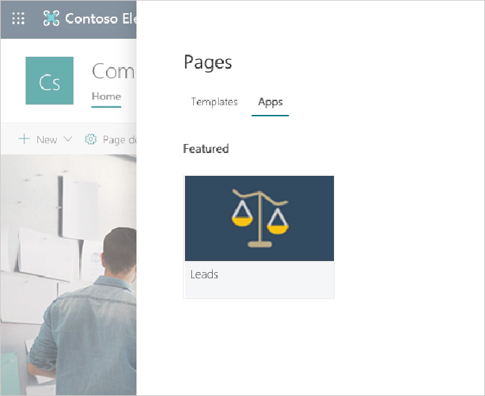
Here is how to use each of the officeFabricIconFontName, iconImageUrl, and fullPageAppIconImageUrl icon attributes:
| Attribute | Description | Accepted values | Dimensions |
|---|---|---|---|
officeFabricIconFontName | The icon for the Web Part, to be displayed in the toolbox, represented as a character name in the Microsoft 365 icon font file. If this field has a value, the iconImageUrl field will be ignored. | The icon font is specified at https://aka.ms/uifabric-icons (but you can also use https://flicon.io) | N/A |
iconImageUrl | The icon for the WebPart, to be displayed in the toolbox, represented an image URL. | Absolute URL or base64-encoded data URL | 64x64px |
fullPageAppIconImageUrl | The icon for the Application pages, to be displayed in the single part app page experience, represented an image URL. The image at the URL should be approximately . If this field is not defined then the iconimageUrl is used instead | Absolute URL | 195x110px |
- To avoid quality loss, you may want to use vector-based SVG images.
- Keep in mind that you have to deploy your web part icon images separately (or host them on a CDS somewhere). However, if you use base64-encoded images, you don’t need to deploy them separately.
- To encode PNG images, you can use one of the many online resources (like this one).
- If you choose to use a base64-encoded SVG for the
iconImageUrlproperty, you may want to use this handy interactive blog post to do the hard work for you. - At least one of
officeFabricIconFontName,iconImageUrl, orfullPageAppIconImageUrlis required.
You may see conflicting information about the fullPageAppIconImageUrl recommended image sizes. The placeholder for the image is actually 193x158px, but the bottom 48px will be partially covered by a label with the web part’s name, hence the suggest 195x110px.
properties
Every Web Part is expected to have some custom properties. For example, an image web part may have the image URL and caption text as custom properties, while a list web part may have the list id and list title as custom properties, and so on.
The image web part would have the following properties:
"preconfiguredEntries: [{
        "properties": {
            "imageUrl": "https:\/\/somerandomurl.com",
            "caption": "This is a sample image"
        }
    },
]
While the list web part would have the following properties:
"preconfiguredEntries: [{
        "properties": {
            "listId": "{3032A5BFC8E14DF88724104FD84890AB}",
            "title": "My events"
        }
    },
]
You can create properties of the following types:
- Array
- Boolean
- Integer
- Number
- Object (in the form of a JSON structure)
- string
Remember: these values are “pre-configured” values. Your page authors and admins may want to change the values. You may want to use default values that will improve the “first run experience”, or leave the
propertiesblank and handle blank values in your code, and use the Placeholder PnP Reusable React control to encourage the page authors to configure the web part.
Having more than one entry in preconfiguredEntries
By default, there is only one preconfiguredEntries, but you can have more than one!
For example, let’s pretend that the same code for my Color wheel web part also allows me to find complementary colors and calculate contrast ratios, depending on a custom property called “mode”. I could use the following preconfiguredEntries values in my manifest:
"preconfiguredEntries": [
    {
      "groupId": "5c03119e-3074-46fd-976b-c60198311f70", // Advanced
      "group": {
        "default": "Advanced"
      },
      "title": {
        "default": "Color wheel"
      },
      "description": {
        "default": "Add an interactive color wheel to your page."
      },
      "officeFabricIconFontName": "Color",
      "tags": [
        "Hue",
        "Saturation",
        "Pantone",
        "Grayscale"
      ],
      "properties": {
        "mode": "ColorWheel"
      }
    },
    {
      "groupId": "5c03119e-3074-46fd-976b-c60198311f70", // Advanced
      "group": {
        "default": "Advanced"
      },
      "title": {
        "default": "Complementary colors"
      },
      "description": {
        "default": "Add an interactive tool to find complementary colors."
      },
      "officeFabricIconFontName": "BucketColor",
      "properties": {
        "mode": "Complementary"
      }
    },
    {
      "groupId": "5c03119e-3074-46fd-976b-c60198311f70", // Advanced
      "group": {
        "default": "Advanced"
      },
      "title": {
        "default": "Contrast ratios"
      },
      "description": {
        "default": "Add an interactive tool to calculate contrast ratios between two colors."
      },
      "officeFabricIconFontName": "Contrast",
      "properties": {
        "mode": "Accessibility"
      }
    }
  ]
Which would produce three web parts in the toolbox: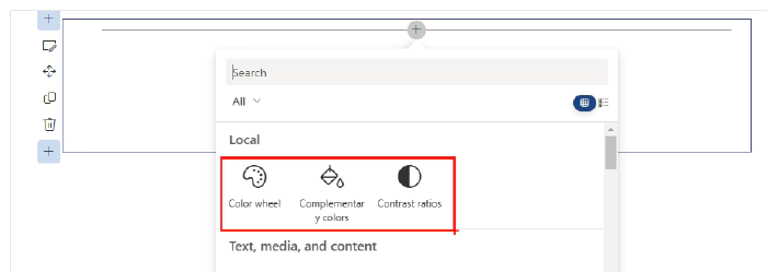
There’s more…
I hope that you learned a few things about the web part manifest that will help you build more “professional”-looking web parts.
We only covered the preconfiguredEntries today, but we still need to cover the attributes that describe the web part’s behaviors and capabilities – which we’ll discuss in tomorrow’s post.
References
Here are some initial references to get started with the SPFx in your development. Please do provide us with feedback and suggestions on what is needed to help you to get started with the SPFx development for Microsoft 365.
- SPFx documentation – https://aka.ms/spfx
- Issues and feedback around SPFx - https://aka.ms/spfx/issues
- Microsoft 365 Platform Community – https://aka.ms/m365/community
- Public SPFx and other Microsoft 365 platform community calls – https://aka.ms/m365/calls
- These calls are for everyone to take advantage to stay up to date on the art of possible within Microsoft 365 and to provide guidance for beginners and more advance users.
- SPFx samples in the Microsoft 365 Unified Sample gallery – https://aka.ms/m365/samples
We will provide more details on the different options and future direction of the SPFx in upcoming blog posts in this series.