Using the PnP Modern Search Web Parts
These are the web parts you’re looking for
The PnP Modern Search web parts, out of all of the hundreds of samples available as a part of the PnP initiative, are some of the most complicated web parts to get configured.
Between the four of them, there’s somewhere around 100 different configuration options, which can be configured into countless combinations; and if you want to make the most out of them, you’re also going to need to be somewhat familiar with SharePoint Search topics such as managed and crawled properties, refiners, result sources, etc... Point is, these web parts are not meant for the masses and can be a challenge even for the most super of super users.
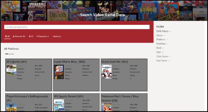
The aim of this post is to, hopefully, lessen that challenge a bit. And to do that, we’re going to be using these web parts to build a page for searching a SharePoint list of the top 999 video games (by # of units shipped).
We’re not going to be deep diving into every option or combination of
setting. Instead, we’re going for the classic "Minimal Path to
Awesome"...with a few detours throughout.
Getting the Web Parts
The latest version of the PnP Modern Search web parts can be found using this link.
For the purposes of this blog, we’re looking at v4.1.0, which can be found using this link (in case it’s no longer the latest).
Just scroll down to the bottom of the page and download the .SPPKG
file.
Once you have those, you can follow along with the installation guide to get them in your tenant.
Setting up for the demo
If you’re interested in following along with the demo in your own environment, there’s a bit of behind-the-scenes work that was done to stage things.
I’ve included a PnP Site template and a README in the github repository for this blog to help get you up to speed.
Configuring the Search Box web part
In keeping with the spirit of our “Minimal Path to Awesome” approach,
the Search Box web part will be the easiest to configure of the lot. We
can just drop it on the page somewhere and be done.
That doesn’t mean, however, that it has to be that simple. Version 4 has introduced more advanced features than we’ll be making use of, but that doesn’t mean we can’t take a peek.
Panel 1 - Search box settings
The first configuration panel initially offers two settings.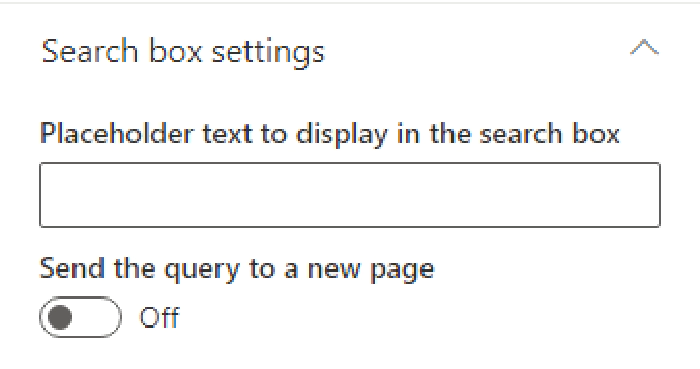
The second setting - Send the query to a new page - will be off by default (and will stay that way for this example). If you enable it, you’ll see some new options appear that allow you send the user’s query to a new page/tab.
This can be incredibly useful if you want to create "Search Results" page like what we’re currently doing, but also want to provide a search box on other pages. Using this we could, for example, include a Search box web part on the home page of our site and, when a user submits a query, the query is passed to the page we’re building, and search results are shown.
Panel 2 - Query Suggestions
It’s possible to provide users with some search suggestions (you know, the things that appear beneath what you’re typing in search engines like Bing or Google) to help speed them along their search journey.
As users search for a particular term or phrase and select search results, SharePoint will (supposedly) make a correlation between the two. In our example, if a user searched for World of Warcraft and clicked on the result World of Warcraft: Legion six times, SharePoint would begin suggesting World of Warcraft: Legion as a potential query.
NOTE: I used the word supposedly earlier because I never saw this feature working in my example. I assume this is either because the search results we’re creating aren’t clickable, or that the Search suggestions are only curated when you’re using the built-in search boxes, such as the Microsoft Search bar.
Panel 3 - Available Connections
The last panel of options includes configurations that allow us to pull
queries from other sources.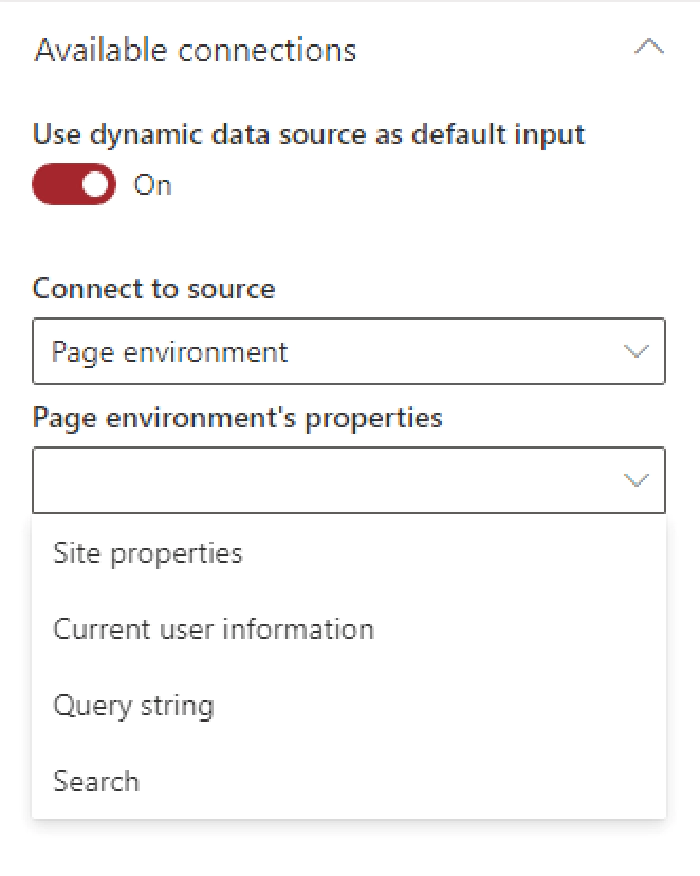
Again, we’re not going to be dealing with these on our MPA. However, referring to the example of having a search box on a home page sending queries to the page we’re currently building, we would want to select the "Query string" option here and specify our parameter name. Once configured, we could pass query information from one page and pull it in here.
Configuring the Search Verticals web part
Verticals allow users to limit their search results to a specific kind of result. If you’ve been around SharePoint long enough, you’ve no doubt seen the standard All, Files, People, Sites, etc... verticals that SharePoint shows when you search for stuff.
Well, the Search Verticals web part allows us to create our own
verticals that enable our users to see results for specific platforms.
In terms of difficulty, the Search Verticals web part comes in second
place in our example, although it’s probably the easiest to configure
overall if you count the Search Box features we’re not making use of.
While the other three web parts in this package saw new features (and added complexity) with the latest version, this web part is actually became much easier to use. There’s only one configuration panel to deal with, so let’s take a look.
Panel 1 - Search verticals configuration
When you open the Search Verticals web part, you’ll be greated with a
singular button that says Configure Verticals.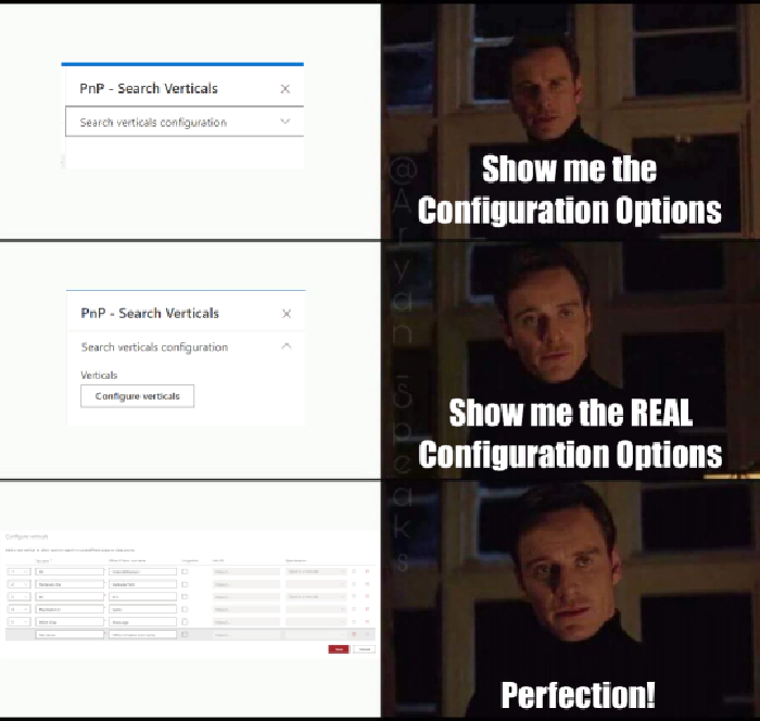
When clicked, you get the real deal...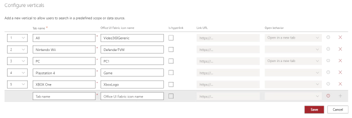
We can add any number of verticals simply by giving them a name and setting an order. We can also make use of the standard Fabric icons if we wish (and we do!) and, if we choose, we can make verticals a link that opens a new page when clicked.
Since we want our users to stay on the same page, we’re not going to bother with hyperlinks, but we will go ahead and create verticals for the latest generation of platforms available in our dataset, as well as an “All” vertical.
Search Verticals Summary
That’s all there is to it, really. However, one important thing to keep in mind is that each vertical you choose to add will require a separate instance of the Search Results web part. For those that are familiar with previous versions of these web parts, this is a departure from what we’re used to.
Configuring the Search Refiners web part
Once a user gets to searching, they may want to be able to filter the results by certain criteria. We can use the Search Filters web part to fulfil that demand.
Panel 1 - Available Connections
For refiners to show, they’ll need search results to refine. The "Available connections" settings will allow you select e or more Search Results web parts. If you haven’t already added one, there won’t be any options, so make sure you’ve added one first. Once you’ve got one, select it here.
Later, you’ll see that we end up with multiple Search Results web parts, so we’ll revisit this after that point to update it so our refiners respect that.
Panel 1 - Filter Settings
The other section has two different settings we can configure.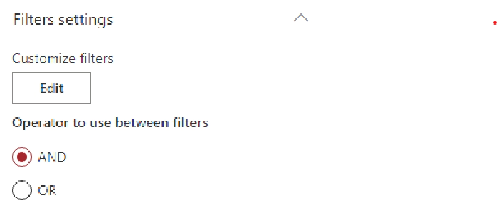
Clicking the edit button will, again, open a meme-worthy panel. Unlike
the last panel, though, this new panel is far more involved.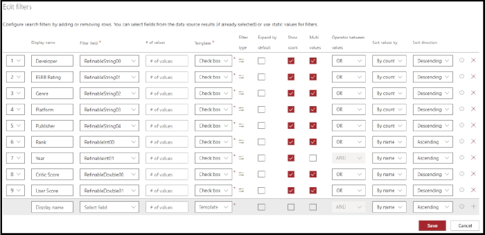
Most of the settings are, I think, self explanatory and you can see the settings used for the demo in the above screenshot.
However, it’s important to note that the values you use in the "Filter field" column MUST map to a managed property that has been marked as Refinable. In our case, we’ve already gone into our search schema and mapped the columns we wanted to filter by to the provided Refinable managed properties.
NOTE: If you’ve applied the PnP template referenced earlier, these settings will have already been mapped for you.
Panel 2 - Available Layouts
We have three pre-canned layouts available to us, as well as a Custom
option which you can use to present your filters in any way you can
imagine.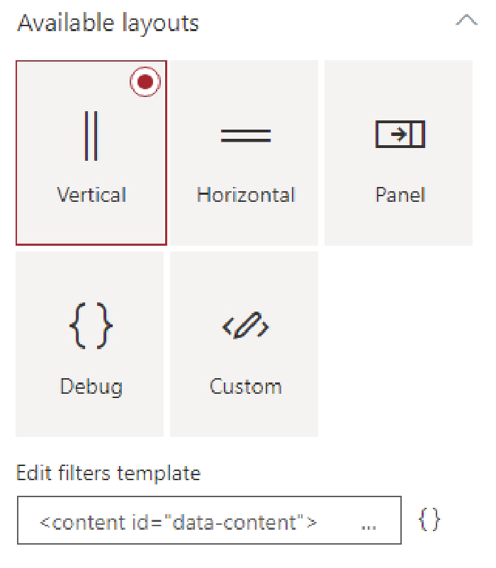
The Vertical and Horizontal options are self-descriptive, while the Panel option will cause a panel to flyout from the right (like how the web part properties do).
Since our Filter web part is in a vertical column, we’ll just stick with that option.
Configuring the Search Results web part.
The Search Results web part is, as the name implies, the component we
use to show search results for the things users are searching for. It’s
also where things start getting little more involved.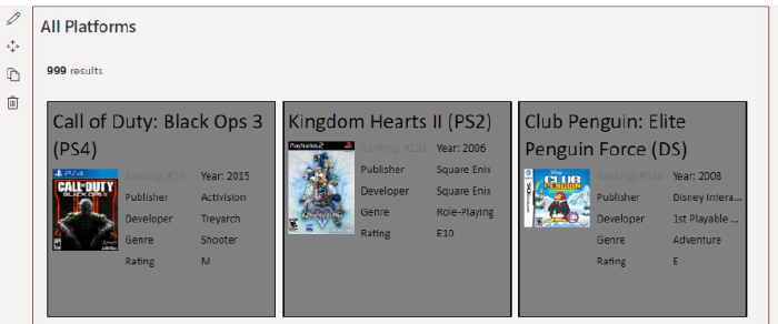
Unlike the previous web parts, there are a lot of different settings, combinations, and customization potential in this web part. Since we’re focused on just getting a quick win, we’ll mostly be sticking to the basics.
Panel 1 - Available data sources
The first section we must deal with is choosing where we will pull
search results from: SharePoint or Microsoft Search?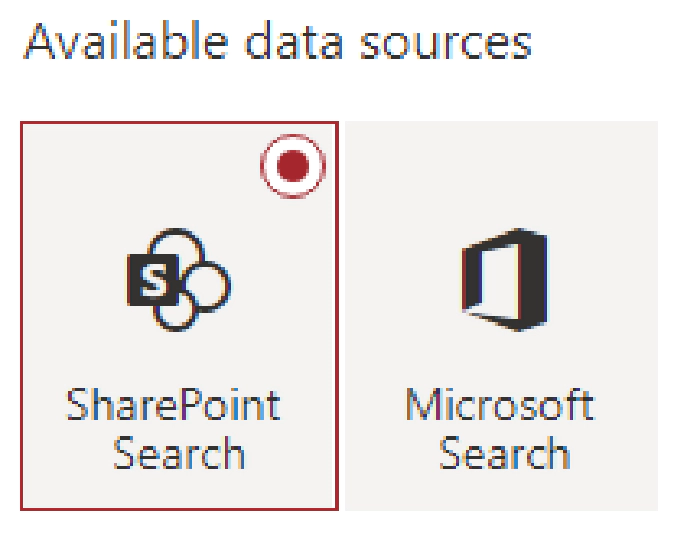
As was mentioned in the at the beginning of this blog, all our data is in SharePoint, so we’re just going to go with that. We could, of course, use Microsoft Search to get the data as well...but we’ll leave that for another time. Just note that if you decide to go forward with Microsoft Search, some of the configuration options will change based on that context.
Panel 1 - Layout slots
If you select the Customize button, you’ll be presented with another flyout panel with a bunch of default entries. There’s a brief description at the top that tries to explain what these are, but honestly didn’t make much sense to me in the beginning. Search results are, behind the scenes, being rendered using Handlebars templates. Each one of these Slots will create a variable that can be referenced in a template and is tied back to a property returned in the search results.

Considering the above, there will be a property exposed in the Handlebars template called "Author" that is mapped to the "AuthorOWSUSER" managed property.
For those of us walking the minimalist path, this isn’t necessary. However, the search results shown in screenshots does make use of custom templates and does rely on some custom layout slots to tie into the managed properties associated with our list of video games. Below is a table of the mappings for those following along.
Slot name Slot field
Developer DeveloperOWSCHCS Rating ESRBRatingOWSCHCS Genre GenreOWSCHCS IMGURL imgurlOWSURLH Platform PlatformOWSCHCS Publisher PublisherNameOWSCHCS Rank RankOWSN Year YearOWSNMBR
Panel 1 - SharePoint Search
This section has a lot going on and is our first real chance to influence what search results are surfaced for the user.
Query Template
The first option is the Query template text box. By default, it will
simply have {searchTerms} loaded into it, which acts as a token to
represent whatever search query is being fed to the web part. In our
case, that will be whatever the user has typed into the Search Box web
part. You can enter your KQL query here, which can enable you to
restrict search results to, say, a particular content type ID like
so...
{searchTerms} ContentTypeId:0x01004527A5975C6A534DAE7EBFD57E41A633*
In this case, the content type ID being used is for a "Video Game Data" content type that is used for items in our list. So, by doing this, we’re limiting our search results to only those that match our content type.
This also gives the benefit of displaying default search results when the user enters the page, which is pretty useful in our example.
Result source ID
Immediately below that is the Result source ID field, which allows you select a SharePoint Search Result Source. By default, it will be set to LocalSharePointResults. If you’re using the method above, you can leave it there. The other option is to create your own custom Search Results type to limit results to our content type and supply the GUID for that here. The end result is the same, ultimately.
Selected Properties
Next up is the Selected Properties dropdown. The web part will have several properties selected by default, and if you’re just wanting to leverage the default layout options, you can leave this alone as well.
If, however, you want to display different properties on your search results you can (de)select as many options as you need. You won’t be able to make use of any property you haven’t included here though, so bear that in mind.
Our search results don’t need any of the default options. Instead, you can just copy & paste the below string into the text box to get going. DeveloperOWSCHCS,ESRBRatingOWSCHCS,GenreOWSCHCS,imgurlOWSURLH,PlatformOWSCHCS,PublisherNameOWSCHCS,RankOWSNMBR,Title,YearOWSNMBR
Each one of those values points to a managed property that was created when our site columns were provisioned and allows us to show that data on our result cards.
Sort order
I think this one is fairly self explanatory. You select a managed
property (or properties), things get sorted as you specify.
The only thing to keep in mind here is that the property you select must be marked as being sortable in the Search schema, which they won’t be by default and is why we’re referencing RefinableInt00 in the screenshot above, which has been mapped to the Rank column in our list.
Refinement filters
You can add additional filters to search results here. This is another
way, like the Query text example above, to limit what results are
returned.
We could totally add our
ContentTypeId:0x01004527A5975C6A534DAE7EBFD57E41A633* filter here, if
we chose, instead of the Query text box above.
The biggest difference would be that we wouldn’t see any search results
until the user actually searched for something.
The other options
There are five other options available in this section which are somewhat self explanatory. The only exception to the rule might be the Enable query rules options, which is more than we’re going to get into here (and honestly not something I’m familiar with).
Panel 1 - Paging options
This section, as the name implies, allows you to configure paging options. They’re all straight forward and the only one we changed for the demo was the Number of items per page, which we set to 9 - the idea being that we wanted to show three cards per row (which left a straggler if we left it at the default 10).
Panel 2 - Available layouts
This panel is more straight forward that the last. Select a layout and
configure any common or layout specific options you want.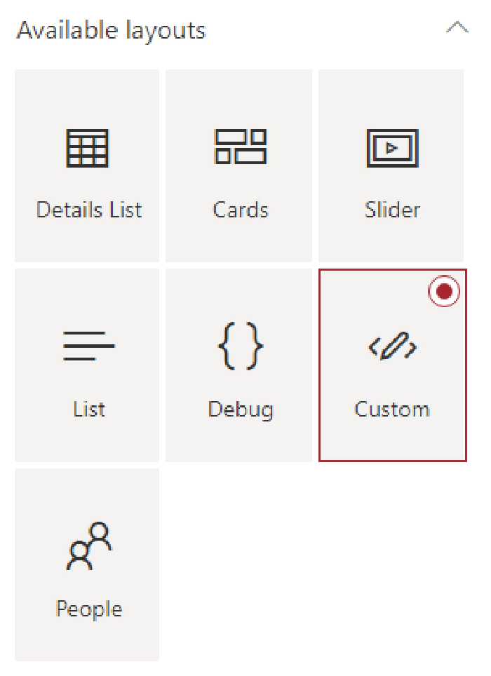
The complexity will come in when you want to customize the visual appearance of the search results. Many of the non-custom layouts have configuration options that allow you to influence the appearance, but all of them will require some familiarity with Handlebars to get the most out of them.
If you’re just using these web parts to surface standard SharePoint content, such as Pages or Documents, the non-custom layouts should suit your needs perfectly.
For the hardcore, you can also go full custom and get as creative as you’d like. We’re using the custom layout in our Search Results web parts, the source for which can be found on GitHub.
NOTE: For the custom layout to function, you will need to ensure that you’ve defined the custom Slots referenced earlier in the blog.
Panel 3 - Available Connections
The last panel of options allows us to connect the other web parts we have on our page which, in turn, allows them to influence our search results.
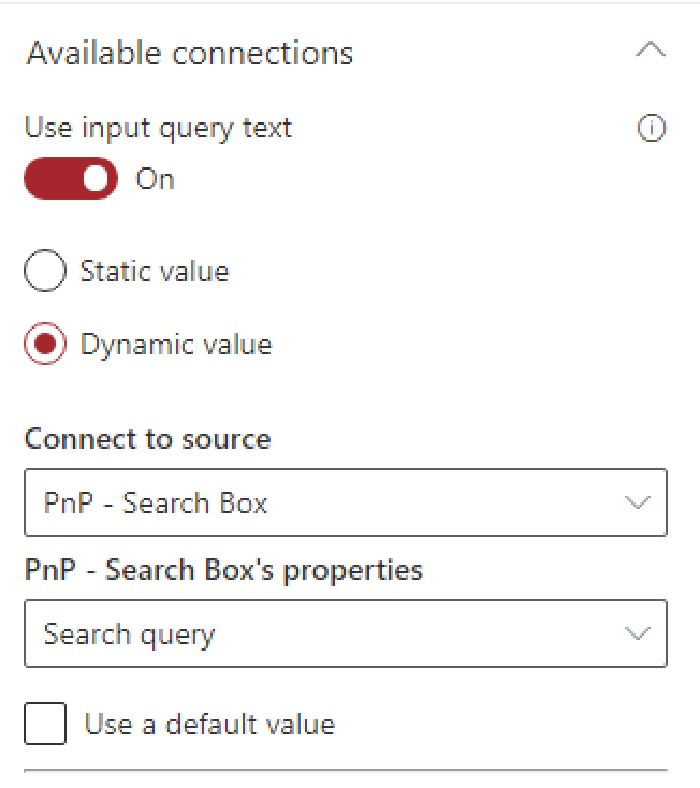
The first option is whether to Use input query text, which is Off by default. This setting basically controls whether we want to allow search queries.
Leaving it off might seem odd, but if we didn’t want users to search via text and instead use verticals, refiners, or just browse through result pages of the query we specified back on the first panel’s Query template, that’s how we’d do it.
However, we definitely want to flip that on, otherwise our Search Box web part will be about as useful as a glass nail. Once on, you can select Dynamic Value and select the PnP - Search Box option.
We’ll also want to go ahead and connect our filters web part, which is as simple as toggling the switch and selecting the only item in the dropdown.
Lastly, we’ll want to connect to our verticals web part, which is only slightly more complicated than the refiners. As you’ll see, we have a second dropdown that is labeled Display data only when the following vertical is selected.
To start with, just select the All option. Once that’s done, in order to support all of our verticals, we’ll need to actually duplicate the web part we just configured for each additional vertical (4 times, in our example) and update each one to show during a different vertical.
It’s a bit heavy handed for our example, but extremely useful if you intend to display different layouts for different verticals.
Once you’ve duplicated your Search Results web part, be sure to update the Available Connections setting in your Search Refiners web part to include these additions.
Conclusion
If you’ve followed along with everything, you should have a page that
looks something like the below...
These web parts are amazingly cool, extremely powerful, and can be leveraged to create a lot of awesome experiences for our users.
It’s also one of the most complicated web parts out there. While this blog post was (mostly) focused on that "minimal path to awesome", it’s still REALLY long, which speaks to some of that complexity. However, hopefully this has helped make it more accessible to get started.
At a minimum, you’ve at least learned that Wii Sports is the most shipped game of all time...so you’ve got that going for you, which is nice.