Samples
PnP Copilot Prompt Gallery
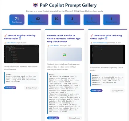
This solution displays a gallery of Copilot prompts from the PnP copilot-prompts repository and allows users to easily copy prompts for reuse.
Open this sample in the gallery (popup panel): Open in gallery
Source: https://github.com/pnp/sp-dev-fx-webparts/tree/main/samples/react-copilot-prompt-gallery
React SharePoint Online Site Game Web Part
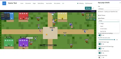
This web part turns any SharePoint site content into a 2D game where players discover lists, libraries, and other users in a fun and engaging way.
Open this sample in the gallery (popup panel): Open in gallery
Source: https://github.com/pnp/sp-dev-fx-webparts/tree/main/samples/react-spo-site-game
React Bookmark Hub Web Part
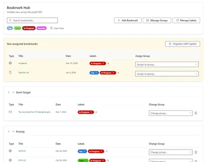
A SharePoint Framework (SPFx) web part that allows users to manage and organize their bookmarks within SharePoint. Built with React, PnPjs and Fluent UI.
Open this sample in the gallery (popup panel): Open in gallery
Source: https://github.com/pnp/sp-dev-fx-webparts/tree/main/samples/react-bookmark-hub
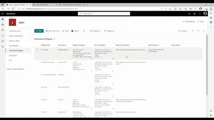
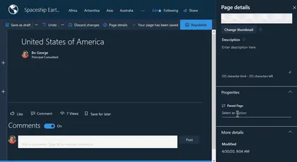
SharePoint Page Indexer

A SharePoint Framework (SPFx) Application Customizer that applies a responsive 3-column grid layout to SharePoint Modern pages. Provides a Fluent-styled floating toolbar and modal panel for live column-width configuration, persisted via localStorage.
Open this sample in the gallery (popup panel): Open in gallery
Source: https://github.com/pnp/sp-dev-fx-extensions/tree/main/samples/js-application-layout-customizer
RSS Reader
A RSS Reader original based on work by Olivier Carpentier, part of the SPFx Fantastic 40 Web Parts
Open this sample in the gallery (popup panel): Open in gallery
Source: https://github.com/pnp/sp-dev-fx-webparts/tree/main/samples/react-rss-reader
Adaptive Cards Host Web Part
This sample creates an Adaptive Cards Host web part that you can use to display Adaptive Cards in your SharePoint applications.
Open this sample in the gallery (popup panel): Open in gallery
Source: https://github.com/pnp/sp-dev-fx-webparts/tree/main/samples/react-adaptivecards
Microsoft 365 Copilot API Explorer (SPFx)
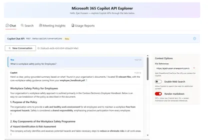
This sample demonstrates how to build a SharePoint Framework 1.22.1 web part that explores Microsoft 365 Copilot APIs through Microsoft Graph.
Open this sample in the gallery (popup panel): Open in gallery
Source: https://github.com/pnp/sp-dev-fx-webparts/tree/main/samples/react-copilot-apis-explorer
Navigation Tabs
A SharePoint Framework (SPFx 1.22) web part that displays navigation links organized by tabbed categories. Links are stored in a SharePoint list and rendered in one of three layout styles: Card, Compact, and Tile.
Open this sample in the gallery (popup panel): Open in gallery
Source: https://github.com/pnp/sp-dev-fx-webparts/tree/main/samples/react-navigation-tabs
AnimPage Motion - Page Scroll Animations for Web Parts
This is a sample web part that illustrates how to use PnPjs, the IntersectionObserver API, and CSS animations to build a SharePoint Framework client-side web part that adds reveal-on-scroll animations to other web parts on a modern SharePoint page.
Open this sample in the gallery (popup panel): Open in gallery
Source: https://github.com/pnp/sp-dev-fx-webparts/tree/main/samples/react-animpage
Spin Wheel Game
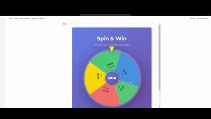
An interactive daily spin wheel game with probability-based rewards, built with React and PnPjs v4
Open this sample in the gallery (popup panel): Open in gallery
Source: https://github.com/pnp/sp-dev-fx-webparts/tree/main/samples/react-spin-wheel
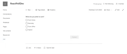
React Dynamic Poll
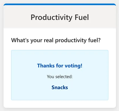
This web part allows users to vote on an active poll and immediately see the results. It is built using the SharePoint Framework (SPFx), React, and Fluent UI. The web part fetches the active poll question and options from a SharePoint list named ‘Polls’ and stores user answers in a ‘Poll Answers’ list.
Open this sample in the gallery (popup panel): Open in gallery
Source: https://github.com/pnp/sp-dev-fx-webparts/tree/main/samples/react-dynamic-poll
Drag Match
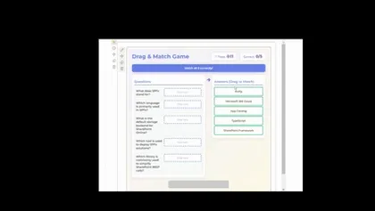
An interactive drag-and-drop matching game for SharePoint with time-based scoring and rank bonuses.
Open this sample in the gallery (popup panel): Open in gallery
Source: https://github.com/pnp/sp-dev-fx-webparts/tree/main/samples/react-dragmatch-game
Smart Context - AI-Powered Page Insights
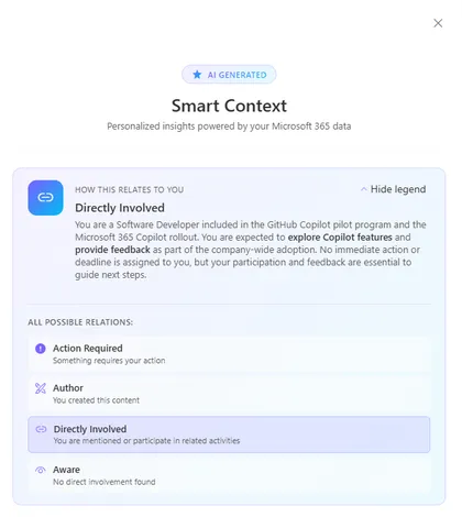
Get instant, personalized insights on any SharePoint page. This Application Customizer leverages the Microsoft Graph Copilot API to analyze page content alongside your emails, chats, meetings, and files — surfacing key people, pending actions, decisions, and context that matter to you.
Open this sample in the gallery (popup panel): Open in gallery
Source: https://github.com/pnp/sp-dev-fx-extensions/tree/main/samples/react-application-smart-context
Authenticated Power Automate Flow Trigger - SPFx CommandSet Extension
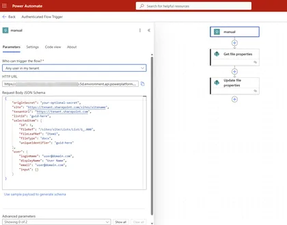
This sample demonstrates how to trigger an authenticated Power Automate flow from a SharePoint document library using an SPFx ListView CommandSet extension. The extension uses the AadHttpClient to make authenticated HTTP requests to Power Automate flows configured with the “When an HTTP request is received” trigger and “Any user in my tenant” authentication.
Open this sample in the gallery (popup panel): Open in gallery
Organization Directory
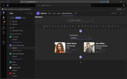
Search People from Organization Directory and show live persona card on hover.
Open this sample in the gallery (popup panel): Open in gallery
Source: https://github.com/pnp/sp-dev-fx-webparts/tree/main/samples/react-directory
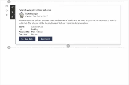
Kanban Board Web part
This solution contains an SPFx web part which shows a Kanban board using Fluent UI. The web part uses the default columns of the SharePoint Tasks list for showing the board’s columns and the tasks.
Open this sample in the gallery (popup panel): Open in gallery
Source: https://github.com/pnp/sp-dev-fx-webparts/tree/main/samples/react-kanban-board
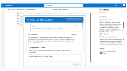
Copilot chat-api-playground
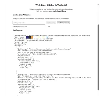
The Copilot Chat API Demo is a SharePoint Framework (SPFx) web part that demonstrates how to consume the Microsoft 365 Copilot Chat API (beta) using the native MSGraphClientV3 HTTP client. This sample showcases best practices for integrating Microsoft Graph endpoints in SharePoint Framework solutions.
Open this sample in the gallery (popup panel): Open in gallery
Source: https://github.com/pnp/sp-dev-fx-webparts/tree/main/samples/react-copilot-chat-api-demo
Building Custom Heft Plugins for SharePoint Framework
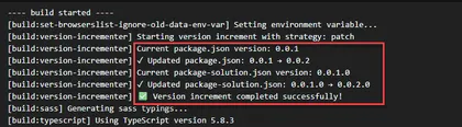
This sample demonstrates how to build and integrate custom Heft plugins into SharePoint Framework 1.22 projects. It includes a practical Version Incrementer Plugin that automatically manages version numbers during production builds.
Open this sample in the gallery (popup panel): Open in gallery
Source: https://github.com/pnp/sp-dev-fx-webparts/tree/main/samples/react-heft-plugin
Page Navigator Web Part
This web part fetches all the automatically added Header anchor tags in a SharePoint page and displays them in a Navigation component.
Open this sample in the gallery (popup panel): Open in gallery
Source: https://github.com/pnp/sp-dev-fx-webparts/tree/main/samples/react-page-navigator
PiCanvas - Tabbed Page Sections
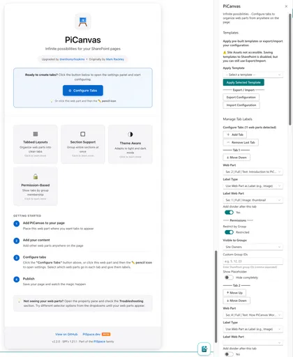
Organize SharePoint page sections and web parts into a tabbed interface with permission-based visibility, templates, and full customization.
Open this sample in the gallery (popup panel): Open in gallery
Source: https://github.com/pnp/sp-dev-fx-webparts/tree/main/samples/js-pi-canvas
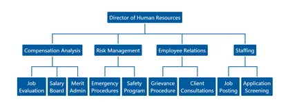
Tree Organization Web Part
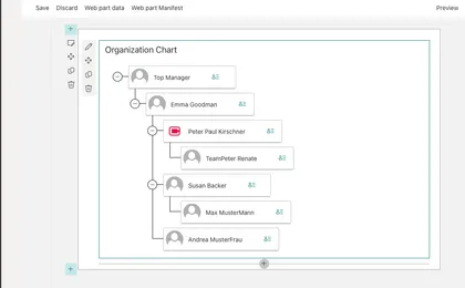
The Tree Organization Web Part shows the Organization Chart of the or the team, the web part reads information from current user to build the Organization Chart.
Open this sample in the gallery (popup panel): Open in gallery
Source: https://github.com/pnp/sp-dev-fx-webparts/tree/main/samples/react-tree-orgchart
Organization Chart Web Part
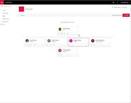
Shows an organization chart based on specified user, and user can navigate to show company organization
Open this sample in the gallery (popup panel): Open in gallery
Source: https://github.com/pnp/sp-dev-fx-webparts/tree/main/samples/react-organization-chart
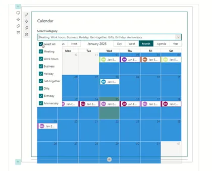
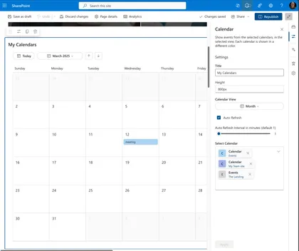
Modern Calendar Web Part
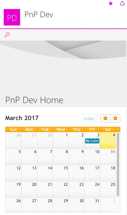
This is a modern web part built on the GA version of the SharePoint Framework demonstrating how to build a custom web part with a calendar capabilities in it.
Open this sample in the gallery (popup panel): Open in gallery
Source: https://github.com/pnp/sp-dev-fx-webparts/tree/main/samples/js-modern-calendar
Content Block
A dynamic SharePoint Framework web part for displaying content in flexible two-panel layouts with rich text editing, drag-and-drop reordering, and SharePoint image uploads.
Open this sample in the gallery (popup panel): Open in gallery
Source: https://github.com/pnp/sp-dev-fx-webparts/tree/main/samples/react-content-block
Microsoft 365 Copilot Chat and Search with Work IQ in SPFx
SharePoint Framework web parts that integrate Microsoft 365 Copilot Chat and Search APIs to create interactive AI assistants with conversational history and intelligent document search.
Open this sample in the gallery (popup panel): Open in gallery
Source: https://github.com/pnp/sp-dev-fx-webparts/tree/main/samples/react-copilot-apis
Company Templates
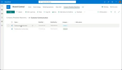
An extension to provide a simple approach for company wide used templates in SharePoint Online.
Open this sample in the gallery (popup panel): Open in gallery
Source: https://github.com/pnp/sp-dev-fx-extensions/tree/main/samples/react-company-templates
QR Code Generator Web Part
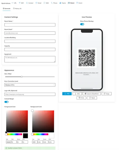
A modern, feature-rich SharePoint Framework (SPFx) web part for generating customizable QR codes directly within SharePoint. This solution provides an intuitive interface for creating QR codes for URLs, WiFi, Contacts, and now Teams Meetings, Meeting Rooms, and Calendar Events. It features advanced styling options, real-time preview, and seamless integration with SharePoint document libraries.
Open this sample in the gallery (popup panel): Open in gallery
Source: https://github.com/pnp/sp-dev-fx-webparts/tree/main/samples/react-my-qr-code-generator
Site Content Web Part
Site Content solution contains SPFx web part that provides
Open this sample in the gallery (popup panel): Open in gallery
Source: https://github.com/pnp/sp-dev-fx-webparts/tree/main/samples/react-site-content
Tenant Telemetry Application Customizer
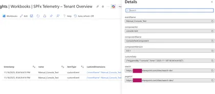
A tenant-wide SPFx Application Customizer that collects telemetry from all SPFx web parts and extensions using Application Insights or Azure Functions.
Open this sample in the gallery (popup panel): Open in gallery
Telemetry Event Sender Web Part
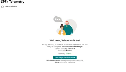
SPFx React web part that sends telemetry events via CustomEvent to a tenant-wide telemetry Application Customizer.
Open this sample in the gallery (popup panel): Open in gallery
Source: https://github.com/pnp/sp-dev-fx-webparts/tree/main/samples/react-telemetry-event-sender-sample
Page Summarization with Chrome Built-in AI
This sample demonstrates a SharePoint Framework web part that uses Chrome’s built-in Summarizer API (Gemini Nano) to summarize SharePoint page content.
Open this sample in the gallery (popup panel): Open in gallery
Command Document Translation
A SharePoint Framework (SPFx) List View Command Set extension that enables users to translate documents from one language to another using Azure Document Translation Service. Users can select one or more documents from a SharePoint document library and translate them into multiple target languages simultaneously.
Open this sample in the gallery (popup panel): Open in gallery
Source: https://github.com/pnp/sp-dev-fx-extensions/tree/main/samples/react-command-document-translation
File Type Distribution
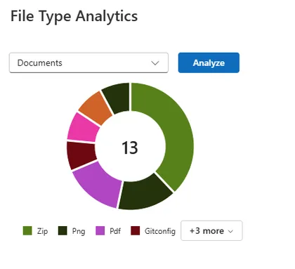
This web part analyzes a SharePoint document library and visualizes the distribution of file types inside it. It uses the SharePoint Search API refiners to aggregate file type counts without enumerating items.
Open this sample in the gallery (popup panel): Open in gallery
Source: https://github.com/pnp/sp-dev-fx-webparts/tree/main/samples/react-file-type-distribution
Document Library Explorer
A comprehensive SharePoint Framework web part for browsing, searching, and filtering documents across multiple document libraries with folder tree navigation.
Open this sample in the gallery (popup panel): Open in gallery
Source: https://github.com/pnp/sp-dev-fx-webparts/tree/main/samples/react-document-explorer
React Who's In
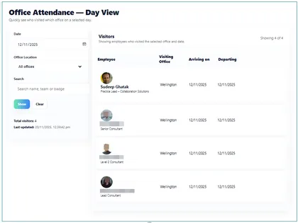
A web part that shows who is in the office and when:
Open this sample in the gallery (popup panel): Open in gallery
Source: https://github.com/pnp/sp-dev-fx-webparts/tree/main/samples/react-whos-in
Quick Links Hierarchy
A modern SharePoint Framework web part that provides hierarchical quick links management with collapsible tree navigation and inline CRUD operations directly from the page.
Open this sample in the gallery (popup panel): Open in gallery
Source: https://github.com/pnp/sp-dev-fx-webparts/tree/main/samples/react-quick-links-hierarchy
Hub Site Navigator
Hub Site Navigator solution contains SPFx web part that provides
Open this sample in the gallery (popup panel): Open in gallery
Source: https://github.com/pnp/sp-dev-fx-webparts/tree/main/samples/react-hub-site-navigator
React UI Editor
Provides dynamic UI Editor with sharepoint like richtext editing capabilities with source code view directly from the page.
Open this sample in the gallery (popup panel): Open in gallery
Source: https://github.com/pnp/sp-dev-fx-webparts/tree/main/samples/react-uieditor
SharePoint Custom Action Manager
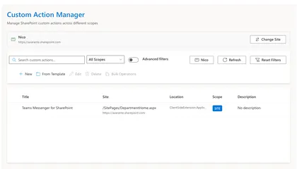
The SharePoint Custom Action Manager is a comprehensive, enterprise-grade SharePoint Framework (SPFx) web part for managing SharePoint custom actions with advanced features including bulk operations, role-based access control, template gallery, and advanced search capabilities.
Open this sample in the gallery (popup panel): Open in gallery
Source: https://github.com/pnp/sp-dev-fx-webparts/tree/main/samples/react-custom-action-manager
Quick Links Pro
A modern SharePoint Framework web part that provides dynamic quick-access links with inline editing capabilities directly from the page.
Open this sample in the gallery (popup panel): Open in gallery
Source: https://github.com/pnp/sp-dev-fx-webparts/tree/main/samples/react-quick-links-pro
My Sites Hub
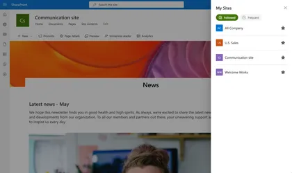
My Sites Hub is a SharePoint Framework (SPFx) Application Customizer Extension that provides users with a centralized “My Sites” dashboard accessible directly from any SharePoint site.
Open this sample in the gallery (popup panel): Open in gallery
Source: https://github.com/pnp/sp-dev-fx-extensions/tree/main/samples/react-my-sites-hub
Modern Experience Theme Manager Web Part
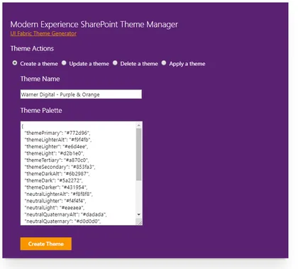
This sample web part provides a user interface for creating, updating, deleting and applying a Modern Experience SharePoint theme in SharePoint Online.
Open this sample in the gallery (popup panel): Open in gallery
Source: https://github.com/pnp/sp-dev-fx-webparts/tree/main/samples/js-theme-manager
Advanced Comments Box Web Part
This component is developed for the advanced usage of commenting the page or article etc. Page Comments lists will be created to store the comments.
Open this sample in the gallery (popup panel): Open in gallery
Source: https://github.com/pnp/sp-dev-fx-webparts/tree/main/samples/js-advanced-commenting
SPFx Avatar Web Part
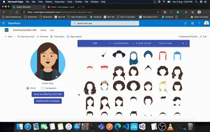
This is a sample web part that helps user create their avatar and save as profile picture. User can even download their avatar as PNG file. This web part can be useful in Intranet to help user create their avatar and save it as profile picture.
Open this sample in the gallery (popup panel): Open in gallery
Source: https://github.com/pnp/sp-dev-fx-webparts/tree/main/samples/react-avatar
React AppInsights Usage WebParts
Three interactive web parts demonstrating Application Insights integration with real-time event tracking, custom logging, and page view analytics. Features visual feedback showing exactly what data is sent to Azure.
Open this sample in the gallery (popup panel): Open in gallery
Source: https://github.com/pnp/sp-dev-fx-webparts/tree/main/samples/react-appinsights-usage
Check Flows Web Part
This web part lists all the automated Flows associated with a SharePoint List/ Library. Basic flow information like Flow Name, Flow Trigger, Flow shared Type and Flow URL are displayed.
Open this sample in the gallery (popup panel): Open in gallery
Source: https://github.com/pnp/sp-dev-fx-webparts/tree/main/samples/react-check-flows
Chat GPT inside SPFx
This web part uses Chat GPT in an SPFx web part. You can ask questions from the web part and you will see the answers, most recent answers first.
Open this sample in the gallery (popup panel): Open in gallery
Source: https://github.com/pnp/sp-dev-fx-webparts/tree/main/samples/react-chat-gpt
Carousel Web Part
This web part show images and videos in carousel
Open this sample in the gallery (popup panel): Open in gallery
Source: https://github.com/pnp/sp-dev-fx-webparts/tree/main/samples/react-carousel
Birthdays Per Month
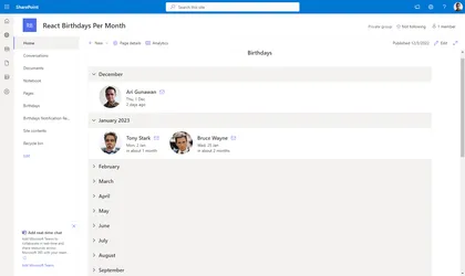
Display employees birthday per month in an accordion.
Open this sample in the gallery (popup panel): Open in gallery
Source: https://github.com/pnp/sp-dev-fx-webparts/tree/main/samples/react-birthdays-per-month
Associated Sites Links
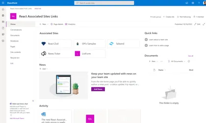
Web part that will display links to all associated sites that registered to the current site. Current site should be a hub site.
Open this sample in the gallery (popup panel): Open in gallery
Source: https://github.com/pnp/sp-dev-fx-webparts/tree/main/samples/react-associated-sites-links
Web Part Report
This sample web part shows a report of the web parts used on the current site.
Open this sample in the gallery (popup panel): Open in gallery
Source: https://github.com/pnp/sp-dev-fx-webparts/tree/main/samples/react-graph-webpart-report
Engage Hub
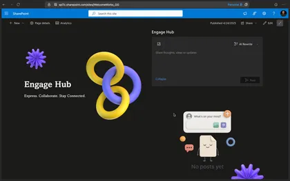
Built purely with off-the-shelf SharePoint capabilities, Engage Hub is a contemporary SPFx-based substitute for Viva Engage. In addition to providing essential social capabilities such as liking and unliking posts, threaded comments, and comment creation, it manages post data using SharePoint Lists and Document Libraries.
Open this sample in the gallery (popup panel): Open in gallery
Source: https://github.com/pnp/sp-dev-fx-webparts/tree/main/samples/react-engage-hub
React Message Banner
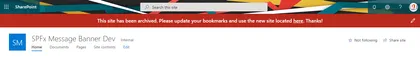
A react Message Banner sample, allows to add a custom banner message to your SharePoint Online modern sites.
Open this sample in the gallery (popup panel): Open in gallery
Source: https://github.com/pnp/sp-dev-fx-extensions/tree/main/samples/react-application-messagebanner
Announcements SharePoint Framework Application Customizer
SharePoint Framework application customizer displaying an information banner using office-fabric-ui MessageBar.
Open this sample in the gallery (popup panel): Open in gallery
Source: https://github.com/pnp/sp-dev-fx-extensions/tree/main/samples/react-application-announcements
SharePoint - Use different options to access SharePoint data
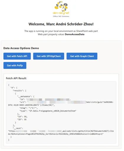
This sample SPFx web part demonstrates multiple ways to read data from a SharePoint list/library. It includes side‑by‑side implementations using the native Fetch API, SPHttpClient, Microsoft Graph, and PnPjs.
Open this sample in the gallery (popup panel): Open in gallery
Source: https://github.com/pnp/sp-dev-fx-webparts/tree/main/samples/react-data-access-options
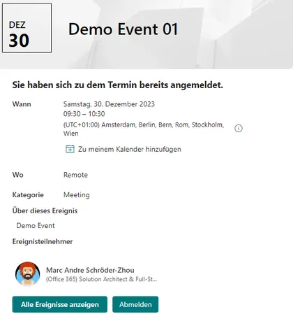
Quick Register to Appointment (SharePoint Event page)
SharePoint Online provides a list of appointments (events) on a site. The “Events” web part can be used to display them on a page. Users can access the appointment details via the web part and view all the details. The detailed view provides a link that allows them to add the appointment to their personal calendar. An appointment entry also allows them to maintain an attendee list. The “Events” list provides the “Attendees” column, where multiple people can be added. However, there is no automatic function for this; the list must be edited manually. The special app extension adds a registration and deregistration function to the detailed view. Users can register for a specific appointment and later deregister with a simple click. Attendees are automatically managed in the attendee column of the list.
List Search Web Part
This list search web part allows the user to show data from lists or libraries.
Open this sample in the gallery (popup panel): Open in gallery
Source: https://github.com/pnp/sp-dev-fx-webparts/tree/main/samples/react-list-search
Chat with Semantic Kernel with Tools
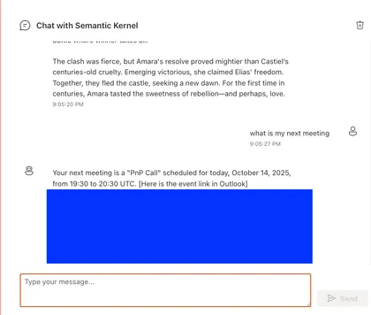
A SharePoint Framework web part that integrates OpenAI’s GPT-4 and Semantic Kernel to provide advanced chat capabilities with tool usage, including Microsoft Graph.
Open this sample in the gallery (popup panel): Open in gallery
Source: https://github.com/pnp/sp-dev-fx-webparts/tree/main/samples/react-chat-sk
React Bubble Template
Displays SharePoint list items as interactive circular bubbles. Each bubble can show an optional logo, title, optional description and act as a link. The bubbles use customizable background and text colors, and a soft shadow to give a lifted appearance. On hover bubbles gently enlarge and return to their original size.
Open this sample in the gallery (popup panel): Open in gallery
Source: https://github.com/pnp/sp-dev-fx-webparts/tree/main/samples/react-bubble-template
Office Breakout
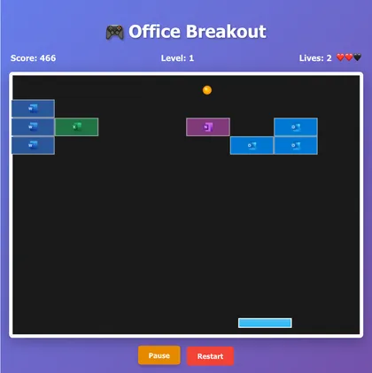
A modern take on the classic breakout game built with React 17, TypeScript, and HTML5 Canvas. Features Office-themed blocks with authentic Microsoft app icons, demonstrates advanced React patterns including Context API and custom hooks. Perfect for SharePoint Framework environments and showcases high-performance Canvas rendering with responsive keyboard controls.
Open this sample in the gallery (popup panel): Open in gallery
Source: https://github.com/pnp/sp-dev-fx-webparts/tree/main/samples/react-office-breakout
Microsoft Learn Agent (Copilot Studio) for SPFx
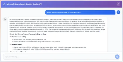
- Connects to a Copilot Studio / Power Virtual Agents agent and renders a chat UI in a SharePoint web part. - Supports both a full WebChat UI (fast setup) and a custom Studio Client UI (full control). - Uses MSAL in the browser to acquire tokens scoped to the Power Platform APIs so the client can call the Copilot Studio endpoints.
Open this sample in the gallery (popup panel): Open in gallery
Calendar Web Part
This Web Part allows you to manage events in a calendar. Uses a list of existing calendars on any website. The location and name of the list and the dates of the events to be displayed are defined in the properties of the web part.
Open this sample in the gallery (popup panel): Open in gallery
Source: https://github.com/pnp/sp-dev-fx-webparts/tree/main/samples/react-calendar
Service Health for Microsoft 365 Web Part
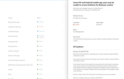
Service Health for Microsoft 365 solution show the health status for all the Microsoft 365 services
Open this sample in the gallery (popup panel): Open in gallery
Source: https://github.com/pnp/sp-dev-fx-webparts/tree/main/samples/react-m365-services-health
Holiday calendar
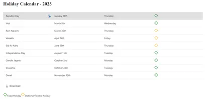
Holiday calendar solution contains SPFx web part and Adaptive card extension for Viva connections. SPFx web part provides below functionalities
Open this sample in the gallery (popup panel): Open in gallery
Source: https://github.com/pnp/sp-dev-fx-webparts/tree/main/samples/react-holidays-calendar
Schema Extensions Manager
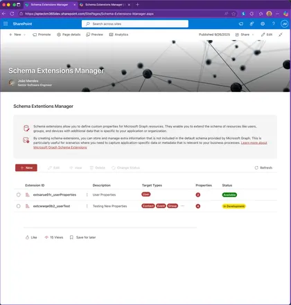
Schema Extensions Manager is a SharePoint Framework (SPFx) solution (also Microsoft Teams / Microsoft 365 host ready) that provides a full UI to Create, Read, Update and Delete (CRUD) Microsoft Graph Schema Extensions and to track the extensions you have created in your tenant. It leverages Microsoft Graph (v1.0) /schemaExtensions endpoint together with SharePoint Tenant Properties (App Catalog site) to persist the list of schema extension IDs that were created through the tool so they can be rediscovered later.
React Flag Template
Displays SharePoint list items as colorful hanging banner cards with an optional logo, title, (optional) description and a full‑card link. Each banner can have its own background and text colors.
Open this sample in the gallery (popup panel): Open in gallery
Source: https://github.com/pnp/sp-dev-fx-webparts/tree/main/samples/react-flag-template
Security Grid
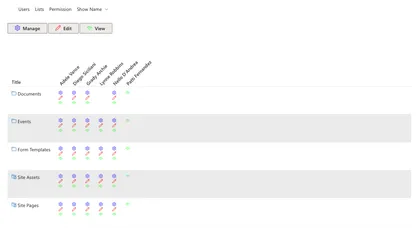
React-securitygrid is an SPFX web part that uses React and Office-UI-Fabric to render a grid showing which users have access to which lists/libraries/folders/files on a Web as shown here:
Open this sample in the gallery (popup panel): Open in gallery
Source: https://github.com/pnp/sp-dev-fx-webparts/tree/main/samples/react-securitygrid
Scatter Chart
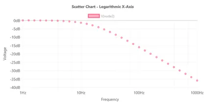
Shows how to use X and Y coordinate data elements in a scatter chart.
Open this sample in the gallery (popup panel): Open in gallery
Source: https://github.com/pnp/sp-dev-fx-webparts/tree/main/samples/react-chartcontrol
Real-Time Chart
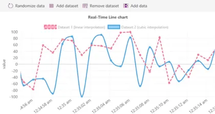
Uses a plugin to create a scrolling/real-time chart with time series X axis.
Open this sample in the gallery (popup panel): Open in gallery
Source: https://github.com/pnp/sp-dev-fx-webparts/tree/main/samples/react-chartcontrol
Radar Chart
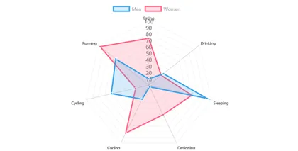
Renders a multi-dataset radar chart.
Open this sample in the gallery (popup panel): Open in gallery
Source: https://github.com/pnp/sp-dev-fx-webparts/tree/main/samples/react-chartcontrol
Polar Chart
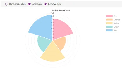
Creates a polar area chart with add/remove data functionality.
Open this sample in the gallery (popup panel): Open in gallery
Source: https://github.com/pnp/sp-dev-fx-webparts/tree/main/samples/react-chartcontrol
Pie Chart
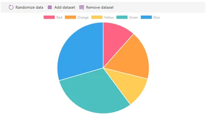
Demonstrates how to create a pie chart.
Open this sample in the gallery (popup panel): Open in gallery
Source: https://github.com/pnp/sp-dev-fx-webparts/tree/main/samples/react-chartcontrol
Line Chart
Demonstrates how to render line charts.
Open this sample in the gallery (popup panel): Open in gallery
Source: https://github.com/pnp/sp-dev-fx-webparts/tree/main/samples/react-chartcontrol
Horizontal Bar
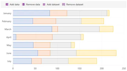
Renders a horizontal bar chart and demonstrates stacked bars.
Open this sample in the gallery (popup panel): Open in gallery
Source: https://github.com/pnp/sp-dev-fx-webparts/tree/main/samples/react-chartcontrol
Dynamic Data Consumer
Renders a chart by receiving events from a dynamic data connection.
Open this sample in the gallery (popup panel): Open in gallery
Source: https://github.com/pnp/sp-dev-fx-webparts/tree/main/samples/react-chartcontrol
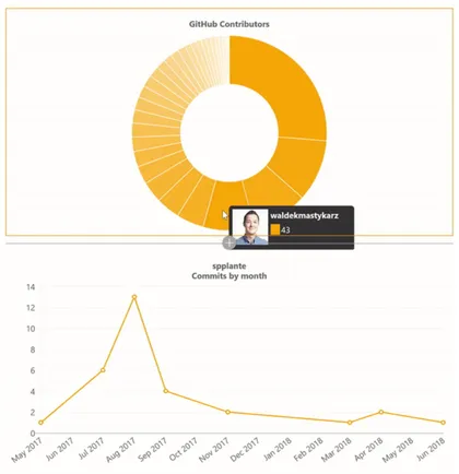
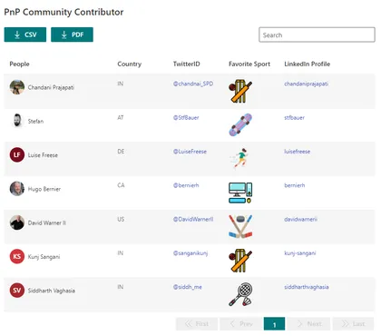
Dynamic Data Callable

Calls the GitHub REST APIs and shows contributors for a given repository.
Open this sample in the gallery (popup panel): Open in gallery
Source: https://github.com/pnp/sp-dev-fx-webparts/tree/main/samples/react-chartcontrol
Doughnut with Patterns
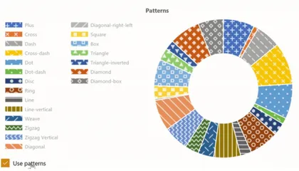
Renders a donut chart with patterns instead of colors.
Open this sample in the gallery (popup panel): Open in gallery
Source: https://github.com/pnp/sp-dev-fx-webparts/tree/main/samples/react-chartcontrol
Custom Plugin

Shows how to implement a custom Chart.js plugin with the ChartControl.
Open this sample in the gallery (popup panel): Open in gallery
Source: https://github.com/pnp/sp-dev-fx-webparts/tree/main/samples/react-chartcontrol
Copy Views Web Part
The Copy Views solution enables a user to copy views from one list/library to another across site collections.
Open this sample in the gallery (popup panel): Open in gallery
Source: https://github.com/pnp/sp-dev-fx-webparts/tree/main/samples/react-copy-views
Combo Chart
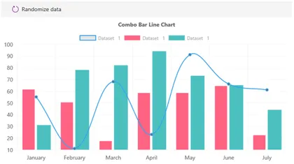
Demonstrates how to create combination charts with multiple datasets.
Open this sample in the gallery (popup panel): Open in gallery
Source: https://github.com/pnp/sp-dev-fx-webparts/tree/main/samples/react-chartcontrol
Chartinator
A Chart Control version of SharePoint Quick Charts with many configuration options.
Open this sample in the gallery (popup panel): Open in gallery
Source: https://github.com/pnp/sp-dev-fx-webparts/tree/main/samples/react-chartcontrol
Cascading Dropdowns
Shows how to use Cascading Dropdowns in property panes. Based on the instructions found at Use cascading dropdowns in web part properties.
Open this sample in the gallery (popup panel): Open in gallery
Source: https://github.com/pnp/sp-dev-fx-webparts/tree/main/samples/react-cascadingdropdowns
Calling Azure OpenAI API in streaming mode web part
This web part shows how you can call Azure OpenAI API in Streaming mode
Open this sample in the gallery (popup panel): Open in gallery
Source: https://github.com/pnp/sp-dev-fx-webparts/tree/main/samples/react-azure-openai-api-stream
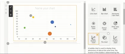
Bubble Chart
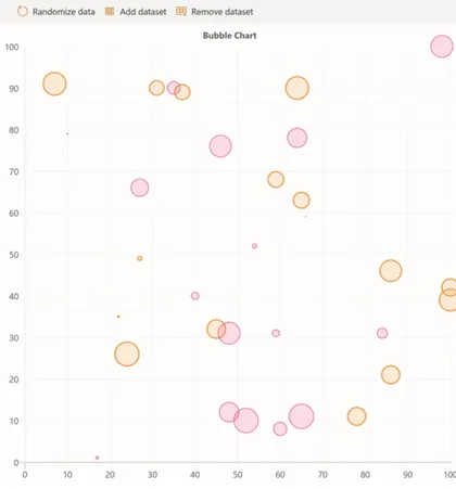
Demonstrates the use of X, Y, and R values to create a bubble chart.
Open this sample in the gallery (popup panel): Open in gallery
Source: https://github.com/pnp/sp-dev-fx-webparts/tree/main/samples/react-chartcontrol
Bar Chart (Static Data)
Uses static data to demonstrate basic ChartControl features.
Open this sample in the gallery (popup panel): Open in gallery
Source: https://github.com/pnp/sp-dev-fx-webparts/tree/main/samples/react-chartcontrol
Bar Chart
Loads data asynchronously from a (fake) service to render a bar chart.
Open this sample in the gallery (popup panel): Open in gallery
Source: https://github.com/pnp/sp-dev-fx-webparts/tree/main/samples/react-chartcontrol
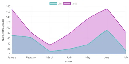
Area Chart
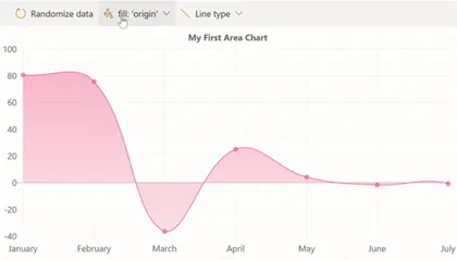
Renders an area chart with gradient fills and configurable line styles.
Open this sample in the gallery (popup panel): Open in gallery
Source: https://github.com/pnp/sp-dev-fx-webparts/tree/main/samples/react-chartcontrol
Accessible Chart
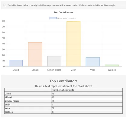
Demonstrates the accessibility features of the Chart Control, including the auto-generated data table.
Open this sample in the gallery (popup panel): Open in gallery
Source: https://github.com/pnp/sp-dev-fx-webparts/tree/main/samples/react-chartcontrol
News Ticker
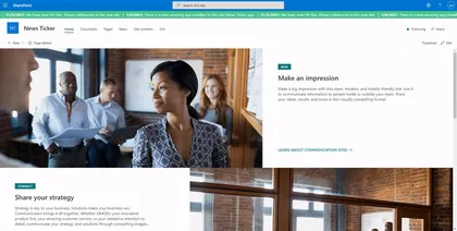
An SPFx Extension that displays news as a running text at the top of every modern page.
Open this sample in the gallery (popup panel): Open in gallery
Source: https://github.com/pnp/sp-dev-fx-extensions/tree/main/samples/react-application-news-ticker
Save and convert as PDF by PnP

A global list customizer which adds functionality to all document libraries in SharePoint Online to convert one or more documents in-place to PDF, or download one or more documents as a PDF. When selecting multiple documents for download they will be downloaded as a zip file. The converter uses built in API’s of converting to PDF.
Open this sample in the gallery (popup panel): Open in gallery
Move Document to Blob Storage Command
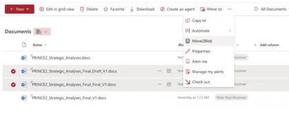
The sample demonstrates how to create a command that moves a document to Azure Blob Storage.
Open this sample in the gallery (popup panel): Open in gallery
Source: https://github.com/pnp/sp-dev-fx-extensions/tree/main/samples/react-command-movedoc2blob
Notification Application Customizer with Webhooks
This project demonstrates a SharePoint Framework (SPFx) Application Customizer that uses webhooks to display notifications when a SharePoint list changes.
Open this sample in the gallery (popup panel): Open in gallery
Drive Item Properties List view command set extension
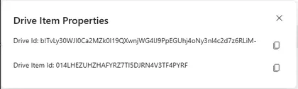
List view command set extensions with below functionalities
Open this sample in the gallery (popup panel): Open in gallery
Source: https://github.com/pnp/sp-dev-fx-extensions/tree/main/samples/react-driveitem-properties
Styled List
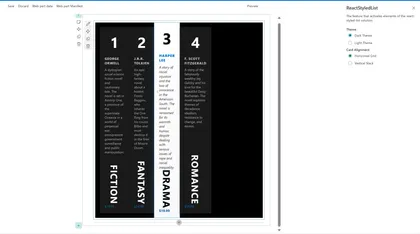
This SharePoint web part displays items from a SharePoint list in a modern, responsive, and styled grid layout.
Open this sample in the gallery (popup panel): Open in gallery
Source: https://github.com/pnp/sp-dev-fx-webparts/tree/main/samples/react-styled-list
Goals OKR Tracker
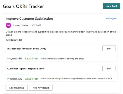
This SharePoint web part is an Objectives and Key Results (OKR) tracking system with a modern, responsive UI. It allows users to create, track, and manage organizational objectives and their associated key results. The application provides a structured way to set goals, track progress, and maintain alignment across teams. Built with React, TypeScript, and Fluent UI, it integrates seamlessly with SharePoint while providing advanced functionality for performance management.
Quick Links Web Part
A demonstration of how one could build SharePoints Quick Links web part
Open this sample in the gallery (popup panel): Open in gallery
Source: https://github.com/pnp/sp-dev-fx-webparts/tree/main/samples/react-quick-links
Quick Links Grid
Displays a set of quick links fetched from a SharePoint list.
Open this sample in the gallery (popup panel): Open in gallery
Source: https://github.com/pnp/sp-dev-fx-webparts/tree/main/samples/react-quick-links-grid
SPFx Legacy App Files Browser
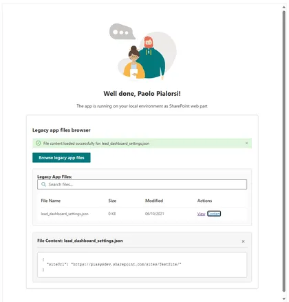
A SharePoint Framework web part for browsing and viewing files in the legacy ‘SharePoint Online Client Extensibility Web Application Principal’ folder using native SPFx MSGraphClientV3.
Open this sample in the gallery (popup panel): Open in gallery
Source: https://github.com/pnp/sp-dev-fx-webparts/tree/main/samples/react-migrate-settings-approot
React People Slick

Show a list of people using react-slick
Open this sample in the gallery (popup panel): Open in gallery
Source: https://github.com/pnp/sp-dev-fx-webparts/tree/main/samples/react-people-slick
SPFx Personal Settings Solution
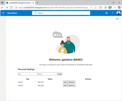
A full-stack solution for secure, user-specific settings in SharePoint using SPFx, Azure Functions, and Microsoft Graph approot.
Open this sample in the gallery (popup panel): Open in gallery
Source: https://github.com/pnp/sp-dev-fx-webparts/tree/main/samples/react-settings-approot
Public Holidays Global
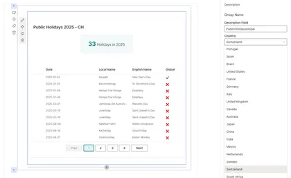
Displays public holidays for multiple countries and years.
Open this sample in the gallery (popup panel): Open in gallery
Source: https://github.com/pnp/sp-dev-fx-webparts/tree/main/samples/react-public-holidays-global
Ticket Management App
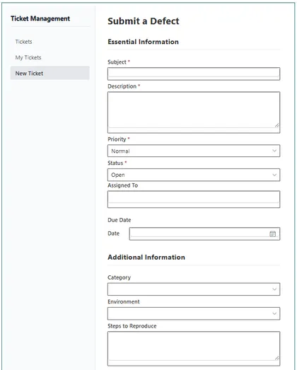
This SharePoint web part is a ticket management system with a modern, responsive design. It includes a dashboard, personal view, new ticket form, and a detailed ticket view. Tickets can be configured with metadata like priority and status. The system integrates with SharePoint for assignments and permissions, stores data in a SharePoint list, and provides real-time updates. Built with React, TypeScript, and Fluent UI, it maintains SharePoint’s look and feel while offering advanced functionality for managing issues or requests.
Applications Secrets Expiration Web Part
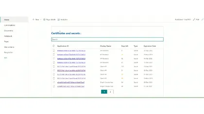
This sample web part shows the list of your applications registered in Azure AD along with their associated client secret/certificate expiration date.
Open this sample in the gallery (popup panel): Open in gallery
Source: https://github.com/pnp/sp-dev-fx-webparts/tree/main/samples/react-graph-app-secret-expiration
Sticky Feedback Widget Application Customizer
An SPFx Application Customizer Extension placed in the bottom placeholder which allows users to input their feedbacks without scrolling down to the end of the page.
Open this sample in the gallery (popup panel): Open in gallery
Copilot Chat Bubble - With SSO integrated to SharePoint which summarizes sessions at ESPC 2024
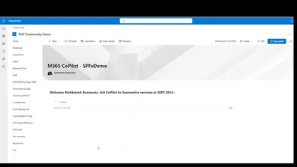
This web part integrates the Microsoft Copilot Agent, built via Copilot Studio, into SharePoint Online featuring Single Sign-on and a chat interface.
Open this sample in the gallery (popup panel): Open in gallery
Source: https://github.com/pnp/sp-dev-fx-webparts/tree/main/samples/react-copilot-chatbubble-with-sso
Carbon Footprint Calculator
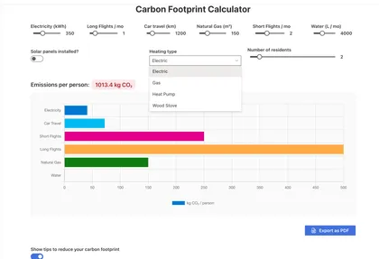
This SharePoint Framework (SPFx) web part provides users with an interactive calculator to estimate their monthly carbon footprint.
Open this sample in the gallery (popup panel): Open in gallery
Source: https://github.com/pnp/sp-dev-fx-webparts/tree/main/samples/react-carbon-footprint-calculator
Modern Carousel
This SharePoint Framework (SPFx) web part introduces a contemporary carousel component leveraging Swiper, facilitating seamless traversal through content housed within a SharePoint site.
Open this sample in the gallery (popup panel): Open in gallery
Source: https://github.com/pnp/sp-dev-fx-webparts/tree/main/samples/react-modern-carousel
My OneDrive Info
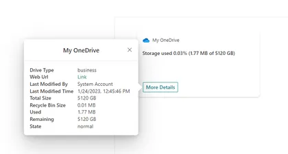
MyOneDriveInfo solution contains Adaptive card extension for Viva connection with below functionalities
Open this sample in the gallery (popup panel): Open in gallery
Source: https://github.com/pnp/sp-dev-fx-webparts/tree/main/samples/react-my-onedrive-info
Image Gallery Web Part
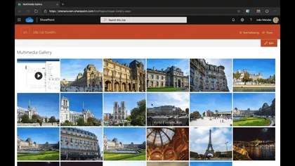
This web part show images and videos in responsive grid, on click it show images and videos in a carousel view.
Open this sample in the gallery (popup panel): Open in gallery
Source: https://github.com/pnp/sp-dev-fx-webparts/tree/main/samples/react-multimedia-gallery
Group Members Web Part – Microsoft 365 Group User Management
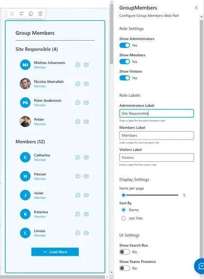
The Group Members Web Part provides a comprehensive solution for displaying and managing Microsoft 365 group memberships within SharePoint. This web part leverages Microsoft Graph to fetch user data and presents it in an intuitive, responsive interface that supports filtering, search, and quick actions.
Open this sample in the gallery (popup panel): Open in gallery
Source: https://github.com/pnp/sp-dev-fx-webparts/tree/main/samples/react-group-members-webpart
rEmployee Recognition
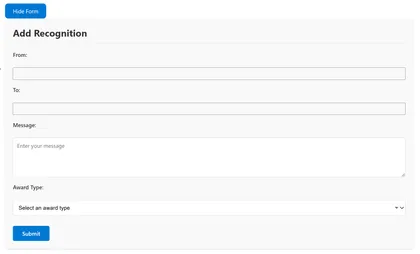
This SharePoint Framework (SPFx) web part enables organizations to celebrate employee achievements and contributions through a modern recognition system. Users can easily nominate colleagues for various types of recognition and engage with these recognitions through social reactions.
Open this sample in the gallery (popup panel): Open in gallery
Source: https://github.com/pnp/sp-dev-fx-webparts/tree/main/samples/react-sp-emp-recognition
Building Org Chart using a SharePoint list
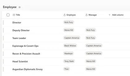
Displays your organization’s structure based on a custom list, starting from the top boss down to everyone else.
Open this sample in the gallery (popup panel): Open in gallery
Source: https://github.com/pnp/sp-dev-fx-webparts/tree/main/samples/react-sp-org-chart
Easter Egg Hunt Game SPFx Web Part
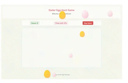
A fun interactive Easter Egg Hunt Game built as a SharePoint Framework web part
Open this sample in the gallery (popup panel): Open in gallery
Source: https://github.com/pnp/sp-dev-fx-webparts/tree/main/samples/react-easter-egg-hunt-game
Personal Dashboard
The Personal Dashboard app, built using the SharePoint framework, offers a versatile solution for organizations across various platforms such as Teams, Outlook, and Office. This app enables seamless integration with both public and enterprise APIs, allowing users to effortlessly consume and leverage their desired APIs within their personalized workspace.
Open this sample in the gallery (popup panel): Open in gallery
Source: https://github.com/pnp/sp-dev-fx-webparts/tree/main/samples/react-personal-dashboard
React Image Editor
This solution contains an SPFx web part that shows an HTML Image Editor based on canvas and Fluent UI.
Open this sample in the gallery (popup panel): Open in gallery
Source: https://github.com/pnp/sp-dev-fx-webparts/tree/main/samples/react-image-editor
Nutrient Document Viewer
This a custom PDF viewer web part for SharePoint Online by integrating Nutrient for Web using the SharePoint Framework (SPFx).
Open this sample in the gallery (popup panel): Open in gallery
Source: https://github.com/pnp/sp-dev-fx-webparts/tree/main/samples/react-nutrient-document-viewer
Copilot April's Fool

An extention to privide a simple approach to display custom messages in SharePoint Online.
Open this sample in the gallery (popup panel): Open in gallery
Source: https://github.com/pnp/sp-dev-fx-extensions/tree/main/samples/react-copilot-aprils-fool
Connected Web Parts
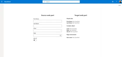
This samples showcase how to connect two web parts together.
Open this sample in the gallery (popup panel): Open in gallery
Source: https://github.com/pnp/sp-dev-fx-webparts/tree/main/samples/react-connected-web-parts
Tab Accordion Web Part with Property Field Collection Data and tinyMCE for Rich Text Editing
This Web Part allows users to create content as Tabbed content using Property Field Collection Data and tinyMCE for Rich Text Editing targeted for SharePoint Online.
Open this sample in the gallery (popup panel): Open in gallery
Source: https://github.com/pnp/sp-dev-fx-webparts/tree/main/samples/react-tabacordion
Mermaid Diagram Web Part for SharePoint Online
I created this web part to add Mermaid diagram support in SharePoint Online as part of my tutorial series. While working on it, I found this discussion thread: Displaying Mermaid Diagrams in SharePoint Online Markdown Web Parts, which highlights the need for a proper solution.
Open this sample in the gallery (popup panel): Open in gallery
Source: https://github.com/pnp/sp-dev-fx-webparts/tree/main/samples/js-mermaid-diagram
Demo Time
This web part is more a POC created for the SharePoint Hackathon 2025. This web part allows you to quickly add presentation mode to any page on your site. It has no UI and is not visible after publish, so not edit mode of the page. After adding it to a page and publishing it will add an additional Play in the page header.
Open this sample in the gallery (popup panel): Open in gallery
CAML to Table

A powerful web part that allows users to test and build CAML queries visually with a rich, intuitive interface. This enhanced version includes a visual query builder, query validation, saved queries, and more.
Open this sample in the gallery (popup panel): Open in gallery
Source: https://github.com/pnp/sp-dev-fx-webparts/tree/main/samples/react-caml2table
Document AI Chat using Kernel Memory
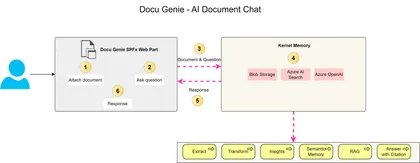
This project guides you through building an intelligent document chatbot using Kernel Memory and Azure services. It covers the architecture and implementation details, including using an Azure Function for backend processing, a SharePoint Framework (SPFx) web part for the user interface, and leveraging Azure AI Search and Azure OpenAI for advanced search and response generation. The project also provides step-by-step instructions and references to relevant documentation.
New Modern Calendar Web Part
New Modern Calendar Web Part for SharePoint Framework
Open this sample in the gallery (popup panel): Open in gallery
Source: https://github.com/pnp/sp-dev-fx-webparts/tree/main/samples/react-modern-calendar
Copy Path and Copy Name List view command set extensions
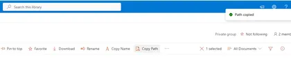
List view command set extensions with below functionalities
Open this sample in the gallery (popup panel): Open in gallery
Source: https://github.com/pnp/sp-dev-fx-extensions/tree/main/samples/react-utility-extensions
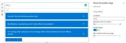
SPFx FAQ Accordion Web Part
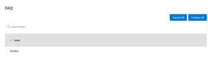
The Yet another FAQ Accordion Web Part is a modern SPFx solution for displaying FAQs in SharePoint Online, featuring a responsive interface with real-time search, grouping, and customizable styling.
Open this sample in the gallery (popup panel): Open in gallery
Source: https://github.com/pnp/sp-dev-fx-webparts/tree/main/samples/react-yet-another-FAQ-webpart
Calendar Feed Web Part
This web part uses event feeds from various sources and renders events using a look and feel that is consistent with the SharePoint out-of-the-box Group calendar/events web part.
Open this sample in the gallery (popup panel): Open in gallery
Source: https://github.com/pnp/sp-dev-fx-webparts/tree/main/samples/react-calendar-feed
Rich Text Editor - Fluent UI
A robust rich text editor utilizing the latest Fluent React components to seamlessly align with SharePoint Online Modern UI standards. Full control over UI and backend code, making integration with external systems like SharePoint lists a breeze. Inspiration is drawn from the out-of-the-box Text web part.
Open this sample in the gallery (popup panel): Open in gallery
Source: https://github.com/pnp/sp-dev-fx-webparts/tree/main/samples/react-richtext-editor
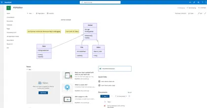
SharePoint Page Indexer
An SPFx Application Customizer that automatically indexes SharePoint modern pages, extracting page content, web parts, and metadata into a centralized SharePoint list.
Open this sample in the gallery (popup panel): Open in gallery
Source: https://github.com/pnp/sp-dev-fx-extensions/tree/main/samples/react-application-page-indexer
Bookmarks Manager
Allows users to manage and organize bookmarks in a SharePoint list.
Open this sample in the gallery (popup panel): Open in gallery
Source: https://github.com/pnp/sp-dev-fx-webparts/tree/main/samples/react-sp-bookmarks
Custom Localization
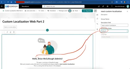
Shows how you can load localization files and use the localized strings if you have requirements to display localized text outside the normal SPFx/SPO processing
Open this sample in the gallery (popup panel): Open in gallery
Source: https://github.com/pnp/sp-dev-fx-webparts/tree/main/samples/react-custom-localization
Star Ratings Web Part
Demonstrates Star Ratings capabilities to SharePoint News.
Open this sample in the gallery (popup panel): Open in gallery
Source: https://github.com/pnp/sp-dev-fx-webparts/tree/main/samples/react-star-ratings
Birthdays Web Part
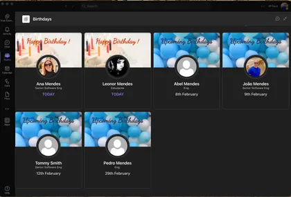
Shows upcoming birthdays in the company
Open this sample in the gallery (popup panel): Open in gallery
Source: https://github.com/pnp/sp-dev-fx-webparts/tree/main/samples/react-modern-birthdays
Birthdays Timeline Web Part
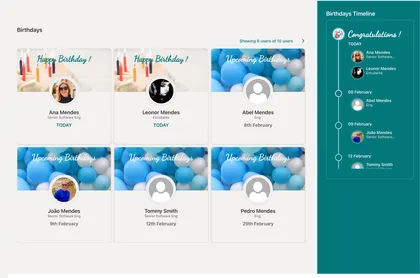
Shows upcoming birthdays in the company in a timeline
Open this sample in the gallery (popup panel): Open in gallery
Source: https://github.com/pnp/sp-dev-fx-webparts/tree/main/samples/react-modern-birthdays
React UseReducer Hook with PnPjs
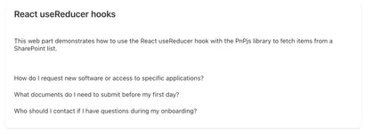
This SPFx web part demonstrates how to use the React useReducer hook with the PnPjs library to fetch items from a SharePoint list. By using useReducer, developers can better manage complex state within their React components, making it easier to handle asynchronous data fetching, loading states, and error handling.
Open this sample in the gallery (popup panel): Open in gallery
Source: https://github.com/pnp/sp-dev-fx-webparts/tree/main/samples/react-use-reducer-hook
My Personal Apps Web Part
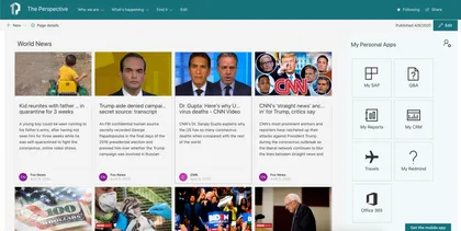
The Web Part My Personal Apps allows the user to define links to Applications or Sites for quick access.
Open this sample in the gallery (popup panel): Open in gallery
Source: https://github.com/pnp/sp-dev-fx-webparts/tree/main/samples/react-my-personal-apps
Copilot Agent - HR Assistant
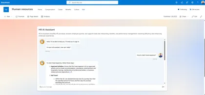
Integrates the Microsoft Copilot Agent, built via Copilot Studio, into SharePoint Online modern pages
Open this sample in the gallery (popup panel): Open in gallery
Source: https://github.com/pnp/sp-dev-fx-webparts/tree/main/samples/react-mcs-hr-assistant
Chatbot Integration for SharePoint Online
This solution integrates a chatbot within SharePoint Online using a Tenant App Catalog and Azure AD App Registration. It provides a seamless way to enhance user engagement on SharePoint sites by embedding a customizable chatbot interface. You have a per site agent by creating it in a SharePoint list or a global one by adding json to TWE
Open this sample in the gallery (popup panel): Open in gallery
Source: https://github.com/pnp/sp-dev-fx-extensions/tree/main/samples/react-application-chatbubble-copilot
MS Teams Channels and Tabs from Modern Team site
A SPFx Web Part using Graph api. It shows Channels and Tabs (with link) from a Modern Team Site connected to Microsoft Teams.
Open this sample in the gallery (popup panel): Open in gallery
Source: https://github.com/pnp/sp-dev-fx-webparts/tree/main/samples/react-teams-tabs-graph
Copilot Retrieval API Playground
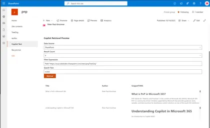
This SPFx sample shows how to integrate a Copilot retrieval API into an SPFx web part and provides a hands‑on workflow to evaluate and tune search relevance.
Open this sample in the gallery (popup panel): Open in gallery
Source: https://github.com/pnp/sp-dev-fx-webparts/tree/main/samples/react-copilot-retrieval-api
Using React Accordion plugin with SPFx
The Secret Santa is a fun and interactive tool designed to manage a Secret Santa gift exchange directly on your SharePoint site.
Open this sample in the gallery (popup panel): Open in gallery
Source: https://github.com/pnp/sp-dev-fx-webparts/tree/main/samples/react-sp-secret-santa
Modern Link Presenter
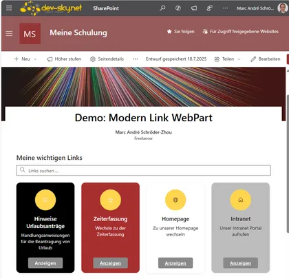
A modern, customizable web part for managing and displaying links in various layouts in SharePoint and Teams. Modern Link Presenter is a flexible SharePoint Framework (SPFx) web part that allows users to manage and present collections of links in various modern layouts. Features include: configurable link properties (title, URL, icon, description, summary, color, target, display format), multiple output formats (simple links, links with icons, inline tiles, and rich tile layouts), individual color and display customization per link, search and filter functionality, and support for opening links in new tabs, within the same tab, or in a modal dialog. The tile layout offers additional customization such as tile size, mouseover effects, and button text. The web part is fully localizable, supports accessibility, and is ideal for creating modern dashboards, resource panels, or curated link collections in SharePoint Online and Microsoft Teams.
M365 Planner Timeline Web Part
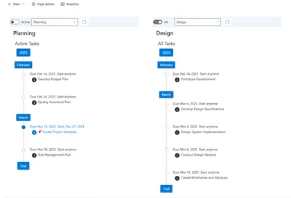
The purpose of this web part sample is to render M365 Group Plan tasks in a timeline ordered by the task due date with tags for years and months in a vertical stack. There are filter options to filter out completed tasks and tender tasks by a plan bucket. A task’s detail can be viewed by clicking the (i) icon below the “Due Date” popping up a callout dialog with task details. It Should be noted that a M365 Group Planner can have 0 to 200 plans assigned to M365 Group. The web part needs to be configured in the web part’s property pane you must select the plan to be rendered, along with options for the plan bucket and completed task filter. These setting will be used when the web part renders on the page. The configuration of multiple web parts on hte page for different plans and buckets is supported.
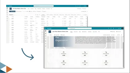
List View Metrics Web Part
This web part displays key metrics from SharePoint Lists and Libraries. It connects to any site, list, and view (or uses custom REST queries) to calculate and visualize metrics like total count, average, sum, min/max values, unique counts, and most popular values. Users can customize which metrics to display, configure visual styling, set target values for performance tracking, and choose between vertical or horizontal card layouts.
Enhanced Power App
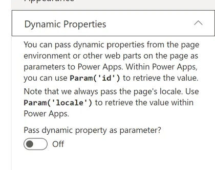
Sample web part showing how to embed a Power App that resizes, adapts to themes, and supports dynamic properties
Open this sample in the gallery (popup panel): Open in gallery
Source: https://github.com/pnp/sp-dev-fx-webparts/tree/main/samples/react-enhanced-powerapps
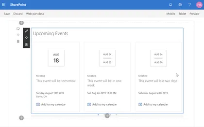
Countdown Timer Web Part
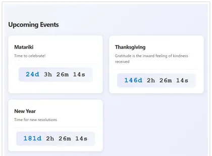
This SharePoint Framework (SPFx) web part displays a countdown timer for upcoming events from a SharePoint list. It helps organizations keep users informed about important dates and deadlines by showing a live countdown for each event.
Open this sample in the gallery (popup panel): Open in gallery
Source: https://github.com/pnp/sp-dev-fx-webparts/tree/main/samples/react-sp-countdown-timer
Machine Translations
This application customizer lets you translate the text on a SharePoint page using the Translator Text API of Microsoft Azure.
Open this sample in the gallery (popup panel): Open in gallery
Source: https://github.com/pnp/sp-dev-fx-extensions/tree/main/samples/react-application-machine-translations
SVG to JSON Converter
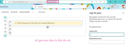
Allows users to read SVGs from a SharePoint library, select one of them and have the code converted into a JSON format that is ready to be used in a SharePoint List in advanced formatting.
Open this sample in the gallery (popup panel): Open in gallery
Source: https://github.com/pnp/sp-dev-fx-webparts/tree/main/samples/react-svg-to-json-converter
Mega Menu Application Customizer Extension
This sample shows site mega menu. Application customizer is used along with SharePoint List to store the menu items.
Open this sample in the gallery (popup panel): Open in gallery
Source: https://github.com/pnp/sp-dev-fx-extensions/tree/main/samples/react-mega-menu
Print List Item Command View Set
This sample shows how you can print list items using different templates, site admin can add, edit or remove templates and users can print items based on those templates.
Open this sample in the gallery (popup panel): Open in gallery
Source: https://github.com/pnp/sp-dev-fx-extensions/tree/main/samples/react-command-print
Field Votes
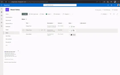
An extension that displays Vote counter and button to vote or unvote.
Open this sample in the gallery (popup panel): Open in gallery
Source: https://github.com/pnp/sp-dev-fx-extensions/tree/main/samples/react-field-votes
Using @pnp/js and ReactJS
Shows how to use PnPjs in a React web part
Open this sample in the gallery (popup panel): Open in gallery
Source: https://github.com/pnp/sp-dev-fx-webparts/tree/main/samples/react-pnp-js-sample
Search driven navigation
SPFx application search driven navigation and permission side panel.
Open this sample in the gallery (popup panel): Open in gallery
Source: https://github.com/pnp/sp-dev-fx-extensions/tree/main/samples/react-application-qna-chat
Google Analytics Application Customizer
In this sample is possible to see how to implement Google Analytics through SPFx Extensions Application Customizers
Open this sample in the gallery (popup panel): Open in gallery
Source: https://github.com/pnp/sp-dev-fx-extensions/tree/main/samples/js-application-analytics
My Dashboard Web Part
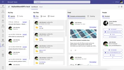
This SPFx app allows quick access to user agenda, ToDo Tasks, Files and News and Relevant People related to user.
Open this sample in the gallery (popup panel): Open in gallery
Source: https://github.com/pnp/sp-dev-fx-webparts/tree/main/samples/react-my-dashboard
Data Table Web Part
This web part provides easy way to render SharePoint custom list in data table view with all the necessary features.
Open this sample in the gallery (popup panel): Open in gallery
Source: https://github.com/pnp/sp-dev-fx-webparts/tree/main/samples/react-datatable
CSV Importer
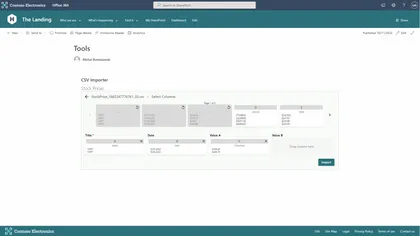
This web part allows users to import CSV files into an existing SharePoint list
Open this sample in the gallery (popup panel): Open in gallery
Source: https://github.com/pnp/sp-dev-fx-webparts/tree/main/samples/react-csv-importer
Microsoft Clarity for modern SharePoint
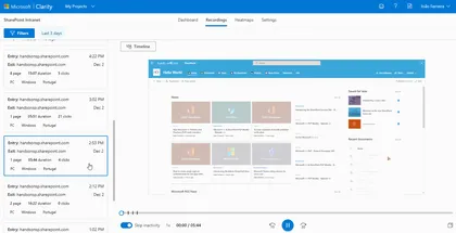
Microsoft Clarity will gives you the recording of the sessions and heat maps of the user interaction with the site, this will help to find and fix the areas of your pages that are not working as you expect
Open this sample in the gallery (popup panel): Open in gallery
Source: https://github.com/pnp/sp-dev-fx-extensions/tree/main/samples/js-application-microsoft-clarity
Dynamic Accordion - FAQ Builder web part
This sample is based on Erik Benke and Mike Zimmerman Accordion Section FAQ Builder web part. It was extended support single FAQs list based on Category and dynamic properties selection.
Open this sample in the gallery (popup panel): Open in gallery
Source: https://github.com/pnp/sp-dev-fx-webparts/tree/main/samples/react-accordion-dynamic-section
Accordion Web Part
This is a sample web Part that illustrates the use of React Accessible Accordion plugin for building SharePoint Framework client-side web parts to show SharePoint list data in Accordion format.
Open this sample in the gallery (popup panel): Open in gallery
Source: https://github.com/pnp/sp-dev-fx-webparts/tree/main/samples/react-accordion
Page Hierarchy Web Part
This web part allows users to create a faux page hierarchy in their pages library and use it for page-to-page navigation.
Open this sample in the gallery (popup panel): Open in gallery
Source: https://github.com/pnp/sp-dev-fx-webparts/tree/main/samples/react-pages-hierarchy
configure a Page as Single App Part page
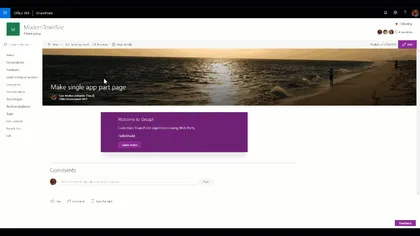
Custom Command Set that set a Page layout to use the Single App Part page Layout
Open this sample in the gallery (popup panel): Open in gallery
Source: https://github.com/pnp/sp-dev-fx-extensions/tree/main/samples/react-command-singlepartapppage
Add JS and CSS reference on Modern Pages Web Part
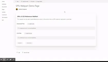
React-based SPFx web part and extension that allows users to add/modify/delete custom js and css file references using SPFx application customizer extension all modern pages within SP online site.
Open this sample in the gallery (popup panel): Open in gallery
Source: https://github.com/pnp/sp-dev-fx-webparts/tree/main/samples/react-add-js-css-ref
Advanced Page Properties Web Part
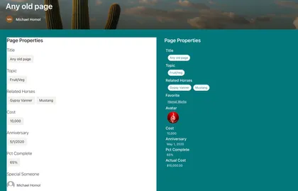
Replicates the functionality of Page Properties with improvements
Open this sample in the gallery (popup panel): Open in gallery
Source: https://github.com/pnp/sp-dev-fx-webparts/tree/main/samples/react-advanced-page-properties
Date range picker in SPFx Web Part
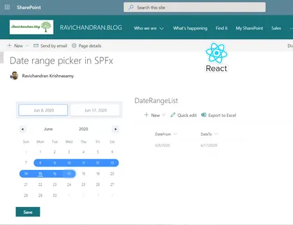
This web part used the date range picker in the SharePoint Framework (SPFx) web part
Open this sample in the gallery (popup panel): Open in gallery
Source: https://github.com/pnp/sp-dev-fx-webparts/tree/main/samples/react-daterangepicker
Modern Organization Chart
This web part show organization chart for current user, shows, managers and direct reports and there available status.
Open this sample in the gallery (popup panel): Open in gallery
Source: https://github.com/pnp/sp-dev-fx-webparts/tree/main/samples/react-modern-organization-chart
Toastr Application Customizer
Sample SharePoint Framework application customizer extension that shows toast notifications configured from a SharePoint list. Demonstrates jQuery module loading, barrel configuration, promise chaining, and localStorage caching.
Open this sample in the gallery (popup panel): Open in gallery
Source: https://github.com/pnp/sp-dev-fx-extensions/tree/main/samples/jquery-application-toastr
Tenant Global NavBar Application Customizer
Sample SharePoint Framework application customizer showing how to create a tenant global NavBar and Footer NavBar for modern sites, reading menu items from the Term Store.
Open this sample in the gallery (popup panel): Open in gallery
Source: https://github.com/pnp/sp-dev-fx-extensions/tree/main/samples/react-application-tenant-global-navbar
CSS Injection
This sample shows how to inject a custom Cascading Style Sheet (CSS) on modern pages.
Open this sample in the gallery (popup panel): Open in gallery
Source: https://github.com/pnp/sp-dev-fx-extensions/tree/main/samples/react-application-injectcss
Breadcrumb application customizer
This sample shows how to create a breadcrumb element and append it to your site via the SharePoint Framework Application Customizer extension.
Open this sample in the gallery (popup panel): Open in gallery
Source: https://github.com/pnp/sp-dev-fx-extensions/tree/main/samples/react-application-breadcrumb
Using Fluent UI 9 in SPFx web part
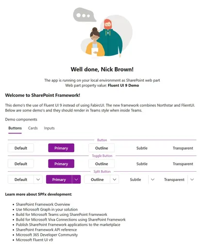
description
Open this sample in the gallery (popup panel): Open in gallery
Source: https://github.com/pnp/sp-dev-fx-webparts/tree/main/samples/react-fluentui-9
React-Manage-List-Subscriptions
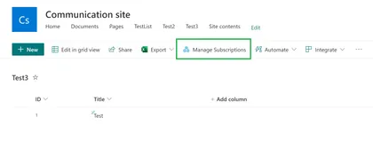
Demonstrates managing the list subscriptions (sharepoint webhooks) and action to renew the webhook expiration date using Rest calls.
Open this sample in the gallery (popup panel): Open in gallery
Subscription Manager Web Part
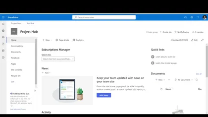
This sample web part demonstrates managing the list subscriptions (sharepoint webhooks) and action to renew the webhook expiration date using Rest calls.
Open this sample in the gallery (popup panel): Open in gallery
Source: https://github.com/pnp/sp-dev-fx-webparts/tree/main/samples/react-manage-hublevel-subscriptions
Birthdays Web Part
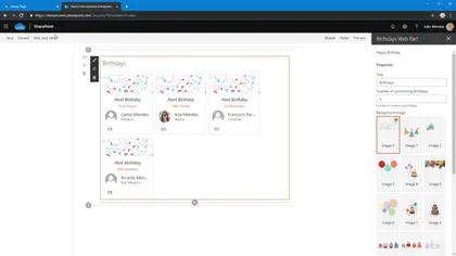
The Web Part Birthdays shows the upcoming birthdays in the company, the web part reads birthdays from a list located on the tenant’s root site with title “Birthdays.”
Open this sample in the gallery (popup panel): Open in gallery
Source: https://github.com/pnp/sp-dev-fx-webparts/tree/main/samples/react-birthdays
Script editor web part
Coming from old classic SharePoint pages you might have existing script solutions you want to re-use on a modern page without having to repackage it as a new SharePoint Framework web part.
Open this sample in the gallery (popup panel): Open in gallery
Source: https://github.com/pnp/sp-dev-fx-webparts/tree/main/samples/react-script-editor
Flow Dashboard Web Part
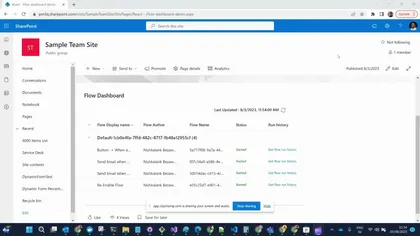
This web part demonstrates displaying the list of flows in different environments, ability to re-enable flows which are stopped or suspended, and the flow run history of the selected flow.
Open this sample in the gallery (popup panel): Open in gallery
Source: https://github.com/pnp/sp-dev-fx-webparts/tree/main/samples/react-flow-dashboard
Application Customizer Quick Create
Injects a button to the command bar which shows all the lists in the site and have the ability to quickly create an item by showing the NewForm.aspx inside a panel.
Open this sample in the gallery (popup panel): Open in gallery
Source: https://github.com/pnp/sp-dev-fx-extensions/tree/main/samples/react-application-quick-create
Rhythm of Business Calendar Web Part
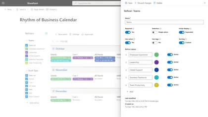
This sample is the source code for the Rhythm of Business Calendar app and is intended to demonstrate patterns and practices for building enterprise apps on the SharePoint platform.
Open this sample in the gallery (popup panel): Open in gallery
Source: https://github.com/pnp/sp-dev-fx-webparts/tree/main/samples/react-rhythm-of-business-calendar
Training Checklist
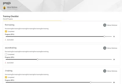
YSample web part to display a training checklist in a SharePoint page.
Open this sample in the gallery (popup panel): Open in gallery
Source: https://github.com/pnp/sp-dev-fx-webparts/tree/main/samples/react-training-checklist
Graph Calendar Web Part
This is a sample web part developed using React Framework to gather events from the underlying group calendar of a Team site. This sample also demonstrates the utilization of web parts as Teams tabs and Personal tab and offering a visualization context to change behaviors based on the platform used (Getting the proper information from the team vs. SharePoint site, understanding the context of the theme on Teams, etc.).
Enhanced Button
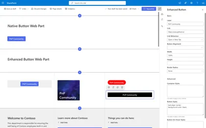
Extends the functionality of the native button web part.
Open this sample in the gallery (popup panel): Open in gallery
Source: https://github.com/pnp/sp-dev-fx-webparts/tree/main/samples/react-enhanced-button
Employee Onboarding
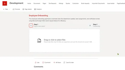
This project is an SPFx (SharePoint Framework) application designed for employee onboarding.
Open this sample in the gallery (popup panel): Open in gallery
Source: https://github.com/pnp/sp-dev-fx-webparts/tree/main/samples/react-employees-onboarding
Consuming Dataverse API using SPFx
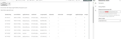
Enhance the potential of SharePoint by integrating it with Dataverse, a low-code data platform from Microsoft
Open this sample in the gallery (popup panel): Open in gallery
Source: https://github.com/pnp/sp-dev-fx-webparts/tree/main/samples/react-dataverse
External API calls tracking with Application Insights
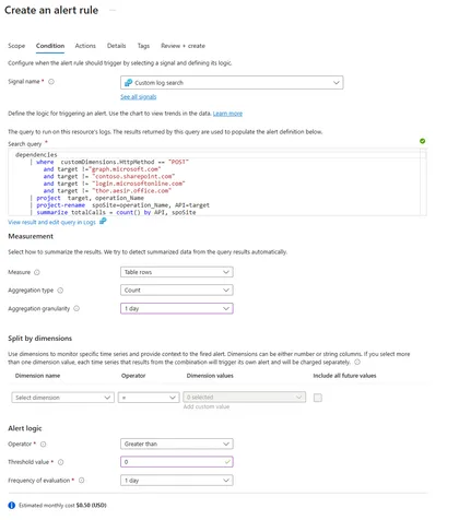
This SPFx solution is designed to monitor and track API calls executed within any SharePoint Online (SPO) site.
Open this sample in the gallery (popup panel): Open in gallery
Site Secure Function Call
This combined SharePoint Framework and Azure Function solution is to provide the potentially most secure access from SharePoint Framework to any kind of third party API or Microsoft Graph.
Open this sample in the gallery (popup panel): Open in gallery
Source: https://github.com/pnp/sp-dev-fx-webparts/tree/main/samples/react-office-offer-creation
Web part displaying hierarchical information from SharePoint list
At the time of developing this sample, the Office 365 UI fabric does not have any control for displaying hierarchical information. This web part helps to display the hierarchical information from SharePoint list.
Open this sample in the gallery (popup panel): Open in gallery
Source: https://github.com/pnp/sp-dev-fx-webparts/tree/main/samples/react-display-hierarchy
Content Query Web Part (SharePoint Online)
The React Content Query Web Part is a modern version of the good old Content by Query Web Part that was introduced in SharePoint 2007. Built for SharePoint Online, this modern version is built against the new SharePoint Framework (SPFx) and uses the latest Web Stack practices. While the original Web Part was based on a XSLT templating engine, this React Web Part is based on the well known Handlebars templating engine, which empowers users to create simple, yet powerfull HTML templates for rendering the queried content. This new version also lets the user query any site collections which resides on the same domain url, add unlimited filters, query DateTime fields to the nearest minute rather than being limited to a day, and much more.
Tour Sample Web Part
A SPFx WebPart using PnP/PnPjs, @pnp/spfx-property-controls and ReactTourJS.
Open this sample in the gallery (popup panel): Open in gallery
Source: https://github.com/pnp/sp-dev-fx-webparts/tree/main/samples/react-tour-pnpjs
Poll Web Part
Add new poll questions and their options. End users can submit his/her response to the poll. After Submission, user can see all responses count with Bar chart.
Open this sample in the gallery (popup panel): Open in gallery
Source: https://github.com/pnp/sp-dev-fx-webparts/tree/main/samples/react-poll
My OneDrive
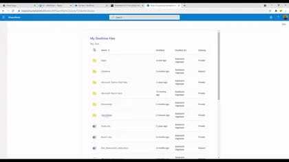
Displays currently logged in user’s OneDrive’s file
Open this sample in the gallery (popup panel): Open in gallery
Source: https://github.com/pnp/sp-dev-fx-webparts/tree/main/samples/react-myonedrive
Personal tools list Web Part
Allows users to select tools from a predefined list and save them in their own personalized view.
Open this sample in the gallery (popup panel): Open in gallery
Source: https://github.com/pnp/sp-dev-fx-webparts/tree/main/samples/react-personal-tools-list
Property Pane Navigation Web Part
This sample showcase how to handle the navigation between property pane pages.
Open this sample in the gallery (popup panel): Open in gallery
Source: https://github.com/pnp/sp-dev-fx-webparts/tree/main/samples/react-property-pane-navigation
Property Bag Navigation Web parts
A set of web parts that lets you set property bag settings on site collections and enable navigation using those properties.
Open this sample in the gallery (popup panel): Open in gallery
Source: https://github.com/pnp/sp-dev-fx-webparts/tree/main/samples/react-property-bag-editor
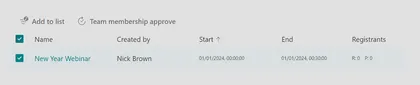
Teams My Webinars Web Part
Displays a list of Teams Webinars you are an organizer of, allows you to sync those webinars to a SharePoint list, to share within a Team and cross check pending registrants against membership of a team.
Open this sample in the gallery (popup panel): Open in gallery
Source: https://github.com/pnp/sp-dev-fx-webparts/tree/main/samples/react-teams-my-webinars
SharePoint Collaboration Footer v8.0.0
Enterprise-grade SharePoint footer with hybrid architecture, advanced link management, and modern user experience
Open this sample in the gallery (popup panel): Open in gallery
Source: https://github.com/pnp/sp-dev-fx-extensions/tree/main/samples/react-application-collab-footer
React Document Reporting Field Customizer
A React-based SPFx application for monitoring user activity within SharePoint documents.
Open this sample in the gallery (popup panel): Open in gallery
Source: https://github.com/pnp/sp-dev-fx-extensions/tree/main/samples/react-field-reporting
Copy Page SPFx Application Customizer
This SPFx Application Customizer empowers content authors to copy modern site pages across sites with full control over:
Open this sample in the gallery (popup panel): Open in gallery
Source: https://github.com/pnp/sp-dev-fx-extensions/tree/main/samples/react-application-copy-page
AI Document Assistant
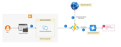
The AI Document Assistant is a SharePoint Framework (SPFx) Command Set extension designed to enhance document interactions in SharePoint Online. This intelligent assistant leverages the OpenAI Assistant API to allow users to ask questions about selected documents directly within a chat interface.
Open this sample in the gallery (popup panel): Open in gallery
Source: https://github.com/pnp/sp-dev-fx-extensions/tree/main/samples/react-command-ai-document-assistant
Workbench customizer Web Part
This sample shows how the Workbench page can be customized to display in a way that better mimics a modern SharePoint page.
Open this sample in the gallery (popup panel): Open in gallery
Source: https://github.com/pnp/sp-dev-fx-webparts/tree/main/samples/js-workbench-customizer
Personal Anniversary Web Part
A web part to help you notice those special days
Open this sample in the gallery (popup panel): Open in gallery
Source: https://github.com/pnp/sp-dev-fx-webparts/tree/main/samples/react-personal-anniversary-counter
Advent Calendar Web Part
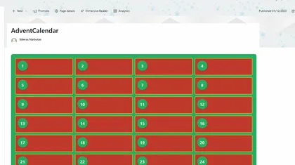
This project shows how to create an Advent Calendar using SPFx and React.
Open this sample in the gallery (popup panel): Open in gallery
Source: https://github.com/pnp/sp-dev-fx-webparts/tree/main/samples/react-advent-calendar
Governor Sharing Web Part
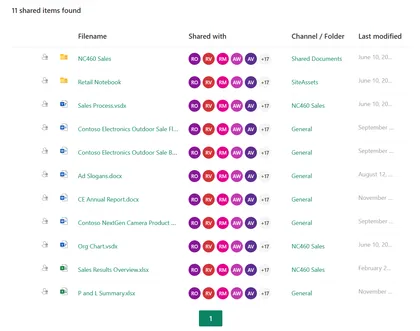
Shows documents which have been (explicitly) shared within a SharePoint site or Team.
Open this sample in the gallery (popup panel): Open in gallery
Source: https://github.com/pnp/sp-dev-fx-webparts/tree/main/samples/react-governor-sharing
SPFx environment settings management web part
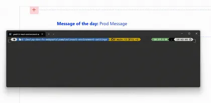
Easily swap between environments when building SPFx solutions
Open this sample in the gallery (popup panel): Open in gallery
Source: https://github.com/pnp/sp-dev-fx-webparts/tree/main/samples/react-environment-settings
Sales Orders Web Part
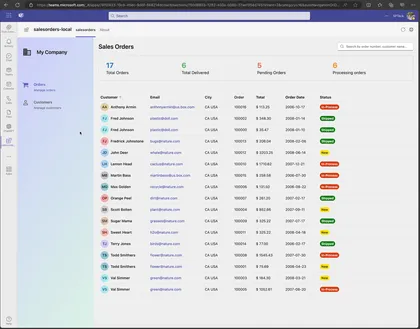
Shows how how to use Microsoft Graph Connector that use DB2 Database and display Sales Orders in a list.
Open this sample in the gallery (popup panel): Open in gallery
Source: https://github.com/pnp/sp-dev-fx-webparts/tree/main/samples/react-sales-orders
Enhanced Page Properties Web Part
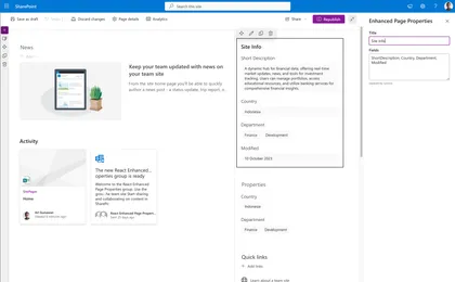
Goes beyond the standard SharePoint Page Properties web part, offering expanded support for various metadata types and configurations
Open this sample in the gallery (popup panel): Open in gallery
Source: https://github.com/pnp/sp-dev-fx-webparts/tree/main/samples/react-enhanced-page-properties
Password Vault Web Part
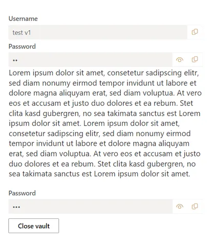
This web part allows you to protect your data, such as the username, password or even just a text note (rich text). This data is protected with a master password that you can choose yourself.
Open this sample in the gallery (popup panel): Open in gallery
Source: https://github.com/pnp/sp-dev-fx-webparts/tree/main/samples/react-password-vault
List notifications + Microsoft Teams Integrations
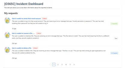
Illustrating using the SharePoint Framework List subscription capability, which allows you to get notified of changes to custom list refresh the displayed data
Open this sample in the gallery (popup panel): Open in gallery
Source: https://github.com/pnp/sp-dev-fx-webparts/tree/main/samples/react-realtime-incidentdashboard
Embed Microsoft Teams chats in SharePoint pages
Embed Microsoft Teams chats within SharePoint pages to streamline collaboration and information access for users.
Open this sample in the gallery (popup panel): Open in gallery
React Functional Component web part with data fetch
This web part demonstrates building a React functional component that uses data from a remote service, in this case the Microsoft Graph, using the recently introduced React Hooks feature. The example web part renders a list of the user’s Teams and, optionally, the channels in each Team.
Open this sample in the gallery (popup panel): Open in gallery
SharePoint - Dynamic Form Builder (WebPart)
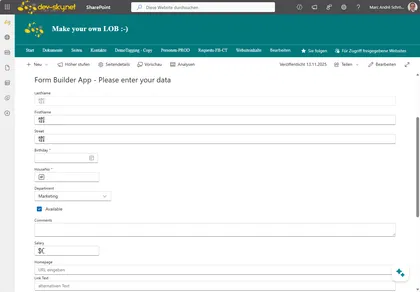
This WebPart (App) builds and creates an input form from a given SharePoint List and defined view. The view is used to determine the fields and the order of the fields in the form. This allows the form to be flexibly integrated into all SharePoint pages. The web part uses the latest version of the Fluent UI React Components library.
Open this sample in the gallery (popup panel): Open in gallery
Tailwind 3 Web Part
This project showcases an integration of Tailwind CSS into an SPFx project.
Open this sample in the gallery (popup panel): Open in gallery
Source: https://github.com/pnp/sp-dev-fx-webparts/tree/main/samples/react-tailwindcss
Using Azure OpenAI Connectors API web part
Shows how to use the new feature of Azure OpenAI Connectors API in a SharePoint Framework web part.
Open this sample in the gallery (popup panel): Open in gallery
Source: https://github.com/pnp/sp-dev-fx-webparts/tree/main/samples/react-azure-openai-connector
Targeted News Web Part using Microsoft Graph Open Extension
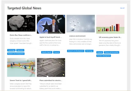
This sample contains two SPFx web parts: User preferences web part and Curated news web part
Open this sample in the gallery (popup panel): Open in gallery
Source: https://github.com/pnp/sp-dev-fx-webparts/tree/main/samples/react-news-extension
Modern Version History
An extension modernizing the version history experience in SharePoint Online.
Open this sample in the gallery (popup panel): Open in gallery
Source: https://github.com/pnp/sp-dev-fx-extensions/tree/main/samples/react-modern-version-history
Application Customizer Extension that is hidden from tenant guest users
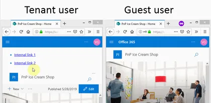
This sample shows how Application Customizer can be hidden from tenant external users. This is often the ask from the business when a SharePoint Framework App customizer or a web part has internal links that would be broken if a guest user attempts to access any or them.
Open this sample in the gallery (popup panel): Open in gallery
Source: https://github.com/pnp/sp-dev-fx-extensions/tree/main/samples/react-hidefrom-externalusers
Accessing Azure table storage data using Azure API Management Web Part
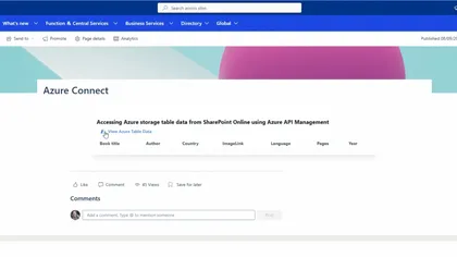
Allows you to access securely Azure storage table data using Azure API Management (APIM)
Open this sample in the gallery (popup panel): Open in gallery
Source: https://github.com/pnp/sp-dev-fx-webparts/tree/main/samples/react-apim-tablestorage
Download Multiple Documents Web Part
This sample empowers users to effortlessly download multiple documents as a single compressed ZIP file.
Open this sample in the gallery (popup panel): Open in gallery
Source: https://github.com/pnp/sp-dev-fx-webparts/tree/main/samples/react-download-multiple-documents
Advanced IFrame
This web part allows users to add a webpage in an IFrame to a modern SharePoint page.
Open this sample in the gallery (popup panel): Open in gallery
Source: https://github.com/pnp/sp-dev-fx-webparts/tree/main/samples/react-advanced-iframe
OpenAI Azure DevOps Bot Web Part
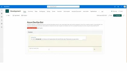
The SPFx web part is a SharePoint Framework web part that allows users to view recent tasks, bugs, and commits assigned to them from a specific project in Azure DevOps
Open this sample in the gallery (popup panel): Open in gallery
Source: https://github.com/pnp/sp-dev-fx-webparts/tree/main/samples/react-openai-devops
Tenant wide extension manager web part
Manage those tenant wide extensions
Open this sample in the gallery (popup panel): Open in gallery
Source: https://github.com/pnp/sp-dev-fx-webparts/tree/main/samples/react-extension-manager
Dynamic Form with location picker
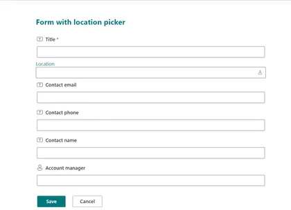
This solution implements a simple Form Customizer with a Dynamic Form with a location picker, to demonstrate the many usages of a Dynamic Form.
Open this sample in the gallery (popup panel): Open in gallery
Unique permissions on list items
This sample demonstrates how to use field customizer to handle unique permissions on list items.
Open this sample in the gallery (popup panel): Open in gallery
Source: https://github.com/pnp/sp-dev-fx-extensions/tree/main/samples/react-field-unique-permissions
Transport for London (TfL) Status
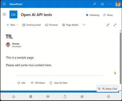
This sample is chatbot that provides information about Transport for London (TfL) status.
Open this sample in the gallery (popup panel): Open in gallery
Source: https://github.com/pnp/sp-dev-fx-extensions/tree/main/samples/react-application-tfl-status
Personal Assistant - OpenAI Function Calling with Microsoft Graph
This sample is chatbot that provides information to the current logged in user.
Open this sample in the gallery (popup panel): Open in gallery
Source: https://github.com/pnp/sp-dev-fx-extensions/tree/main/samples/react-application-personal-assistant
Dynamic Site Form
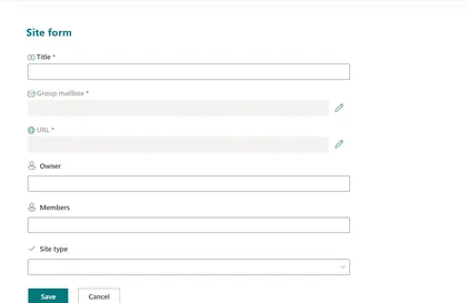
The Dynamic Site Form solution implements a Form Customizer with a Dynamic Form with field overrides to look like the default SharePoint new site form.
Open this sample in the gallery (popup panel): Open in gallery
Source: https://github.com/pnp/sp-dev-fx-extensions/tree/main/samples/react-dynamic-site-form
Invoice Generator Web Part
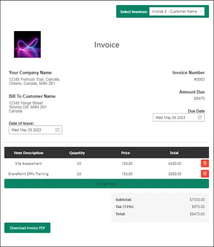
SPFx Invoice Generator Web part using PnP JS allows users to create invoices for different clients or customers.
Open this sample in the gallery (popup panel): Open in gallery
Source: https://github.com/pnp/sp-dev-fx-webparts/tree/main/samples/react-invoice-generator
List Integration with TinyMCE Editor Web Part
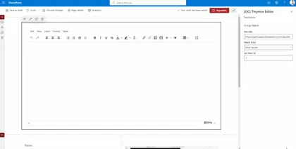
The web part allows users to insert column data from associated SharePoint lists using a split button on the toolbar
Open this sample in the gallery (popup panel): Open in gallery
Source: https://github.com/pnp/sp-dev-fx-webparts/tree/main/samples/react-sp-tinymce
Application Insights and Cost Management Dashboards Web Part
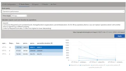
Sharing Application Insights and solution’s cost information with your stakeholders typically requires either using Azure Dashboards or using Power BI. This sample solution allows displaying this dashboards directly in a SharePoint site or a tab in MS Teams, moving it close to the users.
Open this sample in the gallery (popup panel): Open in gallery
Source: https://github.com/pnp/sp-dev-fx-webparts/tree/main/samples/react-dashboards
JSON form builder Web Part
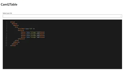
Build a custom form with ease
Open this sample in the gallery (popup panel): Open in gallery
Source: https://github.com/pnp/sp-dev-fx-webparts/tree/main/samples/react-json-form
Group Membership Manager Web Part

This app is an example of managing the membership of a group you own including the owners of the group as well as using FluentUI v9
Open this sample in the gallery (popup panel): Open in gallery
Source: https://github.com/pnp/sp-dev-fx-webparts/tree/main/samples/react-group-membership-manager
Azure Apps Web Part
This sample web part shows list of Azure apps in your tenant. A new Azure application can also be registered and can be edited using this web part.
Open this sample in the gallery (popup panel): Open in gallery
Source: https://github.com/pnp/sp-dev-fx-webparts/tree/main/samples/react-graph-azureapps
Lead Dashboard Web Part
This sample shows how to use SPFx to create a Microsoft Teams dashboard personal app.
Open this sample in the gallery (popup panel): Open in gallery
Source: https://github.com/pnp/sp-dev-fx-webparts/tree/main/samples/react-teams-lead-dashboard
IFramePanel Web Part
This sample shows how to use the IFramePanel control in a SharePoint Framework web part.
Open this sample in the gallery (popup panel): Open in gallery
Source: https://github.com/pnp/sp-dev-fx-webparts/tree/main/samples/react-spfx-control-iframepanel
Azure DevOps Tasks Adaptive Card Extension
This Adaptive Card Extension demonstrates displaying the number of assigned tasks of Azure DevOps.
Open this sample in the gallery (popup panel): Open in gallery
Source: https://github.com/pnp/sp-dev-fx-webparts/tree/main/samples/react-azure-devops-tasks
Weather Application Customizer Extension
SPFx Weather Application Customizer Extension in the top placeholder
Open this sample in the gallery (popup panel): Open in gallery
Source: https://github.com/pnp/sp-dev-fx-extensions/tree/main/samples/react-application-weather-widget
Multilingual SharePoint Page Summarization Web Part with Open AI API and Microsoft Graph Pages API
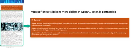
This sample contains a SharePoint Framework web part and an Azure function that uses the Open AI API to summarize a SharePoint page in multiple languages.
Open this sample in the gallery (popup panel): Open in gallery
Source: https://github.com/pnp/sp-dev-fx-webparts/tree/main/samples/react-openai-summarise-page-content
Instagram Feed Web Part
Sample web part to showcase an Instagram feed.
Open this sample in the gallery (popup panel): Open in gallery
Source: https://github.com/pnp/sp-dev-fx-webparts/tree/main/samples/react-instagram
Teams Tab Conversation View
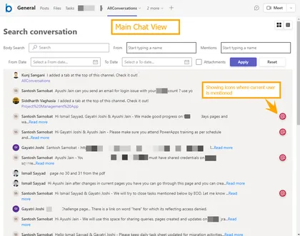
Displays Microsoft Teams channels conversations in a simpler way which makes easy to search and filters the new conversations and its replies
Open this sample in the gallery (popup panel): Open in gallery
Source: https://github.com/pnp/sp-dev-fx-webparts/tree/main/samples/react-teams-conversationview
Telephone Directory Web Part using React, Ms Graph and SPFx
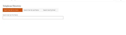
This is sample web part using SPFx and MSGraph to fetch the users information based on First Name, Last Name and Email Address. web part will fetch data from directory using Graph API and display in details list.
Open this sample in the gallery (popup panel): Open in gallery
Source: https://github.com/pnp/sp-dev-fx-webparts/tree/main/samples/react-graph-telephonedirectory
GitHub Profile Web Part Display via API
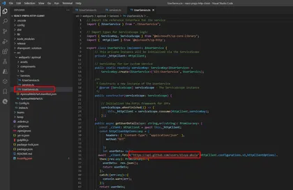
This web part loads the GitHub profile using SPHttp client in PnP v3.
Open this sample in the gallery (popup panel): Open in gallery
Source: https://github.com/pnp/sp-dev-fx-webparts/tree/main/samples/react-pnpjs-http-client
Chat GPT App Web Part
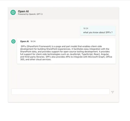
This App is a implementation of OpenAI ChatGPT-3. It runs on SharePoint, Teams as Personal or Teams App and Message Extension.
Open this sample in the gallery (popup panel): Open in gallery
Source: https://github.com/pnp/sp-dev-fx-webparts/tree/main/samples/react-chatgpt-app
Twitter Timeline Web Part
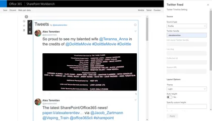
Sample web part to display Twitter timeline.
Open this sample in the gallery (popup panel): Open in gallery
Source: https://github.com/pnp/sp-dev-fx-webparts/tree/main/samples/react-twitter
All Microsoft 365 Groups and Teams Web Part
Web part pulls all Microsoft 365 Groups and Teams that the logged in user has access to view.
Open this sample in the gallery (popup panel): Open in gallery
Source: https://github.com/pnp/sp-dev-fx-webparts/tree/main/samples/react-groups-teams
Modern Page Model with PnP/PnPjs
A SPFx extension using @pnp/sp that allow creating Modern Pages based on prefilled modern pages marked as “Page Model”, inside the Site Pages Library, and code defined pages. Users can select a Modern page as Model just setting a custom property page named “Is Model” to “Yes”. People often need to create periodically editorial pages with the same composition, sections structure and webpart configuration, in order to give users the same users experience between pages with different contents but with the same communicative purpose
React AppInsights Dashboard Web Part
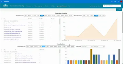
This web part displays different statistics data captured in the Azure Application Insights in a graphical representation.
Open this sample in the gallery (popup panel): Open in gallery
Source: https://github.com/pnp/sp-dev-fx-webparts/tree/main/samples/react-appinsights-dashboard
Interactive Map Web Part
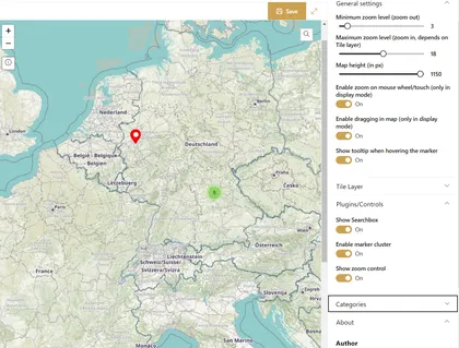
This web parts displays a (world) map. An editor can set custom markers directly in the map. Each marker can configured individually.
Open this sample in the gallery (popup panel): Open in gallery
Source: https://github.com/pnp/sp-dev-fx-webparts/tree/main/samples/react-interactive-map
Feedback Sidebar Web Part
This web part displays a sidebar that allows users to provide feedback on various sections of your site.
Open this sample in the gallery (popup panel): Open in gallery
Source: https://github.com/pnp/sp-dev-fx-webparts/tree/main/samples/react-feedback-sidebar
SharePoint document generator - Offer Creation Web Part
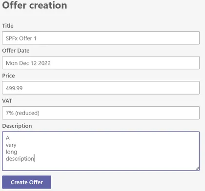
This sample is a Teams personal Tab to act as a Microsoft 365 across application (Teams, Outlook, Office) to generate docuemnts.
Open this sample in the gallery (popup panel): Open in gallery
Source: https://github.com/pnp/sp-dev-fx-webparts/tree/main/samples/react-office-offer-creation
Tab Accordion Web Part
This Web Part allows users to create content as Tabbed content using Property Field Collection Data and tinyMCE for Rich Text Editing targeted for SharePoint Online
Open this sample in the gallery (popup panel): Open in gallery
Source: https://github.com/pnp/sp-dev-fx-webparts/tree/main/samples/react-accordion-with-richtext
Employee ListView Contextual Menu
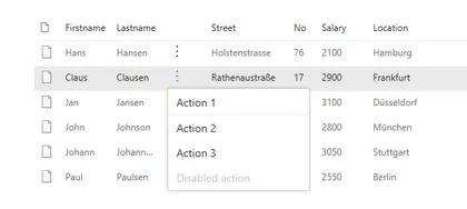
This small sample illustrates how to extend the PnP React SPFx ListView control with a contextual menu.
Open this sample in the gallery (popup panel): Open in gallery
Source: https://github.com/pnp/sp-dev-fx-webparts/tree/main/samples/react-listview-context-ecb
SP Site ER Diagram
This web part loads all lists on a site and display it in a Entity Relationship Diagram (ERD)
Open this sample in the gallery (popup panel): Open in gallery
Source: https://github.com/pnp/sp-dev-fx-webparts/tree/main/samples/react-pnpjs-spsite-er-diagram
Emoji Ratings Web Part
Take emoji-based reactions or feedback for a given news/article/post
Open this sample in the gallery (popup panel): Open in gallery
Source: https://github.com/pnp/sp-dev-fx-webparts/tree/main/samples/react-emoji-ratings
Flight Tracker
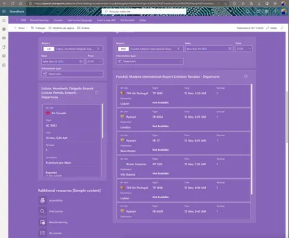
Sample Web Part to track all flights from a selected airport, date and information type.
Open this sample in the gallery (popup panel): Open in gallery
Source: https://github.com/pnp/sp-dev-fx-webparts/tree/main/samples/react-flighttracker
React Kiota Custom API Client Web Part
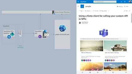
Using Kiota to generate a client to your AzureAd API and use it from a SPFx webpart.
Open this sample in the gallery (popup panel): Open in gallery
Source: https://github.com/pnp/sp-dev-fx-webparts/tree/main/samples/react-kiota-custom-api-client
Associated Sites Links
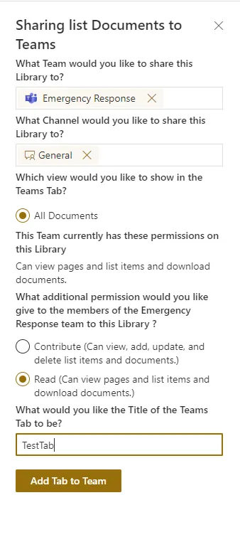
Web part that will display links to all associated sites that registered to the current site. Current site should be a hub site.
Open this sample in the gallery (popup panel): Open in gallery
Source: https://github.com/pnp/sp-dev-fx-extensions/tree/main/samples/react-command-share-to-teams
React Form Customizer (Customers)
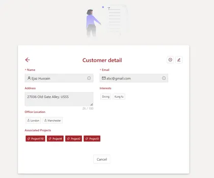
A sample of an SPFx Form Customizer built with React for managing items of a custom list of customers.
Open this sample in the gallery (popup panel): Open in gallery
Source: https://github.com/pnp/sp-dev-fx-extensions/tree/main/samples/react-formcustomizer-customers
Zod Web Part
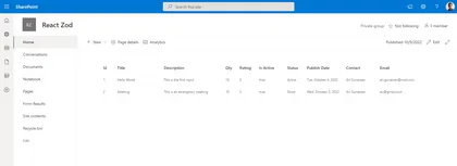
This sample shows the usage of Zod to eliminate manual cast and validation of the data coming from external API.
Open this sample in the gallery (popup panel): Open in gallery
Source: https://github.com/pnp/sp-dev-fx-webparts/tree/main/samples/react-zod
Image Generation using DALL-E API Web Part
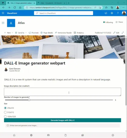
This web part allows you to generate some images using the recently released API of DALL-E image generation.
Open this sample in the gallery (popup panel): Open in gallery
Source: https://github.com/pnp/sp-dev-fx-webparts/tree/main/samples/react-dall-e-image-generation
My Approvals Web Part
This web part demonstrates displaying the list of approval requests of Power Automate. Power Automate provides a new workflow feature that replaces SharePoint workflows, but it is a Power Platform feature, not a Microsoft 365 feature. You can display approval requests from only Power Automate site. This web part enable to display approval requests from SharePoint site.
Open this sample in the gallery (popup panel): Open in gallery
Query Microsoft Graph Web Part

This sample shows how you can query Microsoft Graph from React in SharePoint Framework
Open this sample in the gallery (popup panel): Open in gallery
Source: https://github.com/pnp/sp-dev-fx-webparts/tree/main/samples/react-react-query
pnp/js and ReactJS Functional Components

This solution builds off of the solution react-async-await-sp-pnp-js submitted by Jose Quinto, and re-work of the existing class based react-pnp-js-sample by Julie Turner. This implementation refactors to take aspects out and utilize and showcase PnPjs Version 3 using React Functional Components and Hooks.
Open this sample in the gallery (popup panel): Open in gallery
Source: https://github.com/pnp/sp-dev-fx-webparts/tree/main/samples/react-pnp-js-hooks
List Form Web Part
The React List Form web part is a web part for adding a list form to any page. It provides a working example of implementing generic SharePoint list forms using the SharePoint Framework (SPFx) and the React and Office UI Fabric libraries.
Open this sample in the gallery (popup panel): Open in gallery
Source: https://github.com/pnp/sp-dev-fx-webparts/tree/main/samples/react-list-form
Add Form Customizer to List Web Part
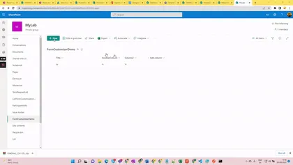
A React based SPFx utility web part which will help admins/user(s) to associate and remove association of the list form customizer extension to a particular list.
Open this sample in the gallery (popup panel): Open in gallery
Source: https://github.com/pnp/sp-dev-fx-webparts/tree/main/samples/react-add-formcustomizer-to-list
Consume Northwind Microsoft database from Azure using a Function App
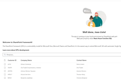
This web part consume an anonymous Function App from an HTTP Trigger using the templates from the Northwind Microsoft DBs
Open this sample in the gallery (popup panel): Open in gallery
Source: https://github.com/pnp/sp-dev-fx-webparts/tree/main/samples/react-azurefunction-northwind2
Palette Picker Web Part
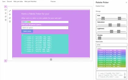
Custom Property Pane pain resolved (whew), color palette generator inspired by Jhey.
Open this sample in the gallery (popup panel): Open in gallery
Source: https://github.com/pnp/sp-dev-fx-webparts/tree/main/samples/react-palette-picker
Room Chat Web Part
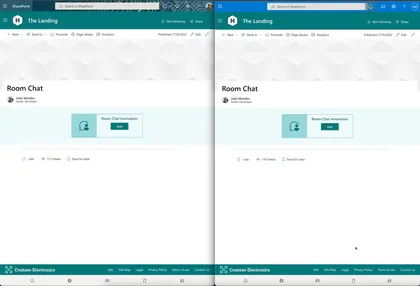
This web part shows how to use Azure Communications Services and React UI component to create a Room Chat.
Open this sample in the gallery (popup panel): Open in gallery
Source: https://github.com/pnp/sp-dev-fx-webparts/tree/main/samples/react-roomchat
Taxonomy File Explorer Web Part
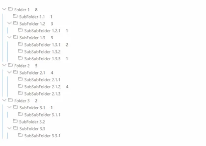
This solution renders a given Termset as a Tree and incorporates files similar than a folder structure in file explorer.
Open this sample in the gallery (popup panel): Open in gallery
Source: https://github.com/pnp/sp-dev-fx-webparts/tree/main/samples/react-taxonomy-file-explorer
Staff Directory Web Part
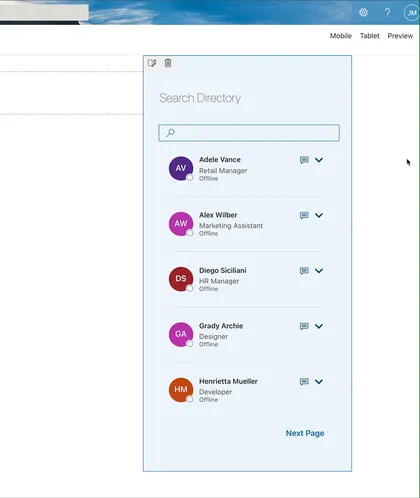
This web part shows the current user’s colleagues, and allows the user to search AD directory, The user can configure the properties to show when expand the user card.
Open this sample in the gallery (popup panel): Open in gallery
Source: https://github.com/pnp/sp-dev-fx-webparts/tree/main/samples/react-staffdirectory
My Awards Web Part
This web part is using the beta MS Graph Profile endpoint to list your awards. At the time of writing this sample (May 2022), this is a Beta endpoint, so it could change in the future. A future version of this web part could include the ability to add new awards to your profile.
Open this sample in the gallery (popup panel): Open in gallery
Source: https://github.com/pnp/sp-dev-fx-webparts/tree/main/samples/react-graph-profile-awards
Frequently Asked Questions Web Part
Allows users to create Frequently Asked Questions using Property Field Collection Data
Open this sample in the gallery (popup panel): Open in gallery
Source: https://github.com/pnp/sp-dev-fx-webparts/tree/main/samples/react-faqs
Filterable Image Gallery Web Part
This sample describe a SPFX application which implement an image gallery with taxonomy base filtering and typed search. This application also implement pagination.
Open this sample in the gallery (popup panel): Open in gallery
Source: https://github.com/pnp/sp-dev-fx-webparts/tree/main/samples/react-image-gallery
Follow Document Web Part
react-follow-document
Open this sample in the gallery (popup panel): Open in gallery
Source: https://github.com/pnp/sp-dev-fx-webparts/tree/main/samples/react-follow-document
Questionnaire Teams Meeting App
Questionnaire meeting app provides Pre-meeting app experience for MS Teams meeting attendees to ask the questions related to meeting before the meeting starts.
Open this sample in the gallery (popup panel): Open in gallery
Source: https://github.com/pnp/sp-dev-fx-webparts/tree/main/samples/react-teams-meeting-app-questionnaire
Page Sections Navigation Web Part
Sample web parts allowing to add sections navigation to the SharePoint page.
Open this sample in the gallery (popup panel): Open in gallery
Source: https://github.com/pnp/sp-dev-fx-webparts/tree/main/samples/react-page-sections-navigation
Cherry picked content web part
The Cherry-Picked Content Web Part is a modern replacement for the classic Content Editor Web Part, with a twist: code snippets can only be picked from approved document libraries.
Open this sample in the gallery (popup panel): Open in gallery
Source: https://github.com/pnp/sp-dev-fx-webparts/tree/main/samples/react-cherry-picked-content
JS Property Controls SVG Web Part
An SPFx web part that displays a Scalable Vector Graphics (SVG) image using properties to customize how it is rendered. The web part utilizes the PnP SPFx Property Controls package (specifially the SpinButton and ColorPicker) to set these properties.
Open this sample in the gallery (popup panel): Open in gallery
Source: https://github.com/pnp/sp-dev-fx-webparts/tree/main/samples/js-propertycontrols-svg
Todo Client Web Part built with Vue.js and Vue's single-file components

Sample Todo web part demonstrating how you can utilize Vue (a progressive framework for building user interfaces) with SharePoint Framework using handy single-file components approach.
Open this sample in the gallery (popup panel): Open in gallery
Source: https://github.com/pnp/sp-dev-fx-webparts/tree/main/samples/vuejs-todo-single-file-component
Tiles V2 Web Part
This solution creates a customizable Tiles Web part, it uses a stored collection from the PnP PropertyFieldCollectionData control and allows the user to choose the color scheme (theme or custom) and to set the size of the tiles.
Open this sample in the gallery (popup panel): Open in gallery
Source: https://github.com/pnp/sp-dev-fx-webparts/tree/main/samples/react-tiles-v2
My Events Web Part
This web part provides loggedin user’s outlook events with some advanced features
Open this sample in the gallery (popup panel): Open in gallery
Source: https://github.com/pnp/sp-dev-fx-webparts/tree/main/samples/react-my-events
Flow Button Web Part
This web part demonstrates displaying the list of flow button of Power Automate.
Open this sample in the gallery (popup panel): Open in gallery
Source: https://github.com/pnp/sp-dev-fx-webparts/tree/main/samples/react-flow-button
Teams Membership Updater Web Part
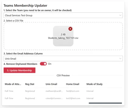
Used to update the membership of a team based on the contents of a CSV file, can be hosted in a SharePoint site where a list can be defined for logging purposes or run inside teams as a personal app.
Open this sample in the gallery (popup panel): Open in gallery
Source: https://github.com/pnp/sp-dev-fx-webparts/tree/main/samples/react-teams-membership-updater
Property Pane Portal PnP Controls Web Part
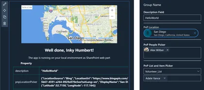
The React-PPP-PnP-Controls sample showcases the use of the Property Pane Portal to display the PnP SPFx React controls in the SPFx Property Pane.
Open this sample in the gallery (popup panel): Open in gallery
Source: https://github.com/pnp/sp-dev-fx-webparts/tree/main/samples/react-ppp-pnp-controls
Quick Poll Web Part
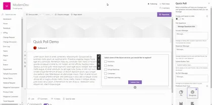
This component is developed for the users who really need to create a Poll within a minute and with less maintenance.
Open this sample in the gallery (popup panel): Open in gallery
Source: https://github.com/pnp/sp-dev-fx-webparts/tree/main/samples/react-quick-poll
Company Stories Web Part
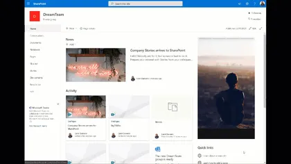
This web part allows you to add images to a SharePoint List, and renders them with a UX very similar to Instagram Stories (or Twitter Reels, or [Place your Social network here]). It is a way to engage employees, showing relevant content in a well-known visual appearance.
Open this sample in the gallery (popup panel): Open in gallery
Source: https://github.com/pnp/sp-dev-fx-webparts/tree/main/samples/react-company-stories
Hero Web Part
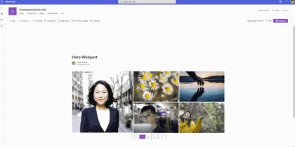
This solution creates a customisable Hero web part, it uses a stored collection from the PnP PropertyFieldCollectionData control
Open this sample in the gallery (popup panel): Open in gallery
Source: https://github.com/pnp/sp-dev-fx-webparts/tree/main/samples/react-hero-webpart
Adaptive Card Host control web part
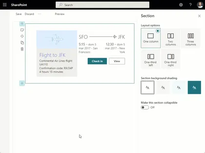
This web part provides an example of how to use the AdaptiveCardHost component present in the PnP React Controls library.
Open this sample in the gallery (popup panel): Open in gallery
Source: https://github.com/pnp/sp-dev-fx-webparts/tree/main/samples/react-adaptive-card-host-control
Cascading managed metadata Web Part using Graph API
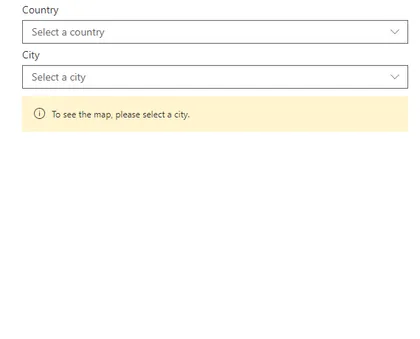
Shows how to use the Microsoft Graph APIs (beta) for Taxonomy to get the data.
Open this sample in the gallery (popup panel): Open in gallery
Source: https://github.com/pnp/sp-dev-fx-webparts/tree/main/samples/react-graph-cascading-managed-metadata
Hide Lists Web Part
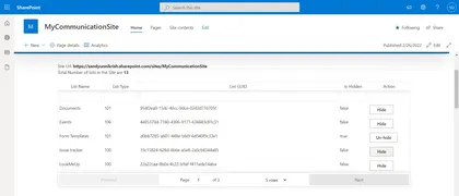
SPFx Web part to Hide/UnHide lists in a Site Collection’s Site Contents Page.
Open this sample in the gallery (popup panel): Open in gallery
Source: https://github.com/pnp/sp-dev-fx-webparts/tree/main/samples/react-lists-hide
Save to User Application Personal Folder in OneDrive
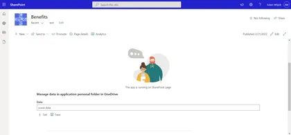
This solution shows how to manage data stored in user application’s personal folder in OneDrive which is one of many good methods to store application data/configuration which may be easily used in apps added to SharePoint page or Teams.
Open this sample in the gallery (popup panel): Open in gallery
Property Pane Wrapper for HTML Controls
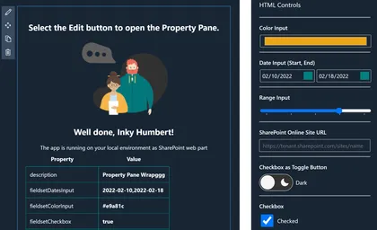
Showcases the use of the Property Pane Wrap to embed HTML controls in the SPFx Property Pane
Open this sample in the gallery (popup panel): Open in gallery
Source: https://github.com/pnp/sp-dev-fx-webparts/tree/main/samples/react-ppw-html
Displaying the version number in a web part
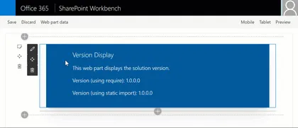
This very simple sample demonstrates three different approaches to display the version number of your SharePoint solution in your web part.
Open this sample in the gallery (popup panel): Open in gallery
Source: https://github.com/pnp/sp-dev-fx-webparts/tree/main/samples/react-versiondisplay
Graph Auto Batching Web Part

This sample shows how to abstract batching graph requests
Open this sample in the gallery (popup panel): Open in gallery
Source: https://github.com/pnp/sp-dev-fx-webparts/tree/main/samples/react-graph-auto-batching
DataTable Web Part Using MUI table
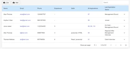
This web part provides mui datatable features for your lists.
Open this sample in the gallery (popup panel): Open in gallery
Source: https://github.com/pnp/sp-dev-fx-webparts/tree/main/samples/react-datatable-using-mui-tables
Custom property pane controls web part
Sample custom property pane controls built in React for use with SharePoint Framework client-side web parts.
Open this sample in the gallery (popup panel): Open in gallery
Source: https://github.com/pnp/sp-dev-fx-webparts/tree/main/samples/react-custompropertypanecontrols
Followed Drag and Drop Grid Web Part
This web part is a good example (starting point) for a solution to implement alternative view for user followed sites (or any kind of links). The web part uses Microsoft Graph so it presents how to define needed web api permissions in package-solution and use MS Graph API endpoints.
Open this sample in the gallery (popup panel): Open in gallery
Source: https://github.com/pnp/sp-dev-fx-webparts/tree/main/samples/react-followed-drag-and-drop-grid
Quote of the Day Web Part
This webpart displays a quote of the day by querying a third-party api or can display a quote entered manually into the webpart property pane.
Open this sample in the gallery (popup panel): Open in gallery
Source: https://github.com/pnp/sp-dev-fx-webparts/tree/main/samples/react-quotes
My Teams Web Part
This sample uses Microsoft Graph to list the Teams the current user is a member of. When the user clicks on one of the teams, the web part retrieves information about the default channel (General) and opens it. The web part can be configured to open the team on the web browser or client app.
Open this sample in the gallery (popup panel): Open in gallery
Source: https://github.com/pnp/sp-dev-fx-webparts/tree/main/samples/react-my-teams
Teams Graph Upload as PDF Web Part
This SPFx web part (or Teams Tab) enables a user to upload a supported file type via drag and drop while the uploaded file will be converted as PDF
Open this sample in the gallery (popup panel): Open in gallery
Source: https://github.com/pnp/sp-dev-fx-webparts/tree/main/samples/react-teams-graph-upload-as-pdf
List Items Menu Web Part
Allows user create a navigation menu , grouped by any column of document library. When the user clicks on the header it dynamically load documents.
Open this sample in the gallery (popup panel): Open in gallery
Source: https://github.com/pnp/sp-dev-fx-webparts/tree/main/samples/react-list-items-menu
Find Parker Web Part
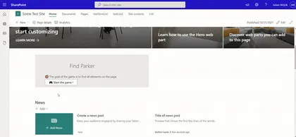
This web part is a simple find object game.
Open this sample in the gallery (popup panel): Open in gallery
Source: https://github.com/pnp/sp-dev-fx-webparts/tree/main/samples/react-find-parker
Change Page Layout Command Extension
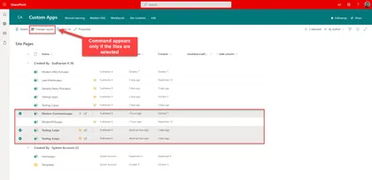
Listview command extension that is available only for the Site Pages library to change the layout type. If the page is Article, it can be changed to Home which will remove the page title placeholder and vice versa.
Open this sample in the gallery (popup panel): Open in gallery
Source: https://github.com/pnp/sp-dev-fx-extensions/tree/main/samples/react-command-change-page-layouttype
At a Glance Web Part

This sample shows a web part to show the first few sentences of an article in a SharePoint site, so that the article can be looked at a glance.
Open this sample in the gallery (popup panel): Open in gallery
Source: https://github.com/pnp/sp-dev-fx-webparts/tree/main/samples/react-at-a-glance
Save Attachments Web Part
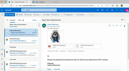
This SPFx Outlook Add-In lets users save any email attachments to a OneDrive folder.
Open this sample in the gallery (popup panel): Open in gallery
Source: https://github.com/pnp/sp-dev-fx-webparts/tree/main/samples/react-save-attachments
Modern Charts
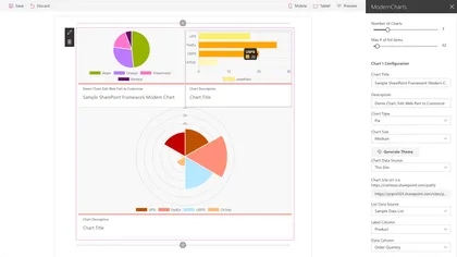
This web part uses the Chart.js library to visualize SharePoint list data.
Open this sample in the gallery (popup panel): Open in gallery
Source: https://github.com/pnp/sp-dev-fx-webparts/tree/main/samples/react-modern-charts
Documents Links Accordion Web Part

This web part allows user create a accordion with documents links grouped by any column of document library.
Open this sample in the gallery (popup panel): Open in gallery
Source: https://github.com/pnp/sp-dev-fx-webparts/tree/main/samples/react-document-links-accordion
Animated Progress Field
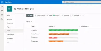
Displays an animated progress bar component
Open this sample in the gallery (popup panel): Open in gallery
Source: https://github.com/pnp/sp-dev-fx-extensions/tree/main/samples/js-field-animated-progress
My Flows List
Application extension that allows the user to check list of flows and their current status and details.
Open this sample in the gallery (popup panel): Open in gallery
Source: https://github.com/pnp/sp-dev-fx-extensions/tree/main/samples/react-application-my-flows-list
Multi screen web part sample
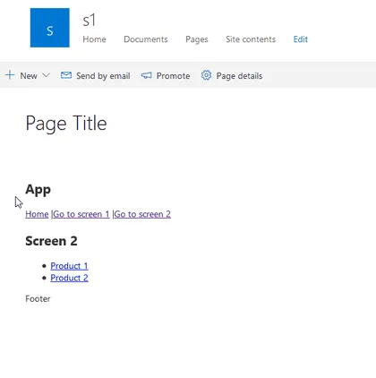
This sample uses the popular React Router library to create tab, multi-screen or single page app (spa) experience in React SPFx web part. This is useful when the web part is more complex and to simplify the user experience multiple screens or tabs are needed. The same approach can be taken when a single page app (SPA) has to be migrated to modern SharePoint sites.
Graph Group Viewer Web Part
Search for groups in your tenant and allow you to view the details of the selected group as well as view a list of group members and export the list of members to a CSV file
Open this sample in the gallery (popup panel): Open in gallery
Source: https://github.com/pnp/sp-dev-fx-webparts/tree/main/samples/react-graph-groupviewer
SharePoint CRUD operations
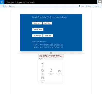
Sample Web Parts illustrating performing SharePoint CRUD operations in React, Angular, JavaScript without any framework and using the @pnp/sp library.
Open this sample in the gallery (popup panel): Open in gallery
Source: https://github.com/pnp/sp-dev-fx-webparts/tree/main/samples/sharepoint-crud
Copy/Move Item(s)
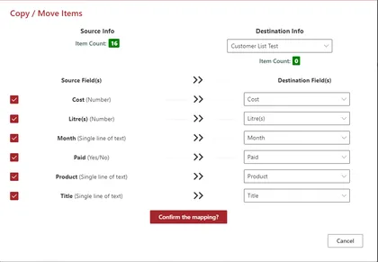
Displays a command button named Copy/Move Item(s) in all the custom lists
Open this sample in the gallery (popup panel): Open in gallery
Source: https://github.com/pnp/sp-dev-fx-extensions/tree/main/samples/react-command-copy-move-items
Share to Teams
Share to teams helps us to share files along with folders in document library it also alows us to share pages in the site pages library and last but not the least it allows sharing list items to teams channels or group.
Open this sample in the gallery (popup panel): Open in gallery
Source: https://github.com/pnp/sp-dev-fx-extensions/tree/main/samples/js-share-to-teams
Fluent UI Theme Variant Web Part
An example of how to apply a custom theme or a variation of the current SharePoint theme directly to the web part
Open this sample in the gallery (popup panel): Open in gallery
Source: https://github.com/pnp/sp-dev-fx-webparts/tree/main/samples/react-fluentui-theme-variant
HTM (Hyperscript Tagged Markup) Templating Web Part
Provides an example of how to create a dynamic template system (configurable via Web Part properties) that can not only render HTML but also React controls, such as Fluent UI, without the need to use Handlebars.js + Web Components
Open this sample in the gallery (popup panel): Open in gallery
Source: https://github.com/pnp/sp-dev-fx-webparts/tree/main/samples/react-htm-templating
Cross-Device Data Web Part
This solution demonstrates how to use the OneDrive special folder Apps in order to save user’s preferencies cross-device.
Open this sample in the gallery (popup panel): Open in gallery
Source: https://github.com/pnp/sp-dev-fx-webparts/tree/main/samples/react-cross-device-data
SharePoint Framework Facebook Page Social Plugin web part
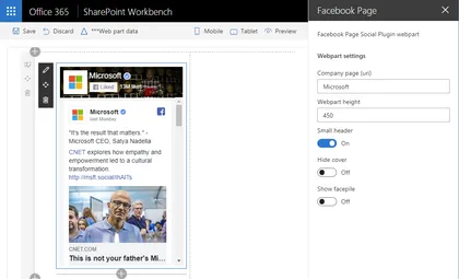
This sample shows how to implement iFrame-based web parts with a dynamic responsive behavior on the example of Facebook Page Social Plugin.
Open this sample in the gallery (popup panel): Open in gallery
Source: https://github.com/pnp/sp-dev-fx-webparts/tree/main/samples/react-facebook-plugin
My Lists Notifications
This application extension alows user receive notifications from selected lists or libraries
Open this sample in the gallery (popup panel): Open in gallery
Page Contributors Web Part

Displays page contributors in reverse chronological order.
Open this sample in the gallery (popup panel): Open in gallery
Source: https://github.com/pnp/sp-dev-fx-webparts/tree/main/samples/react-pagecontributors
Private Library/Folder Manager Web Part
This sample provides a webpart that can be used to manage Document Libraries with Secured Subfolders.
Open this sample in the gallery (popup panel): Open in gallery
Source: https://github.com/pnp/sp-dev-fx-webparts/tree/main/samples/react-private-libraries
Copy PnP search results webpart settings
This list view command set, helps in copying the settings of the PnP search results web part present on a page to the settings of the PnP search results web part present on the selected pages.
Open this sample in the gallery (popup panel): Open in gallery
Remote Event Receiver Manager Web Part
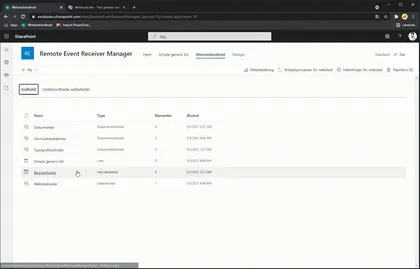
Lets you add and delete remote event receivers to lists
Open this sample in the gallery (popup panel): Open in gallery
Source: https://github.com/pnp/sp-dev-fx-webparts/tree/main/samples/react-remote-event-receiver-manager
Power Virtual Agents Bot Host
Adds footer to launch a Power Virtual Agents chatbot window from any page.
Open this sample in the gallery (popup panel): Open in gallery
Source: https://github.com/pnp/sp-dev-fx-extensions/tree/main/samples/react-application-pva-bot
Microsoft 365 Service Health Extension
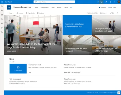
This extension provides real-time monitoring of Microsoft 365 service health directly within your SharePoint environment. It enables users to quickly check the availability status of core M365 services, helping organizations stay informed about outages or incidents.
Open this sample in the gallery (popup panel): Open in gallery
Source: https://github.com/pnp/sp-dev-fx-extensions/tree/main/samples/react-application-m365-service-health
Global News Web Part (SP2019)
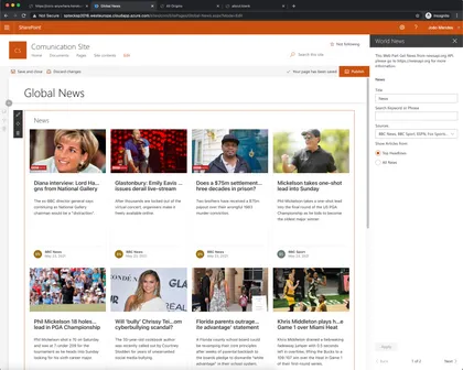
This web part show a world news from various sources, it uses the API available on https://newsapi.org this collect information from news and blog sites around the world.
Open this sample in the gallery (popup panel): Open in gallery
Source: https://github.com/pnp/sp-dev-fx-webparts/tree/main/samples/react-global-news-sp2019
OneDrive Finder Web Part
This sample access drives from OneDrive and navigate between his content using Graph OneDrive and Site API and Microsoft Graph Toolkit React controls with the addition of new FileList control.
Open this sample in the gallery (popup panel): Open in gallery
Source: https://github.com/pnp/sp-dev-fx-webparts/tree/main/samples/react-onedrive-finder
News Banner Web Part
Shows news information as a Banner, this information come from a list defined in any site.
Open this sample in the gallery (popup panel): Open in gallery
Source: https://github.com/pnp/sp-dev-fx-webparts/tree/main/samples/react-news-banner
List Items Menu (SP2019 Version)
Allows user create a navigation menu , grouped by any column of document library. When the user clicks on the header it dynamically load documents.
Open this sample in the gallery (popup panel): Open in gallery
Source: https://github.com/pnp/sp-dev-fx-webparts/tree/main/samples/react-list-items-menu-sp2019
Graph MGT Client Web Part
This is a sample web part developed using React Framework that showcases how to use the latest microsoft-graph-client in order to do advanced configuration of the Microsoft Graph client.
Open this sample in the gallery (popup panel): Open in gallery
Source: https://github.com/pnp/sp-dev-fx-webparts/tree/main/samples/react-graph-mgt-client
Send-To-Teams - Command Set
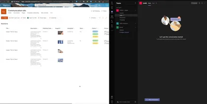
This Command Set allows to create an adaptive card based on list data and send to microsoft teams chanel, The user can select the list fields that will show on the card.
Open this sample in the gallery (popup panel): Open in gallery
Source: https://github.com/pnp/sp-dev-fx-extensions/tree/main/samples/react-send-to-teams
Document Card FAQ Web Part
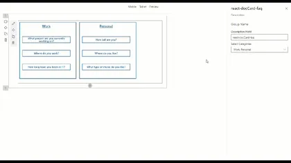
React FAQ Document Card Web Part
Open this sample in the gallery (popup panel): Open in gallery
Source: https://github.com/pnp/sp-dev-fx-webparts/tree/main/samples/react-doccard-faq
Video Banner Web Part
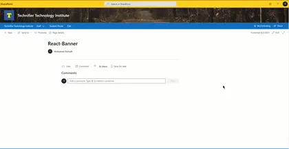
Use this Web Part to add a video banner with a text on top of it to your pages.
Open this sample in the gallery (popup panel): Open in gallery
Source: https://github.com/pnp/sp-dev-fx-webparts/tree/main/samples/react-video-banner
News Web Part
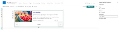
SPFx Webpart to display News from SharePoint site(s)
Open this sample in the gallery (popup panel): Open in gallery
Source: https://github.com/pnp/sp-dev-fx-webparts/tree/main/samples/react-news
Questions and Answers Web Part
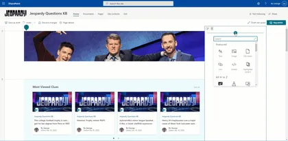
This is an application that supports Questions & Answers through a web part that can be used directly on a Modern SharePoint Site without the need for Yammer or a backing Microsoft Team site. It relies on a backing SharePoint list that is hidden and a provisioned Site Page that hosts a pre-configured version of the questions web part.
Open this sample in the gallery (popup panel): Open in gallery
Jump to folder extension
Sample solution that facilitates navigation between large collections of SharePoint library folders.
Open this sample in the gallery (popup panel): Open in gallery
Source: https://github.com/pnp/sp-dev-fx-extensions/tree/main/samples/react-jump-to-folder
Sites Selected Admin
The web part lets you manage your Azure AD applications that have the Sites Selected Api permission. With this web part you’ll get an UI for managing what app can connect to which site.
Open this sample in the gallery (popup panel): Open in gallery
Source: https://github.com/pnp/sp-dev-fx-webparts/tree/main/samples/react-sites-selected-admin
Feedback Web Part
This is an application that supports Feedback through a web part that can be used directly on a Modern SharePoint Site page. This web part can be added to any site page or article. This allows users to send categorized feedback via email to users in the “Feedback Owners” group.
Open this sample in the gallery (popup panel): Open in gallery
Source: https://github.com/pnp/sp-dev-fx-webparts/tree/main/samples/react-feedback
Message Teams User Web Part
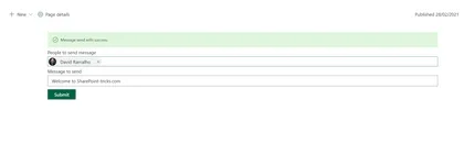
Sample that shows how to send a message to Microsoft Teams using a SharePoint framework solution using Microsoft Graph.
Open this sample in the gallery (popup panel): Open in gallery
Source: https://github.com/pnp/sp-dev-fx-webparts/tree/main/samples/react-teams-message-user
Demote News to Page
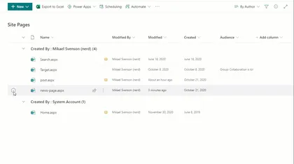
Sample SharePoint Framework list view command set extension to demote a previously promoted News page.
Open this sample in the gallery (popup panel): Open in gallery
Source: https://github.com/pnp/sp-dev-fx-extensions/tree/main/samples/react-command-demote-news
File Size Viewer sample with Command View Set
This sample shows how to create Command View Set working with single and multiple files selection. Once selected some files, it will show file sizes representation using a React D3 TreeMap component. This sample also shows how to integrate D3.js third party components within SharePoint Framework.
Open this sample in the gallery (popup panel): Open in gallery
Source: https://github.com/pnp/sp-dev-fx-extensions/tree/main/samples/react-command-file-size-viewer
Add Folders Command
Sample SharePoint Framework list view command set extension to create folders that can be all at the current location (parallel) or nested (one after another).
Open this sample in the gallery (popup panel): Open in gallery
Source: https://github.com/pnp/sp-dev-fx-extensions/tree/main/samples/react-command-addfolders
Copy Classic Link Extension
Sample SharePoint Framework list view command set extension that copies the classic link (path) of a selected item. Uses copy-to-clipboard library, toastr and sweet alert for notifications.
Open this sample in the gallery (popup panel): Open in gallery
Source: https://github.com/pnp/sp-dev-fx-extensions/tree/main/samples/js-command-copy-classic-link
SharePoint Framework PnP Controls Sample
This is a sample project that contains a web part which makes use of the PnP SPFx Controls
Open this sample in the gallery (popup panel): Open in gallery
Source: https://github.com/pnp/sp-dev-fx-webparts/tree/main/samples/react-pnp-controls
Send Notifications in Teams Web Part
This web part allows you to send MS Teams feed notifications to a selected user
Open this sample in the gallery (popup panel): Open in gallery
Source: https://github.com/pnp/sp-dev-fx-webparts/tree/main/samples/react-teams-send-notification
MGT Events Web Part
This sample shows how to use Microsoft Graph Toolkit in SPFx and custom with Fluent UI Fabric Controls
Open this sample in the gallery (popup panel): Open in gallery
Source: https://github.com/pnp/sp-dev-fx-webparts/tree/main/samples/react-mgtevents
My Favourites Application Customizer
Sample SharePoint Framework application customizer extension that shows favourite links using office ui fabric panel. Fabric UI React components used include - panel, dialog, list and spinner.
Open this sample in the gallery (popup panel): Open in gallery
Source: https://github.com/pnp/sp-dev-fx-extensions/tree/main/samples/react-application-myfavourites
Bot Framework SSO
This sample will show you how to embed a Bot Framework bot into a SharePoint web site with SSO.
Open this sample in the gallery (popup panel): Open in gallery
Source: https://github.com/pnp/sp-dev-fx-extensions/tree/main/samples/react-bot-framework-sso
Bot Framework Secure
This sample will show you how to embed a Bot Framework bot into a SharePoint web site with security consideration.
Open this sample in the gallery (popup panel): Open in gallery
Source: https://github.com/pnp/sp-dev-fx-extensions/tree/main/samples/react-bot-framework-secure
Edit Application Customizers Web Part
This web part will allow users to view/update application customizers properties across any web where the current user has access to.
Open this sample in the gallery (popup panel): Open in gallery
Source: https://github.com/pnp/sp-dev-fx-webparts/tree/main/samples/react-edit-applicationcustomizer
Single-Sign On Bot Framework Web Part

The web parts embeds the login bot by using a webchat. As the user has already login in the SharePoint website, we could use SSO to authorize the bot.
Open this sample in the gallery (popup panel): Open in gallery
Source: https://github.com/pnp/sp-dev-fx-webparts/tree/main/samples/react-bot-framework-sso
Secure Bot Framework Web Part
This sample shows how to secure your conversation including the use of a Direct Line token instead of secret, for user id, generate it inside client side and detect if the client has changed the user ID and reject the change.
Open this sample in the gallery (popup panel): Open in gallery
Source: https://github.com/pnp/sp-dev-fx-webparts/tree/main/samples/react-bot-framework-secure
SPFx web part to Test PnpJS SharePoint Methods
This web part will allow SPFx developers to test PnPjs methods and it displays response in JSON viewer to identify properties/attributes returned by method/API
Open this sample in the gallery (popup panel): Open in gallery
Source: https://github.com/pnp/sp-dev-fx-webparts/tree/main/samples/react-pnpjsexplorer
Soccer Highlights Web Part
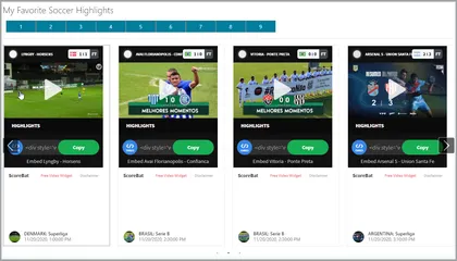
This react web part sample displays Soccer Highlights from a public Soccer API.
Open this sample in the gallery (popup panel): Open in gallery
Source: https://github.com/pnp/sp-dev-fx-webparts/tree/main/samples/react-soccer-highlights
Frequently Asked Questions Web Part
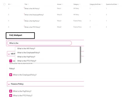
Allows users to create Frequently Asked Questions(Faq App) in modern and classic SharePoint pages.
Open this sample in the gallery (popup panel): Open in gallery
Source: https://github.com/pnp/sp-dev-fx-webparts/tree/main/samples/react-faqapp
Tenant Properties Web Part
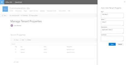
This web part allows tenant administrators to manage tenant properties through a graphical interface. We can create, edit or delete tenant properties.
Open this sample in the gallery (popup panel): Open in gallery
Source: https://github.com/pnp/sp-dev-fx-webparts/tree/main/samples/react-tenant-properties
Personal Greeting Web Part
The web part pulls in the current user’s name and displays it on the page. The greeting text before the name is customizable through the property pane. Additionally the position of the greeting and color of the text can be adjusted through the property pane as well.
Open this sample in the gallery (popup panel): Open in gallery
Source: https://github.com/pnp/sp-dev-fx-webparts/tree/main/samples/react-personal-greeting
Tailwind CSS Web Part
This project shows how to integrate Tailwind CSS framework into a SPFx React project.
Open this sample in the gallery (popup panel): Open in gallery
Source: https://github.com/pnp/sp-dev-fx-webparts/tree/main/samples/react-tailwindcss
Create To Do Task from Email (Outlook Add in)
This web part allows us to create a new To Do task using the new ToDo MS Graph endpoint. If deployed as an Outlook Add In, the Task title comes from email subject. Let´s say this is similar to the OOTB “Flag” action, but here you can select the ToDo List where to store the Task, and you can modify the Title before adding it.
Manage Profile Card Properties Web Part
This web part allows tenant administrators to manage profile card properties.
Open this sample in the gallery (popup panel): Open in gallery
Source: https://github.com/pnp/sp-dev-fx-webparts/tree/main/samples/react-manage-profile-card-properties
Custom Links Web Part
In this web part you can full customize the background and foreground color, font size, width and height of links.
Open this sample in the gallery (popup panel): Open in gallery
Source: https://github.com/pnp/sp-dev-fx-webparts/tree/main/samples/react-custom-links
Youtube Web Part
This web part allows to search and view the Youtube videos, across the Youtube API, directly on a SharePoint page, furthermore the property panel offers the possibility to specify the api key, the number of items to display and it is also possible specify a Youtube Channel Id.
Open this sample in the gallery (popup panel): Open in gallery
Source: https://github.com/pnp/sp-dev-fx-webparts/tree/main/samples/react-youtube
PnP File Type Renderer
This field customizer shows how to use PnP FieldFileTypeRenderer controls.
Open this sample in the gallery (popup panel): Open in gallery
Source: https://github.com/pnp/sp-dev-fx-extensions/tree/main/samples/react-field-pnp-file-type-renderer
World Clocks Web Part
This sample is extension of the single World time clock sample that was provided in SP Starter Kit.
Open this sample in the gallery (popup panel): Open in gallery
Source: https://github.com/pnp/sp-dev-fx-webparts/tree/main/samples/react-world-clocks
JS Application AppInsights Advanced
This application customizer will track the pageviews using Azure App Insights. The customizer will track the react routing which is used in SPA, in SharePoint Online it tracks the navigation between the news post which is not the actual post back.
Open this sample in the gallery (popup panel): Open in gallery
Source: https://github.com/pnp/sp-dev-fx-extensions/tree/main/samples/js-application-appinsights-advanced
SPUPS Photo Sync Web Part
This web part will help the administrators to synchronize the User Profile Photos from Azure AD or from the local file system to SharePoint User Profile Store.
Open this sample in the gallery (popup panel): Open in gallery
Source: https://github.com/pnp/sp-dev-fx-webparts/tree/main/samples/react-photo-sync
PnP Field Renderer Helper
This field customizer shows how to use PnP FieldRendererHelper utility.
Open this sample in the gallery (popup panel): Open in gallery
Source: https://github.com/pnp/sp-dev-fx-extensions/tree/main/samples/react-field-pnp-field-renderer-helper
My Tasks Web Part
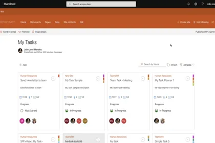
This web part allows user to manage planner tasks in SharePoint Site. The UI was inspired on Planner UI, it is full implemented with Office-UI-Fabric Components. Use MSGraph API’s and PnPjs to data access. The user can search task by name, can filter by progress status, all data are dynamic updated on change..
Open this sample in the gallery (popup panel): Open in gallery
Source: https://github.com/pnp/sp-dev-fx-webparts/tree/main/samples/react-mytasks
Site User and Group Information Web Part
Looks up the SharePoint site user/group ids related to a user. Azure AD groups that the user belongs to, and which are known to the SharePoint site, are also displayed.
Open this sample in the gallery (popup panel): Open in gallery
Source: https://github.com/pnp/sp-dev-fx-webparts/tree/main/samples/react-sp-site-user-groups
Provision SharePoint Assets with the SPFx solution package
This sample shows how we can provision Document Library, Custom List, Web and List PropertyBag properties, Site Columns, Content Types, Images, Site Page with the SFPx Client side web part and even prepopulated list and library items along with the SPFx solution package. All of the components can be deployed at once with the SPFx web part when the app is added to a SharePoint site. It also contains custom list and document library xml schemas.
Restaurant Menu Web Part
This web part shows a Restaurant Menu, the user can select the options to show in Menu.
Open this sample in the gallery (popup panel): Open in gallery
Source: https://github.com/pnp/sp-dev-fx-webparts/tree/main/samples/react-restaurant-menu
Accordion Section FAQ Builder Web Part
Adds a collapsible accordion section to an Office 365 SharePoint page or Teams Tab. Ideal for creating FAQs.
Open this sample in the gallery (popup panel): Open in gallery
Source: https://github.com/pnp/sp-dev-fx-webparts/tree/main/samples/react-accordion-section
My Sites Web Part
This web part shows sites that user has permissions to access. It includes Office 365 Groups, OneDrive Sites, SharePoint Sites and App Sites created by SharePoint Add-ins.
Open this sample in the gallery (popup panel): Open in gallery
Source: https://github.com/pnp/sp-dev-fx-webparts/tree/main/samples/react-my-sites
Display List JavaScript Client-Side Web Part
This simplistic sample Web Part demonstrates the use of JavaScript in a SharePoint Framework web part. The properties pane for this web part display a drop down list of lists in the current web. Once the user selects one of the lists, the web part display the contents of the list.
Open this sample in the gallery (popup panel): Open in gallery
Source: https://github.com/pnp/sp-dev-fx-webparts/tree/main/samples/js-display-list
Upgrade Me Web Part
Use this web part to test the CLI for Microsoft 365 SPFx Project Upgrade.
Open this sample in the gallery (popup panel): Open in gallery
Source: https://github.com/pnp/sp-dev-fx-webparts/tree/main/samples/react-upgrade-me
Visio Embed Web Part
This sample shows how the Visio JavaScript APIs can be used within a web part. For sample purposes, this web part will display the name and the hyperlinks of a Visio shape when the user selects it.
Open this sample in the gallery (popup panel): Open in gallery
Source: https://github.com/pnp/sp-dev-fx-webparts/tree/main/samples/react-visio
Adaptive Cards Viewer Web Parts using Hooks
A version of react-adaptivecards using React Hooks.
Open this sample in the gallery (popup panel): Open in gallery
Source: https://github.com/pnp/sp-dev-fx-webparts/tree/main/samples/react-adaptivecards-hooks
Smart Profile Photo Editor Web Part
Uses Azure Cognitive Services to analyze and approve or reject user-submitted photos.
Open this sample in the gallery (popup panel): Open in gallery
Source: https://github.com/pnp/sp-dev-fx-webparts/tree/main/samples/react-smart-profile-photo-editor
Microsoft Graph People Search Web Part
Show and search users from your organization, through Microsoft Graph. Search results show as a nice People Card, and display the Live Persona Card on hover.
Open this sample in the gallery (popup panel): Open in gallery
Source: https://github.com/pnp/sp-dev-fx-webparts/tree/main/samples/react-msgraph-peoplesearch
Web Part Using Dynamics CRM API
This sample shows how to consume Dynamics CRM API using AadTokenProvider class.
Open this sample in the gallery (popup panel): Open in gallery
Source: https://github.com/pnp/sp-dev-fx-webparts/tree/main/samples/react-dynamics-crm-api
Timeline Web Part
This sample displays list of events in chronological order. It is typically a graphic design showing a long bar labelled with dates paralleling it, and coexisting events. This web part helps to draw the timeline based from SharePoint list with pre-defined schema.
Open this sample in the gallery (popup panel): Open in gallery
Source: https://github.com/pnp/sp-dev-fx-webparts/tree/main/samples/react-timeline
My Groups Web Part
Using Microsoft Graph, this web part grabs the Office 365 groups the current user is a member of with links to the groups SharePoint site.
Open this sample in the gallery (popup panel): Open in gallery
Source: https://github.com/pnp/sp-dev-fx-webparts/tree/main/samples/react-my-groups
Application Alert Message

This application customizer will display the alert message based on the items from the list.
Open this sample in the gallery (popup panel): Open in gallery
Source: https://github.com/pnp/sp-dev-fx-extensions/tree/main/samples/js-application-alert-message
Dynamic data Web Part
Sample web parts illustrating using the SharePoint Framework Dynamic data capability.
Open this sample in the gallery (popup panel): Open in gallery
Source: https://github.com/pnp/sp-dev-fx-webparts/tree/main/samples/react-events-dynamicdata
Minesweeper Web Part

This web part is the classic game Minesweeper, put in a Fluent UI powered SPFx web part!.
Open this sample in the gallery (popup panel): Open in gallery
Source: https://github.com/pnp/sp-dev-fx-webparts/tree/main/samples/react-minesweeper
Greeting client-side web part

This is Greeting web part which shows greeting to the current logged in user.
Open this sample in the gallery (popup panel): Open in gallery
Source: https://github.com/pnp/sp-dev-fx-webparts/tree/main/samples/angular-greeting
Image Editor Command Set
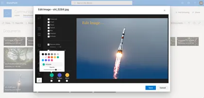
This command set allows quick edit images located in Document Library.
Open this sample in the gallery (popup panel): Open in gallery
Source: https://github.com/pnp/sp-dev-fx-extensions/tree/main/samples/react-command-image-editor
Image Gallery Web Part Built with Adaptive Cards
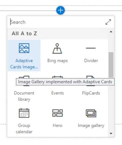
This sample demonstrates the capability of using Adaptive Cards with SharePoint Framework. Adaptive cards are great fit for Bot, however they can be effectively used with SPFx to render the content. This web part helps to display the image gallery from SharePoint list.
Open this sample in the gallery (popup panel): Open in gallery
Source: https://github.com/pnp/sp-dev-fx-webparts/tree/main/samples/react-adaptive-cards-image-gallery
Web Part Details
The web part illustrates how to get all the web part present in the current page, bind them in a multi-select dropdown.
Open this sample in the gallery (popup panel): Open in gallery
Source: https://github.com/pnp/sp-dev-fx-webparts/tree/main/samples/react-webpartdetails
My Followed Sites Application Customizer
Sample SharePoint Framework application customizer extension that shows current user followed sites across tenant using office ui fabric panel.
Open this sample in the gallery (popup panel): Open in gallery
Source: https://github.com/pnp/sp-dev-fx-extensions/tree/main/samples/react-application-myfollowedsites
Word Game Web Part
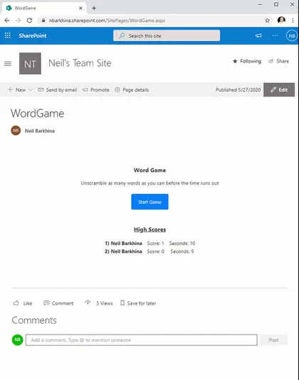
A fun game where you unscramble the words before the time runs out. It stores everyone’s high scores in a SharePoint List on the Site.
Open this sample in the gallery (popup panel): Open in gallery
Source: https://github.com/pnp/sp-dev-fx-webparts/tree/main/samples/react-word-game
Teams Messages Web Part
This is a sample web part that displays currently logged in user’s Microsoft Teams(user is member of), its channels and will allow sending messages to any Team’s channel.
Open this sample in the gallery (popup panel): Open in gallery
Source: https://github.com/pnp/sp-dev-fx-webparts/tree/main/samples/react-teams-message
Festivals Extension
Sample SharePoint Framework application customizer adds a festival animation to the pages. At the moment this extension has capability of display 2 festivals (Christmas and Diwali) however, more can be added very easily.
Open this sample in the gallery (popup panel): Open in gallery
Source: https://github.com/pnp/sp-dev-fx-extensions/tree/main/samples/react-application-festivals
Feedback Form Web Part
Sample SPFx React web part which allows sending emails using Microsoft Graph.
Open this sample in the gallery (popup panel): Open in gallery
Source: https://github.com/pnp/sp-dev-fx-webparts/tree/main/samples/react-graph-feedback-form
Followed Sites Web Part
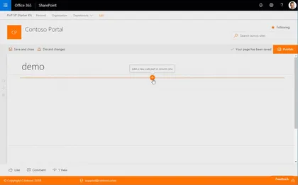
This web part provides you the ability to display a list of site administrator defined number of sites that a given user is following, with paging as well as inline filtering of sites by keyword or phrase. Currently the list of followed sites includes classic as well as modern communication sites but does not include group enabled (modern) team sites.
Open this sample in the gallery (popup panel): Open in gallery
Documents Web Part
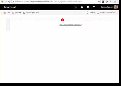
This sample shows how to build web parts that display documents in accordance with the SharePoint Online modern experience. The code uses Office UI Fabric components on the top of SharePoint framework. The web parts implement filtering and sorting. Two data source approaches are demonstrated items retrieved from the search index and real-time query to a document library.
Open this sample in the gallery (popup panel): Open in gallery
Hide Commands
This command-set can be used to hide other ‘out-of-the-box’ commands on list views.
Open this sample in the gallery (popup panel): Open in gallery
Source: https://github.com/pnp/sp-dev-fx-extensions/tree/main/samples/js-command-hide-commands
Teams Personal App Settings Web Part
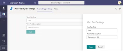
Demonstrates how you can store Teams Personal App Web Part’s properties in user’s OneDrive.
Open this sample in the gallery (popup panel): Open in gallery
Source: https://github.com/pnp/sp-dev-fx-webparts/tree/main/samples/react-teams-personal-app-settings
CSS in JS with SharePoint Framework and TypeStyle
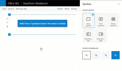
The web part demonstrates the usage of “CSS in JS” pattern with SharePoint Framework. “CSS in JS” is implemented using TypeStyle library.
Open this sample in the gallery (popup panel): Open in gallery
Source: https://github.com/pnp/sp-dev-fx-webparts/tree/main/samples/react-css-in-js-typestyle
SPUPS Property Sync Web Part
This component will help the administrators who are currently maintaining the user profiles in their organization.
Open this sample in the gallery (popup panel): Open in gallery
Source: https://github.com/pnp/sp-dev-fx-webparts/tree/main/samples/react-spupsproperty-sync
Microsoft Bot Framework Web Chat Web Part
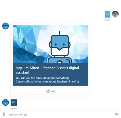
A web part that uses the botframework-webchat module to create implement a React component to render the Bot Framework v4 webchat component. This web part is able to render Text and richt attachments (Images, Cards, Adaptive Cards, …) and has settings for branding purposes.
Open this sample in the gallery (popup panel): Open in gallery
Source: https://github.com/pnp/sp-dev-fx-webparts/tree/main/samples/react-bot-framework
Global News Web Part
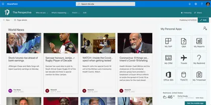
This web part show a world news from various sources, it uses the API available on https://newsapi.org this collect information from news and blog sites around the world.
Open this sample in the gallery (popup panel): Open in gallery
Source: https://github.com/pnp/sp-dev-fx-webparts/tree/main/samples/react-global-news
Project Online Web Part
This sample shows how to use SPFx to consume data from the Project Online REST API.
Open this sample in the gallery (popup panel): Open in gallery
Source: https://github.com/pnp/sp-dev-fx-webparts/tree/main/samples/react-project-online
Outlook to Teams Web Part
This SPFx Outlook Add-In lets you browse your OneDrive, joined Teams or Groups and select a folder to save your complete mail in there.
Open this sample in the gallery (popup panel): Open in gallery
Source: https://github.com/pnp/sp-dev-fx-webparts/tree/main/samples/react-outlook-copy2teams
Field Attachment Info
This field customizer will display the attachment related information for a listitem.
Open this sample in the gallery (popup panel): Open in gallery
Source: https://github.com/pnp/sp-dev-fx-extensions/tree/main/samples/react-field-attachment-info
COVID 19 information web part
This web part displays info about the COVID-19 virus for a given country.
Open this sample in the gallery (popup panel): Open in gallery
Source: https://github.com/pnp/sp-dev-fx-webparts/tree/main/samples/react-covid19-info
Consuming SPFX Service Scopes using React Hooks
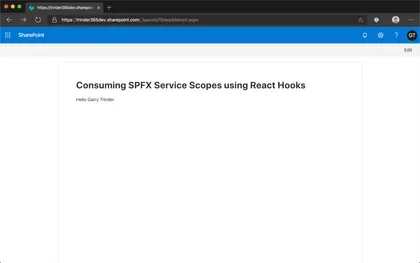
This web part is designed to help developers understand how to use the Context API and useContext() React Hook to share global data between a hierarchy of nested React components.
Open this sample in the gallery (popup panel): Open in gallery
Source: https://github.com/pnp/sp-dev-fx-webparts/tree/main/samples/react-functional-servicescope-hooks
Yammer Praise using aadTokenProvider
This sample shows how to post a praise to Yammer using aadTokenProvider (without Yammer JavaScript SDK).
Open this sample in the gallery (popup panel): Open in gallery
Source: https://github.com/pnp/sp-dev-fx-webparts/tree/main/samples/react-yammer-praise
Enhanced List Formatting Web Part
This web part allows you to add custom CSS on a page to enhance list formatting.
Open this sample in the gallery (popup panel): Open in gallery
Source: https://github.com/pnp/sp-dev-fx-webparts/tree/main/samples/react-enhanced-list-formatting
Script editor web part for modern pages
Coming from old classic SharePoint pages you might have existing script solutions you want to re-use on a modern page without having to repackage it as a new SharePoint Framework web part. This web part is similar to the classic Script Editor Web Part, and allows you do drop arbitrary script or html on a modern page.
Open this sample in the gallery (popup panel): Open in gallery
PnP ListView with PnP Field Controls Web Part
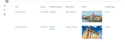
Sample web part to display PnP ListView control with column rendering using PnP Field Controls.
Open this sample in the gallery (popup panel): Open in gallery
Source: https://github.com/pnp/sp-dev-fx-webparts/tree/main/samples/react-pnp-controls-list-view-fields
Manage SPFx solution using ALM APIs
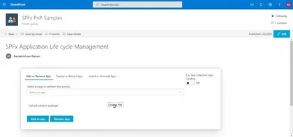
This web part acts as a centralized place where admin can manage SPFx solutions present in their tenant using Application lifecycle Management(ALM) APIs and perform activities like Add, Deploy, Install, Retract, Uninstall & Remove apps.
Open this sample in the gallery (popup panel): Open in gallery
Source: https://github.com/pnp/sp-dev-fx-webparts/tree/main/samples/react-manage-spfx-solutions-alm
Check User Group Web Part
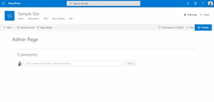
This web part finds all the Office 365 or AAD Security groups a user is a member of or all the members present in such a group. It can be used as an admin utility to quickly check the membership of any user or group from within a SharePoint page itself. The retrieved results can also be exported to a CSV file.
Open this sample in the gallery (popup panel): Open in gallery
Application Customiser sample using Text Analytics API
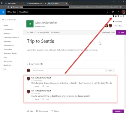
This sample shows how to use the Text Analytics API (Cognitive Services) to render a rating icon based on the different comments in page.
Open this sample in the gallery (popup panel): Open in gallery
Dev-Radar for SharePoint Online
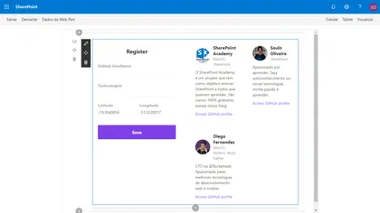
The web part Use PnPjs library and Axios
Open this sample in the gallery (popup panel): Open in gallery
Source: https://github.com/pnp/sp-dev-fx-webparts/tree/main/samples/react-dev-radar
ZPL Viewer Web Part
This web part will allow a user to select a text file contatining zpl which is used to generate an image using the labelary web service to render the zpl and return the image.
Open this sample in the gallery (popup panel): Open in gallery
Source: https://github.com/pnp/sp-dev-fx-webparts/tree/main/samples/react-zpl-viewer
Target Audience Web Part
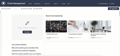
Sample web part which uses a Generic React Component which enables it to have Target Audience functionality like what was available in classic web parts. Targets SharePoint Groups only within the site.
Open this sample in the gallery (popup panel): Open in gallery
Source: https://github.com/pnp/sp-dev-fx-webparts/tree/main/samples/react-target-audience
Thumbnail/preview of pages and files web part
A web part showcasing how to call the Microsoft Graph Thumbnails API to generate a preview image for files and pages in SharePoint. The sample illustrates how to craft the preview URL both from a search result as well as from a SharePoint item object.
Open this sample in the gallery (popup panel): Open in gallery
Source: https://github.com/pnp/sp-dev-fx-webparts/tree/main/samples/js-msgraph-thumbnail
Teams Configuration Tab
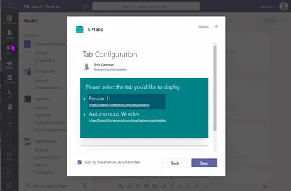
This web part makes a modern SharePoint page into a Teams tab configuration page for use in a Teams application. This allows low-code developers to create Teams applications containing configurable tabs without the need to code a custom configuration page. Using this tool, along with Microsoft Teams App Studio, low-code developers can build Teams applications entirely from modern SharePoint pages.
Open this sample in the gallery (popup panel): Open in gallery
Folder Selection
This extension creates a callout with a dropdown that allows users to select from a list of top level folders in a document library. After selecting the folder they can use the button to navigate to that folder.
Open this sample in the gallery (popup panel): Open in gallery
Source: https://github.com/pnp/sp-dev-fx-extensions/tree/main/samples/react-command-folder-select
Manage Office 365 Groups with SPFx
Office 365 Groups is the foundational membership service, that drives all teamwork across Microsoft 365. Once in a group, we can get the benefits of the group-connected services like shared Outlook inbox, shared calendar, SharePoint site, Planner, Power BI, Yammer, and Teams.
Open this sample in the gallery (popup panel): Open in gallery
Source: https://github.com/pnp/sp-dev-fx-webparts/tree/main/samples/react-manage-o365-groups
Redirect Application Customizers

Redirect from URL based on mapping from a list on the site. Can be used to automatically redirect from pages to other locations.
Open this sample in the gallery (popup panel): Open in gallery
Source: https://github.com/pnp/sp-dev-fx-extensions/tree/main/samples/js-application-redirect
Alerts Application Customizers
This application customizer provides you the ability to show notifications on the pages in the top / header area.
Open this sample in the gallery (popup panel): Open in gallery
Source: https://github.com/pnp/sp-dev-fx-extensions/tree/main/samples/react-application-alerts
Group members list with Presence information web part
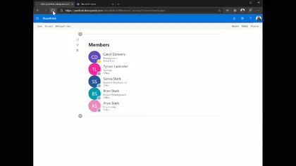
This sample shows how to get the members of a specific group, including their presence information (using the new Presence endpoint in the MS Graph API).
Open this sample in the gallery (popup panel): Open in gallery
Source: https://github.com/pnp/sp-dev-fx-webparts/tree/main/samples/react-members-with-presence
PnPjs Project Online Web Part
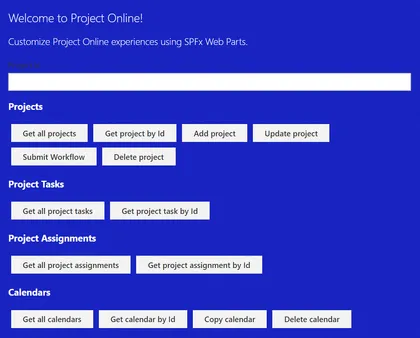
This sample shows how to use SPFx to consume data from the Project Online REST API using a custom module for PnPjs. The web part is currently logging the data returned from the API to the browser console as a simple proof of concept.
Open this sample in the gallery (popup panel): Open in gallery
Source: https://github.com/pnp/sp-dev-fx-webparts/tree/main/samples/react-pnpjs-project-online
Site Collection App Catalogs Web Part
A SPFx Web Part using @pnp/sp/appcatalog and @pnp/spfx-controls-react. It allows to see in a single view all the SiteCollection catalogs and the Apps installed with some useful metadata. It needs Globlal Administrator or SharePoint Online Administrator permissions in order to access Site collection App Catalogs hidden list and each Site Collection App Catalog.
Open this sample in the gallery (popup panel): Open in gallery
Source: https://github.com/pnp/sp-dev-fx-webparts/tree/main/samples/react-admin-sc-catalog-pnpjs
Slide Swiper Web Part
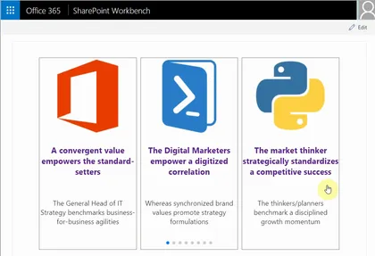
This SPFx React web part sample demonstrates mobile touch slide swiper. By default the swiper web part is responsive, has cross device and browser touch support and uses paging, but additional features like navigation, autoplay, loop of the slides and more can be enabled from the web part properties panel. The swiper web part can be used as carousel as well. The slides or cards template can easily be customized. The SPFx React swiper client side solution can easly be extended with more swiper, carousel like features because it is based on a popular feature rich JavaScript library called Swiper.
MS Teams Channels and Tabs from Modern Team site
A SPFx Web Part using @pnp/graph/teams. It shows Channels and Tabs (with link) from a Modern Team Site connected to Microsoft Teams.
Open this sample in the gallery (popup panel): Open in gallery
Source: https://github.com/pnp/sp-dev-fx-webparts/tree/main/samples/react-teams-tabs-pnpjs
Get Thumbnail List Item Command View Set
This Command Set uses Microsoft Graph API to get the Thumbnail URL, of selected size (small, medium, large), for any file stored in a SharePoint Document Library.
Open this sample in the gallery (popup panel): Open in gallery
Source: https://github.com/pnp/sp-dev-fx-extensions/tree/main/samples/react-command-get-thumbnail
Application Customiser sample using Bing Search API
This sample shows how to use the Bing Search API (Cognitive Services) to get news article related with the current page. That relation is set using the value of a specific Managed metadata field in the page.
Open this sample in the gallery (popup panel): Open in gallery
Manage Microsoft Graph Open Extension in SPFx
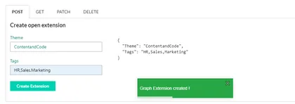
This sample shows how to managed Microsoft Graph Open Extension in SPFX. This application uses User Resource to create Open Extension.
Open this sample in the gallery (popup panel): Open in gallery
Source: https://github.com/pnp/sp-dev-fx-webparts/tree/main/samples/react-msgraph-extension
Bot Framework Chat App Customizer
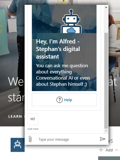
SPFx application extension that uses the Bot Framework React Webchat Component to render a Bot Framework chat window
Open this sample in the gallery (popup panel): Open in gallery
Source: https://github.com/pnp/sp-dev-fx-extensions/tree/main/samples/react-application-botframework-chat
Item Order
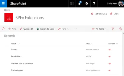
Sample SharePoint Framework field customizer extension that enables reordering of list items through intuitive drag and drop directly in your list view. Demonstrates the use of jQuery and jQuery UI, custom property JSON, and PnPJS Batching.
Open this sample in the gallery (popup panel): Open in gallery
Source: https://github.com/pnp/sp-dev-fx-extensions/tree/main/samples/jquery-field-itemorder
Google reCaptcha Web Part
This is sample web part which showcase how to implement Google reCaptcha v2 in SPFx. CAPTCHA is used to prevent bots from automatically submitting forms with SPAM or other unwanted content. If we are building a custom input form to get feedback, newsletter subscription or contact us form using SPFx web part. We might have to implement SPAM protection using some CAPTCHA resolving technique. This sample can come in handy to extend it for your business requirement if you need to implement CAPTCHA in SPFx web part.
Guest Message
SharePoint Application customizer that allow you to display a message to your External users.
Open this sample in the gallery (popup panel): Open in gallery
Source: https://github.com/pnp/sp-dev-fx-extensions/tree/main/samples/js-guest-message
Site Header Toggler
This application customizer adds a toggle button on all the Modern Pages which will toggle (show/hide) the Site Header, pulling the content to the top and giving more reading space for the users.
Open this sample in the gallery (popup panel): Open in gallery
Source: https://github.com/pnp/sp-dev-fx-extensions/tree/main/samples/js-application-header-toggler
Web/Mobile Camera Demo Web Part
This is sample web part to showcase how to open webcam and take photo in SPFx web part.
Open this sample in the gallery (popup panel): Open in gallery
Source: https://github.com/pnp/sp-dev-fx-webparts/tree/main/samples/react-webcam
Image Metadata from Cognitive Services Vision API List View Command Set
Custom Command Set that gets metadata information from MS Cognitive Services Vision API for the selected Image
Open this sample in the gallery (popup panel): Open in gallery
Source: https://github.com/pnp/sp-dev-fx-extensions/tree/main/samples/react-command-vision-api
Generate QR Code List Item Command View Set
Generates a printable QR code which links to a SharePoint list item.
Open this sample in the gallery (popup panel): Open in gallery
Source: https://github.com/pnp/sp-dev-fx-extensions/tree/main/samples/react-command-qrcode
Custom Dialog Sample with Command View Set
This sample shows how to create Custom Dialogs using @microsoft/sp-dialog package in the context of Command View Set. You can use also custom dialogs with client-side web parts or with any SharePoint Framework component types.
Open this sample in the gallery (popup panel): Open in gallery
Source: https://github.com/pnp/sp-dev-fx-extensions/tree/main/samples/react-command-dialog
Injecting Javascript with Sharepoint Framework Extensions - Azure Application Insights
Sample SharePoint Framework extension project injecting Javascript code to enable Azure App Insights monitoring and statistics.
Open this sample in the gallery (popup panel): Open in gallery
Source: https://github.com/pnp/sp-dev-fx-extensions/tree/main/samples/js-application-appinsights
React Hooks Form Web Part
The React Hooks web part is an example of how to implement Hooks in Spfx. Hooks is a new feature included in React version 16.8, with the new version of SharePoint Framework (SPFx) version 1.9.1 we can use them in our developments. In this example we are going to see the different types of hooks that are available and with the comparison of how this implementation can be done without the Hooks to be able to observe the benefits of using it.
Site Provisioning Manager Web Part
This sample shows how you can manage site provisioning by calling Azure functions.
Open this sample in the gallery (popup panel): Open in gallery
Source: https://github.com/pnp/sp-dev-fx-webparts/tree/main/samples/react-site-provisioning-manager
My Flows Web Part
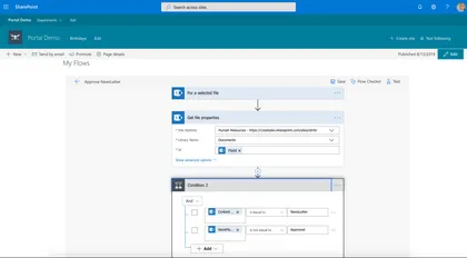
Manage current user flows in SharePoint or Teams Tab, this web part use the msflowsdk-1.1.js
Open this sample in the gallery (popup panel): Open in gallery
Source: https://github.com/pnp/sp-dev-fx-webparts/tree/main/samples/js-myflows
Form Settings Command View Set
This sample shows how you can redirect default SharePoint list forms (New,Edit,Display) to different pages.
Open this sample in the gallery (popup panel): Open in gallery
Source: https://github.com/pnp/sp-dev-fx-extensions/tree/main/samples/react-command-form-settings
React Jest Testing sample Web Part
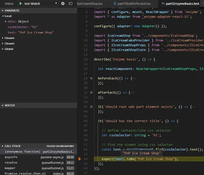
This sample uses the popular Jest Testing Framework with a SPFx client side solution. It is a SPFx-Jest-Enzyme-Sinon starter kit so you can start writing and debugging unit tests in typescript for your SPFx solution. The setup includes unit tests examples, code coverage reports in different formats, visual studio code unit test debug configurations for typescript, setting a coverage threshold (gates) for continuous integration and continuous deployment scenarios.
Modern Experience Theme Manager 2019 Web Part
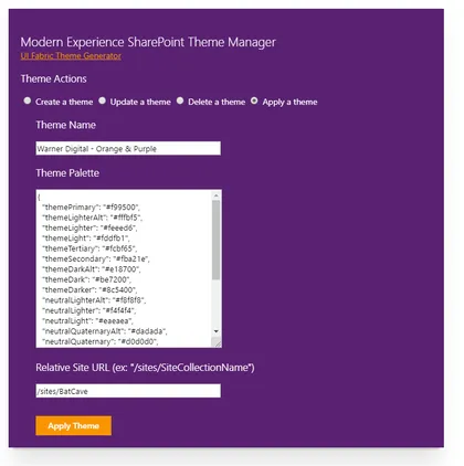
This sample web part provides a user interface for applying a Modern Experience theme in SharePoint 2019 on-premises.
Open this sample in the gallery (popup panel): Open in gallery
Source: https://github.com/pnp/sp-dev-fx-webparts/tree/main/samples/js-theme-manager-2019
VueJS Org Chart Web Part
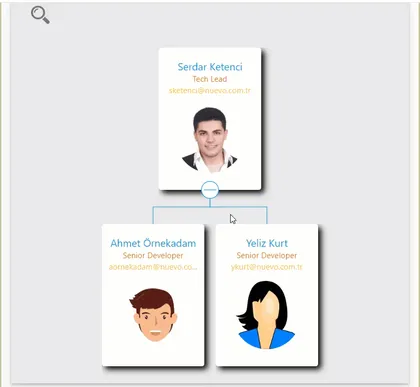
A simple Organisation Chart web part using Office UI Fabric, VueJS, REST API.
Open this sample in the gallery (popup panel): Open in gallery
Source: https://github.com/pnp/sp-dev-fx-webparts/tree/main/samples/vue-js-org-chart
GitHub Badge Web Part (React)
Displays information about a GitHub user.
Open this sample in the gallery (popup panel): Open in gallery
Source: https://github.com/pnp/sp-dev-fx-webparts/tree/main/samples/react-github-badge
React Functional Stateful Component web part
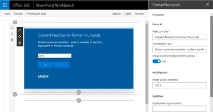
This web part demonstrates building a React functional component that includes state, using the recently introduced React Hooks feature. The example web part renders a number to Roman numerals conversion tool.
Open this sample in the gallery (popup panel): Open in gallery
Source: https://github.com/pnp/sp-dev-fx-webparts/tree/main/samples/react-functional-stateful-component
React Functional Component Web Part
This web part is intended to be easier to understand for new developers building their first SPFx web part. It is a refactoring of the HelloWorld web part that is created by the @microsoft/generator-sharepoint Yeoman generator, and introduces React Functional Components.
Open this sample in the gallery (popup panel): Open in gallery
Source: https://github.com/pnp/sp-dev-fx-webparts/tree/main/samples/react-functional-component
Clone ListView Command Set
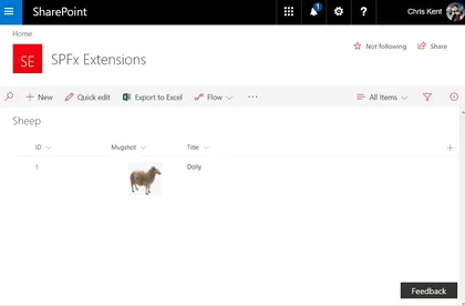
Sample SharePoint Framework listview command set extension that allows users to clone one or more list items. Demonstrates conditional visibility, PnPJS requests, PnPJS Batching, and field specific formats for rest operations.
Open this sample in the gallery (popup panel): Open in gallery
Source: https://github.com/pnp/sp-dev-fx-extensions/tree/main/samples/js-command-clone
Using multiple stores with React and Mobx Web Part
A sample web part that uses the Mobx library with multiple stores to keep track of the applications state.
Open this sample in the gallery (popup panel): Open in gallery
Source: https://github.com/pnp/sp-dev-fx-webparts/tree/main/samples/react-mobx-multiple-stores
Intranet Search Box

This demonstrates how to use an SPFx Application Customiser to inject an additional search box into the header of each page, which uses the “Search Settings” (at either the Site Collection or Sub-Site level) to determine the redirect page.
Open this sample in the gallery (popup panel): Open in gallery
Source: https://github.com/pnp/sp-dev-fx-extensions/tree/main/samples/js-application-intranet-searchbox
Teams Tab - Field Visit Web Part (Mashup)
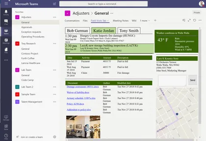
A web part for use in Microsoft Teams that displays a mashup of information partaining to customer visits.
Open this sample in the gallery (popup panel): Open in gallery
Source: https://github.com/pnp/sp-dev-fx-webparts/tree/main/samples/react-teams-tab-field-visit-mashup
Tag Teams using a TermSet in SharePoint
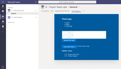
This sample shows how read and update a custom Schema extension in MS Graph to Tag a Team using metadata from a specific TermSet in SharePoint.
Open this sample in the gallery (popup panel): Open in gallery
Source: https://github.com/pnp/sp-dev-fx-webparts/tree/main/samples/react-teams-tagging
GitHub Badge Web Part
Open this sample in the gallery (popup panel): Open in gallery
Source: https://github.com/pnp/sp-dev-fx-webparts/tree/main/samples/js-gitHubBadge
Graph Usage Reports Web Part
This sample describe a SPFX application which retrieves an office 365 usage reports using Microsoft Graph API. This application also use chartjs library to generate graph.
Open this sample in the gallery (popup panel): Open in gallery
Source: https://github.com/pnp/sp-dev-fx-webparts/tree/main/samples/react-graph-reports
Site Designs Manager Web Part
This web part allows tenant administrators to manage site designs through a graphical interface.
Open this sample in the gallery (popup panel): Open in gallery
Source: https://github.com/pnp/sp-dev-fx-webparts/tree/main/samples/react-manage-sitedesigns
Skype Status Web Part
This sample demonstrates how to use the UCWA JS SDK for skype with the SharePoint Framework. It shows how to subscribe to status change of the different people of the organization but you can get much more information, checkout the documentation
Open this sample in the gallery (popup panel): Open in gallery
Source: https://github.com/pnp/sp-dev-fx-webparts/tree/main/samples/react-skype-status
JavaScript Skype Status Web Part
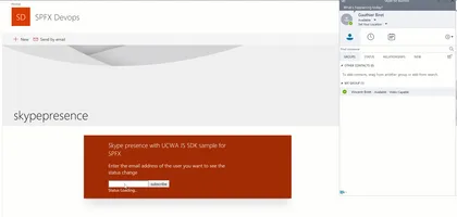
This sample demonstrates how to use the UCWA JS Sdk for skype in the SharePoint Framework. It shows how to subscribe to status change of the different people of the organization but you can get much more information, checkout the documentation
Open this sample in the gallery (popup panel): Open in gallery
Source: https://github.com/pnp/sp-dev-fx-webparts/tree/main/samples/js-skype-status
Material UI Web Part
This sample shows how you can use Material UI components in your SharePoint Framework solution. In this sample you will find some of the Material UI components like Table, Dialog, Text Field and Icon. This sample also includes RXJS DebounceTime, this feature allows you to wait for a certain amount of time before make requests to the server while user is typing to prevent to make requests for each character.
React Inversion Of Control Web Part with Unit Tests using Jest and Enzyme
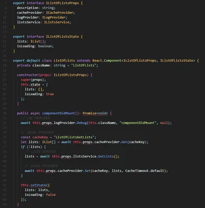
This web part is provided as an example of implementing an IoC (Inversion of Control) pattern in the context of a SharePoint Framework web part.
Open this sample in the gallery (popup panel): Open in gallery
Source: https://github.com/pnp/sp-dev-fx-webparts/tree/main/samples/react-ioc-tests
Logo Festoon
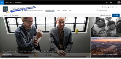
This simple SPFx extension can be used to decorate you SPO site logo with a festoon image of your choice. Keep users engaged by adding a personal touch to your site.
Open this sample in the gallery (popup panel): Open in gallery
Source: https://github.com/pnp/sp-dev-fx-extensions/tree/main/samples/react-application-logo-festoon
Supporting section backgrounds in your web parts
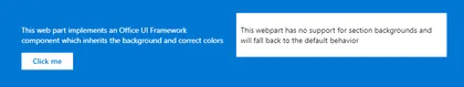
These samples show how to implement support for section backgrounds in your web parts.
Open this sample in the gallery (popup panel): Open in gallery
Source: https://github.com/pnp/sp-dev-fx-webparts/tree/main/samples/section-backgrounds
App settings web part
This sample shows how AppSettings.ts file can be added and used within SharePoint Framewrok webparts similar to the Web.config / App.config key value app settings in .NET Framework projects. That allows better DevOps and continuous integration (CI/CD) automation. The AppSettings.ts is transpiled/compiled with your SPFx solution which differs from the way the web.config. With .Net web.config file we would be able to update independently without the need of compiling DLLs. If that behavior is required, you can store your app settings in a SharePoint list and change them from there. However, that will have performance degradation over if the setting was part of the SPFx code where the logic can get a setting value in milliseconds.
Image Slider from Photo Gallery using Taxonomy Filter Web Part
This web part display the image in slider based on the filter of Taxonomy from Property panel. Images are stored in PhotoGallery and tagged with Taxonomy.
Open this sample in the gallery (popup panel): Open in gallery
Source: https://github.com/pnp/sp-dev-fx-webparts/tree/main/samples/react-image-slider-list-taxonomy-filter
Send Document With E-Mail
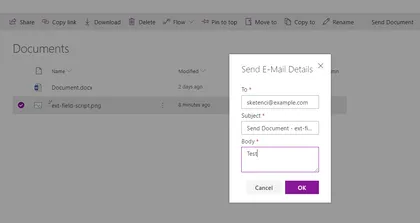
This sample shows how to create Custom Dialogs using @microsoft/sp-dialog package in the context of Command View Set and send selected document with e-mail.
Open this sample in the gallery (popup panel): Open in gallery
Source: https://github.com/pnp/sp-dev-fx-extensions/tree/main/samples/react-send-document
Public teams I'm not a member of Web Part
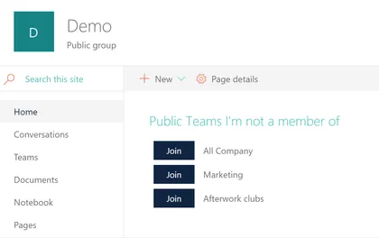
This web part lists all the public teams the current user is not yet a member of. They can then join any of those teams by clicking the button right next to the team name. This web part can also be added to Teams as a tab (built with the 1.7.1 plusbeta/preview version).
Open this sample in the gallery (popup panel): Open in gallery
Comparer Web Part with File Picker
Allows users to compare Before and After pictures, with a draggable slider. Implements a custom file picker.
Open this sample in the gallery (popup panel): Open in gallery
Source: https://github.com/pnp/sp-dev-fx-webparts/tree/main/samples/react-comparer
Optimize CSS/SCSS Style Bundling and Dynamic Loading of Styles
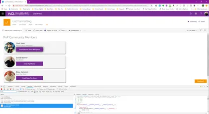
This example illustrates how style files can be dynamically bundled into multiple .js bundle files and then be individually imported at runtime.
Open this sample in the gallery (popup panel): Open in gallery
Web part displaying Google Fit information
This sample demonstrates integration of Google Fit information with SharePoint Framework. The Google Fitness REST APIs allows developers to extend it further and create their own dashboards. Google Fitness REST APIs are useful if you have fitness app and you want to integrate your data with google fit or if you just want to collect Fitness data and display some information to the users. This web part helps to display the key fitness information (activity time spent, distance travelled, calories burned, step count) from the Google fit data source.
Portal Footer Application Customizers

This application customizer provides you the ability to include a footer designed for communication sites.
Open this sample in the gallery (popup panel): Open in gallery
Source: https://github.com/pnp/sp-dev-fx-extensions/tree/main/samples/react-application-portal-footer
Web Part Using PnPJS with MS Graph
This web part demonstrates how to use PnPJS with SharePoint Framework and how to query Microsoft Graph with PnPJS. It requests a list of Azure AD groups at your tenant and shows them using Office UI Fabric React list.
Open this sample in the gallery (popup panel): Open in gallery
Source: https://github.com/pnp/sp-dev-fx-webparts/tree/main/samples/react-graph-pnpjs
Angular Elements with HTML Template File in SharePoint Framework

A sample web part illustrating how to use Angular Elements in the SharePoint Framework with the help of separate template HTML File.
Open this sample in the gallery (popup panel): Open in gallery
Source: https://github.com/pnp/sp-dev-fx-webparts/tree/main/samples/angularelements-html-templatefile
Get a direct link to a document or folder
Sample SharePoint Framework (SPFx) solution which gives the end-user the ability to just get a regular, simple link to a document or folder in the modern SharePoint document libraries. This is done using a CommandSet.
Open this sample in the gallery (popup panel): Open in gallery
Source: https://github.com/pnp/sp-dev-fx-extensions/tree/main/samples/react-command-direct-link
Displaying notification if a team is set as archived
This sample demonstrates how to check is current team linked to team site set as archived from Microsoft Graph API. If team is archived, notification is diplayed to end-user on header placeholder.
Open this sample in the gallery (popup panel): Open in gallery
ReactiveX (RxJs) Event Emitter Web Part
This sample shows how we can use the ReactiveX (RxJs) library with the SharePoint Framework to communicate between web parts through broadcasting events utilizing the Publish–subscribe pattern. It enables a web part or component to emit event (broadcast message) and that event is received by other web parts or components that have been subscribed to receive it. Please note this is custom implementation of the Publish–subscribe pattern by using the ReactiveX (RxJs) library. The SPFx will nativelly support this in future without the need of custom implementation through new SPFx api called Event Aggregator, but it is still in Alpha.
Dynamic Bundling Web Parts & Loading of SPFx Packages
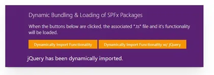
This sample illustrates how SPFx functionality and packages can be bundled in multiple ‘.js’ files then be dynamically & asynchronously loaded into the page at execution time, such as with a button click.
Open this sample in the gallery (popup panel): Open in gallery
Source: https://github.com/pnp/sp-dev-fx-webparts/tree/main/samples/js-dynamic-bundling-libraries
Teams Creator Web Part
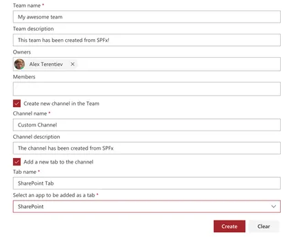
The web part illustrates usage of MS Graph beta APIs to work with Teams
Open this sample in the gallery (popup panel): Open in gallery
Source: https://github.com/pnp/sp-dev-fx-webparts/tree/main/samples/react-team-creator
Group members suggestion Web Part
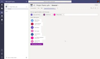
This web part uses Graph API to suggest you members to add to a group (based on People endpoint), so you can easily add those members to the Group / Teams. It can be used as a SharePoint web part or Teams tab
Open this sample in the gallery (popup panel): Open in gallery
Source: https://github.com/pnp/sp-dev-fx-webparts/tree/main/samples/react-teams-tab-suggested-members
Event Aggregator Sample (DEPRECATED)
This sample shows how we can use the SPFx Event Aggregator to communicate between web parts through broadcasting events utilizing the Publish–subscribe pattern. It enables a web part or component to raise event (broadcast message) through the SPFx event aggregator and that event is received by other web parts or components that have been subscribed to receive it.
Open this sample in the gallery (popup panel): Open in gallery
Sample web part showing the use of @pnp/sp library with Knockoutjs
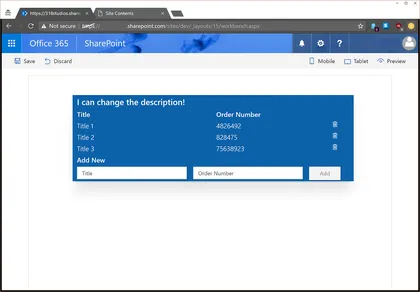
This web part demonstrates how to integrate the @pnp/sp library into the SharePoint Framework as well as including mock data and simple list I/O.
Open this sample in the gallery (popup panel): Open in gallery
Source: https://github.com/pnp/sp-dev-fx-webparts/tree/main/samples/knockout-sp-pnp-js
Mail Current View as Image
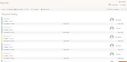
Sample SharePoint Framework list view command set extension that emails the current view to selected (external or internal user) and also saves the same image in SharePoint. Uses html2canvas library, pnp spfx controls, pnp js and office fabric ui react.
Open this sample in the gallery (popup panel): Open in gallery
Source: https://github.com/pnp/sp-dev-fx-extensions/tree/main/samples/react-command-mail-view-as-image
List Subscription Web Part
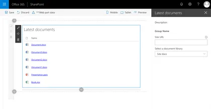
Sample web part illustrating using the SharePoint Framework List subscription capability, which allows you to get notified of changes to documents in a SharePoint Document Library and refresh the displayed data.
Open this sample in the gallery (popup panel): Open in gallery
Source: https://github.com/pnp/sp-dev-fx-webparts/tree/main/samples/react-realtime-documents
AAD Token Provider Bot Extension
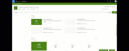
This sample demonstrates how to integrate a bot within a SharePoint Online portal supporting authentication to access Azure AD protected APIs like Microsoft graph resources. Behind the scenes, this sample uses the AADTokenProvider utility class provided with SPFx > 1.6.0 to seamlessly get an access token for the current user and send it to the bot. This way, the user is not prompted anymore for login to interact with the bot, improving overall experience.
Convert documents to PDF using Azure function
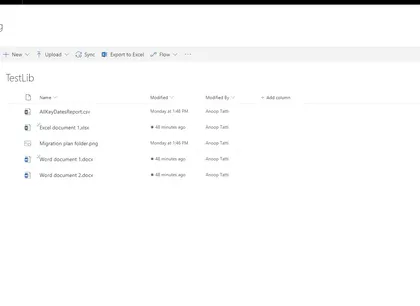
Sample SPFx list view command set extension that converts the selected documents to PDF using Microsoft Graph.
Open this sample in the gallery (popup panel): Open in gallery
Source: https://github.com/pnp/sp-dev-fx-extensions/tree/main/samples/js-command-convert-to-pdf
Displaying the current user permission with PNPJs
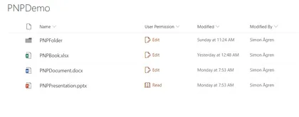
This sample shows how to use PNPJs to get the current users permission on the specific list item. Then a corresponding icon and text is shown in the field. For this sample I’m using simplified roles, so the code is is only checking for edit or read permissions.
Open this sample in the gallery (popup panel): Open in gallery
Source: https://github.com/pnp/sp-dev-fx-extensions/tree/main/samples/react-field-user-permission
Code Splitting in SharePoint Framework
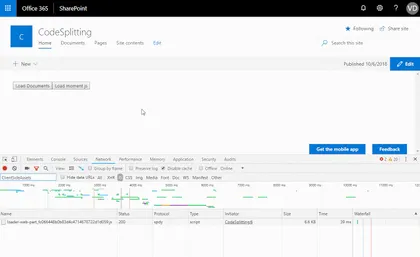
Load React components and third party packages on demand in SPFx
Open this sample in the gallery (popup panel): Open in gallery
Source: https://github.com/pnp/sp-dev-fx-webparts/tree/main/samples/react-components-dynamicloading
Personal e-mail Web Part
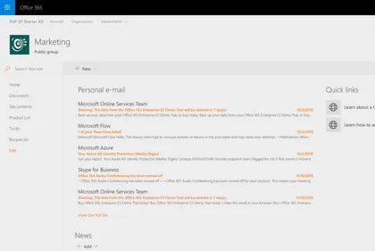
Sample React web part showing how to retrieve and display personal e-mail retrieved using the Microsoft Graph.
Open this sample in the gallery (popup panel): Open in gallery
Source: https://github.com/pnp/sp-dev-fx-webparts/tree/main/samples/react-graph-personalemail
Multishare Command Extension with PnPJs
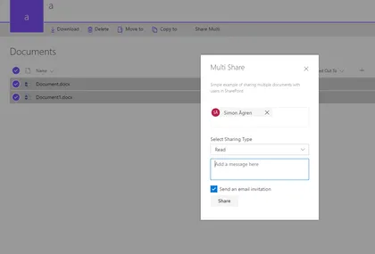
The sample is an custom action only active when multiple items are selected.
Open this sample in the gallery (popup panel): Open in gallery
Source: https://github.com/pnp/sp-dev-fx-extensions/tree/main/samples/react-command-share-pnpjs
Tenant Global NavBar
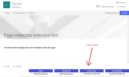
Sample SharePoint Framework application customizer to display the core metadata of a Site Page such as Author,Editor, Created date and Modified date in the footer of the page.
Open this sample in the gallery (popup panel): Open in gallery
Source: https://github.com/pnp/sp-dev-fx-extensions/tree/main/samples/react-application-sitepagecoremetadata
MSAL Bot Extension
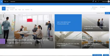
This sample demonstrates how to integrate a bot within a SharePoint Online portal supporting authentication to access Azure AD protected APIs like Microsoft graph resources. Behind the scenes, this sample implements the OAuth2 implicit grant flow using the MSAL JavaScript library.
Open this sample in the gallery (popup panel): Open in gallery
Source: https://github.com/pnp/sp-dev-fx-extensions/tree/main/samples/react-msal-bot
Local Azure Function and SPFx Web Part Development to consume third party APIs
This sample shows how to consume third-party APIs through an Azure Functions by a Web Part.
Open this sample in the gallery (popup panel): Open in gallery
Source: https://github.com/pnp/sp-dev-fx-webparts/tree/main/samples/react-azfunc-vimeo
Using @pnp/js with Async / Await
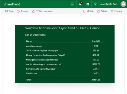
This web part demonstrates how to use PnPJS with Async functions into the SharePoint Framework as well as integrating PnP JS and SPFx Logging systems. Real example querying SharePoint library to show document sizes.
Open this sample in the gallery (popup panel): Open in gallery
Source: https://github.com/pnp/sp-dev-fx-webparts/tree/main/samples/react-async-await-sp-pnp-js
Taxonomy picker using Office UI Fabric Panel
Sample web part with Single and Multi-select taxonomy pickers using Office UI Fabric panel. The web part uses the Taxonomy API support available in the @pnp/taxonomy.
Open this sample in the gallery (popup panel): Open in gallery
Source: https://github.com/pnp/sp-dev-fx-webparts/tree/main/samples/react-taxonomypicker-panel
Discuss Now Command Set
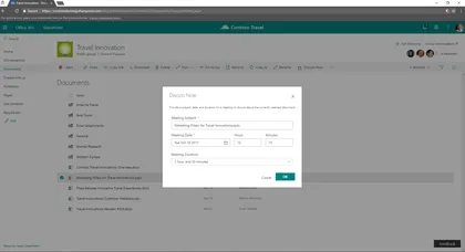
Sample SharePoint Framework command set showing how to create a new meeting to discuss about a document selected in the current list view of a document library.
Open this sample in the gallery (popup panel): Open in gallery
Source: https://github.com/pnp/sp-dev-fx-extensions/tree/main/samples/react-command-discuss-now
Aggregated Calendar Web part
This is a sample web part developed using React Framework to gather the aggregated events from the multiple calendars from multiple sites using Full Calendar from fullcalendar.io
Open this sample in the gallery (popup panel): Open in gallery
Source: https://github.com/pnp/sp-dev-fx-webparts/tree/main/samples/react-aggregated-calendar
Connecting SPFx Extensions with Web Parts using Dynamic Data
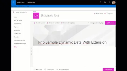
This example shows how to connect Spfx extensions with Spfx Webparts using Dynamic Data Feature
Open this sample in the gallery (popup panel): Open in gallery
Source: https://github.com/pnp/sp-dev-fx-extensions/tree/main/samples/react-application-search-dynamicdata
Read / update MS Graph Custom Schema Extensions Web Part
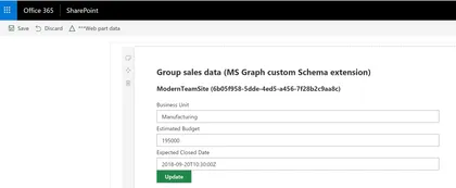
This sample shows how read and update a custom Schema extension in MS Graph. It shows how to create a custom Schema extension in Graph to store custom data related to an Office 365 Group, and how we can read and update that data using an spfx web part.
Open this sample in the gallery (popup panel): Open in gallery
Source: https://github.com/pnp/sp-dev-fx-webparts/tree/main/samples/react-graph-schema-extensions
Item History Web Part
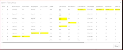
This listview command is used to show the past versions of the selected list item in a grid.
Open this sample in the gallery (popup panel): Open in gallery
Source: https://github.com/pnp/sp-dev-fx-webparts/tree/main/samples/react-item-History
Item History
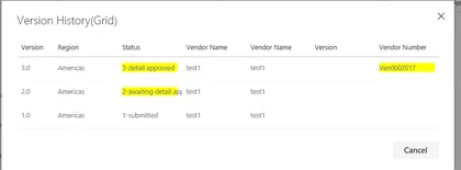
This listview command is used to show the past versions of the selected list item in a grid.
Open this sample in the gallery (popup panel): Open in gallery
Source: https://github.com/pnp/sp-dev-fx-extensions/tree/main/samples/react-item-History
Angular Elements in SPFx web parts

Set of sample web parts illustrating how to use Angular Elements in the SharePoint Framework.
Open this sample in the gallery (popup panel): Open in gallery
Source: https://github.com/pnp/sp-dev-fx-webparts/tree/main/samples/angularelements-helloworld
Content Query Web Part (On-Premises SharePoint)

The React Content Query Web Part is a modern version of the good old Content by Query Web Part that was introduced in SharePoint 2007. Built for SharePoint 2016 and Office 365, this modern version is built against the new SharePoint Framework (SPFx) and uses the latest Web Stack practices. While the original Web Part was based on a XSLT templating engine, this React Web Part is based on the well known Handlebars templating engine, which empowers users to create simple, yet powerfull HTML templates for rendering the queried content. This new version also lets the user query any site collections which resides on the same domain url, add unlimited filters, query DateTime fields to the nearest minute rather than being limited to a day, and much more.
Design Patterns applied to Sharepoint Framework

In software engineering, a design pattern is a general repeatable solution to a commonly occurring problem in software design. A design pattern isn’t a finished design that can be transformed directly into code. It is a description or template for how to solve a problem that can be used in many different situations.
Open this sample in the gallery (popup panel): Open in gallery
Source: https://github.com/pnp/sp-dev-fx-webparts/tree/main/samples/react-designpatterns-typescript
Using Redux-Form library and React
Sample web part to demonstrate the use of Redux-Form library with SPFx, React and Typescript. Demonstrates how to easily build a dynamic grid using redux-form.
Open this sample in the gallery (popup panel): Open in gallery
Source: https://github.com/pnp/sp-dev-fx-webparts/tree/main/samples/react-reduxform
World Time Web Part
This web part provides you the ability to display basic clock for a given time zone on a web page. The clock is based on the user’s workstation time with an offset from UTC to the selected time zone.
Open this sample in the gallery (popup panel): Open in gallery
Source: https://github.com/pnp/sp-dev-fx-webparts/tree/main/samples/react-world-time
Weather Information Web Part
This web part provides you the ability to display basic weather information for one location on a web page. The web part depends on a service provided by Yahoo Weather API.
Open this sample in the gallery (popup panel): Open in gallery
Source: https://github.com/pnp/sp-dev-fx-webparts/tree/main/samples/react-weather-information
Tiles Web Part
This web part provides you the ability to add a per instance listing of tiled links. Tiles are stored as a collection of tiles within the web part’s properties, removing the need for link storage within SharePoint lists, tenant properties, or other external link storage requirements.
Open this sample in the gallery (popup panel): Open in gallery
Source: https://github.com/pnp/sp-dev-fx-webparts/tree/main/samples/react-tiles
Stock Information Web Part
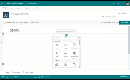
This web part provides you the ability to display basic stock information for one publicly traded stock on a web page. The web part may be configured to display a stock based on stock symbol as well as be set to automatically refresh the stock information every 60 (sixty) seconds.
Open this sample in the gallery (popup panel): Open in gallery
Source: https://github.com/pnp/sp-dev-fx-webparts/tree/main/samples/react-stock-information
Site Information Web Part
This web part provides you the ability to collect and present additional metadata on a web page for group associated team sites. The web part may be configured to display site title, a site contacts powered by a people picker, and a term from the term store, often used to provide classification for the site.
Open this sample in the gallery (popup panel): Open in gallery
Source: https://github.com/pnp/sp-dev-fx-webparts/tree/main/samples/react-site-information
Recently Visited Sites Web Part
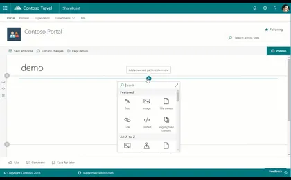
This web part provides you the ability to display a list of a particular user’s recently visited sites on a web page. The web part will display up to the first 30 (thirty) recently visited sites at a time. This web part is powered by the Microsoft Graph and currently requires that the Office 365 tenant be configured for targeted release for all users.
Open this sample in the gallery (popup panel): Open in gallery
Recently Used Documents Web Part
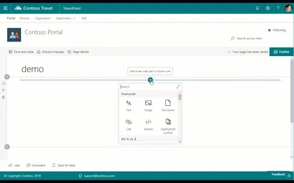
This web part provides you the ability to display a list of a particular user’s recently used documents on a web page. The web part may be configured to display a pre-defined number of documents at a time. This web part is powered by the Microsoft Graph and currently requires that the Office 365 tenant be configured for targeted release for all users.
Open this sample in the gallery (popup panel): Open in gallery
Recent Contacts Web Part

This web part provides you the ability to display list of a particular user’s recent contacts on a web page. The web part may be configured to display a pre-defined number of contacts at a time. This web part is powered by the Microsoft Graph and currently requires that the Office 365 tenant be configured for targeted release for all users.
Open this sample in the gallery (popup panel): Open in gallery
Personal Tasks Web Part
This web part provides you the ability to add a particular user’s personal tasks on a web page. The web part may be configured to show all tasks or to exclude completed tasks. This web part is powered by the Microsoft Graph and currently requires that the Office 365 tenant be configured for targeted release for all users.
Open this sample in the gallery (popup panel): Open in gallery
Personal Email Web Part
This web part provides you the ability to add a particular user’s personal email on a web page. The web part may be configured to display a pre-defined number of emails at a time and includes a link to the user’s Outlook to view all email. This web part is powered by the Microsoft Graph and currently requires that the Office 365 tenant be configured for targeted release for all users.
Personal Contacts Web Part
This web part provides you the ability to add a particular user’s personal contacts on a web page. The web part may be configured to display a pre-defined number of contacts at a time. This web part is powered by the Microsoft Graph and currently requires that the Office 365 tenant be configured for targeted release for all users.
Open this sample in the gallery (popup panel): Open in gallery
Personal Calendar Web Part
This web part provides you the ability to add a particular user’s personal calendar on a web page. The web part may be configured to automatically refresh, as well as display up to seven days of events and a pre-defined number of events at a time. This web part is powered by the Microsoft Graph and currently requires that the Office 365 tenant be configured for targeted release for all users.
People Directory Web Part
This web part provides you the ability to add a searchable people directory. A people search box and alphabet list are provided to enable both searching by name as well as selecting a specific letter. This web part requires no configuration and utilizes the people search API to surface people results.
Open this sample in the gallery (popup panel): Open in gallery
Source: https://github.com/pnp/sp-dev-fx-webparts/tree/main/samples/react-people-directory
LOB Integration web part
This web part allows you to learn how to consume 3rd party APIs, secured with Azure Active Directory, in the context of SharePoint Framework.
Open this sample in the gallery (popup panel): Open in gallery
Source: https://github.com/pnp/sp-dev-fx-webparts/tree/main/samples/react-lob-integration
Links web part
This web part provides you the ability to add a per instance listing of links with the ability to group sets of links. Links are stored as a collection of links within the web part’s properties, removing the need for link storage within SharePoint lists, tenant properties, or other external link storage requirements.
Open this sample in the gallery (popup panel): Open in gallery
Source: https://github.com/pnp/sp-dev-fx-webparts/tree/main/samples/react-links
Banner Web Part

This web part provides you the ability to add a variable height image banner with a linkable title.
Open this sample in the gallery (popup panel): Open in gallery
Source: https://github.com/pnp/sp-dev-fx-webparts/tree/main/samples/react-banner
Sites in Hub site switcher
This sample shows how to get the sites that are part of a Hub Site, and renders a drop down to jump directly into a site. The customiser only renders if the site is a Hub site.
Open this sample in the gallery (popup panel): Open in gallery
Sitepages Metadata Web Part
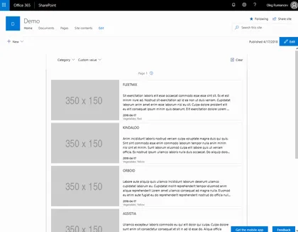
Solution provides an enhancement to SitePages library that enables updating existing items with metadata, and a rollup Web Part to display them.
Open this sample in the gallery (popup panel): Open in gallery
Source: https://github.com/pnp/sp-dev-fx-webparts/tree/main/samples/react-sitepages-metadata
Web part showing Url validation for SharePoint using Office Graph
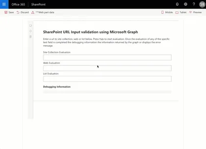
This sample contains a class that evaluates the url input of a text field against the Microsoft Graph.
Open this sample in the gallery (popup panel): Open in gallery
Source: https://github.com/pnp/sp-dev-fx-webparts/tree/main/samples/react-graph-evalurl
Menu Footer Classic Modern
This is a sample showing how to create custom headers and footers that work on classic pages using JavaScript injection, and on modern pages using a SharePoint Framework Application Customizer extension.
Open this sample in the gallery (popup panel): Open in gallery
Source: https://github.com/pnp/sp-dev-fx-extensions/tree/main/samples/react-menu-footer-classic-modern
Web Part with Handlebars.js

This sample demonstrate how to set up SPFX to use Handlebars through webpack loader.
Open this sample in the gallery (popup panel): Open in gallery
Source: https://github.com/pnp/sp-dev-fx-webparts/tree/main/samples/handlebarsjs-webpack-loader
Consuming Third Party APIs secured with Azure Active Directory within SharePoint Framework Web Part
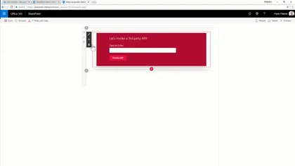
This sub folders contains a client-side project that shows how to consume a 3rd party API within SharePoint Framework.
Open this sample in the gallery (popup panel): Open in gallery
Source: https://github.com/pnp/sp-dev-fx-webparts/tree/main/samples/react-3rd-party-api
Modern Team Sites (Office Groups) Navigation
The sample illustrates how to use AadHttpClient to request Groups information from Microsoft Graph
Open this sample in the gallery (popup panel): Open in gallery
Source: https://github.com/pnp/sp-dev-fx-extensions/tree/main/samples/react-application-office-groups-nav
Groups external links
This sample shows how to render a header navbar with some external links related to the Group the site is in, i.e Group calendar, Notebook, Inbox, People…
Open this sample in the gallery (popup panel): Open in gallery
Source: https://github.com/pnp/sp-dev-fx-extensions/tree/main/samples/react-application-grouplinks
Export Selected Items to Excel
Exports selected items to excel spreadsheet in xlsx format, with the columns from the current modern list view.
Open this sample in the gallery (popup panel): Open in gallery
Source: https://github.com/pnp/sp-dev-fx-extensions/tree/main/samples/js-command-selecteditems-export
File Upload Web Part
The file upload web part allowing users to upload multiple files to a document library or as item attachments.
Open this sample in the gallery (popup panel): Open in gallery
Source: https://github.com/pnp/sp-dev-fx-webparts/tree/main/samples/react-file-upload
TinyMCE Editor Web Part Integration with SharePoint
React TinyMCE is one of the worlds most popular editors for the web. It has many features out of the box and many more plugins that can be added when needed. You can create your own plugins if you want, the editor is powered by the communitiy.
Open this sample in the gallery (popup panel): Open in gallery
Source: https://github.com/pnp/sp-dev-fx-webparts/tree/main/samples/react-tinymce
Weather SharePoint Framework field customizer
Sample SharePoint Framework field customizer showing weather conditions for the given location.
Open this sample in the gallery (popup panel): Open in gallery
Source: https://github.com/pnp/sp-dev-fx-extensions/tree/main/samples/js-field-weather
Field Customiser sample using Text Analytics API
This sample shows how to use the Text Analytics API (Cognitive Services) to render a sentiment icon based on the text of a field in the List. The language is also auto-detected using the API, so it works with text based in any language supported by the API.
Open this sample in the gallery (popup panel): Open in gallery
Source: https://github.com/pnp/sp-dev-fx-extensions/tree/main/samples/react-field-text-analytics-api
Overdue Tasks Application Customizer
The sample illustrates how to display a warning message that current user has overdue tasks.
Open this sample in the gallery (popup panel): Open in gallery
Source: https://github.com/pnp/sp-dev-fx-extensions/tree/main/samples/react-application-duetasks
Lock Item Command Set Customizer
The sample illustrates the ability to lock/unlock selected item/document for the current user. The lock is implemented as item’s unique permissions set to Full Control for current user only. The lock is available only for items that inherit permissions from the parent. Items with unique permissions can’t be locked as we can’t unlock them correctly later on. All other permissions are deleted. The Command is available only for users who have “Manage Permissions” permissions for the list/document library.
People Picker Web Part
SharePoint Framework solution with the Office UI Fabric People Picker, the client web part across the SharePoint Rest API is able to retrieve people and groups.
Open this sample in the gallery (popup panel): Open in gallery
Source: https://github.com/pnp/sp-dev-fx-webparts/tree/main/samples/react-peoplepicker
Webhooks Notification Application Customizer
Sample SharePoint Framework application customizer showing how to leverage the SharePoint webhooks capabilities, in order to show toast notifications. The libraries used by this solution are Socket.io, sp pnp js, moment.
Open this sample in the gallery (popup panel): Open in gallery
Webhooks Realtime
This web part demonstrates how to leverage the capabilities of SharePoint Webhooks. The libraries used by this web part are Socket.io, sp pnp js, moment.
Open this sample in the gallery (popup panel): Open in gallery
Source: https://github.com/pnp/sp-dev-fx-webparts/tree/main/samples/react-webhooks-realtime
Unique Item Permissions Command Set Customizer
The sample illustrates creation of a shortcut command to redirect user to selected item’s permission page.
Open this sample in the gallery (popup panel): Open in gallery
Source: https://github.com/pnp/sp-dev-fx-extensions/tree/main/samples/js-command-item-permissions
Run Once SharePoint Framework application customizer
Sample SharePoint Framework application customizer showing how you can run code once, and then remove the customizer at the end. The code as-is expects to be installed as a site scoped custom action.
Open this sample in the gallery (popup panel): Open in gallery
Source: https://github.com/pnp/sp-dev-fx-extensions/tree/main/samples/js-application-run-once
Azure Active Directory invitation manager Graph API samples
Sample SharePoint Framework web parts built using React illustrating the possibility to use Graph API to invite external users into the Azure Active Directory.
Open this sample in the gallery (popup panel): Open in gallery
Source: https://github.com/pnp/sp-dev-fx-webparts/tree/main/samples/react-invitation-manager
Toggle Field Customizer
In this sample is possible to see how to implement Office UI Fabric React Toggle for the field yes/no through SPFx Extensions Field Customizers to modify in a quick way (inline editing) a list without opening the list item.
Open this sample in the gallery (popup panel): Open in gallery
Source: https://github.com/pnp/sp-dev-fx-extensions/tree/main/samples/react-field-toggle
Regions Footer Application Customizer
Sample SharePoint Framework application customizer showing how to create a custom footer for modern pages, in order to show data about an area manager for a specific region.
Open this sample in the gallery (popup panel): Open in gallery
Source: https://github.com/pnp/sp-dev-fx-extensions/tree/main/samples/react-application-regions-footer
Custom Command Bar Command Set Customizer
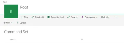
The sample illustrates how to display custom Command Bar when Command Set Button is pressed.
Open this sample in the gallery (popup panel): Open in gallery
Source: https://github.com/pnp/sp-dev-fx-extensions/tree/main/samples/react-command-custom-command-bar
Image Magnifier Web Part
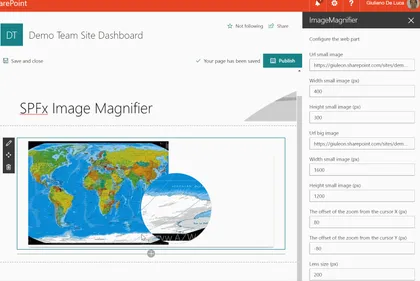
This web part allow to magnify an image, displaying a resolution more detailed through a lens.
Open this sample in the gallery (popup panel): Open in gallery
Source: https://github.com/pnp/sp-dev-fx-webparts/tree/main/samples/react-image-magnifier
List-Driven Placeholders
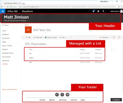
This solution deploys a list that allows end users to manage content that will appear in placeholders, via a SharePoint Framework application customizer extension.
Open this sample in the gallery (popup panel): Open in gallery
Source: https://github.com/pnp/sp-dev-fx-extensions/tree/main/samples/js-application-listdrivenplaceholders
Slider Field Customizer
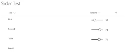
The sample illustrates how to use Office UI Fabric React Slider in Field Customizer with permissions-base inline editing
Open this sample in the gallery (popup panel): Open in gallery
Source: https://github.com/pnp/sp-dev-fx-extensions/tree/main/samples/react-field-slider
Priority Field SharePoint Framework field customizer
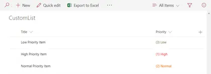
Sample SharePoint Framework field customizer that shows how to apply conditional color formatting to the values in a Priority field based on their value.
Open this sample in the gallery (popup panel): Open in gallery
Source: https://github.com/pnp/sp-dev-fx-extensions/tree/main/samples/js-field-taskpriority
Handling Multiple Editions of SPFx Solution

This sample shows possible approach of handling multiple editions (e.g. trial, lite, full) of SharePoint Framework solution.
Open this sample in the gallery (popup panel): Open in gallery
Source: https://github.com/pnp/sp-dev-fx-webparts/tree/main/samples/js-solution-editions
Organisation Chart Web Part
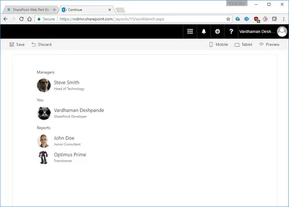
A simple Organisation Chart web part using Office UI Fabric, React, REST API batching and ServiceScope plumbing.
Open this sample in the gallery (popup panel): Open in gallery
Source: https://github.com/pnp/sp-dev-fx-webparts/tree/main/samples/react-organisationchart
File Upload web part using AngularJs
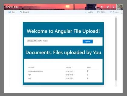
File Update/Delete web part using AngularJs and ngOfficeUIFabric with the SharePoint Framework.
Open this sample in the gallery (popup panel): Open in gallery
Source: https://github.com/pnp/sp-dev-fx-webparts/tree/main/samples/angular-ngofficeuifabric-file-upload
Using React, Redux and ImmutableJS
SharePoint Framework web part which uses Redux to maintain a single state for the entire application and ImmutableJS to create performant state trees.
Open this sample in the gallery (popup panel): Open in gallery
Source: https://github.com/pnp/sp-dev-fx-webparts/tree/main/samples/react-redux-async-immutablejs
Using PnP JS Core custom objects with @select and @expand decorators

This web part demonstrates how to use PnP JS Core Custom Objects with @select and @expand TypeScript decorators.
Open this sample in the gallery (popup panel): Open in gallery
Source: https://github.com/pnp/sp-dev-fx-webparts/tree/main/samples/react-sp-pnp-js-property-decorators
Announcements SharePoint Framework application customizer
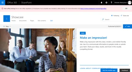
Sample SharePoint Framework application customizer showing urgent organizational announcements.
Open this sample in the gallery (popup panel): Open in gallery
Source: https://github.com/pnp/sp-dev-fx-extensions/tree/main/samples/react-app-announcements
Directions SharePoint Framework list view command set
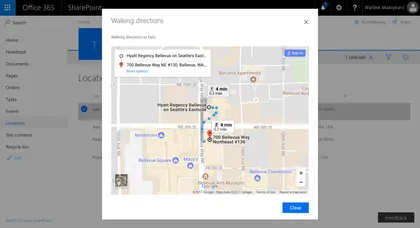
Sample SharePoint Framework list view command set showing travel directions to the given location using Google Maps.
Open this sample in the gallery (popup panel): Open in gallery
Source: https://github.com/pnp/sp-dev-fx-extensions/tree/main/samples/react-command-directions
Conditional formatting SharePoint Framework field customizer
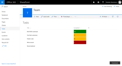
Sample SharePoint Framework field customizer that applies Excel-like conditional formatting to numeric fields based on their values.
Open this sample in the gallery (popup panel): Open in gallery
Source: https://github.com/pnp/sp-dev-fx-extensions/tree/main/samples/js-field-conditionalformatting
Display Employee Spotlight JavaScript Client-Side Web Part
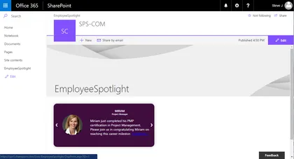
Simple Web Part that demonstrates the use of SharePoint Framework for showcasing Employee Spotlight. The web part pulls data from a configured list and User Profile service. The properties pane for this web part has 5 cascading dropdowns.
Open this sample in the gallery (popup panel): Open in gallery
Source: https://github.com/pnp/sp-dev-fx-webparts/tree/main/samples/js-employee-spotlight
GraphClient from Modern Teamsite
Simple example to call the Graph via the new GraphHttpClient (No ADAL) for getting the group title, mail, and description.
Open this sample in the gallery (popup panel): Open in gallery
Source: https://github.com/pnp/sp-dev-fx-extensions/tree/main/samples/js-application-graph-client
Offline First Web part built using LocalForage, Whatwg-Fetch, ES6-Promise
Sample SharePoint Framework Client-Side Web Parts built using React showing interacting with the Office Graph.
Open this sample in the gallery (popup panel): Open in gallery
Source: https://github.com/pnp/sp-dev-fx-webparts/tree/main/samples/react-offline-first
Office Graph Web Part samples
Open this sample in the gallery (popup panel): Open in gallery
Source: https://github.com/pnp/sp-dev-fx-webparts/tree/main/samples/react-officegraph
Knockout Dependent Properties
Sample Web Part illustrating…
Open this sample in the gallery (popup panel): Open in gallery
Source: https://github.com/pnp/sp-dev-fx-webparts/tree/main/samples/knockout-dependent-properties
Side Panel Client-Side Web Part
The web part illustrates creation and usage of Side Panel (Sidebar) control.
Open this sample in the gallery (popup panel): Open in gallery
Source: https://github.com/pnp/sp-dev-fx-webparts/tree/main/samples/react-side-panel
SharePoint Themes Client Side Web Part
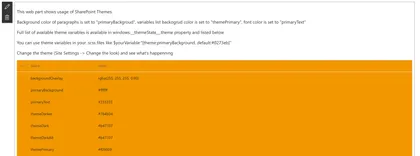
This web part illustrates how to use SharePoint Theme variables in custom web parts.
Open this sample in the gallery (popup panel): Open in gallery
Source: https://github.com/pnp/sp-dev-fx-webparts/tree/main/samples/react-themes
Taxonomy Web Part
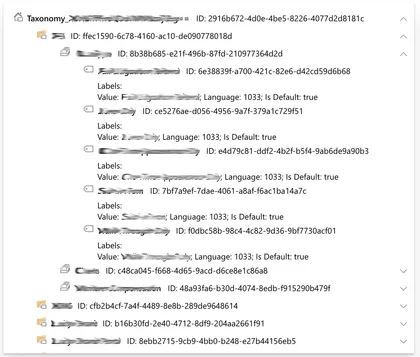
Sample Web Part illustrating Reading taxonomy term stores’ hierarchy from SharePoint, Loading JavaScript Object Model scripts, creating Knockout components
Open this sample in the gallery (popup panel): Open in gallery
Source: https://github.com/pnp/sp-dev-fx-webparts/tree/main/samples/knockout-taxonomy
Call custom APIs secured with Azure Active Directory without ADAL JS
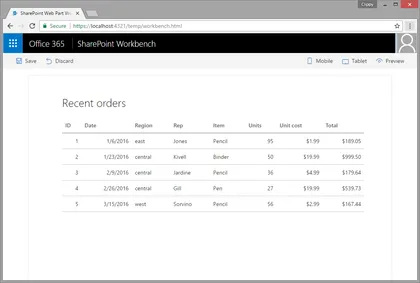
Sample SharePoint Framework client-side web part showing how to access a custom API secured with Azure Active Directory (AAD) without using ADAL JS.
Open this sample in the gallery (popup panel): Open in gallery
Source: https://github.com/pnp/sp-dev-fx-webparts/tree/main/samples/aad-api-spo-cookie
Todo Basic Web Part
A simple todo web part built using react to showcase some of the SharePoint Framework developer features, utilities and best practices in building react based web parts.
Open this sample in the gallery (popup panel): Open in gallery
Source: https://github.com/pnp/sp-dev-fx-webparts/tree/main/samples/react-todo-basic
Multi-page client-side web part

Sample SharePoint Framework client-side web parts built using React illustrating building multi-page web parts.
Open this sample in the gallery (popup panel): Open in gallery
Source: https://github.com/pnp/sp-dev-fx-webparts/tree/main/samples/react-multipage
List RiotJS Client-Side Web Part
Simplistic sample Web Part that demonstrates the use of RiotJS in creating a SharePoint Framework web part.
Open this sample in the gallery (popup panel): Open in gallery
Source: https://github.com/pnp/sp-dev-fx-webparts/tree/main/samples/riot-list
Bootstrap Slider Web Part Built with jQuery v1.x and Boostrap v3.x
Sample bootstrap slider which pulls the slides from a list inside the SharePoint site. The list is automatically deployed once the app is installed in the SharePoint site.
Open this sample in the gallery (popup panel): Open in gallery
Source: https://github.com/pnp/sp-dev-fx-webparts/tree/main/samples/bootstrap-slider
Yammer REST API web part
This sample shows how Yammer REST APIs can be consumed by using SharePoint Framework React web part and the Yammer JavaScript SDK. The SPFx web part contains wrapper around the Yammer JavaScript SDK that can be extended for fluent typescript api experience.
Open this sample in the gallery (popup panel): Open in gallery
Source: https://github.com/pnp/sp-dev-fx-webparts/tree/main/samples/react-yammer-api
Angular MS Graph Web Part Built with Angular v1.x
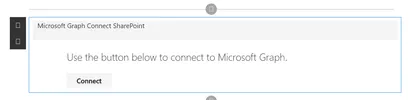
This is a sample MS Graph web part that connects to Microsoft Graph and pulls SharePoint information from your tenant. It will first pull the root site collection (currently a limitation by Microsoft Graph), then it will display all the lists associated with the site followed by all the items inside the list.
Open this sample in the gallery (popup panel): Open in gallery
Taxonomy Picker Web Part
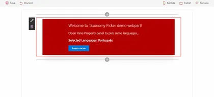
A Taxonomy Picker control built with React based on react-taxonomypicker for use with SharePoint Framework client-side web parts (SPFx).
Open this sample in the gallery (popup panel): Open in gallery
Source: https://github.com/pnp/sp-dev-fx-webparts/tree/main/samples/react-taxonomypicker
Call custom Web API secured with AAD from SharePoint Framework client-side web part using Angular v1.x
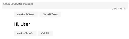
Sample SharePoint Framework client-side web part illustrating communication with a custom Web API secured with Azue Active Directory using Angular v1.x
Open this sample in the gallery (popup panel): Open in gallery
Source: https://github.com/pnp/sp-dev-fx-webparts/tree/main/samples/angular-aad-webapi
Microsoft Authentication Library (MSAL JS) authentication sample
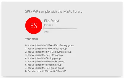
Open this sample in the gallery (popup panel): Open in gallery
Source: https://github.com/pnp/sp-dev-fx-webparts/tree/main/samples/react-msal-msgraph
Azure Active Directory implicit flow authentication sample web parts
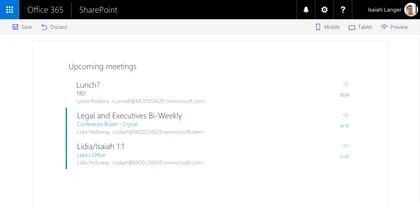
Sample SharePoint Framework web parts built using React illustrating different scenarios using implicit OAuth flow with Azure Active Directory.
Open this sample in the gallery (popup panel): Open in gallery
Source: https://github.com/pnp/sp-dev-fx-webparts/tree/main/samples/react-aad-implicitflow
Angular client-side web part
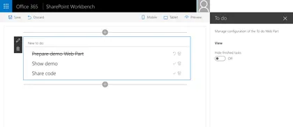
Sample Web Part illustrating using Angular with the SharePoint Framework.
Open this sample in the gallery (popup panel): Open in gallery
Source: https://github.com/pnp/sp-dev-fx-webparts/tree/main/samples/angular-todo
Search Client-Side Web Part built with React and Flux
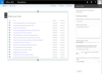
Sample Search Web Part with internal and external template support. This sample illustrates how you can use React and Flux within the SharePoint Framework.
Open this sample in the gallery (popup panel): Open in gallery
Source: https://github.com/pnp/sp-dev-fx-webparts/tree/main/samples/react-search
Deployment of SharePoint assets as part of SPFx package
Simplistic solution demonstrating how to provision SharePoint assets using Feature Framework elements when SharePoint Framework solution is being deployed to a SharePoint site.
Open this sample in the gallery (popup panel): Open in gallery
Source: https://github.com/pnp/sp-dev-fx-webparts/tree/main/samples/react-feature-framework
QnA Chatbot
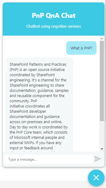
SPFx application extension that uses Azure QnA cognitive services to efficiently answer FAQs.
Open this sample in the gallery (popup panel): Open in gallery
Source: https://github.com/pnp/sp-dev-fx-extensions/tree/main/samples/react-application-qna-chat
Search Client-Side Web Part Built with Angular v1.x
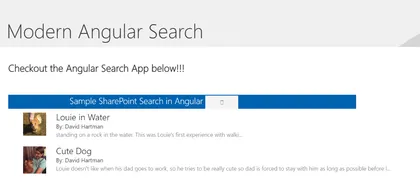
This is a sample search web part that illustrates how you can use Angular within the new SharePoint Framework
Open this sample in the gallery (popup panel): Open in gallery
Source: https://github.com/pnp/sp-dev-fx-webparts/tree/main/samples/angular-search
Integrating custom gulp tasks to SharePoint Framework toolchain

SharePoint client-side development tools use gulp as the build process task runner to…
Open this sample in the gallery (popup panel): Open in gallery
Source: https://github.com/pnp/sp-dev-fx-webparts/tree/main/samples/js-extend-gulp
Extending webpack in the SharePoint Framework toolchain

This sample shows how to use the webpack markdown-loader to preprocess markdown files to HTML string.
Open this sample in the gallery (popup panel): Open in gallery
Source: https://github.com/pnp/sp-dev-fx-webparts/tree/main/samples/js-extend-webpack
Angular2 Web Part Prototype
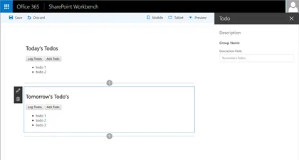
Sample To Do Web Part built with Angular2. This sample illustrates how you can use Angular2 with the SharePoint Framework.
Open this sample in the gallery (popup panel): Open in gallery
Source: https://github.com/pnp/sp-dev-fx-webparts/tree/main/samples/angular2-prototype
Video Library Web Part
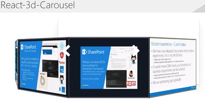
A set of 3 SPFX webparts that use different open-source carousels (react-3d-carousel, reactjs-coverface, and react-slick) to display videos stored on an Office 365 Video Channel
Open this sample in the gallery (popup panel): Open in gallery
Source: https://github.com/pnp/sp-dev-fx-webparts/tree/main/samples/react-videolibrary
Multi-list Grid Web Part
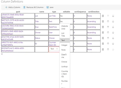
React-multilist-grid is an SPFX web part that uses React, Office-UI-Fabric, and Redux to let users edit list data from lists that reside in multiple webs and multiple sites in a single grid, similar to Quick Edit mode. The lists do not to be of the same type – you just need to create column mappings to tell the web part which fields to show in which columns of the grid.
Using React and Mobx Web Part
Sample web part implementation that uses Mobx to keep track of its state.
Open this sample in the gallery (popup panel): Open in gallery
Source: https://github.com/pnp/sp-dev-fx-webparts/tree/main/samples/react-mobx
Real Time News Feed Web Part using Azure Logic Apps, Node.js and socket.io
This sample shows you how to implement real time web parts using the SPFx, Azure Logic Apps, Node.js and socket.io.
Open this sample in the gallery (popup panel): Open in gallery
Source: https://github.com/pnp/sp-dev-fx-webparts/tree/main/samples/react-real-time
Angular multi-page client-side web part
This is a sample SharePoint Framework client-side web part built using Angular, illustrating building multi-page web parts.
Open this sample in the gallery (popup panel): Open in gallery
Source: https://github.com/pnp/sp-dev-fx-webparts/tree/main/samples/angular-multipage
Using React and Redux
Sample web part implementation that uses Redux to keep track of its state.
Open this sample in the gallery (popup panel): Open in gallery
Source: https://github.com/pnp/sp-dev-fx-webparts/tree/main/samples/react-redux
Migrating existing Angular applications to SPFx web parts
This is a sample Angular application before and after it has been migrated to a SharePoint Framework client-side web part.
Open this sample in the gallery (popup panel): Open in gallery
Source: https://github.com/pnp/sp-dev-fx-webparts/tree/main/samples/angular-migration
Communicate using elevated privileges with SharePoint
Sample SharePoint Framework client-side web part illustrating communication with SharePoint using elevated privileges through a custom Web API.
Open this sample in the gallery (popup panel): Open in gallery
Source: https://github.com/pnp/sp-dev-fx-webparts/tree/main/samples/react-sp-elevatedprivileges
Call custom Web API secured with AAD from SharePoint Framework client-side web part
Sample SharePoint Framework client-side web part illustrating communication with a custom Web API secured with Azure Active Directory.
Open this sample in the gallery (popup panel): Open in gallery
Source: https://github.com/pnp/sp-dev-fx-webparts/tree/main/samples/react-aad-webapi
Web Part Using jQuery loaded from CDN
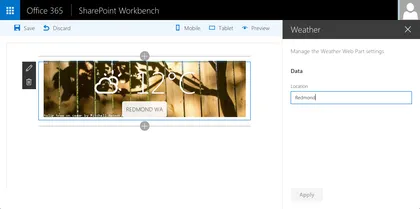
This is a sample web Part that illustrates the use of jQuery and its plugins loaded from CDN for building SharePoint Framework client-side web parts.
Open this sample in the gallery (popup panel): Open in gallery
Source: https://github.com/pnp/sp-dev-fx-webparts/tree/main/samples/jquery-cdn
Embed a PowerBI report in a Client-Side Web Part
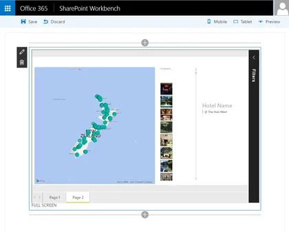
This sample SharePoint Framework client-side web part embedding a PowerBI report using PowerBI Embedded without any server-side code.
Open this sample in the gallery (popup panel): Open in gallery
Source: https://github.com/pnp/sp-dev-fx-webparts/tree/main/samples/js-powerbi-embedded
JQuery, Photopile.JS & Office UI Fabric Client-Side Web Part
This is a sample web part that illustrated the use of JQuery and Photopile.Js with the SharePoint Framework.
Open this sample in the gallery (popup panel): Open in gallery
Source: https://github.com/pnp/sp-dev-fx-webparts/tree/main/samples/jquery-photopile
Angular & ngOfficeUIFabric Client-Side Web Part

Illustrates the use of Angular and ngOfficeUIFabric with the SharePoint Framework.
Open this sample in the gallery (popup panel): Open in gallery
Source: https://github.com/pnp/sp-dev-fx-webparts/tree/main/samples/angular-ngofficeuifabric-todo