
Copilot UX component
Choice Relay
Follow a user choice from Copilot into SPFx, back into the conversation, and into a second interactive component.

- Updated
- July 29, 2026
- Built with
- React
- SPFx version
- 1.24.0-beta.2
- Products
- SharePoint, Microsoft Copilot
Overview
What this sample demonstrates
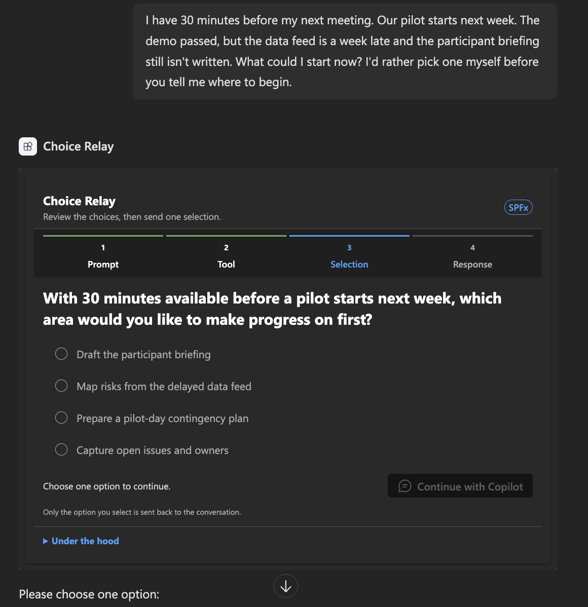
Choice Relay is a compact teaching sample with two SharePoint Framework Copilot Components. Copilot generates typed arguments for an interactive choice component, the user selects one option locally, and the component sends that selection back as a readable user turn.
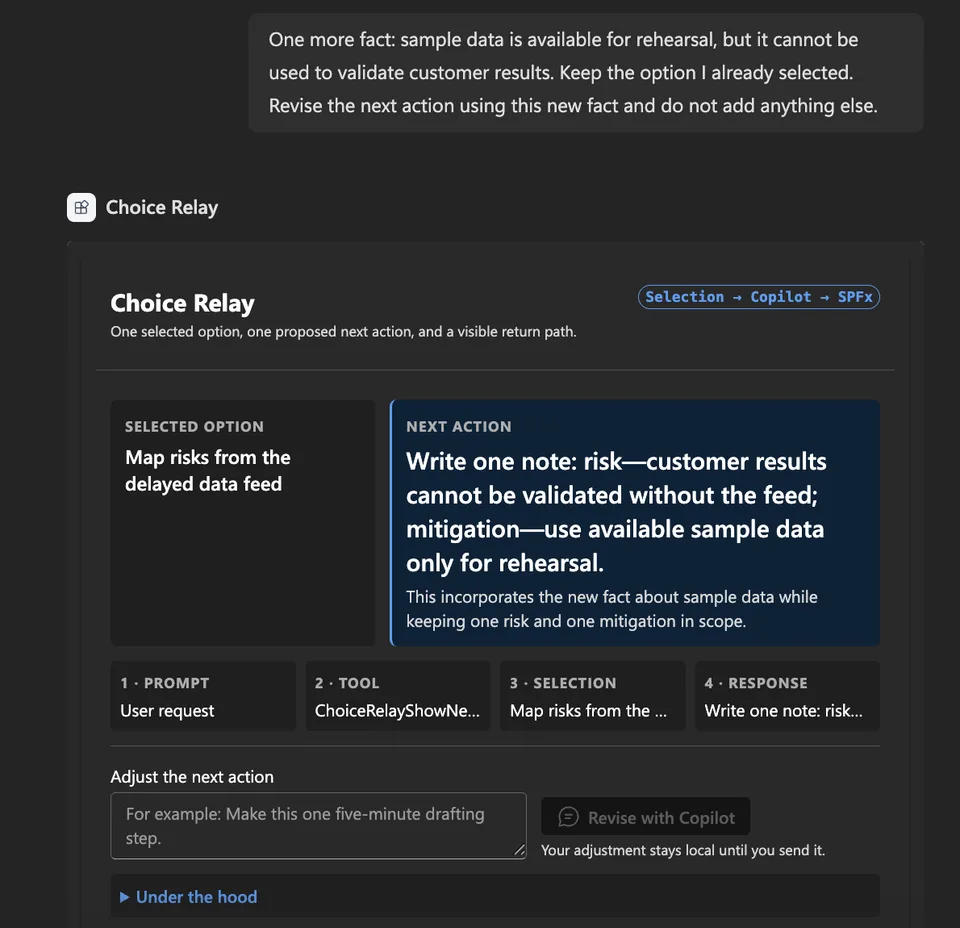
Copilot can then select a second tool and render one grounded next action. The sample also demonstrates revisions initiated from either the SPFx component or the normal Copilot composer, with a collapsed inspector that makes tool input, host context, and outbound messages visible.
Gallery
See the component in action


Documentation
Setup and implementation
Summary
Choice Relay demonstrates both directions of the exchange between an SPFx Copilot Component and the Copilot conversation.
Copilot → SPFx. A prompt produces typed arguments and a component renders.
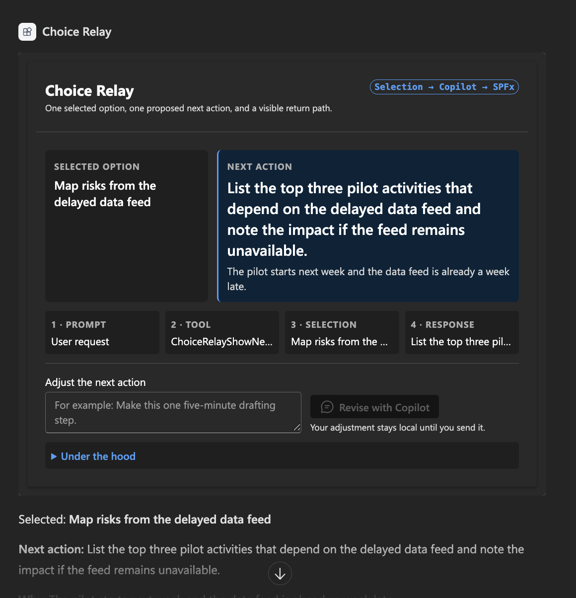
SPFx → Copilot. A choice made locally in React is posted back into the conversation as a readable user turn, and that turn causes Copilot to invoke a second tool.
And back again. With a component already on screen, an ordinary instruction typed in the Copilot composer invokes the tool again and renders the result as a new component. No prompt names a tool or a component.
A teaching sample: two tools, nothing to provision.
1. A prompt renders the component
2. A choice returns and a second component renders
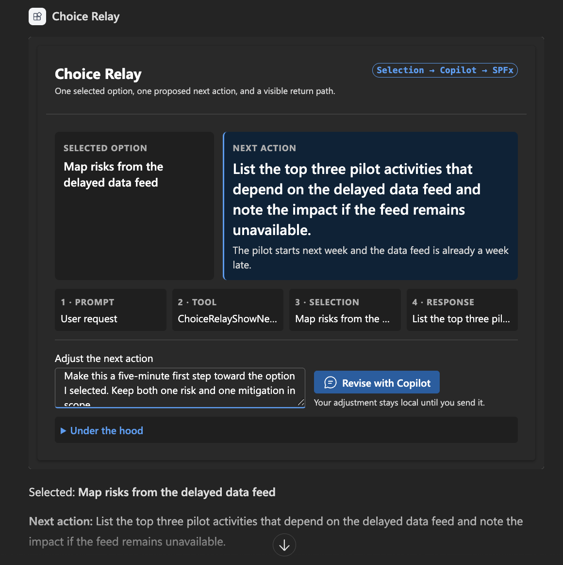
3. Revise it inside the component
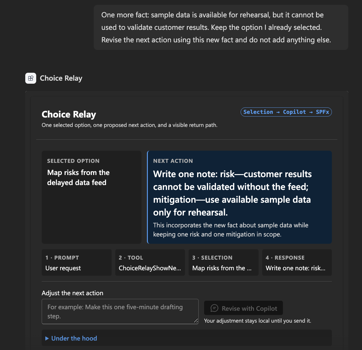
4. Or type in the Copilot chat, and the component reacts
Compatibility





SPFx Copilot components and the APIs used by this sample are currently preview capabilities.
Applies to
- SharePoint Framework 1.24+ Copilot Components
- Microsoft Copilot extensibility
- A Microsoft 365 tenant with a SharePoint App Catalog
Contributors
Version history
| Version | Date | Comments |
|---|---|---|
| 1.0.0 | July 29, 2026 | Initial community sample |
Prerequisites
- Node.js >=22.14.0 and <23.0.0
- A SharePoint App Catalog site
- No Microsoft Graph permissions and no tenant admin approval beyond deploying the package
Minimal Path to Awesome
- Clone this repository
- Ensure that you are at the solution folder (
samples/choice-relay) - Set your tenant so the Workbench URL resolves —
config/serve.jsonships a{tenantDomain}placeholder:export SPFX_SERVE_TENANT_DOMAIN="contoso.sharepoint.com"- or replace the placeholder in
config/serve.jsondirectly
- In the command line run:
npm installnpx heft trust-dev-certnpm run start
Production build, test, and package:
npm run build
Deploy the agent
- Run
npm run build, then uploadsharepoint/solution/choice-relay.sppkgto the tenant App Catalog and enable it for all sites. - Use Sync to Teams on the catalog entry to synchronise the embedded declarative agent.
- Install it — from the Agents page in the Microsoft 365 admin center, or from the agent store.
Synchronising the agent and installing it are separate steps; step 3 is what makes it available to a user.
Try it
Select Choice Relay in a Copilot chat. Four steps — none of them names a tool or a component.
1. Describe a situation. The choice component renders.
I have 30 minutes before my next meeting. Our pilot starts next week. The demo passed, but the data feed is a week late and the participant briefing still isn't written. What could I start now? I'd rather pick one myself before you tell me where to begin.
2. Pick an option and choose Continue with Copilot. Nothing to type. The result component renders.
3. Revise it in the component's own field.
Make this a five-minute first step toward the option I selected. Keep both one risk and one mitigation in scope.
4. Now type in the Copilot chat. The component reacts.
One more fact: sample data is available for rehearsal, but it cannot be used to validate customer results. Keep the option I already selected. Revise the next action using this new fact and do not add anything else.
The two tools
| User intent | Tool | Component output |
|---|---|---|
| Show two to four possible actions and let the user choose | ChoiceRelayShowChoices |
Question, selectable options, send action |
| Continue from a selected option, or revise its next action | ChoiceRelayShowNextAction |
Selected option, next action, explanation, revision field |
Copilot creates the typed arguments for both. React owns the local state. The component never calls a language model — it uses the preview Copilot bridge to place a user-role message into the conversation, and Copilot decides what to do with that turn.
Features
- Two SPFx Copilot Components in one solution, one tool contract each
- Intent-based routing — no prompt names a tool or a component
- Copilot-generated typed input arriving through
this.properties - Local React state that Copilot cannot see until the user sends it
sendFollowUpMessageAsyncposting a readable message into the conversation- Revisions from either the component or the normal Copilot composer
- A collapsed Under the hood inspector showing tool input and outbound messages
- Inline and fullscreen modes, host-driven light and dark themes, Fluent UI v9
Help
We do not support samples, but the community is always willing to help. Search the repository issues or create a new issue with your environment and reproduction steps.
References
- Overview of SPFx Copilot components
- Build your first SPFx Copilot component
- Fluent UI React v9
- Microsoft 365 Patterns and Practices
Disclaimer
THIS CODE IS PROVIDED AS IS WITHOUT WARRANTY OF ANY KIND, EITHER EXPRESS OR IMPLIED, INCLUDING ANY IMPLIED WARRANTIES OF FITNESS FOR A PARTICULAR PURPOSE, MERCHANTABILITY, OR NON-INFRINGEMENT.