
Copilot UX component
Executive Sales & Revenue Dashboard (Copilot Component)
An SPFx Copilot Component that renders an executive sales dashboard inline in Microsoft Copilot and expands to a rich full-screen view, entirely from offline mock data.

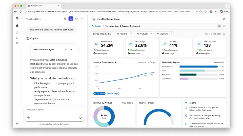
- Updated
- July 8, 2026
- Built with
- React
- SPFx version
- 1.24.0-beta.2
- Products
- SharePoint, Microsoft Copilot
Overview
What this sample demonstrates
A SharePoint Framework Copilot Component (React 17 + Fluent UI v9) that surfaces an Executive Sales & Revenue Dashboard directly inside Microsoft Copilot. It renders a compact inline card and, on request, a rich full-screen dashboard, switching on the host displayMode. All data comes from a locally generated, Graph-shaped mock so the sample runs fully offline; a data-service interface plus a useMock flag make switching to a real backend a drop-in change.
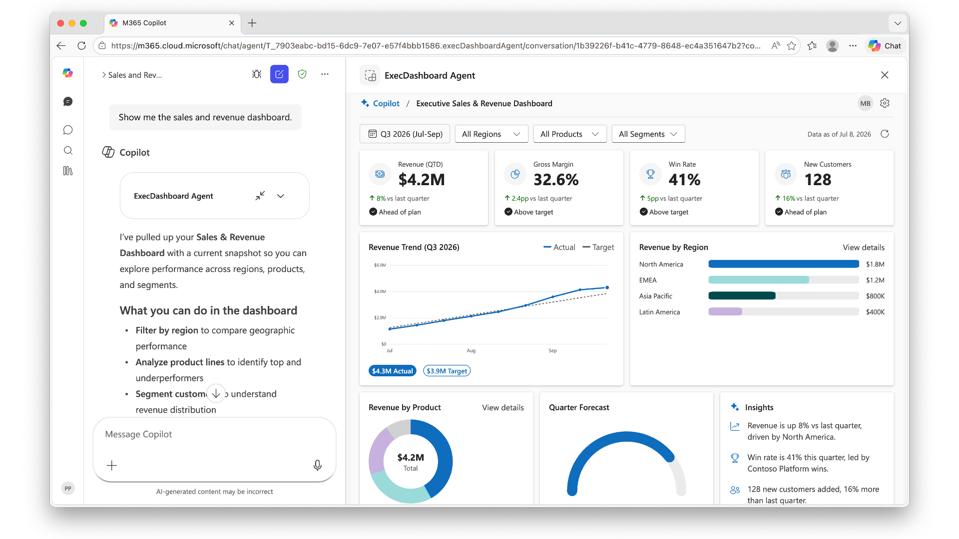
Features include KPI cards, an actual-vs-target revenue trend, revenue by region and by product, a quarter-forecast gauge, generated insights, host-driven light/dark theming, a gear-activated settings panel, filters (region/product/segment) that noticeably reshape the data, and a data-loading spinner. All charts are drawn with inline SVG (no external chart library).
Gallery
See the component in action


Documentation
Setup and implementation
An executive sales & revenue dashboard that lives inside the Microsoft Copilot canvas — store performance and customer satisfaction at a glance.






Summary
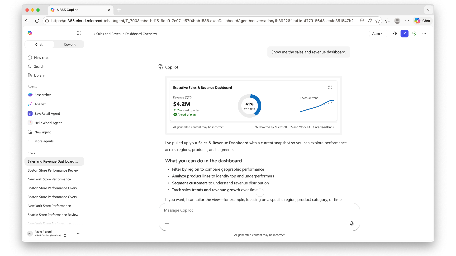
An SPFx Copilot component that surfaces an Executive Sales & Revenue Dashboard directly inside Microsoft Copilot. It renders a compact inline card and, on request, expands to a rich full-screen dashboard — switching automatically on the host displayMode.
The sample runs fully offline: all data is generated locally as Graph-shaped mock data on every render, with dates anchored to the current date/time. A data-service interface plus a useMock flag make switching to a real backend a drop-in change with no UI rework.
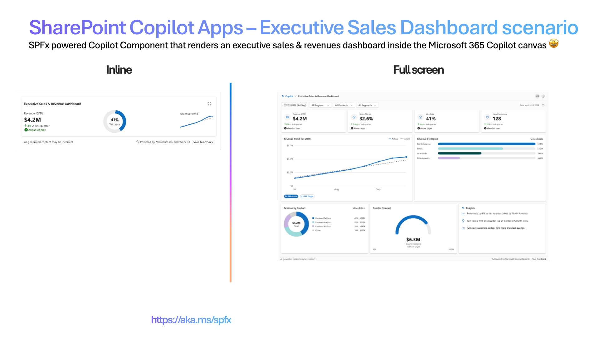
Inline (left) + full-screen (right).
Screenshots & demo
| Inline | Full screen |
|---|---|
 |
 |
Used SharePoint Framework Version
Applies to
Get your own free development tenant by subscribing to the Microsoft 365 developer program.
Prerequisites
- Node.js >=22.14.0 <23.0.0
- A Microsoft 365 tenant with SPFx 1.24 (dev preview) enabled
- SharePoint App Catalog site
- Heft (
npm install -g @rushstack/heft) - Yeoman +
@microsoft/generator-sharepoint(only needed to scaffold additional components)
This solution uses the Heft build system (not Gulp), React 17 functional components and Fluent UI v9, aligned with the SPFx 1.24 dev preview.
Solution
Version history
| Version | Date | Comments |
|---|---|---|
| 1.0 | 07.08.2026 | Initial release |
Disclaimer
THIS CODE IS PROVIDED AS IS WITHOUT WARRANTY OF ANY KIND, EITHER EXPRESS OR IMPLIED, INCLUDING ANY IMPLIED WARRANTIES OF FITNESS FOR A PARTICULAR PURPOSE, MERCHANTABILITY, OR NON-INFRINGEMENT.
Minimal Path to Awesome
Ready-made package included. Because this is a scenario sample that runs entirely on mock data - with no live customer data or line-of-business integration - the repository ships the fully built solution package so you can deploy and demo it in minutes without building anything. Grab the package here: /sharepoint/solution/executive-sales-dashboard.sppkg.
To use it, upload
executive-sales-dashboard.sppkgto your tenant App Catalog, enable solution in all sites (includes Copilot), and invoke the agent in Microsoft Copilot. Prefer to build from source instead? Follow the steps below.
- Clone this repository
- Ensure that you are at the solution folder (
executive-sales-dashboard) - In the command-line run:
npm install -g @rushstack/heftnpm installheft start --clean— local dev server athttps://localhost:4321
- Invoke the agent in Copilot and confirm the inline render, expand-to-full-screen, and dark/light theming.
Production build, test, and package:
heft test --clean --production && heft package-solution --production
Other build commands can be listed using heft --help.
60-second demo script
- Invoke it - in Microsoft Copilot, select the ExecDashboard Agent and send: "Show me the sales and revenue dashboard" The compact inline card renders.
- Land the inline experience (~10s) - call out the initial output with brief recap of performance (revenue, win rate, and revenue trend).
- Expand (~10s) - select the Expand to full screen command on the upper right part of the card. The full-screen dashboard animates in - revenue, gross margin, win rate, new customers, revenue trend, revenue by region, revenue by product, quarter forecast, and insights.
- The "wow" moment (~30s) - select All Regions, or All Products, or All Segments to filter data accordingly to your selection. The whole dashboard dynamically updates accordingly to your settings. Explain the audience that all the data is dynamic.
- Theming (~10s) - flip the Copilot host to dark mode to show the whole experience re-theme instantly.
Tip: the day is always "today" and data follows current calendar, whenever you demo.
Features
This sample illustrates the following concepts:
- A single SPFx Copilot Component that renders both inline and full-screen experiences, chosen from
hostContext.displayMode. - Host-driven theming (light/dark) via a single stable-key Fluent v9
FluentProvider. - A data-service abstraction (
IExecDashboardDataService) with a shipped mock implementation and a stubbed real implementation, selected by auseMockflag /dataServiceUrlproperty. - A settings panel (gear icon) that toggles
useMockand configures the data endpoint. - Filters (region / product / segment) that meaningfully reshape the mock data.
- A data-loading state (
isDataLoading) with a spinner. - Fully offline SVG charts: KPI cards, actual-vs-target trend, revenue by region/product, and a quarter-forecast gauge.
- A static footer: AI disclaimer, "Powered by Microsoft 365 and Work IQ", and a feedback action.
- The current user rendered from a mock persona (mock mode) or Microsoft Graph (
/me) when live.
Data source
All data is mock data generated on the client by mockData/salesData.ts, shaped so a real
IExecDashboardDataService implementation can be swapped in without UI changes. Dates and
the reporting period are derived from the render time, so the dashboard always reads as
current.
Solution structure
src/copilotComponents/execDashboard/
  ExecDashboardCopilotComponent.tsx        # SPFx host adapter
  ExecDashboardCopilotComponentProperties.ts # useMock + dataServiceUrl (Zod schema)
  components/
    ExecDashboard.tsx                      # root selector (loading, data, mode switch)
    ExecDashboardThemeProvider.tsx         # single Fluent v9 provider (host theme)
    ExecDashboardInline.tsx                # inline experience
    ExecDashboardFullscreen.tsx            # full-screen experience
    inline/                                # inline building blocks
    fullscreen/                            # KPI cards, charts, filter bar, settings panel
    shared/                                # footer, donut, spinner, delta badge
  models/                                  # view models
  services/                                # data-service interface, mock, real (stub), factory
  mockData/                                # sales + people mock data
  utils/                                   # datetime, format, colors, settings, motion
References
- Getting started with SharePoint Framework
- Use Microsoft Graph in your solution
- Fluent UI React v9
- Microsoft 365 Patterns and Practices - Guidance, tooling, samples and open-source controls for your Microsoft 365 development
- Heft Documentation
Part of the Copilot UX components sample gallery — interactive UX in the Copilot canvas, powered by SPFx. See aka.ms/spfx.