
Copilot UX component
M365 Product Roadmap
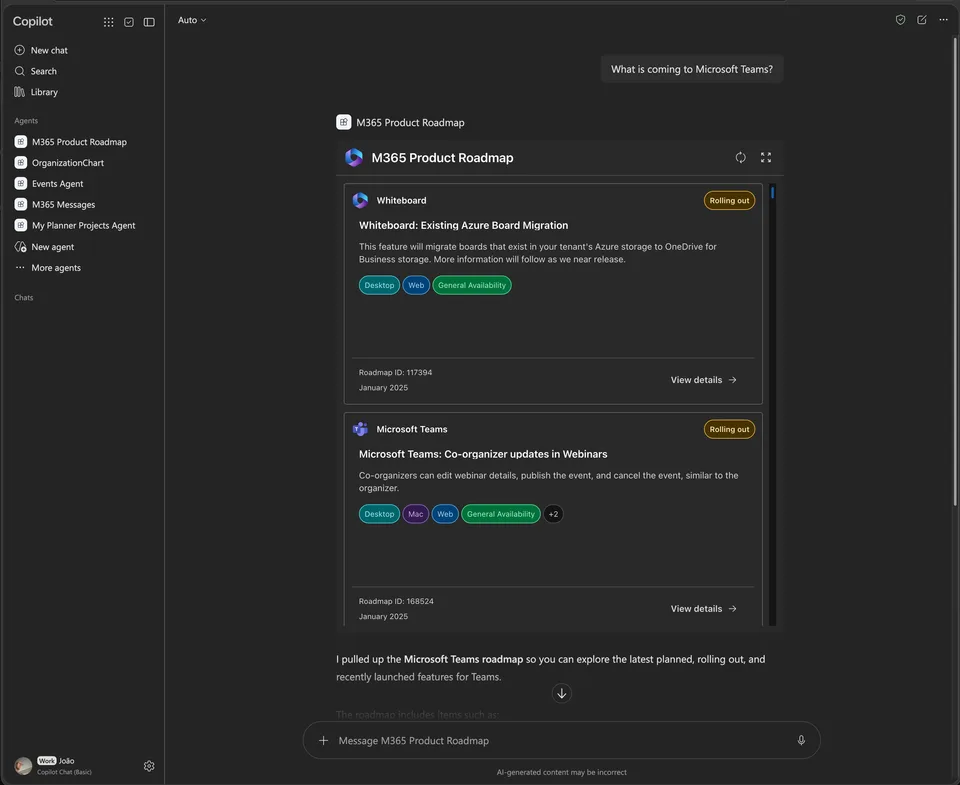
An SPFx 1.24 Copilot UX component for discovering Microsoft 365 roadmap features through the public Microsoft Release Communications MCP server.

- Updated
- September 22, 2026
- Built with
- React
- SPFx version
- 1.24.0-beta.4
- Products
- SharePoint, Microsoft Copilot
Overview
What this sample demonstrates
M365 Product Roadmap is a SharePoint Framework 1.24 Copilot UX component that helps users discover and explore Microsoft 365 roadmap features through the public Microsoft Release Communications (MRC) MCP server. The component provides both compact inline views and fullscreen responsive card grids for browsing upcoming Microsoft 365 releases.
The component supports advanced filtering and search capabilities including debounced search, product picker, status dropdown, exact roadmap ID input, and multi-select filters for release phase, platform, and cloud. It features lazy-loading detail dialogs with overview information, rollout timelines, metadata, and direct links to Microsoft source documentation.
Built with React and TypeScript using the SharePoint Framework 1.24, the component leverages @spteck/react-controls-v2 for UI controls and @emotion/css for styling with Fluent design tokens. It demonstrates best practices for integrating Copilot components with remote MCP endpoints, including offset paging with deduplication, stale-request protection, and light/dark theme support.
Gallery
See the component in action


Documentation
Setup and implementation
An SPFx 1.24 Copilot UX component for discovering Microsoft 365 roadmap features through the public Microsoft Release Communications MCP server.
Experience
- Compact inline view with the first three roadmap cards and an expand action
- Fullscreen responsive card grid with native infinite scrolling
- Debounced search plus product picker, status dropdown, exact roadmap ID input, and multi-select release phase, platform, and cloud filters
- Lazy detail dialog with overview, rollout timeline, metadata, and Microsoft source links
- Loading skeletons, empty/error states, retry actions, light/dark themes, and Copilot host resizing
- Offset paging with item deduplication and stale-request protection
The interface uses @spteck/react-controls-v2 for search, pickers, inputs, dropdowns, menus, buttons, cards, grid, dialog, timeline, loading, messages, layout, typography, and theme integration. Component styles use @emotion/css with Fluent design tokens.
Data source
The MRC endpoint does not support direct browser access. The component therefore calls ISPCopilotBridge.callServerToolAsync, while the agent plugin registers the public MRC endpoint as an anonymous remote MCP runtime. The Copilot host performs the MCP network request outside the SharePoint iframe, avoiding browser CORS and connect-src restrictions.
Remote MCP endpoint:
https://www.microsoft.com/releasecommunications/mcp
It calls:
get_recent_m365_roadmapsfor search, OData filtering, facets, and paged resultsget_m365_roadmap_by_idfor the full detail view
Build
Requirements: Node.js 22.14 or newer within the supported Node 22 range.
npm install
npm run build
The production build generates:
sharepoint/solution/m365-product-roadmap.sppkgteams/m365-product-roadmap.zip
For local Copilot Workbench development:
npm start
Design artifacts
The implementation plan, interactive HTML prototype, and five UI mock images are in docs/m365-product-roadmap.
Notes
- The MCP endpoint is public and does not require a Microsoft Graph permission grant.
- The generated agent package contains separate runtime mappings for the MRC tools and the tenant-hosted SPFx component tool.
- The SharePoint solution uses tenant-wide deployment.
- Fluent UI is retained only for host portal support and text-button primitives that are not available in
react-controls-v2.