
Copilot UX component
My Day — Personalized Intranet Copilot App
A SharePoint Copilot App (SPFx 1.24 Copilot Component) that renders a personal 'My Day' cockpit inside the Microsoft Copilot canvas — a compact inline card that expands to a full-screen dashboard with agenda, tasks, mail, news, a 'Plan my day' briefing and session-persisted settings.

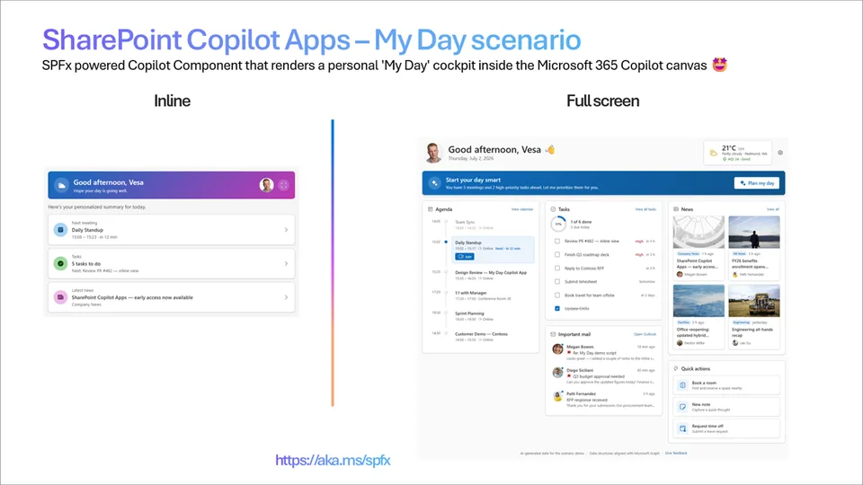
- Updated
- July 2, 2026
- Built with
- React
- SPFx version
- 1.24.0-beta.2
- Products
- SharePoint, Microsoft Copilot
Overview
What this sample demonstrates
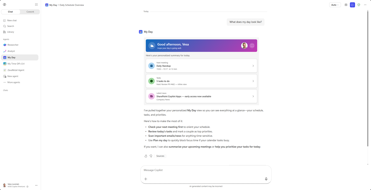
My Day is a SharePoint Copilot App built as an SPFx 1.24 Copilot Component (not a classic web part). The same React component renders in two display modes inside the Microsoft Copilot canvas: a compact inline card and an immersive full-screen dashboard. Inline shows a time-aware greeting, the next meeting, tasks due today and the top news headline; it can request expansion via requestDisplayModeAsync('fullscreen').
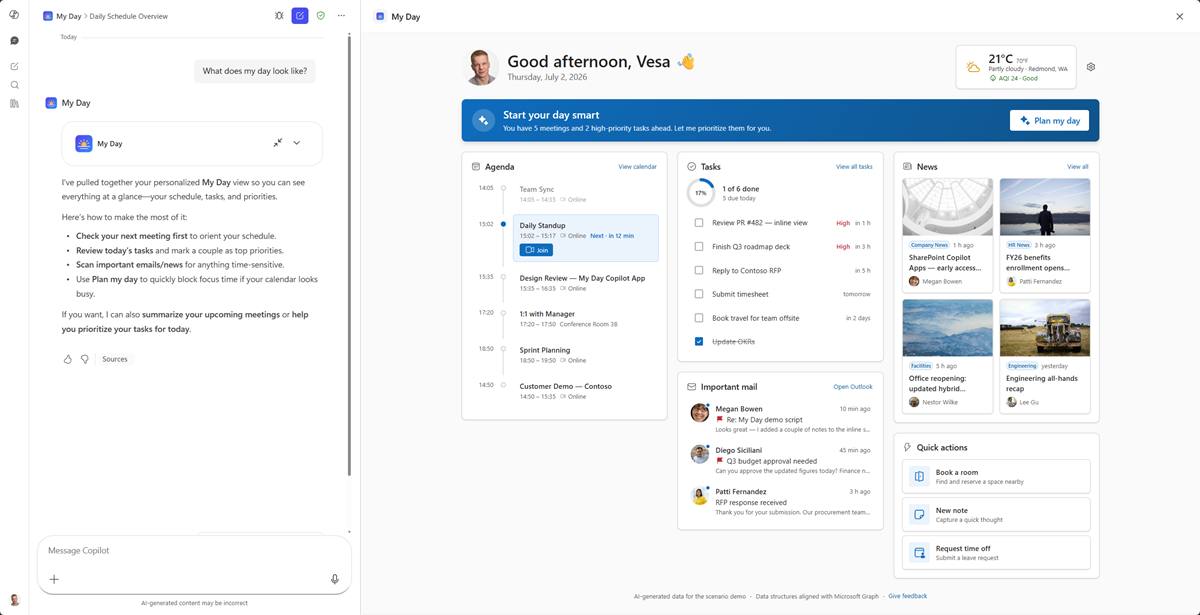
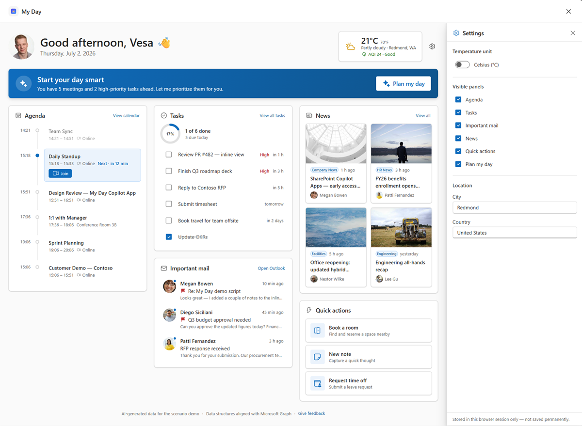
The full-screen experience is a responsive dashboard — agenda timeline, tasks completion ring, important mail with sender face avatars, a news wall, quick actions and a hero weather card. A 'Plan my day' banner opens a read-only, deterministically generated focus briefing (no chat, no real AI/WorkIQ call), and a settings drawer lets the user switch temperature units, edit location and show/hide panels.
Settings are intentionally persisted to the browser session (sessionStorage) to demonstrate how configuration can shape the dashboard live without server-side storage; the layout re-flows dynamically to the number of visible panels. The sample ships with mocked, Microsoft Graph-shaped data behind a swappable IMyDayDataService interface, so a live Graph / SharePoint implementation is a drop-in replacement. Built with the Heft build system, React 17 and Fluent UI v9 with host-driven light/dark theming.
Gallery
See the component in action


Documentation
Setup and implementation




Summary
My Day is an SPFx 1.24 Copilot component (not a classic web part). Copilot opens to a living personal cockpit - greeting, next meeting, tasks and news - then expands to a full personal dashboard. Maximum relatability for a launch demo.
The same React component renders in two modes inside the Copilot canvas:
- a compact inline card, and
- an immersive full-screen dashboard with a "Plan my day" focus assistant and a settings drawer.
The sample ships with mocked data so anyone can deploy and demo in minutes - no line-of-business integration required. The data is served through a swappable IMyDayDataService interface, so the mock implementation can be replaced by a live Microsoft Graph / SharePoint implementation without touching the UI.
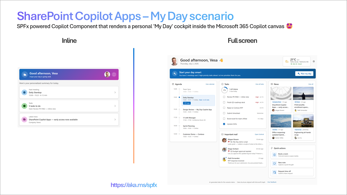
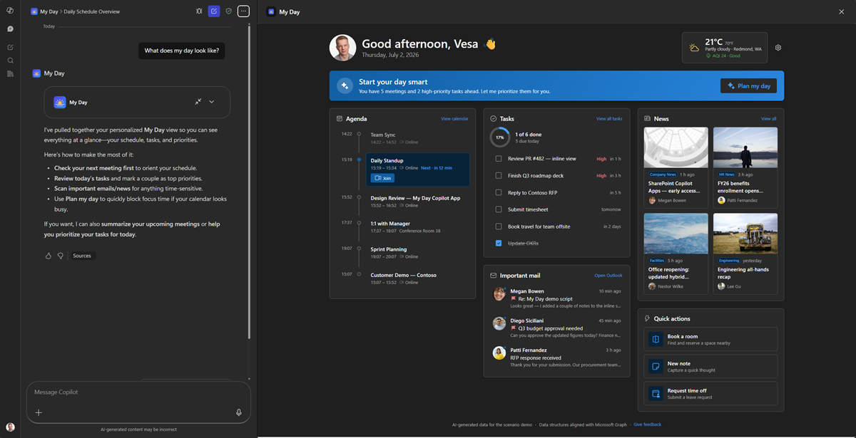
Inline (left) + full-screen (right).
Screenshots & demo
Inline
Full screen
Settings (session-persisted)
Dark mode
Used SharePoint Framework Version
Applies to
- SharePoint Framework 1.24+ (Copilot Component)
- Microsoft Copilot
- Microsoft 365 tenant with the SharePoint App Catalog
Get your own free development tenant by subscribing to the Microsoft 365 developer program
Prerequisites
- Node.js >=22.14.0 <23.0.0
- A Microsoft 365 tenant with SPFx 1.24 (dev preview) enabled
- SharePoint App Catalog site
- Heft (
npm install -g @rushstack/heft) - Yeoman +
@microsoft/generator-sharepoint(only needed to scaffold additional components)
This solution uses the Heft build system (not Gulp) and React 17 functional components, aligned with the SPFx 1.24 dev preview.
Solution
Version history
| Version | Date | Comments |
|---|---|---|
| 1.0 | 7.2.2026 | Initial version |
Disclaimer
THIS CODE IS PROVIDED AS IS WITHOUT WARRANTY OF ANY KIND, EITHER EXPRESS OR IMPLIED, INCLUDING ANY IMPLIED WARRANTIES OF FITNESS FOR A PARTICULAR PURPOSE, MERCHANTABILITY, OR NON-INFRINGEMENT.
Minimal Path to Awesome
Ready-made package included. Because this is a scenario sample that runs entirely on mock data - with no live customer data or line-of-business integration - the repository ships the fully built solution package so you can deploy and demo it in minutes without building anything. Grab the package here: sharepoint/solution/my-day.sppkg.
To use it, upload
my-day.sppkgto your tenant App Catalog, enable solution in all sites (includes Copilot), and invoke the agent in Microsoft Copilot. Prefer to build from source instead? Follow the steps below.
- Clone this repository
- Ensure that you are at the solution folder (
samples/my-day) - In the command-line run:
npm install -g @rushstack/heftnpm installheft start --clean- local dev server athttps://localhost:4321
- Invoke the agent in Copilot and confirm the inline render, expand-to-full-screen, dark/light theming, the Plan my day briefing, and the settings drawer (toggle temperature units and panel visibility to see the layout re-flow).
Production build, test, and package:
npm run build
Other build commands can be listed using heft --help.
60-second demo script
A tight, repeatable flow for a live demo. All data is mock, so it works the same every time.
- Invoke it - in Microsoft Copilot, select the My Day agent and send: "What does my day look like?" The compact inline card renders.
- Land the personal hook (~10s) - call out the greeting using the real signed-in user's name and photo, the time-aware sub-line, and the dynamic summary ("You have 3 meetings and 2 high-priority tasks ahead."). Tap a tile (Next meeting / Tasks) to show the inline drill-down, then back.
- Expand (~10s) - click the expand control on the greeting card. The full-screen dashboard animates in - agenda timeline, tasks completion ring, important mail with face avatars, a news wall with real thumbnails, and the weather card.
- The "wow" moment (~15s) - click Plan my day. Watch the assistant "think" and then stream in a prioritized, deterministic focus briefing that opens with the user's name and reads as one connected story (prep the Design Review → review the inline-view PR → polish the demo script → reply to Megan).
- Show settings shaping the UX (~15s) - open the gear ⚙️. Toggle °C / °F and point out the hero weather updating live; uncheck a panel (e.g. News) and watch the layout re-flow. Note the footnote: settings are stored in this browser session only.
- Theming (~10s) - flip the Copilot host to dark mode to show the whole experience re-theme instantly.
Tip: the day is always "today" and time-of-day aware, so the agenda, greeting and Plan my day stay believable whenever you demo.
Features
My Day demonstrates how to build a rich, theme-aware UX inside the Microsoft Copilot canvas using an SPFx Copilot Component.
This sample illustrates the following concepts:
- Copilot Component UX - a
CopilotComponent(copilotType: "Ux") surfaced as a tool a declarative agent can call, rendering its own React UI inside the Copilot host. - Display-mode-aware rendering - a single root React component selects a dedicated inline or full-screen view from the host-advertised display mode; inline can request expansion via
requestDisplayModeAsync('fullscreen'). - Swappable data service - all data flows through an
IMyDayDataServiceinterface (mock implementation shipped), so a live Microsoft Graph / SharePoint implementation can be dropped in without changing the UI. - Theme awareness - light/dark theme driven by the Copilot host context, using Fluent UI v9 theme tokens (no hardcoded colors).
- "Plan my day" focus assistant - a read-only, deterministically generated focus briefing derived from the day's mock data (no chat, no real AI/WorkIQ call) that shifts with the time of day.
- Session-persisted settings - a settings drawer whose values are intentionally stored in the browser session (
sessionStorage) to show how configuration can shape the dashboard, without any server-side persistence. - Dynamic, visibility-driven layout - the full-screen grid re-flows to the number of visible panels and the available width (3 → 2 → 1) with no fixed breakpoints.
UX components
Cards · agenda timeline · tasks ring · news wall · quick-action tiles · weather card · Plan my day panel · settings drawer
Inline experience
Time-aware greeting + next-meeting card + tasks due today summary + top news headline, with drill-down views and an expand-to-full-screen affordance.
Full-screen experience
Responsive card grid - Agenda (today's timeline), Tasks (checklist + completion ring), Important mail (with sender face avatars), News wall (image cards), a quick-actions row, and a weather card in the hero. A "Plan my day" banner opens a prioritized focus briefing, and a settings drawer lets the user switch temperature units, edit location, and show/hide panels - all persisted for the browser session and reflected live in the dashboard.
Settings & session persistence
The settings drawer is controlled by session-scoped state (sessionStorage), intentionally chosen for the demo so changes survive reloads within the session but are forgotten when it ends:
- Temperature unit (°C / °F) - applied live to the hero weather card.
- Location (city / country) - illustrative inputs, persisted for the session.
- Visible panels - toggles each dashboard panel; the layout re-flows dynamically and at least one panel always stays visible.
Wireframe
INLINE  ☀ Good morning, Vesa   ▸ Next: Sync 10:00 (12m)   ✓ 3 tasks due   📰 "SPFx Copilot Components ships"

FULL    ┌ Agenda timeline ┐┌ Tasks ◔ ┐┌ News wall ┐
        │  (dynamic grid) ││  Mail   ││ Quick a.  │   + "Plan my day" briefing · settings drawer
        └─────────────────┘└─────────┘└───────────┘
Data source
All data is mocked for the sample and served through the IMyDayDataService interface (MockMyDayDataService), so the views never call an API directly. The mock is shaped to mirror Microsoft Graph so a live implementation is a drop-in replacement:
- user →
/me+/me/photo/$value - calendar →
/me/events(or/me/calendarView) - tasks →
/me/todo/lists/{id}/tasks - mail →
/me/messages - news → SharePoint site pages / a
Newslist
The "Plan my day" briefing is produced by a pure planMyDay(data, now) function (deterministic, derived from the mock) - no real AI/WorkIQ call is made.
Solution structure
samples/my-day/
  README.md
  todo.md                       # build log / reference checklist for similar samples
  assets/                       # concept mockup, screenshots, demo GIF, face avatars
  config/                       # Heft / SPFx + Copilot agent configuration
  copilot/                      # declarative agent + plugin manifests
  src/
    copilotComponents/
      myDay/
        MyDayCopilotComponent.ts             # entry point (mounts React)
        MyDayCopilotComponent.manifest.json  # component + tools manifest
        MyDayCopilotComponentProperties.ts   # Zod tool-input schema
        components/
          MyDayApp.tsx          # root selector (inline vs. full-screen)
          MyDayThemeProvider.tsx# host light/dark → FluentProvider
          MyDayInline.tsx       # inline display-mode view
          MyDayFullscreen.tsx   # full-screen display-mode view
          inline/               # inline building blocks (greeting, summary, lists)
          fullscreen/           # dashboard cards, Plan my day + settings drawers
        models/                 # Graph-shaped + UI view models
        services/               # IMyDayDataService, mock service, planMyDay, mappers
        mockData/               # static mock data (meetings, tasks, news, mail, weather…)
        utils/                  # datetime, greeting, session-persisted settings
References
- Getting started with SharePoint Framework
- Use Microsoft Graph in your solution
- Heft Documentation
- PnPjs
- PnP React controls
- Microsoft 365 & Power Platform Community - Guidance, tooling, samples and open-source controls for your Copilot, Microsoft 365 & Power Platform development
Notice that better pictures and documentation will increase the sample usage and the value you are providing for others. Thanks for your submissions in advance.
Share your solution with others through the Microsoft 365 Patterns and Practices program to get visibility and exposure. Learn more from the Microsoft 365 & Power Platform Community.
Part of the Copilot UX components sample gallery - complex UX in the Copilot canvas, powered by SPFx. See aka.ms/spfx.