
Copilot UX component
SP Permissions Explorer - SharePoint Access Review Copilot App
An SPFx Copilot Component that lets users review SharePoint access, inspect principals and permission levels, and perform guarded write operations from Microsoft Copilot.

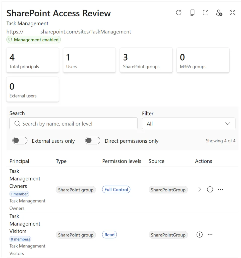
- Updated
- July 15, 2026
- Built with
- React
- SPFx version
- 1.24.0-beta.2
- Products
- SharePoint, Microsoft Copilot
Overview
What this sample demonstrates
SP Permissions Explorer is a SharePoint Copilot App built as an SPFx 1.24 Copilot Component. It lets the signed-in user ask Microsoft Copilot who has access to a site and get back an interactive permissions experience with users, groups, external or guest users, and permission levels.
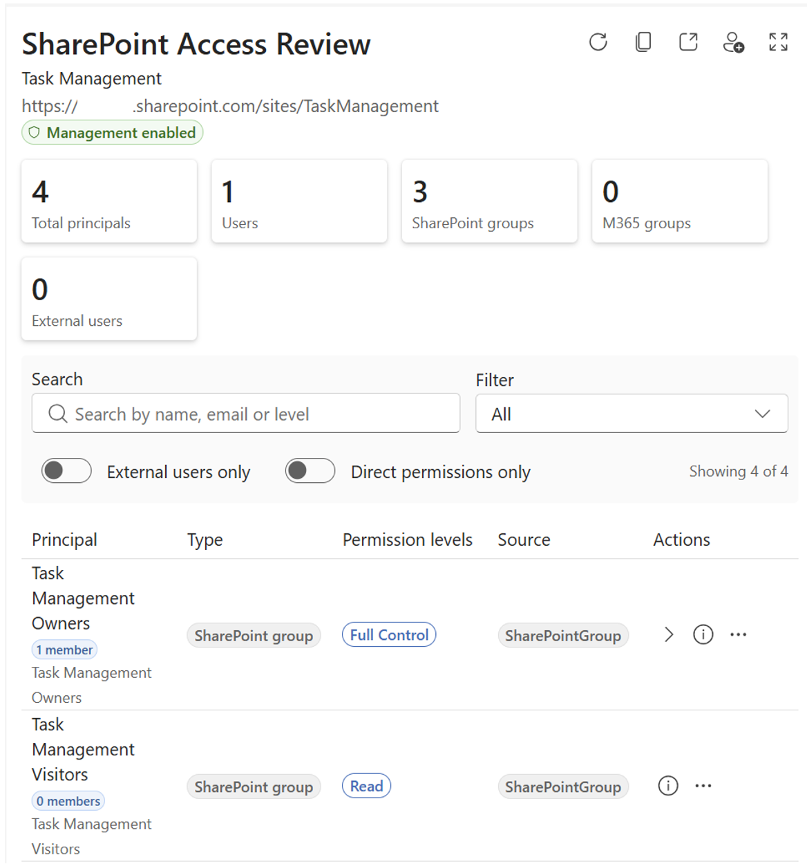
The same React component renders in inline and full-screen display modes inside the Copilot canvas. It queries SharePoint using the user's delegated identity, supports filtering and principal lookup, and exposes write operations such as grant or remove access and change permission levels, with every write confirmed in the UI before it runs.
Gallery
See the component in action


Documentation
Setup and implementation





Summary
SP Permissions Explorer is an SPFx 1.24 Copilot component (not a classic web part). It lets the signed-in user ask Microsoft Copilot "who has access to this site?" and get back an interactive, on-canvas permissions experience - users, groups, external/guest users and permission levels - instead of a wall of text.
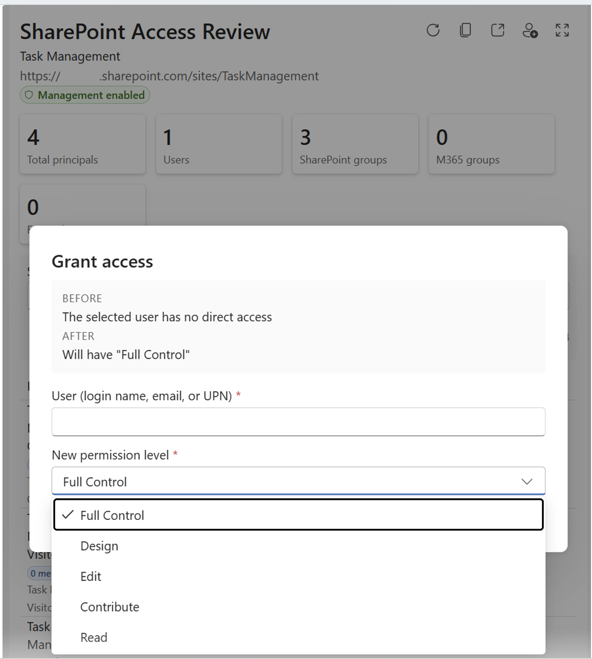
The component queries SharePoint directly with the user's own delegated identity, so it only ever surfaces what the user is already allowed to see. From the same experience the user can review access in depth, look up whether a specific person or group has access, and perform write operations (grant/remove access, change permission level, add/remove from a SharePoint group) - every write is confirmed in the UI before it runs.
The same React component renders in two modes inside the Copilot canvas:
- a compact inline access summary, and
- an immersive full-screen permissions explorer with filtering, a full permissions table and a principal details panel.
Used SharePoint Framework Version
Applies to
- SharePoint Framework 1.24+ (Copilot Component)
- Microsoft Copilot
- Microsoft 365 tenant with the SharePoint App Catalog
Get your own free development tenant by subscribing to the Microsoft 365 developer program
Prerequisites
- Node.js >=22.14.0 <23.0.0
- A Microsoft 365 tenant with SPFx 1.24 (dev preview) enabled
- SharePoint App Catalog site
- Heft (
npm install -g @rushstack/heft) - Yeoman +
@microsoft/generator-sharepoint(only needed to scaffold additional components) - Sufficient SharePoint permissions on the sites you review - the component acts as the signed-in user, so read and write operations are subject to that user's own access.
This solution uses the Heft build system (not Gulp) and React 17 functional components, aligned with the SPFx 1.24 dev preview.
Solution
| Solution | Author(s) |
|---|---|
| sp-permissions-explorer | Aimery Thomas |
Version history
| Version | Date | Comments |
|---|---|---|
| 1.0 | July 14, 2026 | Initial version |
Minimal Path to Awesome
- Clone this repository
- Ensure that you are at the solution folder (
samples/sp-permissions-explorer) - In the command-line run:
npm install -g @rushstack/heftnpm installheft start --clean- local dev server athttps://localhost:4321
- Invoke the agent in Microsoft Copilot, name a site you have access to, and confirm the inline access summary renders, expands to full screen, filters correctly, resolves a specific person or group, and prompts for confirmation before any write action.
Production build, test, and package:
heft test --clean --production && heft package-solution --production
Other build commands can be listed using heft --help.
Demo script
- Invoke it - in Microsoft Copilot, select the Permissions Explorer Agent agent and ask: "Who has access to the Home site?" The inline access summary renders.
- Read the summary - call out the high-level counts (users, groups, external/guest users, permission levels) drawn live from SharePoint with the signed-in user's identity.
- Expand - open the full-screen explorer to show the full permissions table, then apply a filter (e.g. External users or Full control) and watch the table re-scope.
- Look someone up - ask "Does Adele Vance have access?" to switch to userLookup mode and open the principal details panel with their effective access and how it's granted.
- Guarded write - ask to grant someone Edit permission. The component presents an in-UI confirmation dialog - nothing changes until the user explicitly confirms.
The agent prefers rendering the experience over describing permissions in text, and never invents site names, people or access details - the rendered component reports the real data.
Features
SP Permissions Explorer demonstrates how to build a data-driven, delegated-identity admin experience inside the Microsoft Copilot canvas using an SPFx Copilot Component.
This sample illustrates the following concepts:
- Copilot Component UX - a
CopilotComponent(copilotType: "Ux") surfaced as a tool a declarative agent can call, rendering its own React UI inside the Copilot host. - Display-mode-aware rendering - a single root React component selects a compact inline or immersive full-screen view from the host-advertised display mode.
- Delegated-identity SharePoint queries - permissions are read directly from SharePoint with the signed-in user's own identity via SPFx HTTP clients, so users only see what they're entitled to.
- Structured tool arguments - a Zod schema (
siteQuery,mode,filter,principalQuery,operation, …) exported as JSON Schema describes exactly how Copilot invokes the component. - Filtering - narrow the view to users, groups, external/guest users, a permission level (full control / edit / read) or direct-only assignments.
- Guarded write operations - grant/remove access, change a permission level, and add/remove principals from SharePoint groups, each gated behind an explicit in-UI confirmation before execution.
- Theme awareness - light/dark theming driven by the Copilot host context using Fluent UI tokens (no hardcoded colors).
References
- Getting started with SharePoint Framework
- Introducing SPFx Copilot components
- Overview of SPFx Copilot components
- SharePoint REST API
- Heft Documentation
- Microsoft 365 & Power Platform Community - Guidance, tooling, samples and open-source controls for your Copilot, Microsoft 365 & Power Platform development
Help
If you encounter any issues using this solution, please open an issue in this repository.
Disclaimer
THIS CODE IS PROVIDED AS IS WITHOUT WARRANTY OF ANY KIND, EITHER EXPRESS OR IMPLIED, INCLUDING ANY IMPLIED WARRANTIES OF FITNESS FOR A PARTICULAR PURPOSE, MERCHANTABILITY, OR NON-INFRINGEMENT.