
Copilot UX component
Zava Employee Agent
An employee-first SharePoint Copilot App with 20 intent-routed HR components and one shared ten-family workspace.

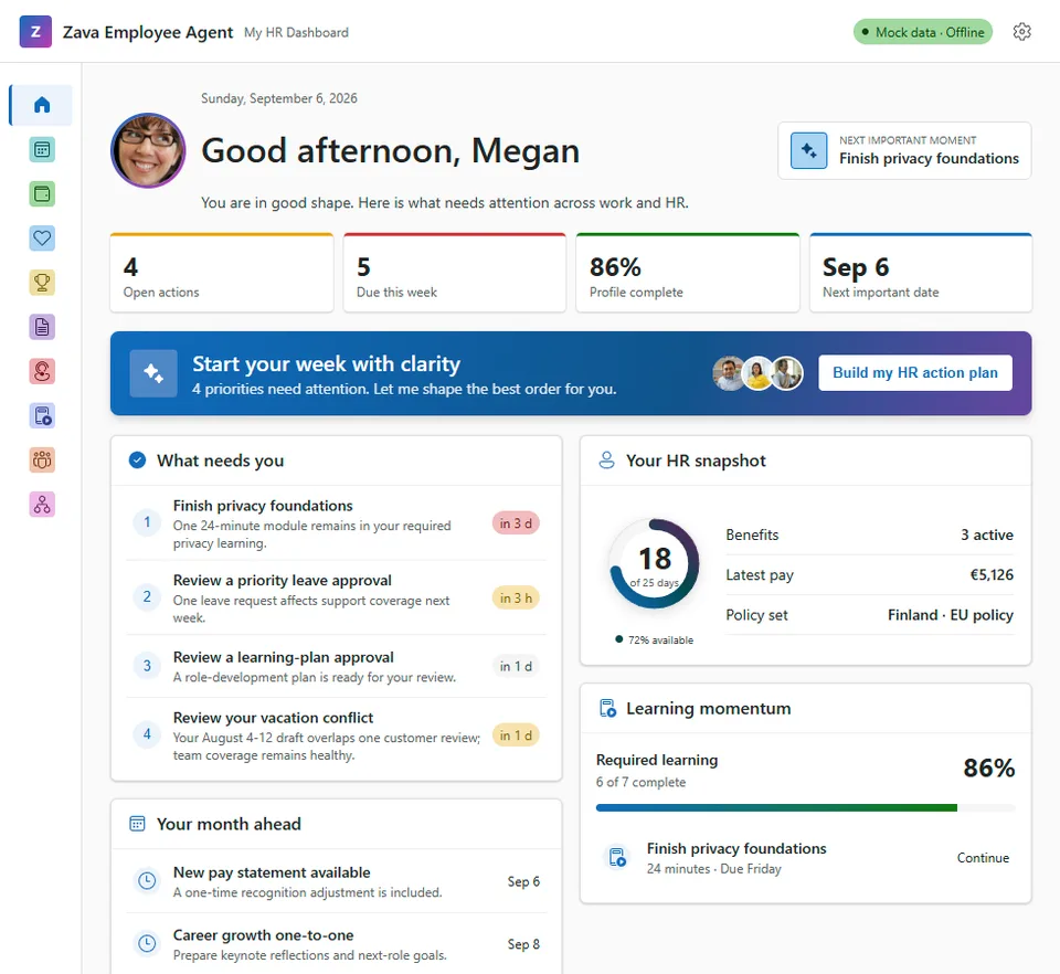
- Updated
- August 21, 2026
- Built with
- React
- SPFx version
- 1.24.0-beta.2
- Products
- SharePoint, Microsoft Copilot
Overview
What this sample demonstrates
Zava Employee Agent demonstrates intent-driven employee experiences inside Microsoft Copilot. Twenty SPFx Copilot Components independently route natural-language HR requests to purpose-built summaries, comparisons, timelines, forms, decision queues, and organization experiences.
Every component expands into one responsive ten-family HR workspace covering Home, Policy, Time, Money, Benefits, Support, Learning, Rewards, Team, and People. The shared shell preserves the owning family and prompt-derived context while providing fifty complete internal routes for deeper work.
The sample is deterministic, offline, and safe for demonstrations. Prompt values may prefill or filter UX but never submit a request, open a case, or decide an approval without explicit review and confirmation. One optimized production bundle emits shared React, Fluent UI, services, icons, and bundled persona media once, with automated generated-plugin and final-package audits.
Gallery
See the component in action


Documentation
Setup and implementation
Powered by SPFx Copilot Components
Summary
Zava Employee Agent is an HR hub built with SPFx 1.24 Copilot components. It is the HR front door for Zava employees, not another HR chatbot.
Instead of returning walls of policy text, the agent renders work directly in the Microsoft Copilot canvas: balances, forms, cards, comparisons, calendars, timelines, and manager workflows. The core design principle is:
Chat asks; Copilot UX components render the answer, the action, and the proof in the canvas.
The solution contains ten component families. Each family has compact inline experiences for focused answers and actions, plus a full-screen experience for deeper work. The sample uses realistic mocked Zava HR data so it can be deployed and demonstrated without a live line-of-business system.
[!IMPORTANT] All 20 current-target Copilot Components and all 50 internal full-screen routes are implemented. The clean production gate passes 39 suites and 170 tests, validates the generated 20-function API plugin, validates 32 gallery screenshots, and packages all components into one shared 0.493 MiB
.sppkg. Authenticated Copilot prompt routing and the final manual accessibility/host matrix remain explicit pre-publication evidence gates intodo.md.
The product source brief is Zava-Employee-Agent-Intro-Brief.md. The canonical interaction and component contract is Zava-Employee-Agent-UX-Design.md, and implementation must follow agentic-creation-rules.md. For Copilot UX testing, use the copy/paste routing and parameter scenarios in Zava-Employee-Agent-Demo-Prompts.md. For a live presentation, use the 60-second primary demo or the timed 3-minute demo story and script. Longer sessions can use the 10-minute business value demo or 5-minute developer and architecture demo. For the wider launch, use the ten-video global social campaign.
Applies To
- SharePoint Framework 1.24 Copilot Components
- Microsoft Copilot declarative agents
- React 17 and Fluent UI React v9
At a Glance
| Metric | Target |
|---|---|
| Copilot Component families | 10 |
| Prompt-addressable Copilot Components/tools | 20 value-ranked tools across 10 families |
| Full-screen sections | 10, one per family |
| Inline surfaces | 20, one per Copilot Component/tool |
| Hub entry point | 1 Zava Employee Agent |
| Data source | Offline mocked HR data |
| Current implementation | 20 of 20 components complete across all 10 implemented full-screen families |
Screenshots
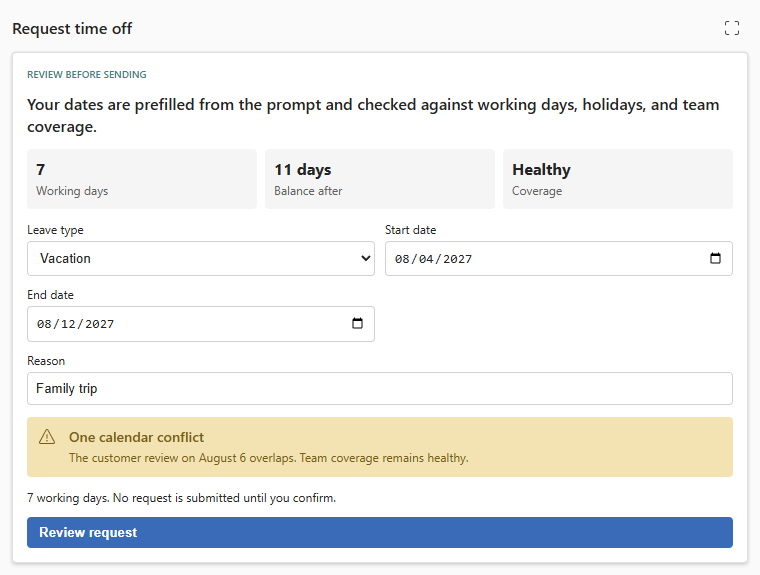
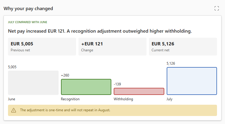
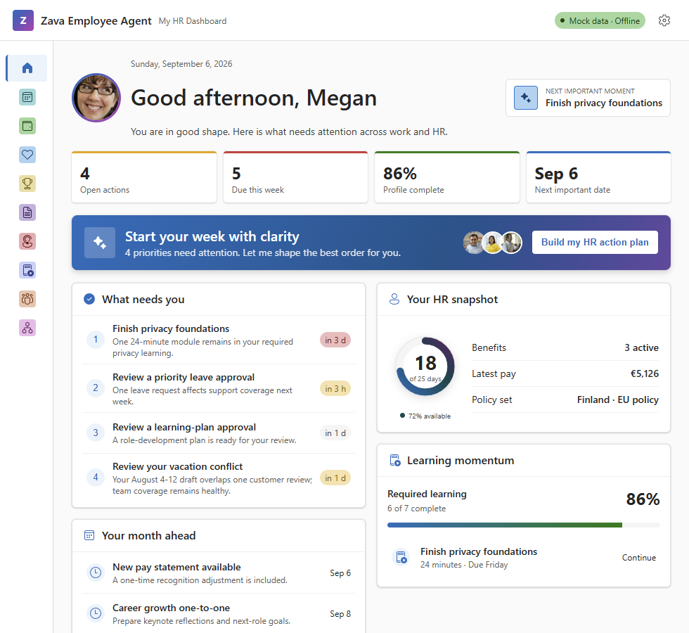
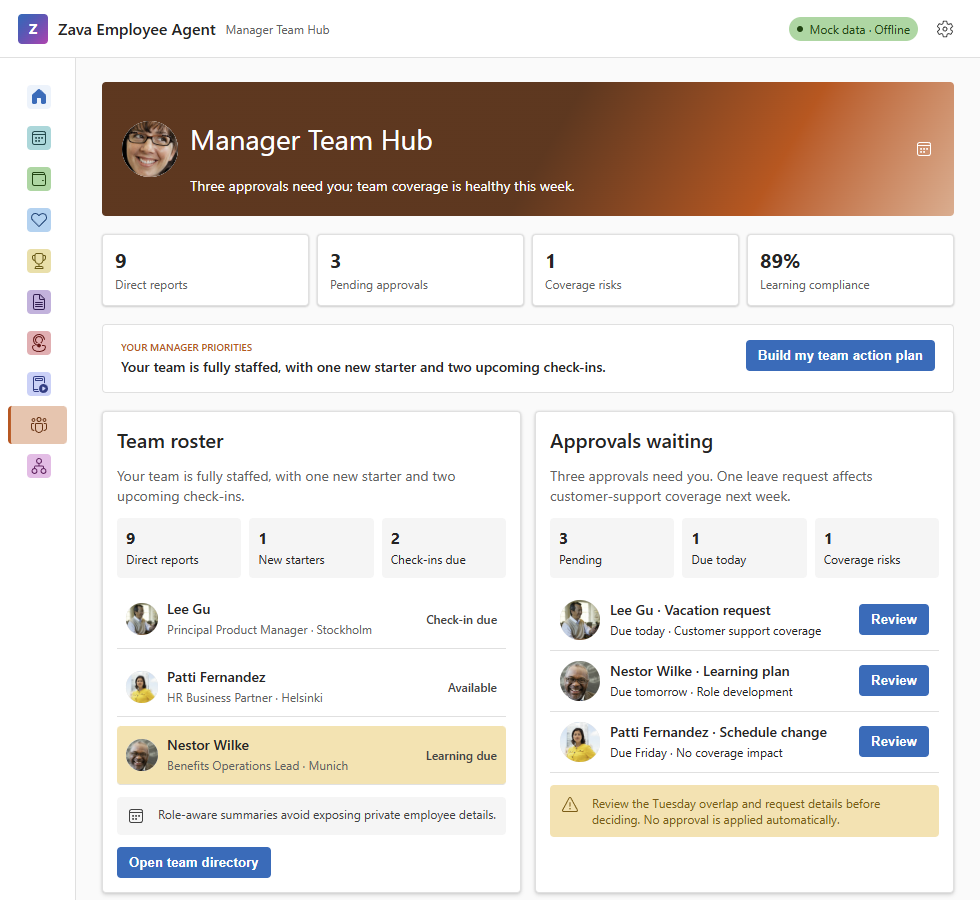
Component Plan
Each named inline intent is its own SPFx Copilot Component and MCP app tool with a manifest GUID,
tool description, minimal optional Zod schema, bundle entry, and agent registration. Components in a
family share data/services, theme, and the full-screen destination; they do not share one generic
view-multiplexed tool.
The canonical names, tool metadata, parameters, fixed fullscreen routes, and implementation order are defined in Zava-Employee-Agent-Component-Plan.md.
| # | Component family | Intent components | Full-screen tab | Status |
|---|---|---|---|---|
| 01 | My HR Dashboard | 5 | Home | Complete |
| 02 | Policy Q&A | 2 | Policy | Complete |
| 03 | PTO & Leave | 2 | Time | Complete |
| 04 | Payroll Explainer | 2 | Money | Complete |
| 05 | Benefits & Life Events | 2 | Benefits | Complete |
| 06 | HR Case Desk | 1 | Support | Complete |
| 07 | Learning & Compliance | 1 | Learning | Complete |
| 08 | Total Rewards | 1 | Rewards | Complete |
| 09 | Manager Team Hub | 2 | Team | Complete |
| 10 | Org & People Graph | 2 | People | Complete |
Add Future Components
[!IMPORTANT] Always add a new inline Copilot Component with the supported Yeoman command-line generator. Do not manually build, copy, or rename a component structure in the solution. Generate the clean component first, then update its code to the standards and implementation model in agentic-creation-rules.md.
All 20 current-target components already exist. If an optimal-future intent is explicitly promoted, create it from the solution root with the catalog's component name:
yo @microsoft/sharepoint --component-type copilotComponent --component-name NameOfTheComponent --framework none --skip-install
npm install
After each generation, verify that the generator added the component bundle and agent registration. Then adapt the generated entry point, properties schema, React views, styles, and mock-data service.
Experience Model
Inline
Each component exposes one focused inline intent. Its tool description drives MCP app routing, and
its optional parameters visibly prefill or filter the compact result. It includes Expand when the
host advertises the fullscreen display mode.
Full Screen
The design target is a consistent full-screen HR workspace with:
- A left navigation rail for Home, Policy, Leave, Payroll, Benefits, Support, Learning, Rewards, Team, and People.
- A family-colored header with the signed-in user, time-aware greeting, area state, and key metrics.
- An area-specific priority banner that opens a mocked AI-style action plan in a right-side panel.
- A primary content area with cards, charts, tables, forms, or timelines appropriate to the family.
- Guided actions that stay in the Copilot canvas.
- A settings experience stored only for the current browser session.
All 20 current-target intent components reuse one shared dashboard shell in full-screen mode. Each component has a fixed owning family and initial route; its normalized prompt parameters carry into that route. The shell then owns the rail, right-side panel, settings, and internal cross-family navigation. This retains MCP-level intent routing without creating unrelated full-screen implementations.
Each family tab also includes all five originally planned family experiences. The 30 catalog intents that were not promoted to inline Copilot Components are dashboard-only internal routes with complete mocked UX. “Optimal future” refers only to possible future MCP/inline promotion, not missing full-screen functionality.
The Home signature feature is My HR action plan. Its banner summarizes the most important mocked signals across all families, and Build my HR action plan opens a right-side panel that mimics AI thinking and streamed recommendations. Every recommendation can navigate directly to its owning family detail. No AI or other runtime API is called.
Parameter-Driven Rendering
Parameters change the component before it renders. The agent resolves intent and supplies typed, serializable values; the renderer does not infer business intent from display text.
| Pattern | Example family | Typical parameters |
|---|---|---|
| Filtered summary | My HR Dashboard | focusArea, dateRange, showSensitive |
| Guided transaction | PTO & Leave | leaveType, startDate, endDate, reason |
| Explainability | Payroll Explainer | period, compareTo, includeDeductions |
| Comparison matrix | Benefits & Life Events | coverageTier, weighting, dependents |
| Private handoff | HR Case Desk | category, privacyLevel, subject |
| Manager scope | Manager Team Hub | teamId, includeApprovals, includeRisk |
Prompt-derived values visibly prefill editable controls and are validated before any action. For
example, I'd like vacation from August 4th to August 12th, 2027 for a family trip opens the PTO & Leave
request variant with leaveType, startDate, endDate, and reason prefilled. The component then
calculates working days and mocked calendar or coverage conflicts for the user to review. It never
submits directly from prompt values.
The complete schemas, normalization lifecycle, examples, and per-family dashboard compositions are defined in Zava-Employee-Agent-UX-Design.md.
Data Model
The first implementation is fully offline. UI components consume mocked data through service interfaces so live Microsoft Graph, SharePoint, or HR-system implementations can replace the mock without rewriting the views.
Mock data should resemble likely live shapes for:
| Domain | Likely live source |
|---|---|
| User and profile photo | Microsoft Graph /me and /me/photo/$value |
| Calendar and absence | Microsoft Graph events or calendar view |
| People and organization | Microsoft Graph manager, direct reports, and users |
| Policies | SharePoint policy library and search |
| HR cases | SharePoint list or HR case connector |
| Leave, payroll, benefits, rewards | Graph-shaped projection from HR connectors |
| Learning | Viva Learning or task-based assignments |
Mock dates use relative offsets so demonstrations remain current. Images required at runtime are
generated into the typed mock-data registry as base64 data URIs; the mock experience does not depend
on image hosting, profile-photo endpoints, or external services. All 20 component entries share one
production bundle, so this registry is emitted once rather than repeated per tool. Run
npm run generate:mock-media after changing a source image and npm run check:mock-media to verify
the registry is current.
Design Assets
The canonical Family 01 implementation references are generated from one reproducible offline design source. See assets/README.md for the complete catalog and legacy mapping.
The source HTML remains a historical transition-review prototype. Final publication images are
captured from the real React implementation through npm run start:ux-review; the harness can render
all 20 inline tools and all ten full-screen families without a tenant.
- Home inline design source
- Home wide design source
- Home action-plan design source
- Home narrow design source
- Home mobile design source
The remaining pc-* images under assets/design-sources/legacy-people-compass/ are composite mockups
from the People Compass design review that informed the Zava brief. Their interaction and layout
concepts remain useful for Families 02-10, but they are legacy source material rather than canonical
implementation references or publication screenshots.
Known Design Inconsistencies
- The images still contain the old People Compass name and
IPeopleCompassDataServicelabel. The implementation must use Zava Employee Agent naming. - Inline asset filenames are shifted: for example,
pc-02-policy-qa-inline.pngvisibly contains the family 01 My HR Dashboard designs,pc-03-pto-leave-inline.pngcontains family 02 Policy Q&A, andpc-10-people-graph-inline.pngcontains family 09 Manager Team Hub. pc-full-benefits-life-events.pngis not a Benefits full-screen design; it contains the family 10 Org & People Graph inline designs.- The remaining full-screen filenames are also shifted. For example,
pc-full-home-dashboard.pngshows Benefits & Life Events,pc-full-policy-answers.pngshows Org & People Graph, andpc-full-total-rewards.pngshows Time & Leave. - Family 01 has historical Zava inline, wide, panel-open, narrow, and mobile design references. Final
implementation screenshots for every family now live directly under
assets/. - The original brief required a persistent Ask the agent input at the top-right, while the reviewed designs show settings. The canonical UX uses the Copilot host for conversation and an area priority banner for in-component guidance, avoiding a second competing prompt box.
- The brief lists the rail in component-family order, while the designs use the shorthand order Home, Time, Money, Benefits, Rewards, Policy, Support, Learning, Team, People.
- The designs imply one persistent shell while the product requires multiple callable intents. The canonical architecture keeps 20 value-ranked tools and reuses one shared full-screen shell.
Treat these boards as provenance only. Use the implementation screenshots directly under assets/
for README, gallery, review, and publication.
Zava Brand
- Company: Zava, Microsoft's fictional demonstration company.
- Tone: Personal and approachable, with employee-first language such as "Your leave balance" and "Your next best action."
- Typography: Aptos Display and Aptos where available.
- Palette: Zava brand colors may guide design intent, but runtime colors must use Fluent UI v9 theme tokens and remain accessible in light and dark host themes.
- Catalog mark: A white employee silhouette with a gold agent spark on Zava blue (
#0F6CBD). The 192 × 192 color icon keeps the mark inside the 120 × 120 safe region; the matching 32 × 32 outline icon uses white pixels on transparency. Regenerate both with./scripts/generate-agent-icons.ps1.
Technology and Standards
- SharePoint Framework 1.24 Copilot Components, not classic web parts.
- Heft build system, not Gulp.
- React 17 functional components.
- Fluent UI React v9 components, icons, and theme tokens.
- Zod schemas with descriptions for every tool property.
- Host-derived theme, dimensions, and display mode.
- Accessible keyboard behavior and reduced-motion support.
- Mock data first, with live integrations deferred.
Build
Prerequisites
- Node.js
>=22.14.0 <23.0.0 - Yeoman and the SharePoint Framework generator
- Heft
- A Microsoft 365 tenant that supports SPFx 1.24 Copilot Components for deployment testing
npm install -g yo @microsoft/generator-sharepoint @rushstack/heft
npm install
heft test --clean
For a production package:
npm run build
The final gate verifies generated mock media, runs the clean production test suite, packages the
solution, validates all generated API-plugin functions and MCP tools, and audits the final .sppkg
for stale JavaScript, duplicated media, icon-font payloads, and size regressions.
The package path configured by the project is
sharepoint/solution/zava-employee-agent.sppkg.
Minimal Path to Awesome
- Deploy the ready-made
sharepoint/solution/zava-employee-agent.sppkgto the tenant app catalog, or runnpm installandnpm run build. - Add the generated Zava Employee Agent to Microsoft Copilot.
- Start a fresh conversation and use the exact prompts in Zava-Employee-Agent-Demo-Prompts.md.
- Confirm prompt values are visible and editable before completing any mocked action.
Video: test the package in Microsoft 365
Use this walkthrough to deploy and test SPFx Copilot component .sppkg packages in a Microsoft 365
tenant:
The ready-made package is intended for sample and demo tenants. Complete tenant-specific privacy, accessibility, localization, security, and connector validation before production adoption.
Local UX Review
Run the real React surfaces without a tenant:
npm run start:ux-review
Open http://127.0.0.1:4401. The toolbar switches intent, family, width, display mode, and theme.
Query parameters such as ?mode=fullscreen&family=team&width=wide&clean=1 make review and screenshot
states reproducible. This harness validates local UX behavior, not authenticated tenant CSP, iframe
focus, high contrast, or screen-reader output.
Validation Status
- 39 suites and 170 tests pass with zero failures.
- All 20 manifests, component entries, agent registrations, functions, and mirrored MCP tools validate.
- All 32 implementation screenshots validate against assets/sample.json.
- The final package contains one 910,310-byte hashed JavaScript bundle and no stale JavaScript, duplicate cross-bundle media, or Fluent icon-font payload.
- Authenticated Copilot routing, iframe focus, screen-reader, and Windows high-contrast checks remain explicit manual gates in todo.md.
Demo and Testing
- 60-second primary demo
- 3-minute dynamic UX demo
- 10-minute business value demo
- 5-minute developer and architecture demo
- 20-component prompt catalog
- Unified sample gallery metadata
- Experience and implementation tracker
- Reusable agentic creation rules
Current Solution Structure
samples/zava-employee-agent/
|-- README.md
|-- Zava-Employee-Agent-Intro-Brief.md
|-- agentic-creation-rules.md
|-- assets/                                 # source design mockups
|-- config/                                 # Heft, SPFx, and Copilot registration
|-- copilot/                                # declarative agent and plugin manifests
|-- src/
|   `-- copilotComponents/
|       |-- getMyHrDashboard/               # Home summary component and shared shell
|       |-- approvalInbox/                   # representative manager workflow
|       `-- ...                              # 18 additional intent components
|-- teams/
`-- package.json
As components are generated, each receives its own folder under src/copilotComponents/, bundle
entry in config/config.json, component GUID registration in config/copilot-agent.json, and tool
definition in its component manifest.
Version History
| Version | Date | Comments |
|---|---|---|
| 1.0 | August 10, 2026 | Initial scaffold |
| 1.1 | August 11, 2026 | Updated Zava naming and ten-component implementation plan |
| 1.2 | August 11, 2026 | Added canonical UX, action-plan, and prompt-parameter contracts |
| 1.3 | August 11, 2026 | Added shared offline mock foundation and Family 01 inline baseline |
| 1.4 | August 11, 2026 | Added shared full-screen Home shell and streamed My HR action plan |
| 1.5 | August 12, 2026 | Added reusable UI primitives, improved leave chart, and functional session settings |
| 1.6 | August 12, 2026 | Enabled ten-family full-screen navigation with color-coded title-only placeholders |
| 1.7 | August 12, 2026 | Added ten unique reusable family themes with same-hue dark-to-light gradients |
| 1.8 | August 12, 2026 | Added licensed anniversary photography, Work IQ welcome polish, and a real Workbench review avatar |
| 1.9 | August 12, 2026 | Replanned the solution as 50 intent-specific Copilot Components sharing one ten-tab full-screen shell |
| 2.0 | August 12, 2026 | Completed five independent Home intent components with MCP routing and shared full-screen routes |
| 2.1 | August 13, 2026 | Value-ranked the inline portfolio to 20 current tools and moved 30 candidates to optimal future |
| 2.2 | August 21, 2026 | Added shared production bundling, package/plugin audits, Team roster portraits, and final demo/readiness documentation |
Disclaimer
THIS CODE IS PROVIDED AS IS WITHOUT WARRANTY OF ANY KIND, EITHER EXPRESS OR IMPLIED, INCLUDING ANY IMPLIED WARRANTIES OF FITNESS FOR A PARTICULAR PURPOSE, MERCHANTABILITY, OR NON-INFRINGEMENT.