
Copilot UX component
Zava AI Project Portfolio Agent
A leadership-ready SharePoint Copilot App with 31 intent-routed UX components for personal work, project delivery, portfolio governance, AI investment, capacity, submissions, and approvals.

- Updated
- August 21, 2026
- Built with
- React
- SPFx version
- 1.24.0-beta.2
- Products
- SharePoint, Microsoft Copilot
Overview
What this sample demonstrates
Zava demonstrates dynamic UX resolution inside Microsoft Copilot. Thirty operational SPFx Copilot Components independently route natural-language intents to purpose-built information, comparison, submission, and decision experiences. A thirty-first capability explorer helps users discover the complete scenario catalog through business outcomes and safe previews.
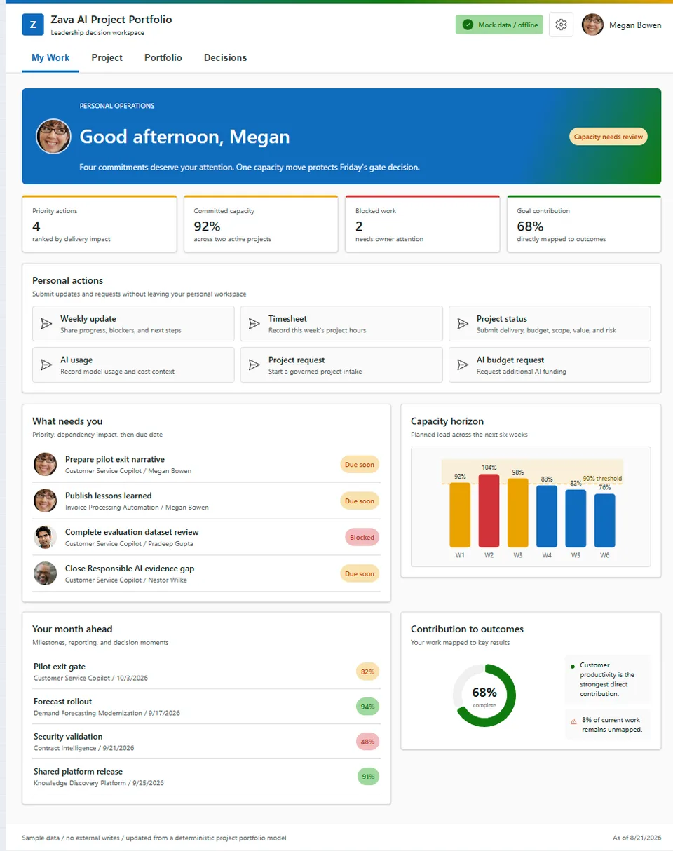
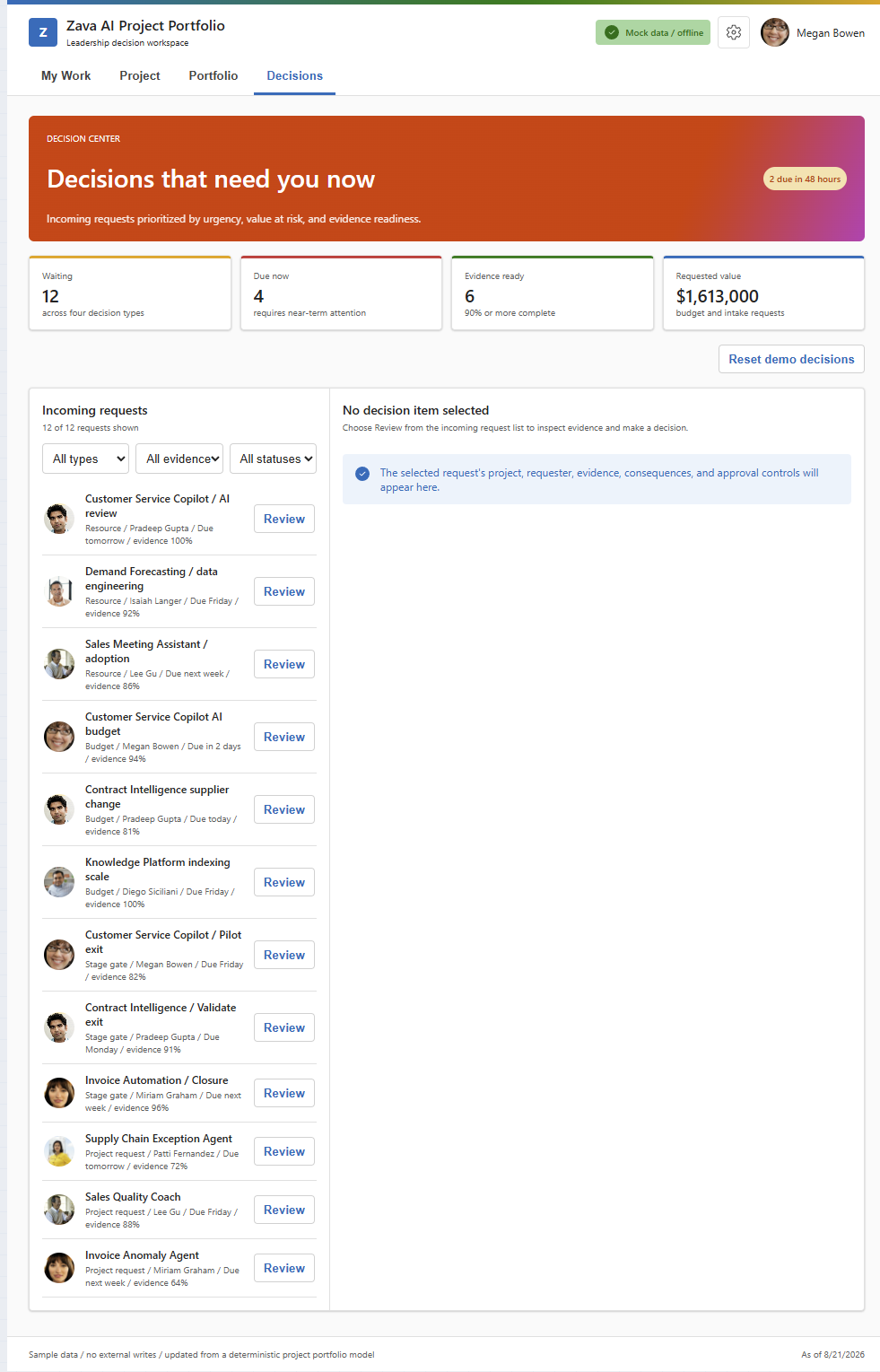
Operational components expand into one responsive full-screen application with My Work, Project, Portfolio, and Decisions dashboards. Project selection coordinates delivery, budget, AI spend, milestones, risk, team load, and benefits. Portfolio views show company investment, run-rate, value, capacity, and systemic exposure. Decisions uses one evidence-first inbox backed by the same records as the inline review components.
The sample is deterministic, offline, and safe for worldwide demonstrations. Prompt values prefill or filter UX but never submit or decide automatically. Confirmed sample actions create browser-session receipts and never write to an external system. The production package uses one optimized shared bundle, bundled personas, Fluent UI v9, React 17, Griffel owner-document styling, focused D3 visualizations, and automated plugin/package-output validation.
Gallery
See the component in action


Documentation
Setup and implementation
Summary
Zava demonstrates intent-driven UX inside Microsoft Copilot. Thirty independently routed operational Copilot Components answer personal delivery, project, portfolio, AI investment, capacity, submission, and approval intents. A catalog-driven capability explorer helps users discover them.
Inline dynamic UX is the primary experience: a project-health question renders evidence, a comparison renders aligned trade-offs, and a request renders an editable review flow. Operational components can expand into a shared full-screen workspace with My Work, Project, Portfolio, and Decisions dashboards. All data and confirmed actions are deterministic, offline, and sample-only.
For a live presentation, use the timed 3-minute dynamic UX demo. For routing, extraction, and UX testing, use the complete 31-component prompt catalog.
Screenshots
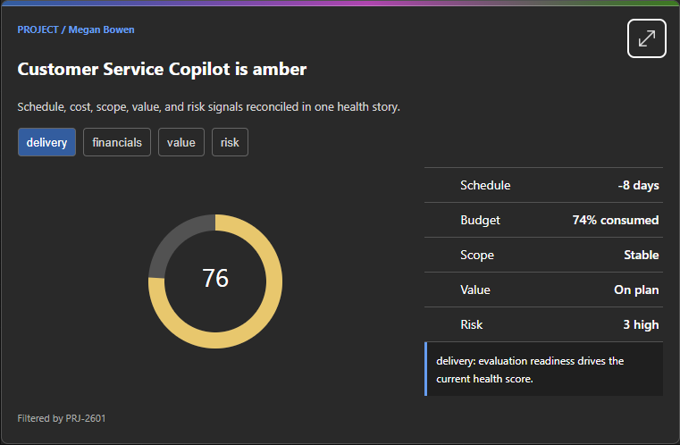
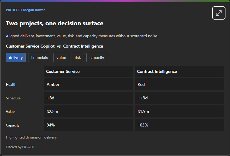
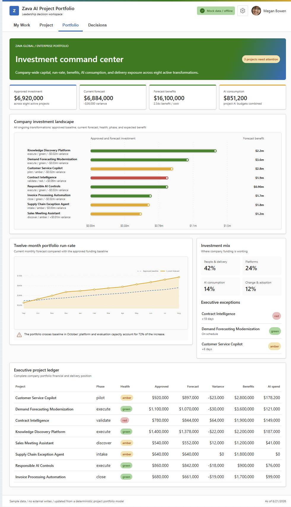
Used SharePoint Framework Version

This sample targets the SPFx 1.24.0-beta.2 Copilot Component preview used by the repository. Confirm
the supported SPFx Copilot component version in your target tenant before production adoption.
Applies to
Get your own free development tenant by subscribing to Microsoft 365 developer program
Prerequisites
- Node.js
>=22.14.0 <23.0.0for local development. - A SharePoint app catalog and Microsoft Copilot access for deployment and tenant-host validation.
- No external API, Azure resource, or runtime network dependency is required for the sample data.
- For local Workbench testing, replace
{tenantDomain}inconfig/serve.jsonwith the target tenant domain. The ready-made package does not require this local development setting.
Solution
| Solution | Author(s) |
|---|---|
zava-project-tracker |
Microsoft 365 & Power Platform Community sample |
Version history
| Version | Date | Comments |
|---|---|---|
| 1.0 | August 20, 2026 | Public sample baseline with 31 Copilot Components |
Disclaimer
THIS CODE IS PROVIDED AS IS WITHOUT WARRANTY OF ANY KIND, EITHER EXPRESS OR IMPLIED, INCLUDING ANY IMPLIED WARRANTIES OF FITNESS FOR A PARTICULAR PURPOSE, MERCHANTABILITY, OR NON-INFRINGEMENT.
Minimal Path to Awesome
Deploy the ready-made package from
sharepoint/solution/zava-project-tracker.sppkgto the tenant app catalog, or build locally:npm install npm run buildFor local development, configure the tenant domain in
config/serve.json, then run:npm startAdd the generated Zava agent to Microsoft Copilot and start with one of the three conversation starters. Use the prompt catalog for deterministic routing checks.
Video: test the package in Microsoft 365
Use this walkthrough to deploy and test SPFx Copilot component .sppkg packages in a Microsoft 365
tenant:
The ready-made package is intended for sample/demo tenants. Build from source and complete your own tenant, accessibility, privacy, localization, and security validation before production use.
Other build commands can be listed using heft --help.
Features
- 30 purpose-designed operational Copilot Components and one capability explorer.
- Information, review/decision, and request/submit operation models.
- Shared responsive full-screen shell with four useful default dashboards.
- Explicit Draft -> Review -> Confirm -> session receipt workflows.
- Typed invocation versioning and supported inline-to-full-screen context continuation.
- Deterministic mock project/portfolio data, bundled personas, and no external writes.
- Fluent UI v9, React 17, Griffel owner-document styling, and focused D3 visualizations.
- Tenant-free UX review harness with responsive, dark, reduced-motion, and zoom evidence.
- Optimized shared production bundle with generated plugin and package-output validation.
Data and safety
- Projects, people, financials, capacity, AI usage, risks, and approvals are deterministic mock data.
- Megan Bowen, Pradeep Gupta, and other named people are standard fictional Microsoft 365 demo personas.
- Prompt values prefill or filter UX but never submit, approve, reject, assign, or write automatically.
- Confirmed sample actions persist only in browser-session state and can be reset from Decisions.
- No live Graph, SharePoint, Planner, Project, Fabric, finance, or AI-service call is made at runtime.
Accessibility and responsive design
- Keyboard-accessible tabs, forms, queues, controls, and icon-button names.
- Visible text/icon semantics accompany status colors.
- Reduced-motion behavior and real 200% browser zoom validated in the tenant-free review harness.
- Inline layouts validated at 340 px and 760 px; full-screen dashboards validated from 340 px through keynote width in light and dark themes.
- Charts provide accessible names and nearby textual insight. Additional table/list equivalents and authenticated-host screen-reader/high-contrast validation remain tracked in todo.md.
Worldwide readiness
- Currency display supports USD, EUR, and JPY in the full-screen session settings.
- Layouts are designed for narrow and wide hosts without viewport-scaled typography.
- Authored UI and localization resources are currently English (US). Full translation, right-to-left presentation, locale-specific week starts, and final worldwide stress testing are documented follow-ups rather than implied completed capabilities.
Validation status
168/168tests pass with zero build warnings.- All 31 manifests, tools, schemas, registrations, and 188 optional prompt properties validate.
- The generated API plugin and final
.sppkgpass automated output audits. - All 39 unified-gallery screenshots are validated against
assets/sample.json. - Tenant-authenticated CSP, iframe focus, screen-reader, and high-contrast smoke testing requires a configured tenant and remains an explicit external validation step.
Demo and testing
- 3-minute dynamic UX demo - concise keynote showing three intent-routed inline experiences and one governed Decisions continuation.
- 10-minute business value demo - comprehensive leadership story across discovery, project evidence, portfolio trade-offs, personal work, and a confirmed session decision.
- 5-minute developer and architecture demo - pairs live UX with the exact routing, host, state, theming, session-store, bundling, and validation code.
- 31-component demo prompt catalog
- Unified sample gallery metadata
- Experience and implementation plan
- Reusable agentic creation rules
References
- Getting started with SharePoint Framework
- Building for Microsoft teams
- Use Microsoft Graph in your solution
- Publish SharePoint Framework applications to the Marketplace
- Microsoft 365 Patterns and Practices - Guidance, tooling, samples and open-source controls for your Microsoft 365 development
- Heft Documentation