
Copilot UX component
Zava Retail Store — Retail Performance Copilot App
A SharePoint Copilot App (SPFx 1.24 Copilot Component) that renders an executive retail cockpit inside the Microsoft Copilot canvas — a compact inline performance card that expands to a full-screen dashboard covering sales, category mix, customer satisfaction, feedback, top products and store comparisons.

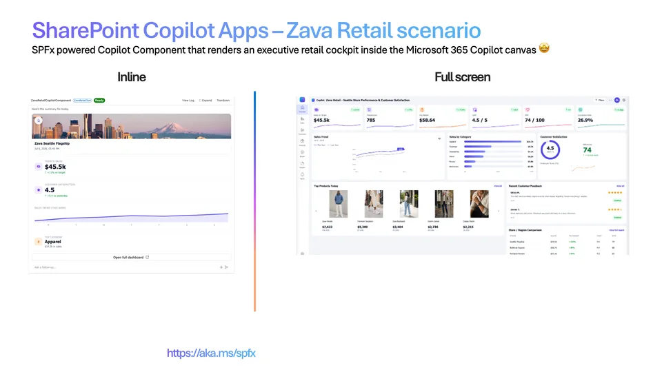
- Updated
- July 6, 2026
- Built with
- React
- SPFx version
- 1.24.0-beta.2
- Products
- SharePoint, Microsoft Copilot
Overview
What this sample demonstrates
Zava Retail Store is a SharePoint Copilot App built as an SPFx 1.24 Copilot Component (not a classic web part). The same React component renders in two display modes inside the Microsoft Copilot canvas: a compact inline card and an immersive full-screen executive dashboard. Copilot opens to a compact performance card — headline metrics and a sales trend — then can request expansion via requestDisplayModeAsync('fullscreen') to reveal the full experience.
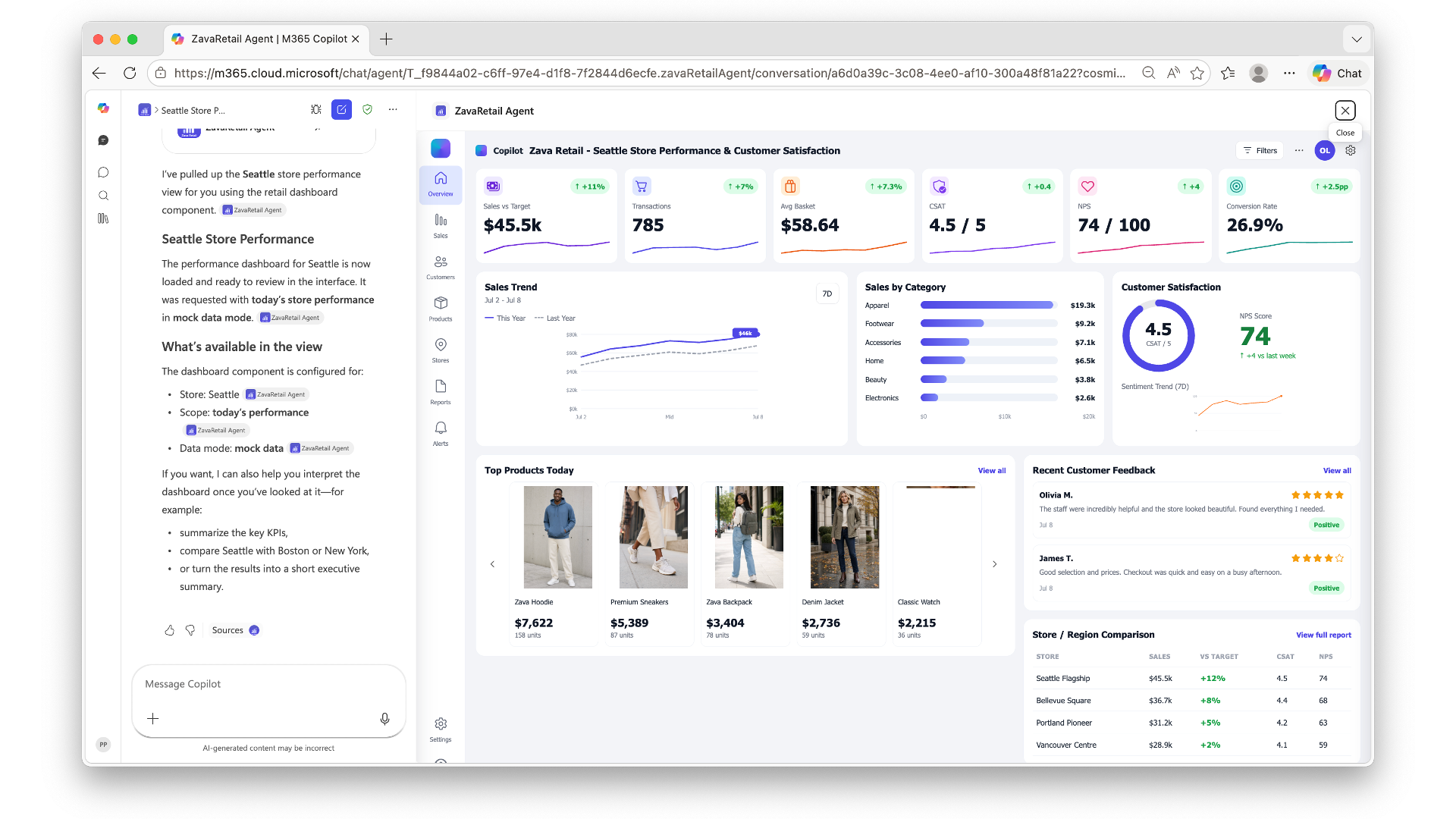
The full-screen experience is an executive dashboard shell (app rail + top bar) composed of modular sections: a metrics row (sales vs target, transactions, avg basket, CSAT, NPS, conversion rate), a sales trend panel, sales by category, a customer satisfaction gauge, recent customer feedback, a top-products carousel and store/region comparison. A Filters dialog lets the user pick the target store and date and enable/disable individual panels, and the whole dashboard re-flows live to match the selection.
The sample ships with mocked, Microsoft Graph-shaped data behind a swappable data service exposing a useMock flag (true for fully offline demos, false to read a live data service and Microsoft Graph for the signed-in user), so a live implementation is a drop-in replacement. The Copilot Component is surfaced as a tool (ZavaRetailTool) a declarative agent can call, rendering its own React UI inside the Copilot host. Built with the Heft build system, React 17 and Fluent UI v9 with host-driven light/dark theming.
Gallery
See the component in action


Documentation
Setup and implementation
An executive retail cockpit that lives inside the Microsoft Copilot canvas — store performance and customer satisfaction at a glance.






Summary
Zava Retail Store is an SPFx 1.24 Copilot component (not a classic web part). Copilot opens to a compact performance card — key metrics and a sales trend — then expands to a full executive dashboard covering sales, category mix, customer satisfaction, feedback, top products and store comparisons. Maximum impact for a retail launch demo.
The same React component renders in two modes inside the Copilot canvas:
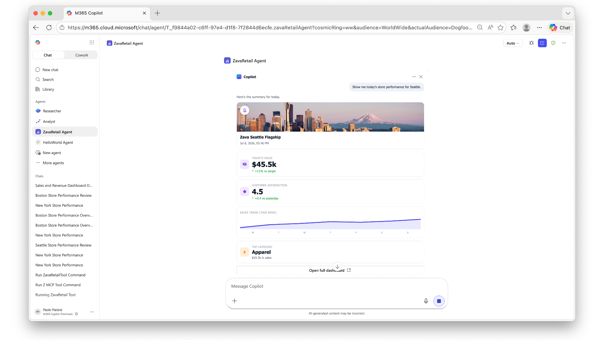
- a compact inline card, and
- an immersive full-screen executive dashboard.
The sample ships with mocked data so anyone can deploy and demo in minutes — no line-of-business integration required. A swappable data service exposes a useMock flag (true for offline demos, false to read a live data service and Microsoft Graph for the signed-in user).
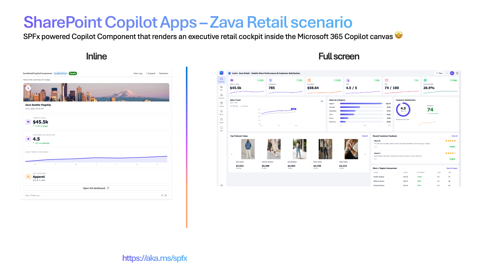
Inline (left) + full-screen (right).
Screenshots & demo
| Inline | Full screen |
|---|---|
 |
 |
Used SharePoint Framework Version
Applies to
- SharePoint Framework 1.24+ (Copilot Component)
- Microsoft Copilot
- Microsoft 365 tenant with the SharePoint App Catalog
Get your own free development tenant by subscribing to the Microsoft 365 developer program
Prerequisites
- Node.js >=22.14.0 <23.0.0
- A Microsoft 365 tenant with SPFx 1.24 (dev preview) enabled
- SharePoint App Catalog site
- Heft (
npm install -g @rushstack/heft) - Yeoman +
@microsoft/generator-sharepoint(only needed to scaffold additional components)
This solution uses the Heft build system (not Gulp), React 17 functional components and Fluent UI v9, aligned with the SPFx 1.24 dev preview.
Solution
Version history
| Version | Date | Comments |
|---|---|---|
| 1.0 | 07.06.2026 | Initial release |
Disclaimer
THIS CODE IS PROVIDED AS IS WITHOUT WARRANTY OF ANY KIND, EITHER EXPRESS OR IMPLIED, INCLUDING ANY IMPLIED WARRANTIES OF FITNESS FOR A PARTICULAR PURPOSE, MERCHANTABILITY, OR NON-INFRINGEMENT.
Minimal Path to Awesome
Ready-made package included. Because this is a scenario sample that runs entirely on mock data - with no live customer data or line-of-business integration - the repository ships the fully built solution package so you can deploy and demo it in minutes without building anything. Grab the package here: /sharepoint/solution/zava-retail-store.sppkg.
To use it, upload
zava-retail-store.sppkgto your tenant App Catalog, enable solution in all sites (includes Copilot), and invoke the agent in Microsoft Copilot. Prefer to build from source instead? Follow the steps below.
- Clone this repository
- Ensure that you are at the solution folder (
zava-retail-store) - In the command-line run:
npm install -g @rushstack/heftnpm installheft start --clean— local dev server athttps://localhost:4321
- Invoke the agent in Copilot and confirm the inline render, expand-to-full-screen, and dark/light theming.
Production build, test, and package:
npm run build
Other build commands can be listed using heft --help.
60-second demo script
A tight, repeatable flow for a live demo. All data is mock, so it works the same every time.
- Invoke it - in Microsoft Copilot, select the ZavaRetail Agent agent and send: "Show me the performance of our store in New York" The compact inline card renders.
- Land the inline experience (~10s) - call out the initial output with brief recap of performance (today's sales, customer satisfaction, sales trend, and top category).
- Expand (~10s) - click the Open full dashboard command on the lower part of the card. The full-screen dashboard animates in - sales vs target, transactions, avg basket, CSAT, NPS, conversion rate, sales trend, sales by category, customer satisfaction, top products today, recent customer feedback, and store/region comparison.
- The "wow" moment (~30s) - click Filters. Select the target store, target date, and enabled/disable any of the components/charts rendering in the dashboard. The whole dashboard dynamically updates accordingly to your settings.
- Theming (~10s) - flip the Copilot host to dark mode to show the whole experience re-theme instantly.
Tip: the day is always "today" and data follows current calendar, whenever you demo.
Features
Zava Retail Store demonstrates how to build a rich, theme-aware executive dashboard inside the Microsoft Copilot canvas using an SPFx Copilot Component.
This sample illustrates the following concepts:
- Copilot Component UX — a
CopilotComponent(copilotType: "UX") surfaced as a tool (ZavaRetailTool) a declarative agent can call, rendering its own React UI inside the Copilot host. - Display-mode-aware rendering — a single root React component (
ZavaRetailApp) selects a dedicated inline or full-screen view from the host-advertised display mode; inline can request expansion to full screen. - Swappable data service — Microsoft Graph + data service access behind a
useMockflag, with mock data fallback for fully offline demos. - Theme awareness — light/dark theme driven by the Copilot host context and Fluent UI v9 (
webLightTheme/webDarkTheme).
UX components
Metrics row · sales trend line chart · sales-by-category · satisfaction gauge · customer feedback · product carousel · store comparison · sparklines
Inline experience
Compact performance card — headline metrics plus a sales trend at-a-glance summary, with a control to expand into the full dashboard.
Full-screen experience
Executive dashboard shell (app rail + top bar) composed of modular sections: metrics row, sales trend panel, sales by category, customer satisfaction, customer feedback, top-products carousel and store comparison — plus a settings dialog for data source and theme.
Wireframe
INLINE  🏬 Zava Retail — Seattle   ▲ Sales $128.4k   ◔ CSAT 4.6   ▸ Expand dashboard

FULL    ┌ Metrics row ───────────────┐
        ├ Sales trend ┤├ Categories ┤├ Satisfaction ◔ ┤
        ├ Feedback ───┤├ Top products carousel ┤├ Store comparison ┤
Data source
Microsoft Graph (/me, /me/photo for the signed-in user); retail metrics, categories, feedback and product catalog from a data service. All data is mocked for the sample via a swappable data service (useMock flag); set useMock to "false" and provide a dataServiceUrl to read live data.
Solution structure
zava-retail-store/
  README.md
  Zava-Retail-3-Minute-Demo.md                 # business and vision presenter script
  Zava-Retail-5-Minute-Technical-Demo.md       # developer and architecture walkthrough
  scripts/validate-public-dependencies.mjs     # public npm provenance release gate
  config/                       # Heft / SPFx + Copilot agent configuration
  copilot/                      # declarative agent + plugin manifests
  src/
    copilotComponents/
      zavaRetail/
        ZavaRetailCopilotComponent.ts             # entry point (mounts React)
        ZavaRetailCopilotComponent.manifest.json  # component + tools manifest
        ZavaRetailCopilotComponentProperties.ts   # Zod tool-input schema
        ZavaRetailApp.tsx                         # root selector (inline vs. full-screen)
        propertyParsers.ts                        # string-encoded property parsing
        components/
          InlineView.tsx        # inline display-mode view
          FullScreenView.tsx    # full-screen dashboard shell
          MetricsRow.tsx · SalesTrendPanel.tsx · SalesByCategory.tsx
          SatisfactionPanel.tsx · CustomerFeedback.tsx · ProductCarousel.tsx
          StoreComparison.tsx · Gauge.tsx · LineChart.tsx · Sparkline.tsx
        data/
          ZavaRetailDataService.ts                # swappable mock / live data service
        assets/products/                          # product images
References
- Getting started with SharePoint Framework
- Use Microsoft Graph in your solution
- Heft Documentation
- Fluent UI React v9
- PnP React controls
- Microsoft 365 & Power Platform Community - Guidance, tooling, samples and open-source controls for your Copilot, Microsoft 365 & Power Platform development
Part of the Copilot UX components sample gallery — complex UX in the Copilot canvas, powered by SPFx. See aka.ms/spfx.