
From the contributor
How to use this sample
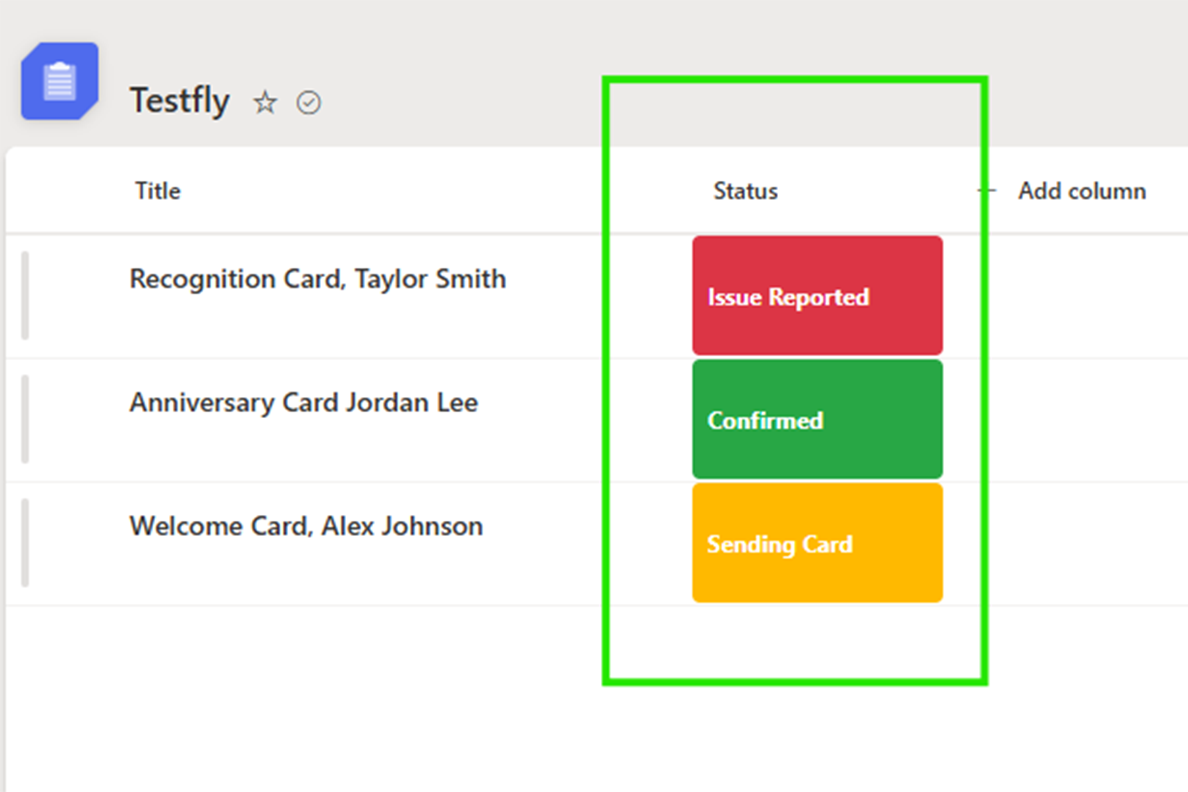
This sample uses SharePoint column formatting to display status values as simple, color-coded badges. It provides a quick visual indicator that makes list items easier to scan.
Features
- Displays each status as a centered badge
- Uses amber for Sending Card
- Uses green for Confirmed
- Uses red for Issue Reported
- Uses gray for any other or unexpected value
- Does not change the underlying list data
- Contains no tenant-specific or personal information
Requirements
Create a SharePoint Choice column containing the following values:
- Sending Card
- Confirmed
- Issue Reported
The choice values must match exactly for the corresponding colors to appear.
Installation
- Create or open a SharePoint list.
- Add a Choice column named Status.
- Add the required choices listed above.
- Open the Status column menu.
- Select Column settings and then Format this column.
- Select Advanced mode.
- Copy the contents of
generic-status-badges.json. - Paste the JSON into the formatting editor.
- Select Save.
Status Colors
| Status | Color |
|---|---|
| Sending Card | Amber (#FFB900) |
| Confirmed | Green (#28A745) |
| Issue Reported | Red (#DC3545) |
| Any other value | Gray (#808080) |
Customization
You can customize the formatting by changing the status text or hexadecimal color values inside generic-status-badges.json.
If you change a status name, make sure the value in the JSON exactly matches the corresponding SharePoint Choice value.
Sample
| Solution | Author(s) |
|---|---|
| generic-status-badges.json | Leul Mesfin |
Version history
| Version | Date | Comments |
|---|---|---|
| 1.0 | September 22, 2026 | Initial release |
Disclaimer
THIS CODE IS PROVIDED AS IS WITHOUT WARRANTY OF ANY KIND, EITHER EXPRESS OR IMPLIED, INCLUDING ANY IMPLIED WARRANTIES OF FITNESS FOR A PARTICULAR PURPOSE, MERCHANTABILITY, OR NON-INFRINGEMENT.