
Back to column formats
Column formattingSharePoint Online

Field Value Update Button

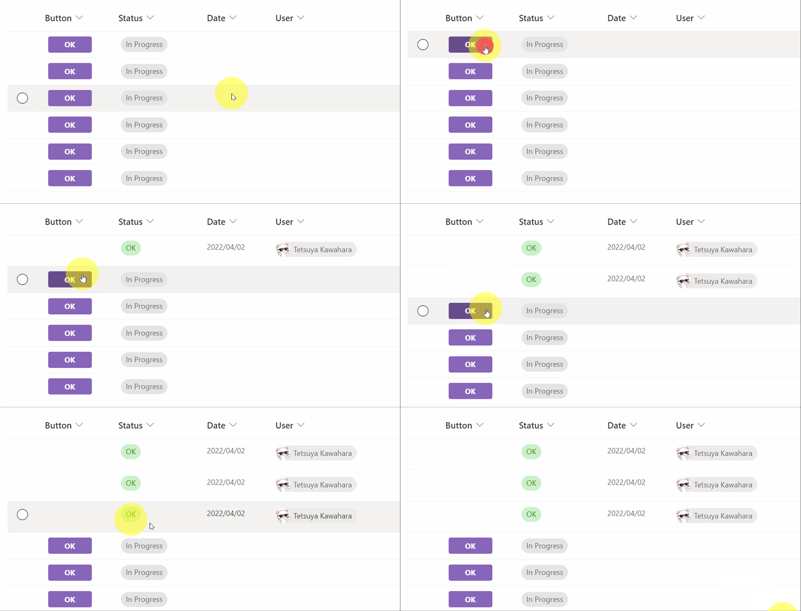
This sample demonstrates displaying a button to update the fields values of an item.

Field Value Update Button formatting preview
Sample preview · View original animation

Copy. Apply. Make it yours.

Get this format

8 definitions

Review the requirements below, then paste this JSON into the matching formatting panel. Show me where.

Use your list's internal column names and replace any tenant-specific URLs or flow IDs. Formatting is presentation, not a way to secure data.

Column formatting
Download JSON
{
  "$schema": "https://developer.microsoft.com/json-schemas/sp/v2/column-formatting.schema.json",
  "elmType": "div",
  "children": [
    {
      "elmType": "div",
      "style": {
        "display": "=if([$FieldName] == 'Value to hide the button' , 'none' , 'flex')",
        "flex-direction": "row"
      },
      "children": [
        {
          "elmType": "div",
          "style": {
            "width": "70px",
            "height": "26px",
            "border-radius": "3px",
            "cursor": "pointer",
            "display": "flex",
            "align-items": "center",
            "justify-content": "space-evenly",
            "margin": "5px",
            "border": "1px solid"
          },
          "attributes": {
            "class": "ms-fontColor-teal ms-bgColor-teal--hover ms-fontColor-white--hover ms-fontSize-12 ms-fontWeight-bold"
          },
          "customRowAction": {
            "action": "setValue",
            "actionInput": {
              "Status": "OK",
              "Date": "@now",
              "User": "@me"
            }
          },
          "children": [
            {
              "elmType": "div",
              "txtContent": "OK"
            }
          ]
        },
        {
          "elmType": "div",
          "style": {
            "width": "70px",
            "height": "26px",
            "border-radius": "3px",
            "cursor": "pointer",
            "display": "flex",
            "align-items": "center",
            "justify-content": "space-evenly",
            "margin": "5px",
            "border": "1px solid"
          },
          "attributes": {
            "class": "ms-fontColor-red ms-bgColor-red--hover ms-fontColor-white--hover ms-fontSize-12 ms-fontWeight-bold"
          },
          "customRowAction": {
            "action": "setValue",
            "actionInput": {
              "Status": "NG",
              "Date": "@now",
              "User": "@me"
            }
          },
          "children": [
            {
              "elmType": "div",
              "txtContent": "NG"
            }
          ]
        }
      ]
    }
  ]
}

From the contributor

How to use this sample

Summary

This sample demonstrates displaying a button to update the fields values of an item.
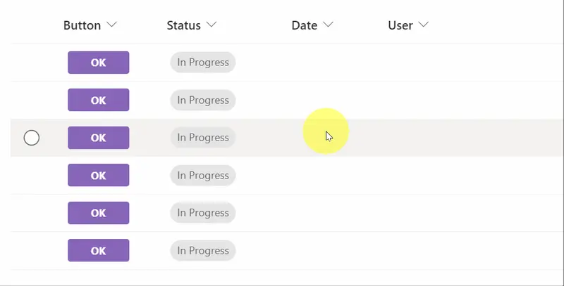
screenshot of the sample

In this sample, there are 8 types of buttons as follows.
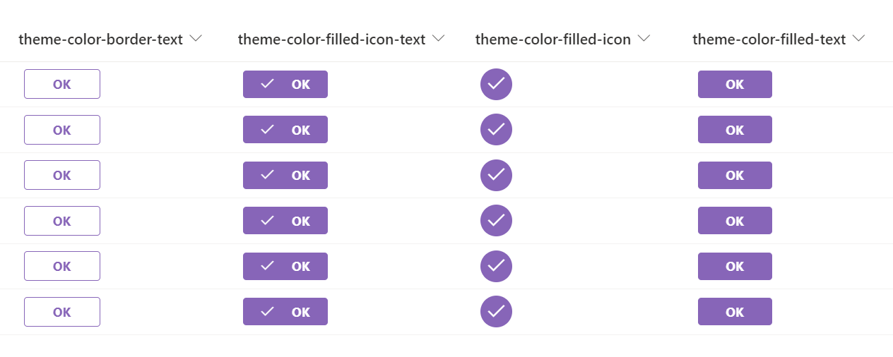
screenshot of the sample

screenshot of the sample

How to change the text on the button

If you want to change the text of the button, change the value of the txtContent property.

How to change the icon

If you want to change the icon, refer to Fluent UI Icons and change the value of the iconName property.

How to change the field to be updated

If you want to change the field to be updated, refer to Microsoft Docs and change the value of the actionInput property.

How to set the button to show or hide

If you want to show or hide the button, change the value of the display property.

View requirements

This format can be applied to any column type but expects the following columns to be part of the view:

Type Internal Name Required
Choice Status No
Date and Time Date No
Person or Group User No

Sample

Solution Author(s)
generic-update-button.json Tetsuya Kawahara
generic-update-button-theme-color-filled-icon-text.json Tetsuya Kawahara
generic-update-button-theme-color-filled-icon.json Tetsuya Kawahara
generic-update-button-theme-color-filled-text.json Tetsuya Kawahara
generic-update-button-OK-NG-border-text.json Tetsuya Kawahara
generic-update-button-OK-NG-filled-icon-text.json Tetsuya Kawahara
generic-update-button-OK-NG-filled-icon.json Tetsuya Kawahara
generic-update-button-OK-NG-filled-text.json Tetsuya Kawahara

Version history

Version Date Comments
1.0 April 2, 2022 Initial release

Disclaimer

THIS CODE IS PROVIDED AS IS WITHOUT WARRANTY OF ANY KIND, EITHER EXPRESS OR IMPLIED, INCLUDING ANY IMPLIED WARRANTIES OF FITNESS FOR A PARTICULAR PURPOSE, MERCHANTABILITY, OR NON-INFRINGEMENT.