
Back to view formats
View formattingSharePoint Online

Custom Header

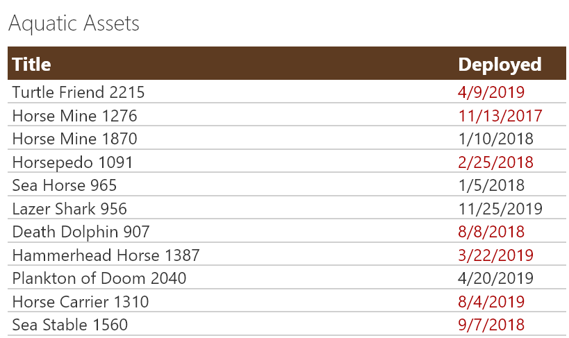
Sometimes it is necessary to remove the standard headers. In those cases, you may still want to show a custom header. This sample demonstrates creating a custom header and only showing it on the first row. The key to this technique is setting the `display` style attribute to `none` (hidden) whenever the `@rowIndex` is not 0 (first row).

Custom Header formatting preview
Sample preview · View original image

Copy. Apply. Make it yours.

Get this format

2 definitions

Review the requirements below, then paste this JSON into the matching formatting panel. Show me where.

Use your list's internal column names and replace any tenant-specific URLs or flow IDs. Formatting is presentation, not a way to secure data.

View formatting
Download JSON
{
  "$schema": "https://developer.microsoft.com/json-schemas/sp/v2/row-formatting.schema.json",
  "hideColumnHeader": true,
  "hideSelection": true,
  "rowFormatter": {
    "elmType": "div",
    "style": {
      "display": "flex",
      "flex-direction": "column",
      "align-items": "flex-start"
    },
    "children": [
      {
        "elmType": "div",
        "attributes": {
          "class": "ms-bgColor-themePrimary ms-fontColor-white"
        },
        "style": {
          "display": "=if(@rowIndex % 30 == 0, 'flex', 'none')",
          "font-weight": "bold",
          "font-size": "18px",
          "width": "100%",
          "padding": "4px"
        },
        "children": [
          {
            "elmType": "div",
            "txtContent": "Title",
            "style": {
              "flex-grow": "1"
            }
          },
          {
            "elmType": "div",
            "txtContent": "Deployed",
            "style": {
              "width": "100px"
            }
          }
        ]
      },
      {
        "elmType": "div",
        "attributes": {
          "class": "ms-borderColor-neutralQuaternary"
        },
        "style": {
          "display": "flex",
          "font-size": "16px",
          "width": "100%",
          "padding": "0 4px",
          "border-bottom-width": "1px",
          "border-bottom-style": "solid"
        },
        "children": [
          {
            "elmType": "div",
            "txtContent": "[$Title]",
            "style": {
              "flex-grow": "1"
            }
          },
          {
            "elmType": "div",
            "txtContent": "=toLocaleDateString([$Deployed])",
            "attributes": {
              "class": "=if([$Active], '', 'ms-fontColor-redDark')"
            },
            "style": {
              "width": "100px"
            }
          }
        ]
      }
    ]
  }
}

From the contributor

How to use this sample

Summary

Sometimes it is necessary to remove the standard headers. In those cases, you may still want to show a custom header. This sample demonstrates creating a custom header and only showing it on the first row. The key to this technique is setting the display style attribute to none (hidden) whenever the @rowIndex is not 0 (first row).
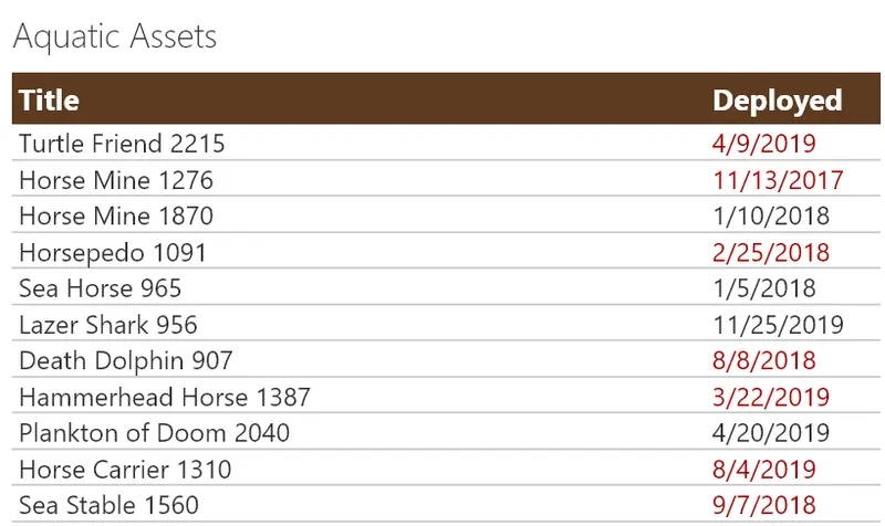
screenshot of the sample

Creating a custom header removes the standard features such as menus, sorting, moving, resizing, etc. In addition, the sticky header feature is now gone. So an additional sample, custom-header-repeating-format.json is provided that demonstrates drawing the custom header every 30 rows.
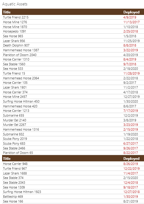
screenshot repeating

View requirements

The concept can be adjusted for any view, but this specific format expects the following columns to be part of the view:

Type Internal Name Required
Single line of text Title Yes
Date Deployed Yes
Yes/No Active Yes

Sample

Solution Author(s)
custom-header.json Chris Kent
custom-header-repeating.json Chris Kent

Version history

Version Date Comments
1.0 February 20, 2020 Initial release

Disclaimer

THIS CODE IS PROVIDED AS IS WITHOUT WARRANTY OF ANY KIND, EITHER EXPRESS OR IMPLIED, INCLUDING ANY IMPLIED WARRANTIES OF FITNESS FOR A PARTICULAR PURPOSE, MERCHANTABILITY, OR NON-INFRINGEMENT.


Additional notes