
From the contributor
How to use this sample
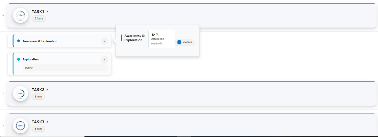
This sample uses SharePoint List Formatting to display list items grouped by TaskTitle with a modern, card-based design featuring:
- Elegant group headers with TaskTitle images and item counts
- Color-coded item cards with visual indicators
- Interactive hover cards showing detailed information
- Smooth modern styling
View Requirements
Column Requirements
Create a list with the following columns:
| Internal Name | Type | Description |
|---|---|---|
| Title | Single line of text | Item title |
| Description | Multiple lines of text | Item description (optional) |
| ColorCode | Single line of text | Hex color code for visual theming (e.g., #0078d4) |
| TaskTitle | Lookup | Lookup column to TaskTitle list |
TaskTitle List Setup
Create a separate TaskTitle list with the following columns:
| Internal Name | Type |
|---|---|
| Title | Single line of text |
| ImageUrl | Single line of text |
| TaskTitle | Calculated (calculation based on other columns) |
Important: The TaskTitle lookup column must be configured to show additional fields. The lookup value should be formatted as:
=CONCATENATE(Title,"&+&",ImageUrl,"&++&")
For example: Title&+&https://example.com/icon.png&++&
Sample Data
TaskTitle List
| Title | Image |
|---|---|
| Task1 | https://example.com/images/icon.png |
| Task2 | https://example.com/images/icon2.png |
| Task3 | https://example.com/images/icon3.png |


Main List
| Title | Description | ColorCode | TaskTitle |
|---|---|---|---|
| Awareness & Exploration | Build REST API endpoints | #0078d4 | Task1 |
| Exploration | Budvik | #00b7c3 | Task1 |
| Sharepoint | Sharepoint | #8764b8 | Task2 |
| Copilot | Modernize | #d13438 | Task3 |
View Configuration
- Grouping: Group the view by the TaskTitle column
- Group Expansion: Set groups to be collapsed by default for a cleaner initial view
- Sorting: Sort by TaskTitle (ascending) and then by Title (ascending)
Features
Group Headers
- Profile Images: TaskTitle images displayed in circular frames with elegant shadows
- TaskTitle Names: Bold, uppercase styling with visual separators
- Item Counts: Dynamic count badges showing number of items per TaskTitle
- Modern Design: Subtle gradients, shadows, and accent borders
Item Cards
- Color Coding: Each item features its ColorCode as a visual indicator
- Compact Layout: Essential information displayed in a clean, organized manner
- Visual Feedback: Smooth hover effects and background color transitions
- Description Display: Optional descriptions shown in styled containers
Hover Cards
- Detailed Information: Comprehensive item details shown on hover
- Callout Design: Professional callout with beak pointer
- Color Indicators: Visual color swatches showing the item's ColorCode
- Responsive Layout: Optimized for various screen sizes
Styling Features
- Shadow Effects: Multi-layered shadows for depth and hierarchy
- Border Radius: Consistent 12-16px rounded corners throughout
- Color Accents: Strategic use of accent colors and glowing effects
- Transitions: Smooth 0.35-0.4s transitions for interactive elements
- Typography: Carefully selected font sizes and weights for readability
Customization
Modify Card Dimensions
Adjust card width and positioning:
"width": "533px"               // Card width
"left": "61px"                 // Card positioning
Change Hover Behavior
Modify the hover card appearance:
"openOnEvent": "hover"         // Change to "click" for click-to-open
"directionalHint": "rightCenter" // Change callout position
Sample
| Solution | Author |
|---|---|
| grouped-accordion-cards.json | Sai Bandaru (LinkedIn) |
Version history
| Version | Date | Comments |
|---|---|---|
| 1.0 | October 24, 2025 | Initial release |
Disclaimer
THIS CODE IS PROVIDED AS IS WITHOUT WARRANTY OF ANY KIND, EITHER EXPRESS OR IMPLIED, INCLUDING ANY IMPLIED WARRANTIES OF FITNESS FOR A PARTICULAR PURPOSE, MERCHANTABILITY, OR NON-INFRINGEMENT.
Additional Notes
- The format automatically handles missing descriptions with a default message
- ColorCode defaults to #0078d4 if not specified
- Optimal viewing experience with 5-15 items per TaskTitle
- Cards are positioned to work best with standard SharePoint list view widths
- All styling uses modern CSS properties for maximum visual appeal
Troubleshooting
Issue: TaskTitle images not displaying
- Solution: Verify the lookup column is configured to show the Image field and that the format matches
Title&+&ImageUrl&++&
Issue: Cards appear misaligned
- Solution: Adjust the
leftandwidthproperties in the rowFormatter section
Issue: Colors not showing
- Solution: Ensure ColorCode values are valid hex colors (e.g., #FF5733)