
Back to view formats
View formattingSharePoint Online

Sticky Title Feedback Card

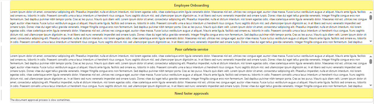
This sample uses SharePoint List Formatting to display feedback items as card-style layouts with a prominent title header and scrollable feedback content.

Sticky Title Feedback Card formatting preview
Sample preview · View original image

Copy. Apply. Make it yours.

Get this format

1 definition

Review the requirements below, then paste this JSON into the matching formatting panel. Show me where.

Use your list's internal column names and replace any tenant-specific URLs or flow IDs. Formatting is presentation, not a way to secure data.

View formatting
Download JSON
{
  "$schema": "https://developer.microsoft.com/json-schemas/sp/v2/view-formatting.schema.json",
  "rowFormatter": {
    "elmType": "div",
    "style": {
      "border": "1px solid #e0e0e0",
      "border-radius": "8px",
      "box-shadow": "0 2px 5px rgba(0,0,0,0.1)",
      "overflow": "hidden",
      "background-color": "#fff",
      "display": "flex",
      "flex-direction": "column"
    },
    "children": [
      {
        "elmType": "div",
        "txtContent": "[$Title]",
        "style": {
          "background-color": "#fff78a",
          "font-size": "18px",
          "font-weight": "600",
          "padding": "12px",
          "text-align": "center",
          "border-bottom": "2px solid #f2d600",
          "width": "100%"
        }
      },
      {
        "elmType": "div",
        "style": {
          "max-height": "180px",
          "overflow-y": "auto",
          "font-size": "14px",
          "line-height": "20px",
          "color": "#333",
          "width": "100%"
        },
        "txtContent": "[$Feedback]"
      }
    ]
  }
}

From the contributor

How to use this sample

This sample uses SharePoint List Formatting to display feedback items as card-style layouts with a prominent title header and scrollable feedback content.
Each row is rendered as a visually appealing card with a yellow header for the title and a scrollable area for longer feedback text.
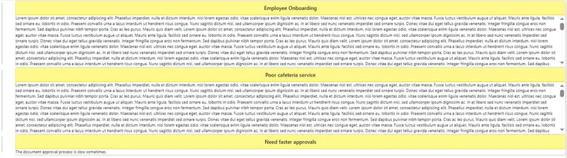
screenshot of the sample

View Requirements

Create a list with the following columns:

Internal Name Type
Title Single line of text
Feedback Multiple lines of text

How it Works

  • Each feedback item is displayed as a card with rounded corners and subtle shadow.
  • The Title appears in a yellow header bar at the top of each card.
  • The Feedback content is displayed below in a scrollable area (max height: 180px).
  • Cards have consistent spacing and borders for a clean, organized appearance.
  • Long feedback text will scroll independently within each card while the title remains visible at the top.

Sample

Solution Author
sticky-title-feedback-card.json Sai Bandaru (LinkedIn)

Version history

Version Date Comments
1.0 October 26, 2025 Initial release

Disclaimer

THIS CODE IS PROVIDED AS IS WITHOUT WARRANTY OF ANY KIND, EITHER EXPRESS OR IMPLIED, INCLUDING ANY IMPLIED WARRANTIES OF FITNESS FOR A PARTICULAR PURPOSE, MERCHANTABILITY, OR NON-INFRINGEMENT.


Additional Notes

  • The title header uses a yellow background (#fff78a) with a darker yellow border for visual emphasis.
  • The feedback area supports scrolling for content longer than 180px.
  • You can adjust the max-height value in the JSON to show more or less content before scrolling.
  • Works in both light and dark SharePoint themes.