
A reusable Power Platform snippet
Activity Feed
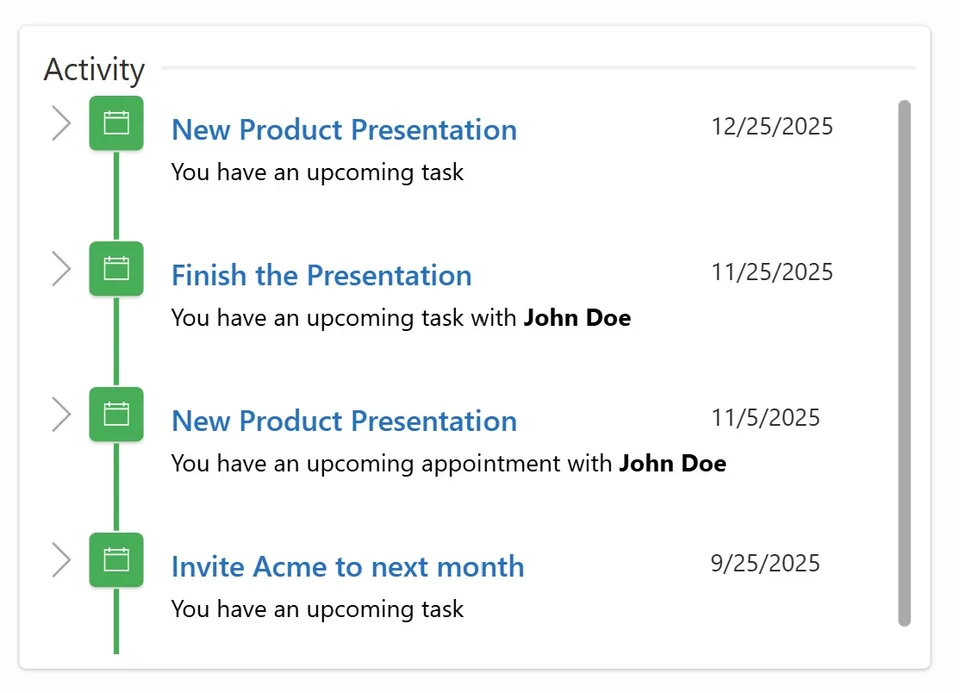
This snippet provides a real-time activity feed to display user actions and updates in a collaborative environment.
 Power Apps
- Last updated
- Nov 25, 2025
- Category
- User Interface, Collaboration
From idea to implementation
Make it your own.
Check this snippet's prerequisites, permissions, and licensing before using it. The documentation below comes directly from the snippet README.
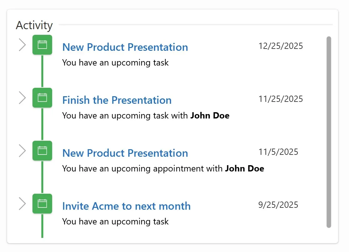
A Activity feed UI that displays a real-time style activity feed which is perfect for showing updates such as appointments, tasks, or status changes.
Great for collaboration scenarios and keeping users informed.
Features
- Clean, vertical timeline layout
- Supports HTML in descriptions
- Automatically sorts items by date (newest first)
- Easy to import with a simple YAML snippet
- Works with collections, Dataverse, or API data sources
Authors
| Author | Socials |
|---|---|
| Summit Bajracharya | GitHub (@summitbajracharya ) |
Minimal path to awesome
Follow these steps to start using the Activity Feed snippet:
- Open your Canvas App in Power Apps.
- Copy the contents of the activityfeed.yaml file.
- Select the screen where you want to insert the control, click the three dots (…), and choose Paste code.
- Add sample data (see below) or connect your own source.
- Done!
Preparation
To help you test the Activity Feed quickly, add this sample collection to App OnStart or any button’s OnSelect:
ClearCollect(
    colActivity,
    {
        Name: "New Product Presentation",
        Date: DateValue("12/25/2025"),
        Details: "You have an upcoming task"
    },{
        Name: "Finish the presentation",
        Date: DateValue("11/25/2025"),
        Details: "You have an upcoming task with <b>John Doe</b>"
    },{
        Name: "New Product Presentation",
        Date: DateValue("11/05/2025"),
        Details: "You have an upcoming appointment with <b>John Doe</b>"
    },{
        Name: "Invite Acme to the next month",
        Date: DateValue("9/25/2025"),
        Details: "You have an upcoming task"
    }
)
The gallery in the YAML snippet uses:
Items = Sort(colActivity, Date, SortOrder.Descending)
Replace colActivity with any source you prefer.
YAML Snippet
Copy and paste the YAML code below into your canvas screen (right-click → Paste):
- conTimelineMain:
Control: GroupContainer@1.3.0
Variant: AutoLayout
Properties:
Fill: =RGBA(255, 255, 255, 1)
Height: =353
LayoutAlignItems: =LayoutAlignItems.Center
LayoutDirection: =LayoutDirection.Vertical
PaddingBottom: =8
PaddingLeft: =8
PaddingRight: =8
PaddingTop: =8
X: =60
Y: =60
Children:
- conTimelineHeader:
Control: GroupContainer@1.3.0
Variant: AutoLayout
Properties:
DropShadow: =DropShadow.None
FillPortions: =0
Height: =30
LayoutAlignItems: =LayoutAlignItems.Center
LayoutDirection: =LayoutDirection.Horizontal
LayoutMaxHeight: =0
LayoutMaxWidth: =0
LayoutMinHeight: =16
LayoutMinWidth: =16
Children:
- Label2:
Control: Label@2.5.1
Properties:
AlignInContainer: =AlignInContainer.Start
BorderColor: =RGBA(0, 0, 0, 0)
BorderStyle: =BorderStyle.None
BorderThickness: =2
Color: =RGBA(50, 49, 48, 1)
DisabledBorderColor: =RGBA(0, 0, 0, 0)
DisabledColor: =RGBA(161, 159, 157, 1)
FocusedBorderThickness: =4
Font: =Font.'Segoe UI'
Height: =30
LayoutMaxHeight: =0
LayoutMaxWidth: =0
LayoutMinHeight: =16
LayoutMinWidth: =16
Text: ="Activity"
Width: =70
- Rectangle2_1:
Control: Rectangle@2.3.0
Properties:
BorderColor: =RGBA(0, 0, 0, 0)
BorderStyle: =BorderStyle.None
BorderThickness: =2
DisabledFill: =RGBA(161, 159, 157, 1)
Fill: =RGBA(240, 240, 240, 1)
FillPortions: =1
FocusedBorderThickness: =4
Height: =2
HoverFill: =RGBA(0, 120, 212, 1)
LayoutMaxHeight: =0
LayoutMaxWidth: =0
LayoutMinHeight: =16
LayoutMinWidth: =5
PressedFill: =RGBA(0, 120, 212, 1)
Width: =5
- galTimeline:
Control: Gallery@2.15.0
Variant: BrowseLayout_Vertical_ThreeTextVariant_ver5.0
Properties:
BorderColor: =RGBA(245, 245, 245, 1)
Items: =Sort(colActivity,Date,SortOrder.Descending)
TemplateSize: =80
X: =40
Y: =40
Children:
- conGalContainer:
Control: GroupContainer@1.3.0
Variant: AutoLayout
Properties:
DropShadow: =DropShadow.None
Height: =80
LayoutAlignItems: =LayoutAlignItems.Center
LayoutDirection: =LayoutDirection.Horizontal
Width: =Parent.Width
Children:
- conGalNextArrow:
Control: Classic/Icon@2.5.0
Properties:
AccessibleLabel: =Self.Tooltip
AlignInContainer: =AlignInContainer.Start
BorderColor: =RGBA(0, 0, 0, 0)
Color: =RGBA(166, 166, 166, 1)
DisabledBorderColor: =RGBA(245, 245, 245, 1)
DisabledColor: =RGBA(225, 223, 221, 1)
DisabledFill: =RGBA(0, 0, 0, 0)
FocusedBorderThickness: =4
Height: =30
HoverBorderColor: =RGBA(0, 0, 0, 0)
HoverColor: =RGBA(16, 110, 190, 1)
HoverFill: =RGBA(0, 0, 0, 0)
Icon: =Icon.ChevronRight
PaddingBottom: =5
PaddingLeft: =5
PaddingRight: =5
PaddingTop: =5
PressedBorderColor: =RGBA(0, 0, 0, 0)
PressedColor: =RGBA(16, 110, 190, 1)
PressedFill: =RGBA(0, 0, 0, 0)
Tooltip: ="View item details"
Width: =30
Y: =33
- conGalSeperator:
Control: GroupContainer@1.3.0
Variant: AutoLayout
Properties:
DropShadow: =DropShadow.None
FillPortions: =0
LayoutAlignItems: =LayoutAlignItems.Center
LayoutDirection: =LayoutDirection.Vertical
LayoutMaxHeight: =0
LayoutMaxWidth: =0
LayoutMinHeight: =16
LayoutMinWidth: =16
Width: =30
Children:
- conGalIcon:
Control: GroupContainer@1.3.0
Variant: AutoLayout
Properties:
AlignInContainer: =AlignInContainer.Start
Fill: =RGBA(54, 176, 75, 1)
FillPortions: =0
Height: =30
LayoutAlignItems: =LayoutAlignItems.Center
LayoutDirection: =LayoutDirection.Vertical
LayoutMaxHeight: =0
LayoutMaxWidth: =0
LayoutMinHeight: =16
LayoutMinWidth: =16
PaddingBottom: =8
PaddingLeft: =8
PaddingRight: =8
PaddingTop: =8
Width: =30
Children:
- Icon1:
Control: Classic/Icon@2.5.0
Properties:
BorderColor: =RGBA(0, 0, 0, 0)
Color: =RGBA(255, 255, 255, 1)
DisabledBorderColor: =RGBA(245, 245, 245, 1)
DisabledColor: =RGBA(225, 223, 221, 1)
DisabledFill: =RGBA(0, 0, 0, 0)
FocusedBorderThickness: =4
Height: =14
HoverBorderColor: =RGBA(0, 0, 0, 0)
HoverColor: =RGBA(16, 110, 190, 1)
HoverFill: =RGBA(0, 0, 0, 0)
Icon: =Icon.CalendarBlank
LayoutMaxHeight: =0
LayoutMaxWidth: =0
LayoutMinHeight: =16
LayoutMinWidth: =16
PressedBorderColor: =RGBA(0, 0, 0, 0)
PressedColor: =RGBA(16, 110, 190, 1)
PressedFill: =RGBA(0, 0, 0, 0)
Width: =14
- conGalRect:
Control: Rectangle@2.3.0
Properties:
BorderColor: =RGBA(0, 0, 0, 0)
BorderStyle: =BorderStyle.None
BorderThickness: =2
DisabledFill: =RGBA(161, 159, 157, 1)
Fill: =RGBA(54, 176, 75, 1)
FillPortions: =1
FocusedBorderThickness: =4
Height: =10
HoverFill: =RGBA(0, 120, 212, 1)
LayoutMaxHeight: =0
LayoutMaxWidth: =0
LayoutMinHeight: =16
LayoutMinWidth: =16
PressedFill: =RGBA(0, 120, 212, 1)
Width: =5
- conGalContent:
Control: GroupContainer@1.3.0
Variant: AutoLayout
Properties:
DropShadow: =DropShadow.None
LayoutAlignItems: =LayoutAlignItems.Center
LayoutDirection: =LayoutDirection.Vertical
LayoutMaxHeight: =0
LayoutMaxWidth: =0
LayoutMinHeight: =16
LayoutMinWidth: =16
PaddingBottom: =8
PaddingLeft: =15
PaddingRight: =8
PaddingTop: =8
Children:
- conGalTimelineHeader:
Control: GroupContainer@1.3.0
Variant: AutoLayout
Properties:
DropShadow: =DropShadow.None
LayoutAlignItems: =LayoutAlignItems.Center
LayoutDirection: =LayoutDirection.Horizontal
LayoutMaxHeight: =0
LayoutMaxWidth: =0
LayoutMinHeight: =16
LayoutMinWidth: =16
Children:
- conGalTimelineTitle:
Control: Label@2.5.1
Properties:
AlignInContainer: =AlignInContainer.Start
BorderColor: =RGBA(0, 0, 0, 1)
Color: =RGBA(39, 113, 194, 1)
DisabledColor: =RGBA(161, 159, 157, 1)
FillPortions: =1
Font: =Font.'Segoe UI'
FontWeight: =FontWeight.Semibold
Height: =27
PaddingBottom: =0
PaddingLeft: =0
PaddingRight: =0
PaddingTop: =0
Size: =12
Text: =ThisItem.Name
VerticalAlign: =VerticalAlign.Top
Width: =295
X: =50
Y: =47
- conGalTimelineDate:
Control: Label@2.5.1
Properties:
AlignInContainer: =AlignInContainer.Start
BorderColor: =RGBA(0, 0, 0, 1)
Color: =RGBA(50, 49, 48, 1)
DisabledColor: =RGBA(161, 159, 157, 1)
Font: =Font.'Segoe UI'
Height: =26
PaddingBottom: =0
PaddingLeft: =12
PaddingRight: =0
PaddingTop: =0
Size: =10
Text: =ThisItem.Date
VerticalAlign: =VerticalAlign.Top
Width: =117
X: =436
Y: =24
- htmGalTimelineContent:
Control: HtmlViewer@2.1.0
Properties:
AlignInContainer: =AlignInContainer.Stretch
DisabledBorderColor: =RGBA(161, 159, 157, 1)
Font: =Font.'Segoe UI'
HtmlText: =ThisItem.Details
LayoutMaxHeight: =0
LayoutMaxWidth: =0
LayoutMinHeight: =16
LayoutMinWidth: =16
PaddingBottom: =0
PaddingLeft: =0
PaddingRight: =0
PaddingTop: =0
Size: =10
Disclaimer
THIS CODE IS PROVIDED AS IS WITHOUT WARRANTY OF ANY KIND, EITHER EXPRESS OR IMPLIED, INCLUDING ANY IMPLIED WARRANTIES OF FITNESS FOR A PARTICULAR PURPOSE, MERCHANTABILITY, OR NON-INFRINGEMENT.