
A reusable Power Platform snippet
Animated Progress Circle Chart
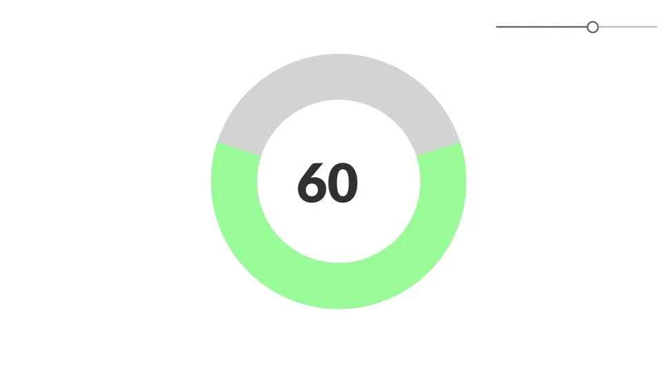
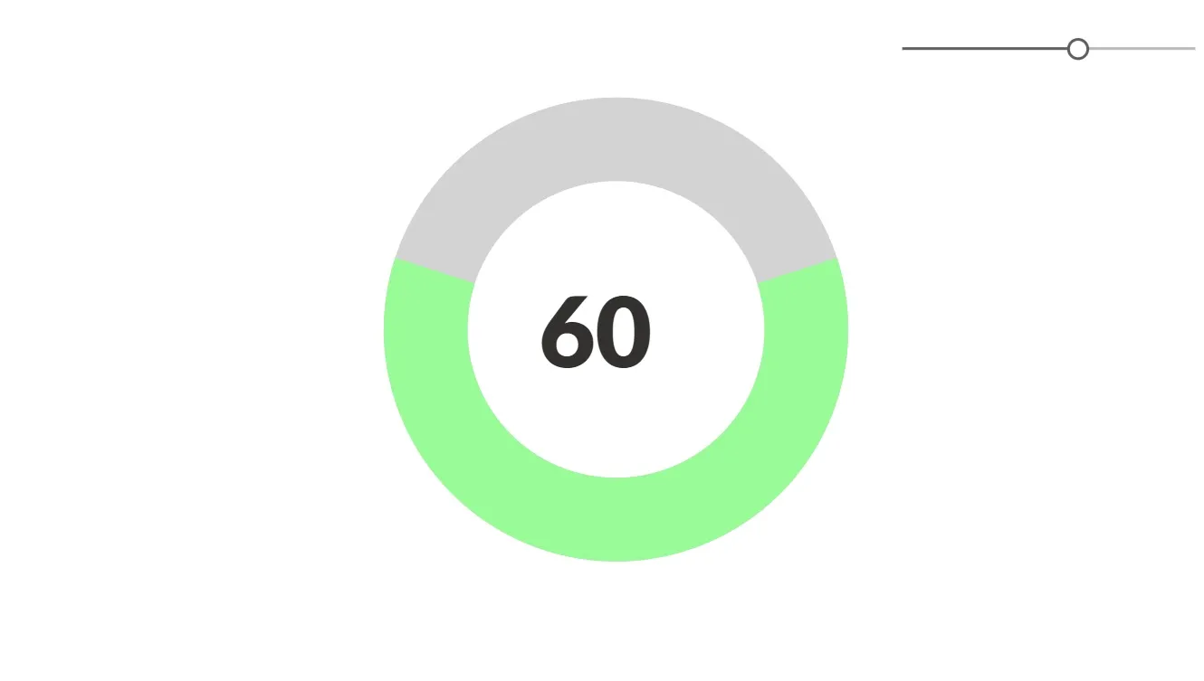
This is an animated progress chart which functions off of a slider value 0 - 100.
 Power Apps
- Last updated
- Apr 18, 2025
- Category
- Community snippet
From idea to implementation
Make it your own.
Check this snippet's prerequisites, permissions, and licensing before using it. The documentation below comes directly from the snippet README.
This is an animated progress chart which functions off of a slider value 0 - 100.
Authors
| Snippet | Author(s) |
|---|---|
| Animated Progress Circle Chart | Melissa Hale (LinkedIn ) |
Minimal path to awesome
- Open your canvas app in Power Apps
- Copy the contents of the YAML-file
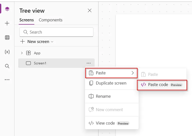
- Click on the three dots in a screen in the app where you want to add this and select "Paste code"
Code
- Chart:
    Control: Image@2.2.3
    Properties:
      BorderColor: =RGBA(0, 0, 0, 0)
      BorderStyle: =BorderStyle.None
      BorderThickness: =2
      DisabledBorderColor: =RGBA(0, 0, 0, 0)
      DisabledFill: =RGBA(0, 0, 0, 0)
      FocusedBorderThickness: =4
      Height: =653
      HoverBorderColor: =RGBA(0, 0, 0, 0)
      HoverFill: =RGBA(0, 0, 0, 0)
      Image: |+
        ="data:image/svg+xml;utf8," & EncodeUrl(
            "<svg width='50' height='50' viewBox='0 0 50 50' xmlns='http://www.w3.org/2000/svg'>" &
                "<circle cx='25' cy='25' r='" & 100/(2*Pi()) & "' stroke='lightgray' stroke-width='7' fill='transparent'/>" &
                "<circle cx='25' cy='25' r='" & 100/(2*Pi()) & "' stroke='palegreen' stroke-width='7' fill='transparent' stroke-dasharray='" & Text(Slider1.Value/2) & "," & Text(100 - Slider1.Value) & "' transform='rotate(90,25,25)'>" &
                    "<animate attributeName='stroke-dasharray' values='0,100;" & Text(Slider1.Value/2) & "," & Text(100 - Slider1.Value) & "' dur='1s' repeatCount='1'/>" &
                    "<animate attributeName='stroke' values='rgba(255,0,0);" &
                        If(Slider1.Value>50, "rgba(255,130,0);", "") &
                        "rgba(" & If(Slider1.Value<50, 255, 255 - (Slider1.Value-50)/50 * 255) & "," &
                        If(Slider1.Value<50, (Slider1.Value)/50 * 130) & ",0)" &
                    "' dur='1s' repeatCount='1'/>" &
                "</circle>" &
            "</svg>"
        )

      PressedBorderColor: =RGBA(0, 0, 0, 0)
      PressedFill: =RGBA(0, 0, 0, 0)
      Width: =1016
      X: =175
      Y: =40
- Slider1:
    Control: Classic/Slider@2.1.0
    Properties:
      BorderColor: =RGBA(0, 0, 0, 0)
      BorderStyle: =BorderStyle.None
      BorderThickness: =2
      DisabledBorderColor: =RGBA(0, 0, 0, 0)
      FocusedBorderThickness: =4
      HandleActiveFill: =RGBA(255, 255, 255, 1)
      HandleHoverFill: =RGBA(255, 255, 255, 1)
      HoverBorderColor: =RGBA(0, 0, 0, 0)
      OnChange: =Set(varReset,true);Set(verReset,false);
      PressedBorderColor: =RGBA(0, 0, 0, 0)
      RailFill: =RGBA(184, 187, 184, 1)
      RailHoverFill: =RGBA(222, 236, 249, 1)
      ValueFill: =RGBA(96, 94, 92, 1)
      ValueHoverFill: =RGBA(0, 120, 212, 1)
      X: =996
      Y: =40
- Label1:
    Control: Label@2.5.1
    Properties:
      BorderColor: =RGBA(0, 0, 0, 0)
      BorderStyle: =BorderStyle.None
      BorderThickness: =2
      Color: =RGBA(50, 49, 48, 1)
      DisabledBorderColor: =RGBA(0, 0, 0, 0)
      DisabledColor: =RGBA(161, 159, 157, 1)
      FocusedBorderThickness: =4
      Font: =Font.'Lato Black'
      FontWeight: =FontWeight.Lighter
      Height: =177
      Size: =80
      Text: =Slider1.Value
      Width: =221
      X: =594
      Y: =278
Disclaimer
THIS CODE IS PROVIDED AS IS WITHOUT WARRANTY OF ANY KIND, EITHER EXPRESS OR IMPLIED, INCLUDING ANY IMPLIED WARRANTIES OF FITNESS FOR A PARTICULAR PURPOSE, MERCHANTABILITY, OR NON-INFRINGEMENT.