
A reusable Power Platform snippet
Animated SVG Loading
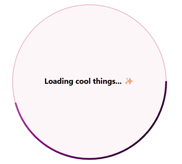
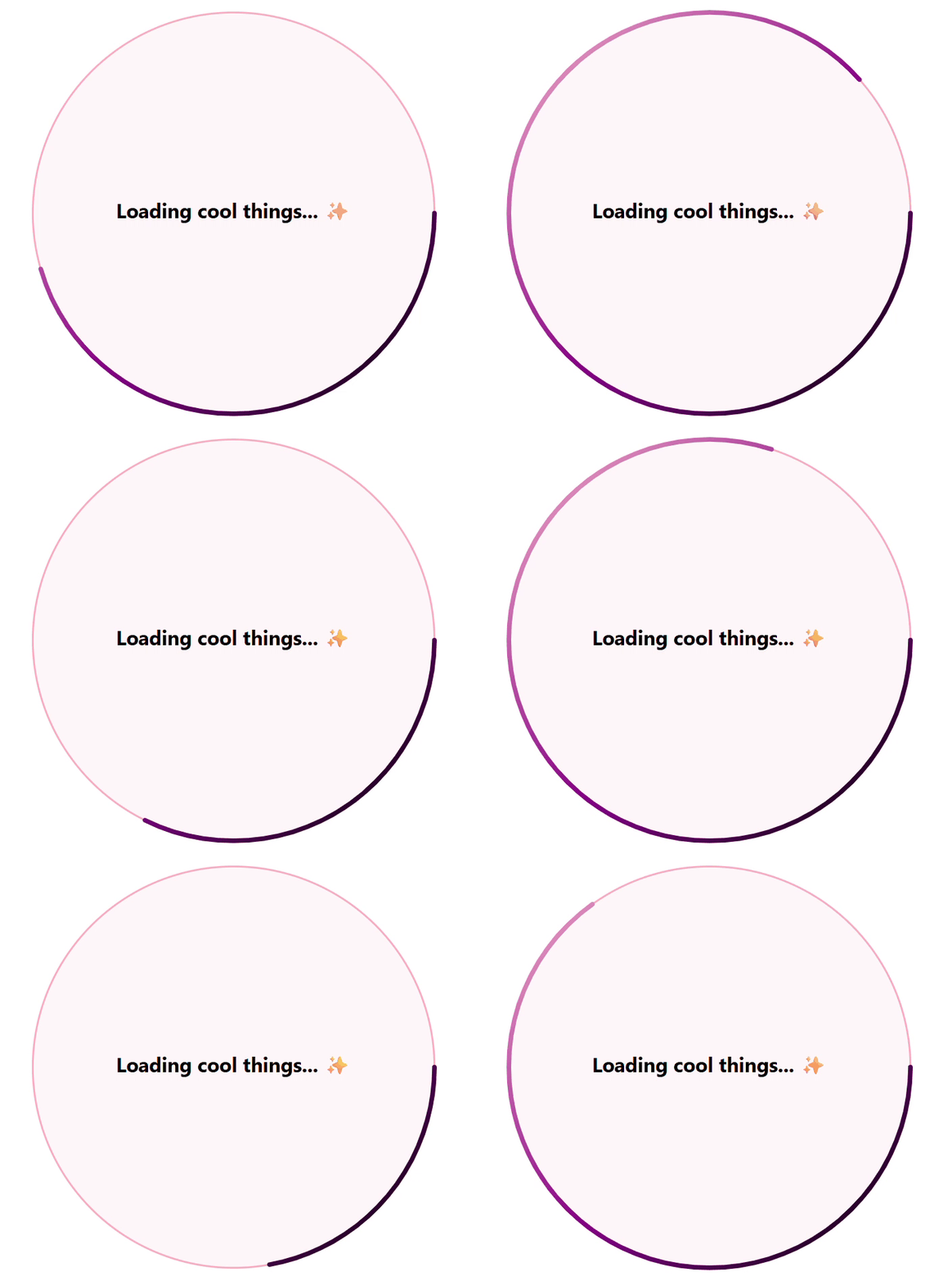
This is a custom animated loading visual of a circle with gradient border color changing from purple to pink to purple over three seconds.
 Power Apps
- Last updated
- May 18, 2025
- Category
- Community snippet
From idea to implementation
Make it your own.
Check this snippet's prerequisites, permissions, and licensing before using it. The documentation below comes directly from the snippet README.
This is a custom animated loading visual of a circle with gradient border color changing from purple to pink to purple over three seconds. The spinning graphic can be used to show application users that something is being processed in a more engaging way.
Author
| Snippet | Author |
|---|---|
| Animated SVG Loading | Cathrine Bruvold | GitHub | LinkedIn |
Minimal path to awesome
- Open your canvas app in Power Apps
- Copy the contents of the YAML-file
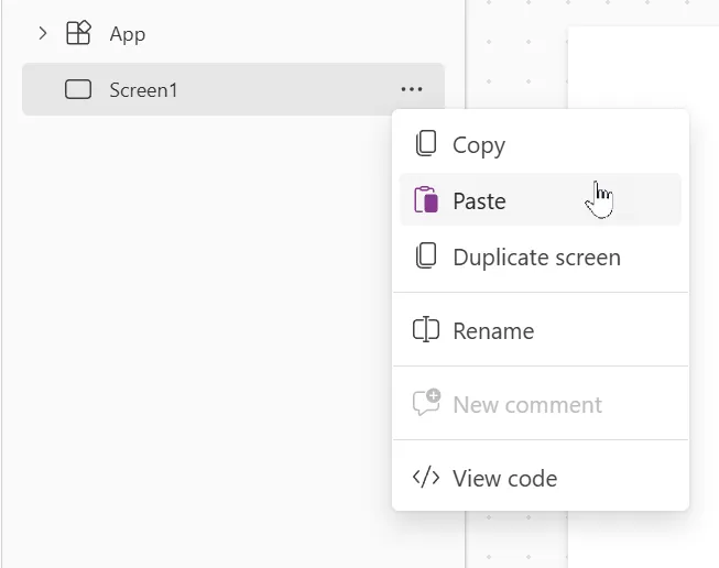
- Right click on the screen where you want to add the snippet and select "Paste"
- Edit the code on the Image property of the SVG to change size, colors, duration etc.
🎨 Customize the SVG Code
If you want to adapt the SVG to your needs, here are some options:
1. Repetition
Change how many times the animated circle should be drawn. Use a number or leave it infinite:
repeatCount="indefinite"
2. Center Text
Update the text message shown in the middle of the visual:
<text ...>Loading cool things... ✨</text>
3. Color Outline
Customize the outer stroke color of the circle:
<circle ... stroke="lightpink" />
4. Background Circle
Change the background color or its transparency (the last number controls opacity):
<circle cx="250" cy="250" r="220" fill="rgba(255, 182, 193, 0.1)" />
5. Gradient Colors
Add or update gradient stops to create a smooth color transition:
<stop offset="0%" stop-color="pink" />
<stop offset="60%" stop-color="purple" />
<stop offset="100%" stop-color="darkpurple" />
💡 You can add more
<stop>tags to create richer color transitions.
6. Animation Speed
Control how fast the circle is drawn:
dur="3s"
Try 2s, 5s, etc. to make it faster or slower.
7. Visual Styling
Stroke Appearance
Control the thickness and shape of the animated stroke:
stroke-width="5"
stroke-linecap="round"
You can try "square" or "butt" instead of "round" for different styles.
Text Styling
Tweak the font, size, and color of the central message:
font-size="22"
font-family="Segoe UI"
font-weight="bold"
fill="black"
💡 Final Tip
Most importantly — have fun and make something AMAZING ✨
This is your loading screen, so give it your personality!
Disclaimer
THIS CODE IS PROVIDED AS IS WITHOUT WARRANTY OF ANY KIND, EITHER EXPRESS OR IMPLIED, INCLUDING ANY IMPLIED WARRANTIES OF FITNESS FOR A PARTICULAR PURPOSE, MERCHANTABILITY, OR NON-INFRINGEMENT.