
A reusable Power Platform snippet
Brick Club Responsive Header
A responsive Power Apps navigation header with desktop buttons, a compact dropdown, and active-page highlighting.
 Power Apps
- Last updated
- Oct 23, 2026
- Category
- Community snippet
From idea to implementation
Make it your own.
Check this snippet's prerequisites, permissions, and licensing before using it. The documentation below comes directly from the snippet README.
A responsive navigation header for Power Apps canvas apps. At widths of 960 pixels and above, it displays the Brick Club brand, a subtitle, and four navigation buttons. Below 960 pixels, the buttons are replaced by a dropdown beside the brand, keeping navigation on one row.
The header uses native shapes and classic controls, with no external images or connectors. It includes active-page highlighting, hover and focus states, and notification placeholders so you can paste it without creating destination screens first.
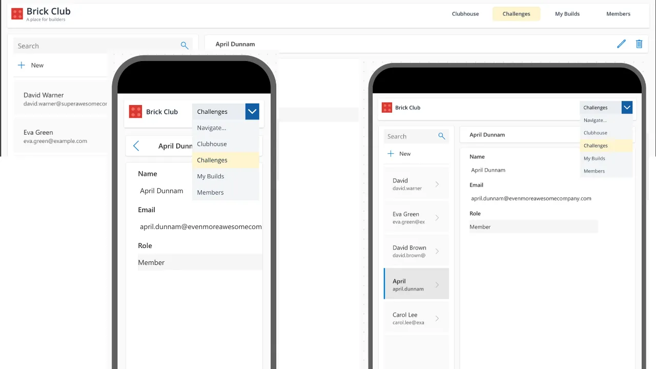
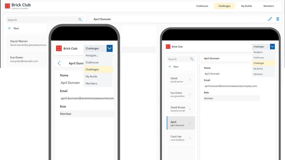
Only the header is included in this snippet; the surrounding app and device frames in the screenshot are not included.
Authors
| Snippet | Author(s) |
|---|---|
| Brick Club Responsive Header | April Dunnam |
Minimal path to awesome
- Open your canvas app in Power Apps Studio.
- Under Settings > Display, turn Scale to fit off so the header responds to its parent's width.
- Copy the entire contents of brick-club-responsive-header.yaml.
- In the Tree view, right-click the screen or parent container where you want the header and select Paste (or Paste code, depending on your Studio version).
- If you use an outer header container, set its height to 104, its top and bottom padding to 0, and Flexible height to Off. Keep flexible height off for
conBrickHeaderwhen placing it in a vertical auto-layout container. - Preview the app and resize it to see the desktop buttons change to a compact dropdown.
- Select a navigation item to see its placeholder notification, then replace the placeholders as described below.
Layout requirements
The supported minimum parent width is 280 pixels. The root container fills its parent's width and uses Min(104, Parent.Height) for its height. The recommended outer height is 104 pixels, with a supported minimum of 64 pixels.
The breakpoint is based on the header's parent width, not the device type: 960 pixels or wider shows the buttons and subtitle; less than 960 pixels shows the dropdown and hides the subtitle.
Connect navigation
The snippet uses varBrickActivePage to highlight the selected desktop button. It defaults visually to "Home" until a navigation action sets the variable.
Replace the Notify(...) call in each desktop button's OnSelect with Navigate(...) using a screen that exists in your app. Keep the preceding Set(...) statement. For example, after creating a screen named scrChallenges, use:
Set(varBrickActivePage, "Challenges");
Navigate(scrChallenges, ScreenTransition.None)
Make the equivalent replacements in the OnChange formula of drpBrickMobileNav. The labels and active-page values map as follows:
| Navigation label | Active-page value |
|---|---|
| Clubhouse | "Home" |
| Challenges | "Challenges" |
| My Builds | "Builds" |
| Members | "Members" |
If you reuse the header on multiple screens, set the appropriate active-page value in each screen's OnVisible formula so the highlight also stays correct when users arrive through other navigation paths.
To allow users to select the same dropdown destination again after returning to a screen, reset that screen's dropdown in OnVisible:
Reset(drpBrickMobileNav)
Use the actual control name if Studio renames it when pasting additional copies.
Customize the header
Change lblBrickTitle.Text and lblBrickSubtitle.Text to update the brand. Customize the button labels and dropdown items together, and update their corresponding navigation formulas. The brick icon is built from a rectangle and four circles, so no image asset is required at runtime.
For reuse as a canvas component, enable access to app scope if retaining the global varBrickActivePage variable, and adapt navigation to the app's screens or your component's behavior properties.
Disclaimer
THIS CODE IS PROVIDED AS IS WITHOUT WARRANTY OF ANY KIND, EITHER EXPRESS OR IMPLIED, INCLUDING ANY IMPLIED WARRANTIES OF FITNESS FOR A PARTICULAR PURPOSE, MERCHANTABILITY, OR NON-INFRINGEMENT.