
A reusable Power Platform snippet
Brick Loading Animation
A customizable timer-free brick loading animation for Power Apps canvas apps, with colored bricks and editable loading messages.
 Power Apps
- Last updated
- Oct 23, 2026
- Category
- Community snippet
From idea to implementation
Make it your own.
Check this snippet's prerequisites, permissions, and licensing before using it. The documentation below comes directly from the snippet README.
A customizable timer-free brick loading animation for Power Apps canvas apps. Four colored bricks assemble above a title and message, providing an indeterminate loading overlay without a Power Apps Timer, JavaScript, external assets, or connectors.
Preview
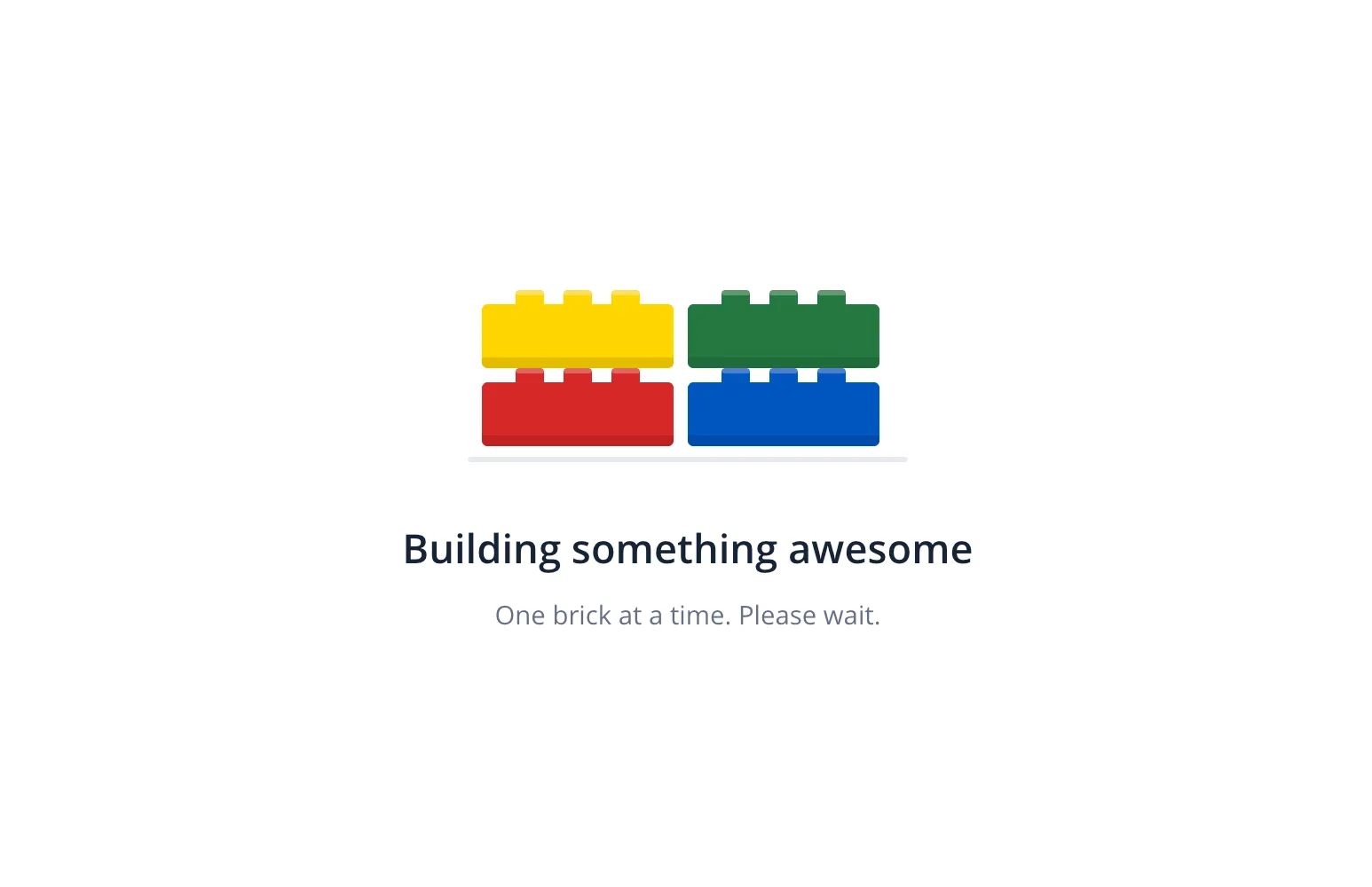
The screenshot shows the appearance of the overlay, not proof of live animation playback. SVG animation support varies by browser and Power Apps player; test in the actual desktop browser, tablet, and phone players you intend to support.
Authors
| Snippet | Author(s) |
|---|---|
| Brick Loading Animation | April Dunnam (@aprildunnam) |
Minimal path to awesome
- Open your canvas app in Power Apps Studio in edit mode.
- Copy the entire contents of brick-loading-animation.yaml.
- In the tree view, select the screen where you want the overlay. Right-click and choose Paste code to insert the copied YAML. Paste at screen level, outside short header containers.
- Ensure the parent provides at least 280 x 360 of space. The root
conBrickLoaderfills its parent, and its inner content is centered. - Bring
conBrickLoaderto the front so the white overlay covers the other screen controls. The suppliedVisible = trueis for demonstration, so the overlay appears immediately. - For real use, initialize an app loading flag such as
Set(varIsLoading, false)inApp.OnStartand setconBrickLoader.VisibletovarIsLoading. Set the flag totruebefore your loading operation and back tofalsewhen it finishes, including any error path. The snippet does not manage this flag or start any work itself. - Preview the app and verify both animation playback and overlay visibility in your target players before publishing.
For reuse, consider placing the snippet inside a canvas component with an appropriately sized parent and exposing the loading state and label text as component inputs.
How it works
The native Image control imgBrickLoaderAnimation renders an inline SVG through a "data:image/svg+xml;utf8," & EncodeUrl(...) data URI. SVG animateTransform moves each brick into place, while animate changes its opacity. All eight animation elements use dur='3.2s' and repeatCount='indefinite'.
The animation runs continuously while visible. It is indeterminate: it does not measure progress, track your loading operation, or signal completion. There is no motion toggle or motion-preference variable in this version. No Timer control, JavaScript, external image assets, uploaded media, or connectors are needed for the loader itself.
SVG media support does not guarantee support for every animation feature in every rendering environment. The supplied YAML and embedded SVG can be parsed structurally, but this is not equivalent to Power Apps compilation or live player verification.
Customization
| Setting | Where to change it |
|---|---|
| Title | lblBrickLoaderTitle.Text, initially "Building something awesome". |
| Message | lblBrickLoaderMessage.Text, initially "One brick at a time. Please wait.". |
| Brick colors | Replace matching SVG fill values in imgBrickLoaderAnimation.Image: red #D62828, blue #0055BF, yellow #FFD500, and green #237841. Replace every matching value for each brick, including its studs. |
| Cycle speed | Replace every dur='3.2s' consistently in the Image formula to keep the movement and opacity animations synchronized. |
| Overlay and text colors | Adjust conBrickLoader.Fill, lblBrickLoaderTitle.Color, and lblBrickLoaderMessage.Color to suit your app. |
| Loading visibility | Bind conBrickLoader.Visible to your app's loading flag instead of the demonstration value true. |
Both labels have Wrap = false; keep replacement text short enough to fit and check it at your smallest supported parent size.
References
Disclaimer
THIS CODE IS PROVIDED AS IS WITHOUT WARRANTY OF ANY KIND, EITHER EXPRESS OR IMPLIED, INCLUDING ANY IMPLIED WARRANTIES OF FITNESS FOR A PARTICULAR PURPOSE, MERCHANTABILITY, OR NON-INFRINGEMENT.