
A reusable Power Platform snippet
Confirmation Dialog Component
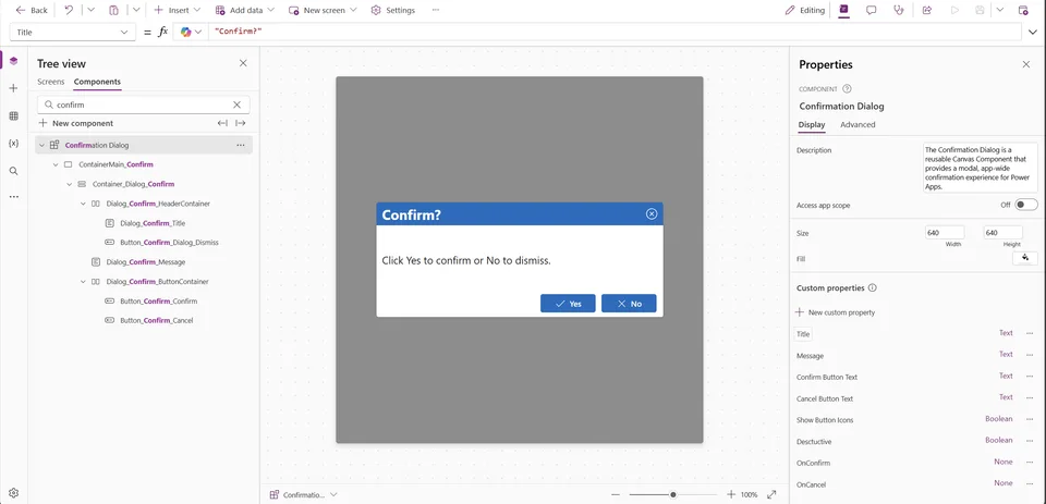
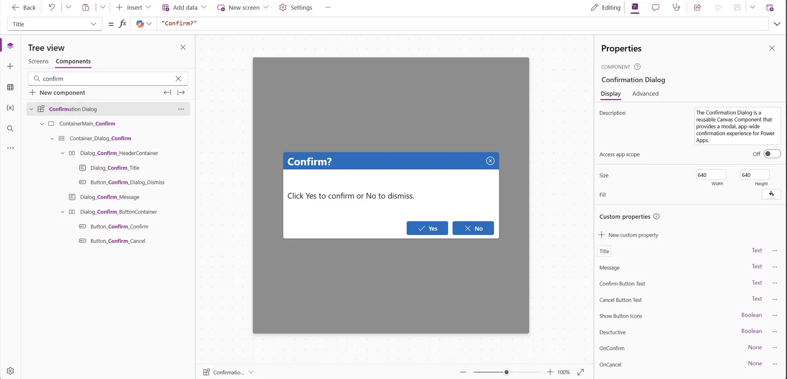
The Confirmation Dialog is a reusable Canvas Component that provides a modal, app-wide confirmation experience for Power Apps.
 Power Apps
- Last updated
- Dec 30, 2025
- Category
- Canvas apps
- Premium license
- Not required
- Experimental features
- No
A closer look
See the snippet in action.
From idea to implementation
Make it your own.
Check this snippet's prerequisites, permissions, and licensing before using it. The documentation below comes directly from the snippet README.
Summary
The Confirmation Dialog is a reusable Canvas Component that provides a modal, app-wide confirmation experience for Power Apps. It displays a centered dialog with a customizable title, message, and configurable Confirm and Cancel buttons.
Key features:
- Customizable Title, Message, Confirm Button Text, and Cancel Button Text
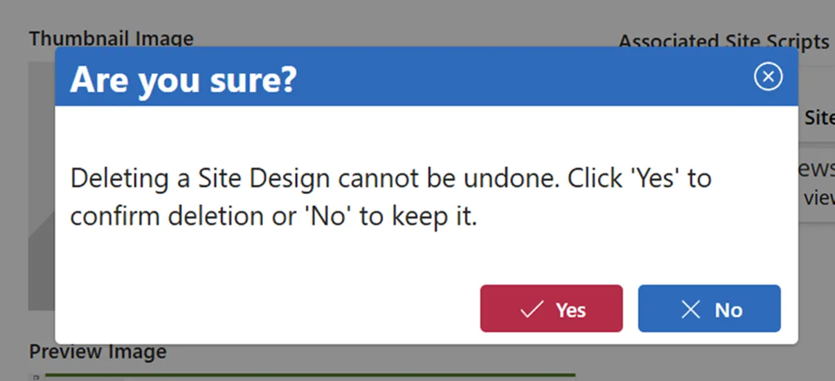
- Optional destructive mode for high‑risk actions
- Optional button icons
- Modal overlay with built‑in close/dismiss behavior
- Event properties (OnConfirm, OnCancel) for clean app integration
Use this component to standardize confirmation UI patterns throughout your Canvas Apps.
Applies to









Compatibility


Contributors
Version history
| Version | Date | Comments |
|---|---|---|
| 1.0 | December 30, 2025 | Initial release |
Prerequisites
None
Minimal path to awesome
Using the source code
- Open your canvas app in Power Apps
- Copy the contents of the YAML file
- Right-click on the Components section in the tree view and select Paste
- Navigate to the Screens area and add the component (with the highest z-index)
- Configure it to your liking with the available properties
Features
This solution illustrates the following concepts on top of the Power Platform:
- Custom Canvas Components
- Component Input Properties (Data)
- Component Event Properties (Events)
- Modal UI patterns
- Accessibility features
Component Properties
| Property | Type | Description | Default |
|---|---|---|---|
| Title | Input (Text) | Title of the dialog | "Confirm?" |
| Message | Input (Text) | Message text of the dialog | "Click Yes to confirm or No to dismiss." |
| ConfirmButtonText | Input (Text) | Text to display on the Confirm button | "Yes" |
| CancelButtonText | Input (Text) | Text to display on the Cancel button | "No" |
| Destructive | Input (Boolean) | True if the action is destructive (Confirm button will be red) | false |
| ShowButtonIcons | Input (Boolean) | True to show icons on the buttons | true |
| OnConfirm | Event | Fired when user clicks Confirm button | - |
| OnCancel | Event | Fired when user clicks Cancel button or closes the dialog | - |
Help
We do not support snippets, but this community is always willing to help, and we want to improve these snippets. We use GitHub to track issues, which makes it easy for community members to volunteer their time to help you.
If you encounter any issues while using this snippet, you can create a new issue.
For questions regarding this snippet, create a new question.
Finally, if you have an idea for improvement, make a suggestion.
Disclaimer
THIS CODE IS PROVIDED AS IS WITHOUT WARRANTY OF ANY KIND, EITHER EXPRESS OR IMPLIED, INCLUDING ANY IMPLIED WARRANTIES OF FITNESS FOR A PARTICULAR PURPOSE, MERCHANTABILITY, OR NON-INFRINGEMENT.