
A reusable Power Platform snippet
Photos Gallery
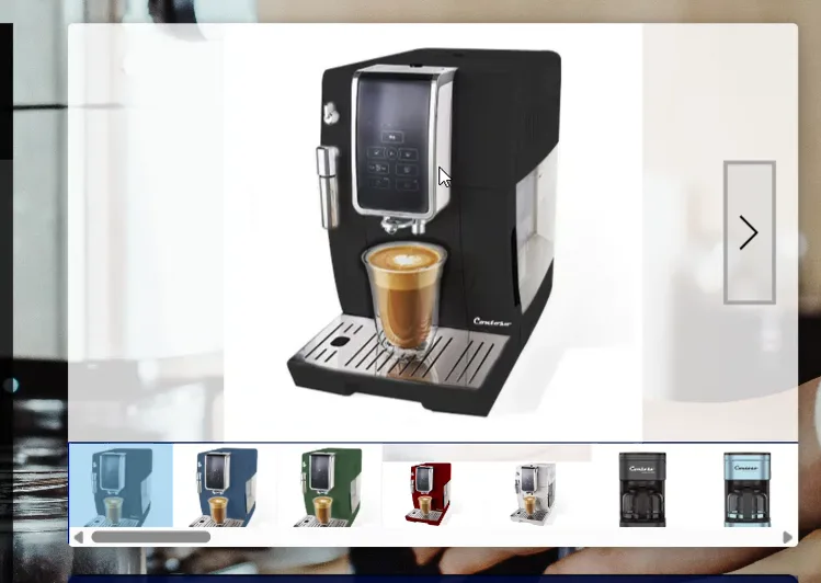
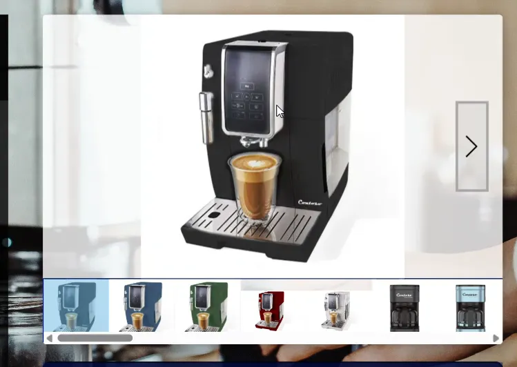
This snippet allows you to display a photo gallery, navigate between photos, and zoom in to view the photo in full screen.
 Power Apps
- Last updated
- Apr 11, 2025
- Category
- Community snippet
From idea to implementation
Make it your own.
Check this snippet's prerequisites, permissions, and licensing before using it. The documentation below comes directly from the snippet README.
This snippet allows you to display a photo gallery, navigate between photos, and zoom in to view the photo in full screen.
Authors
| Snippet | Author |
|---|---|
| Steve Bourdin | GitHub (@steve-bourdin-ab998762 ) |
Minimal path to awesome
- Open your canvas app in Power Apps
- Copy the contents of the YAML-file
- Click on the three dots of the screen where you want to add the snippet and select "Paste code"
Code
- cont_photoGallery:
    Control: GroupContainer@1.3.0
    Variant: ManualLayout
    Group: snippet_photoGallery
    Properties:
      ContentLanguage: =//Steve BOURDIN - MOCA By ASI
      DropShadow: =DropShadow.Bold
      Fill: =RGBA(255, 255, 255,0.8)
      Height: =400
      Width: =558
      X: =704
      Y: =120
    Children:
      - gal_photoGalleryList:
          Control: Gallery@2.15.0
          Variant: Horizontal
          Properties:
            BorderColor: =RGBA(0, 18, 107, 1)
            BorderThickness: =1
            Default: =varImgDefault
            Height: =Parent.Height-img_photoGallery.Height
            Items: =Sort(varCollectPhoto,position)
            TemplatePadding: =0
            TemplateSize: =Self.Height
            Width: =Parent.Width
            Y: =img_photoGallery.Height
          Children:
            - img_photoGalleryList:
                Control: Image@2.2.3
                Properties:
                  BorderColor: =RGBA(0, 18, 107, 1)
                  Height: =Parent.TemplateHeight
                  Image: =ThisItem.Photo
                  OnSelect: =Select(Parent)
                  Width: =Parent.TemplateWidth
            - lbl_photoGalleryList:
                Control: Label@2.5.1
                Properties:
                  BorderColor: =RGBA(0, 18, 107, 1)
                  Fill: =RGBA(102, 182, 227, 0.5)
                  Font: =Font.'Open Sans'
                  Height: =Parent.Height
                  OnSelect: =Select(Parent)
                  Text: =""
                  Visible: =gal_photoGalleryList.Selected.position=ThisItem.position
                  Width: =Parent.TemplateWidth
                  Y: '=0   '
      - img_photoGallery:
          Control: Image@2.2.3
          Properties:
            BorderColor: =RGBA(0, 18, 107, 1)
            Height: =4*Parent.Height/5
            Image: =gal_photoGalleryList.Selected.Photo
            OnSelect: |-
              =UpdateContext({varPhotoFull : true})
            Width: =Parent.Width
      - ico_photoGalleryRight:
          Control: Classic/Icon@2.5.0
          Properties:
            BorderColor: =RGBA(166, 166, 166, 1)
            BorderThickness: =3
            Color: =RGBA(0, 0, 0, 1)
            Fill: =RGBA(166, 166, 166, 0.2)
            Height: =img_photoGallery.Height/3
            Icon: =Icon.ChevronRight
            OnSelect: |-
              =UpdateContext({varImgDefault : Index(varCollectPhoto,gal_photoGalleryList.Selected.position+1)})
            PaddingBottom: =5
            PaddingLeft: =5
            PaddingRight: =5
            PaddingTop: =5
            Visible: =Last(gal_photoGalleryList.AllItems).position<>gal_photoGalleryList.Selected.position
            Width: =Parent.Width/15
            X: =Parent.Width-Self.Width-Self.Width/2
            Y: =img_photoGallery.Height/3
      - ico_photoGalleryLeft:
          Control: Classic/Icon@2.5.0
          Properties:
            BorderColor: =RGBA(166, 166, 166, 1)
            BorderThickness: =3
            Color: =RGBA(0, 0, 0, 1)
            Fill: =RGBA(166, 166, 166, 0.2)
            Height: =img_photoGallery.Height/3
            Icon: =Icon.ChevronLeft
            OnSelect: |-
              =UpdateContext({varImgDefault : Index(varCollectPhoto,gal_photoGalleryList.Selected.position-1)})
            PaddingBottom: =5
            PaddingLeft: =5
            PaddingRight: =5
            PaddingTop: =5
            Visible: =First(gal_photoGalleryList.AllItems).position<>gal_photoGalleryList.Selected.position
            Width: =Parent.Width/15
            X: =Self.Width/2
            Y: =img_photoGallery.Height/3
      - tim_photoGalleryInit:
          Control: Timer@2.1.0
          Properties:
            AutoStart: =CountRows(varCollectPhoto)>0
            BorderColor: =ColorFade(Self.Fill, -15%)
            Color: =RGBA(255, 255, 255, 1)
            DisabledBorderColor: =ColorFade(Self.BorderColor, 70%)
            DisabledColor: =ColorFade(Self.Fill, 90%)
            DisabledFill: =ColorFade(Self.Fill, 70%)
            Duration: =600
            Fill: =RGBA(56, 96, 178, 1)
            Font: =Font.'Open Sans'
            HoverBorderColor: =ColorFade(Self.BorderColor, 20%)
            HoverColor: =RGBA(255, 255, 255, 1)
            HoverFill: =ColorFade(RGBA(56, 96, 178, 1), -20%)
            OnTimerEnd: =
            OnTimerStart: |-
              =UpdateContext({varNbPhoto: CountRows(varCollectPhoto),varPhotoFull:false});

              ForAll(
                  AddColumns(
                      Sequence(varNbPhoto),
                      pos,
                      Value
                  ),
                  Patch(
                      varCollectPhoto,
                      Index(
                          varCollectPhoto,
                          pos
                      ),
                      {position: pos}
                  )
              );
              UpdateContext(
                  {
                      varImgDefault: Index(
                          varCollectPhoto,
                          1
                      )
                  }
              )
            PressedBorderColor: =Self.Fill
            PressedColor: =Self.Fill
            PressedFill: =Self.Color
            Start: =Self.AutoStart
            Visible: =false
            X: =60
            Y: =60
      - tim_photoGalleryRemoveError:
          Control: Timer@2.1.0
          Properties:
            BorderColor: =ColorFade(Self.Fill, -15%)
            Color: =RGBA(255, 255, 255, 1)
            DisabledBorderColor: =ColorFade(Self.BorderColor, 70%)
            DisabledColor: =ColorFade(Self.Fill, 90%)
            DisabledFill: =ColorFade(Self.Fill, 70%)
            Fill: =RGBA(56, 96, 178, 1)
            Font: =Font.'Open Sans'
            HoverBorderColor: =ColorFade(Self.BorderColor, 20%)
            HoverColor: =RGBA(255, 255, 255, 1)
            HoverFill: =ColorFade(RGBA(56, 96, 178, 1), -20%)
            OnTimerStart: |-
              =ClearCollect(
                  varCollectPhoto,
                  {
                      Photo: Blank(),
                      position: 0
                  }
              );
              UpdateContext({varPhotoFull: false})
            PressedBorderColor: =Self.Fill
            PressedColor: =Self.Fill
            PressedFill: =Self.Color
            Visible: =false
            X: =40
            Y: =40
- cont_photoGalleryFullScreen:
    Control: GroupContainer@1.3.0
    Variant: ManualLayout
    Group: snippet_photoGallery
    Properties:
      ContentLanguage: =//Steve BOURDIN - MOCA By ASI
      Fill: =RGBA(0, 0, 0, 0.9)
      Height: =768
      Visible: =varPhotoFull=true
      Width: =1366
    Children:
      - img_ico_photoGalleryFullScreenClose:
          Control: Image@2.2.3
          Properties:
            BorderColor: =RGBA(0, 18, 107, 1)
            Height: =Parent.Height
            Image: =gal_photoGalleryList.Selected.Photo
            Width: =Parent.Width
            Y: '=0   '
      - btn_photoGalleryFullScreenClose:
          Control: Classic/Button@2.2.0
          Properties:
            BorderColor: =ColorFade(Self.Fill, -15%)
            Color: =RGBA(255, 255, 255, 1)
            DisabledBorderColor: =RGBA(166, 166, 166, 1)
            DisabledFill: =Self.Fill
            DisplayMode: =DisplayMode.Disabled
            Fill: =RGBA(166, 166, 166, 0.5)
            Font: =Font.'Open Sans'
            Height: =Parent.Height/15
            HoverBorderColor: =ColorFade(Self.BorderColor, 20%)
            HoverColor: =RGBA(255, 255, 255, 1)
            HoverFill: =RGBA(255, 255, 255, 1)
            PressedBorderColor: =Self.Fill
            PressedColor: =Self.Fill
            PressedFill: =Self.Color
            RadiusBottomLeft: =20
            RadiusBottomRight: =20
            RadiusTopLeft: =20
            RadiusTopRight: =20
            Text: =""
            Visible: =false
            Width: =Self.Height
            X: =Parent.Width-Self.Width-Self.Width/4
            Y: =Self.Width/4
      - ico_photoGalleryFullScreenClose:
          Control: Classic/Icon@2.5.0
          Properties:
            BorderColor: =RGBA(0, 18, 107, 1)
            Color: =RGBA(0, 0, 0, 1)
            Fill: =RGBA(255, 255, 255, 0.5)
            Height: =btn_photoGalleryFullScreenClose.Height
            HoverFill: =Color.White
            Icon: =Icon.Cancel
            OnSelect: =UpdateContext({varPhotoFull:false})
            PaddingBottom: =15
            PaddingLeft: =15
            PaddingRight: =15
            PaddingTop: =15
            Width: =btn_photoGalleryFullScreenClose.Width
            X: =btn_photoGalleryFullScreenClose.X
            Y: =btn_photoGalleryFullScreenClose.Y
      - ico_photoGalleryFullScreenRight:
          Control: Classic/Icon@2.5.0
          Properties:
            BorderColor: =RGBA(166, 166, 166, 1)
            BorderThickness: =3
            Color: =RGBA(0, 0, 0, 1)
            Fill: =RGBA(166, 166, 166, 0.5)
            Height: =img_photoGallery.Height/3
            HoverFill: =RGBA(255, 255, 255, 1)
            Icon: =Icon.ChevronRight
            OnSelect: |-
              =UpdateContext({varImgDefault : Index(varCollectPhoto,gal_photoGalleryList.Selected.position+1)})
            PaddingBottom: =5
            PaddingLeft: =5
            PaddingRight: =5
            PaddingTop: =5
            Visible: =Last(gal_photoGalleryList.AllItems).position<>gal_photoGalleryList.Selected.position
            Width: =Parent.Width/20
            X: =Parent.Width-Self.Width-Self.Width/2
            Y: =Parent.Height/2-Self.Height/2
      - ico_photoGalleryFullScreenLeft:
          Control: Classic/Icon@2.5.0
          Properties:
            BorderColor: =RGBA(166, 166, 166, 1)
            BorderThickness: =3
            Color: =RGBA(0, 0, 0, 1)
            Fill: =RGBA(166, 166, 166, 0.5)
            Height: =img_photoGallery.Height/3
            HoverFill: =Color.White
            Icon: =Icon.ChevronLeft
            OnSelect: |-
              =UpdateContext({varImgDefault : Index(varCollectPhoto,gal_photoGalleryList.Selected.position-1)})
            PaddingBottom: =5
            PaddingLeft: =5
            PaddingRight: =5
            PaddingTop: =5
            Visible: =First(gal_photoGalleryList.AllItems).position<>gal_photoGalleryList.Selected.position
            Width: =Parent.Width/20
            X: =Self.Width/2
            Y: =Parent.Height/2-Self.Height/2
Disclaimer
THIS CODE IS PROVIDED AS IS WITHOUT WARRANTY OF ANY KIND, EITHER EXPRESS OR IMPLIED, INCLUDING ANY IMPLIED WARRANTIES OF FITNESS FOR A PARTICULAR PURPOSE, MERCHANTABILITY, OR NON-INFRINGEMENT.