
A reusable Power Platform snippet
HTML Progress Bar Card
A Power Apps YAML snippet for a customizable progress bar card with gradient and text options.
 Power Apps
- Last updated
- Oct 31, 2024
- Category
- Visualizations, Dashboard Components
From idea to implementation
Make it your own.
Check this snippet's prerequisites, permissions, and licensing before using it. The documentation below comes directly from the snippet README.
Overview
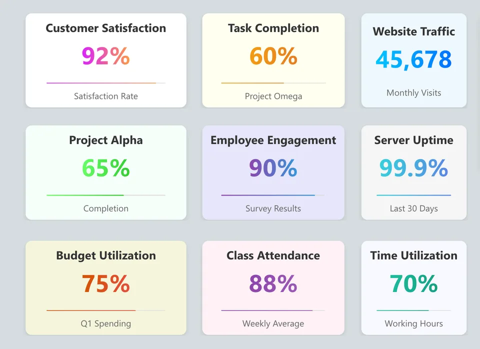
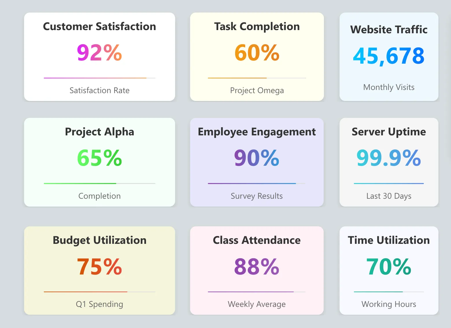
The Progress Bar Card is a custom HTML component for Power Apps designed to display a progress bar with a title, value, and subtitle.
This component is ideal for visualizing metrics like customer satisfaction rates in an engaging format.
Authors
| Author (s) | Socials |
|---|---|
| Rudimar Baesso Althof | GitHub - YouTube - Linkedin |
Features
- Displays a title, value, and subtitle with a progress bar.
- Uses a gradient color effect for the progress bar.
- Customizable properties for title, value, background color, and gradient colors.
- Simple, clean design suitable for dashboards or report pages in Power Apps.
Minimal path to awesome
- Open your canvas app in Power Apps
- Copy the contents of the YAML-file.
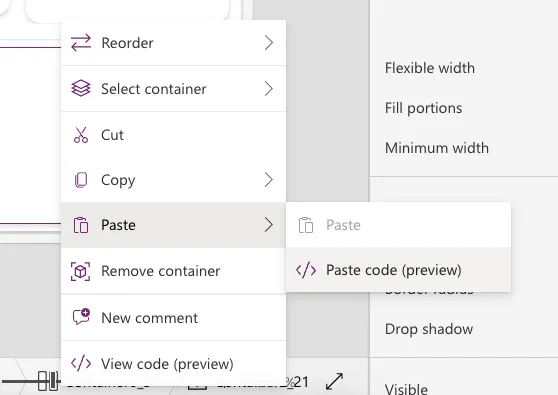
- Right click on the screen where you want to add the snippet and select "Paste YAML"
This will add the card to your screen and you can customize the item HTMLTextproperty to dynamically change its data.
YAML Configuration
Control
The htmlProgressBarCard uses the HtmlViewer control to render HTML-based visuals.
Configuring Properties in the With Function
The htmlProgressBarCard uses a With function to set key properties for customization.
It's located in the HTMLText property and here’s a breakdown of each property and how to configure them:
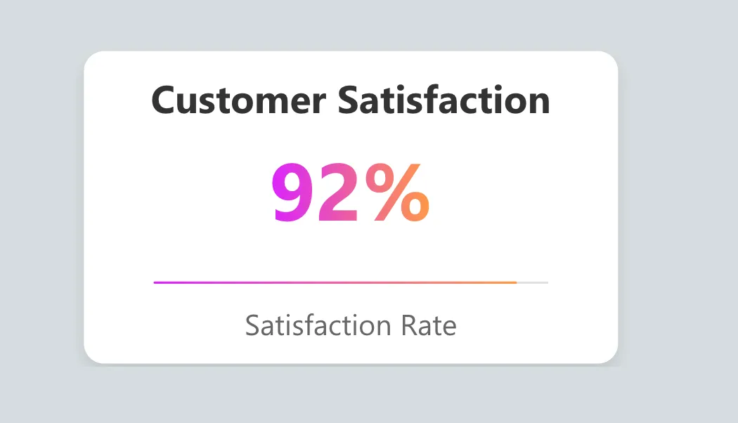
- Title: The main title text displayed on the card (e.g.,
"Customer Satisfaction"). - Subtitle: The text displayed below the progress bar to describe the value (e.g.,
"Satisfaction Rate"). - Value: The displayed percentage value and progress bar fill level (e.g.,
"92%"). - BgColor: Background color of the card. Use Power Apps color values, like
Color.White. - GradientStart: The starting color of the gradient used for the progress bar and value text (e.g.,
"#da22ff"). - GradientEnd: The ending color of the gradient for the progress bar and value text (e.g.,
"#ff9b44").
Card Configuration Example
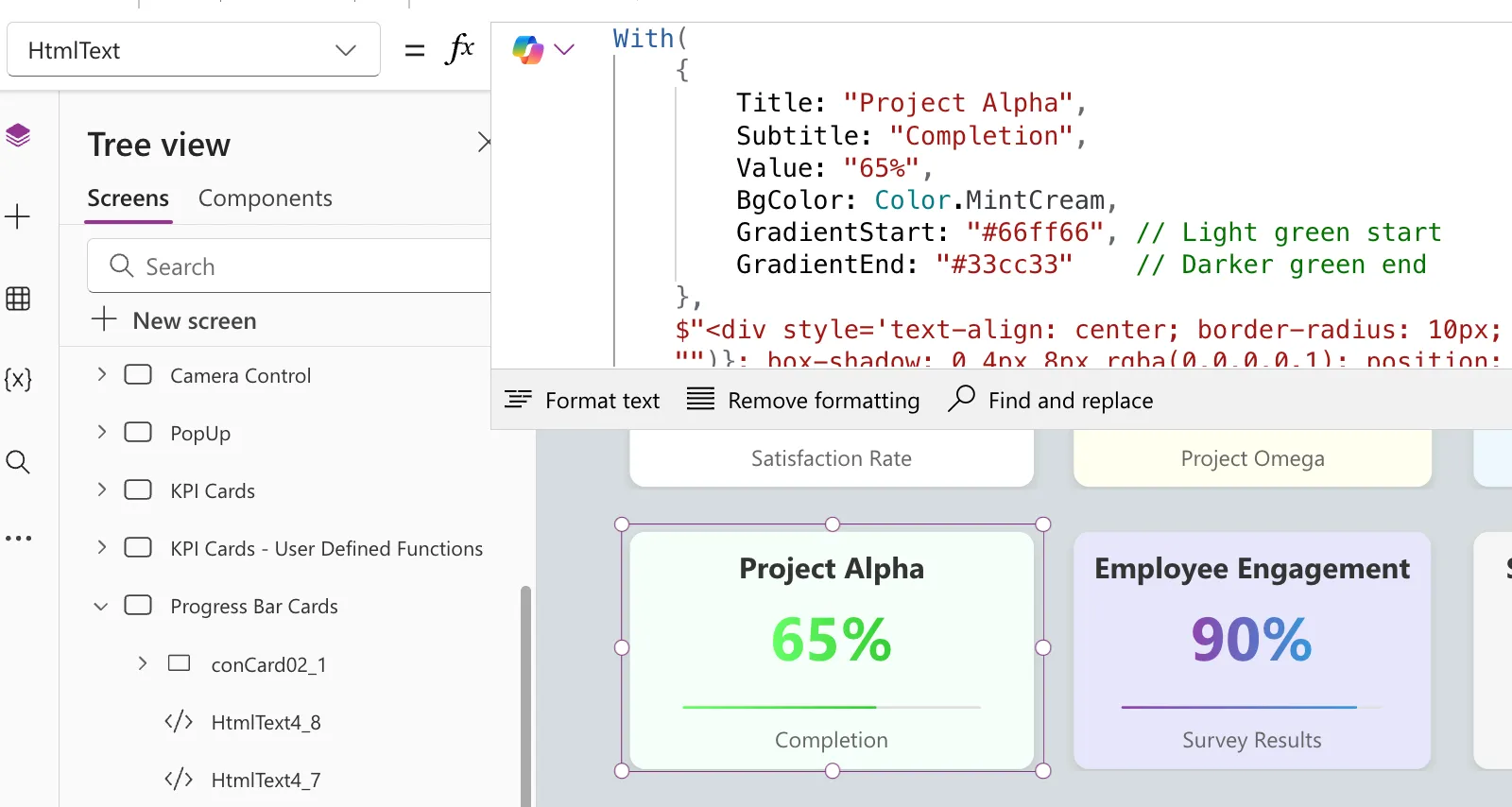
Below is the relevant code excerpt showing how to set these properties in the With function:
=With(
    {
        Title: "Customer Satisfaction",
        Subtitle: "Satisfaction Rate",
        Value: "92%",
        BgColor: Color.White,
        GradientStart: "#da22ff", // Start color of the gradient
        GradientEnd: "#ff9b44"    // End color of the gradient
    },
    // HTML structure that builds the card
)
Here is an example of how it is configured in the Power Apps interface:
Related Videos
For a complete guide on creating custom controls in Power Apps, check out my playlist on YouTube:
Power Apps Design & Customizations Playlist 🚀
This playlist contains all the videos I’ve created on custom controls, with tutorials and tips to enhance your Power Apps projects.
Disclaimer
THIS CODE IS PROVIDED AS IS WITHOUT WARRANTY OF ANY KIND, EITHER EXPRESS OR IMPLIED, INCLUDING ANY IMPLIED WARRANTIES OF FITNESS FOR A PARTICULAR PURPOSE, MERCHANTABILITY, OR NON-INFRINGEMENT.