A reusable Power Platform snippet
SVG Donut
This snippet shows how to add an animated SVG donut visual that gets data dynamically from your Power App to fill in the donut to show an amount used and amount remaining.
 Power Apps
- Last updated
- Apr 21, 2025
- Category
- Community snippet
From idea to implementation
Make it your own.
Check this snippet's prerequisites, permissions, and licensing before using it. The documentation below comes directly from the snippet README.
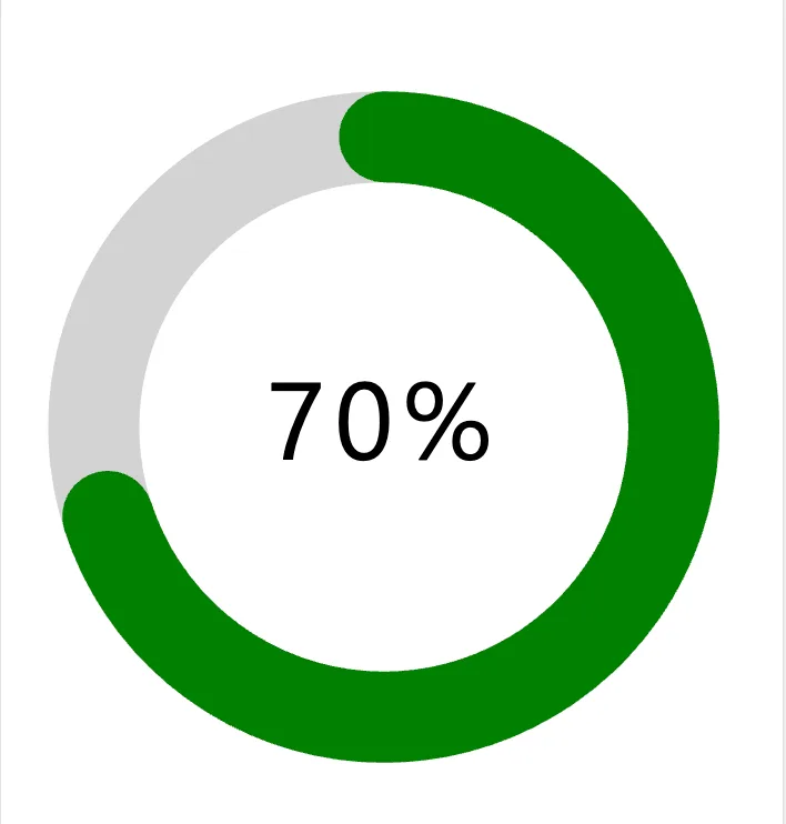
This snippet shows how to add an animated SVG donut visual that gets data dynamically from your Power App to show an amount used and amount remaining.
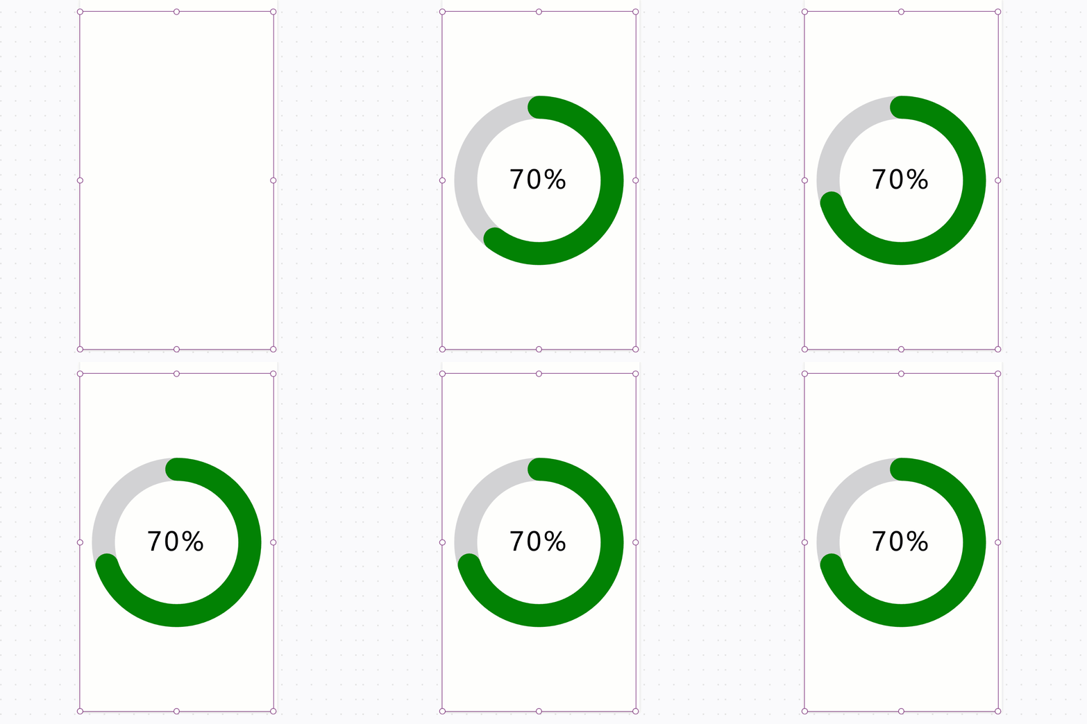
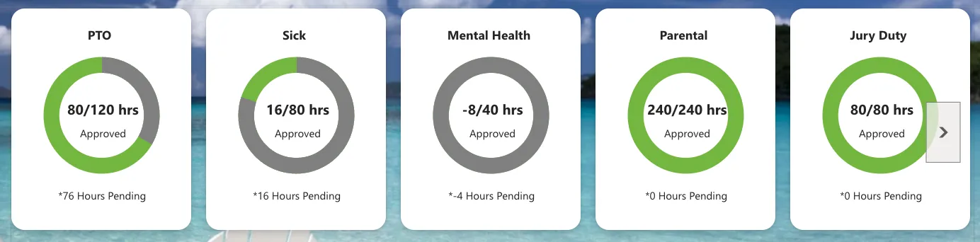
This is for the donut visual only but this can be used within a gallery along with labels to accomplish a visual like shown below.
Minimal path to awesome
- Open your canvas app in Power Apps
- Copy the contents of the YAML-file
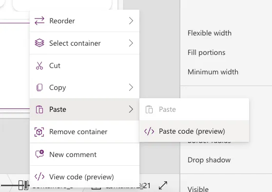
- Right click on the screen where you want to add the snippet and select "Paste YAML"
- Select the imgSVGDonut control and go to the Image property
- Replace the properties in the With section with your values.
Code
- Image1:
    Control: Image@2.2.3
    Properties:
      BorderColor: =RGBA(0, 18, 107, 1)
      Height: =1096
      Image: |-
        =With(
            {
                donutValue: 70,
                textValue: "70%",
                animationDuration: 1,
                circleMiddleColor: Color.White,
                unusedRingColor: Color.LightGray,
                usedRingColor: Color.Green,
                textColor: Color.Black
            },
            "data:image/svg+xml," & EncodeUrl(
                "<svg width='100%' height='100%' viewBox='0 0 42 42' xmlns='http://www.w3.org/2000/svg'>
          <!-- Donut Center Fill Color. Replace Stroke value with your color value -->
          <circle cx='21' cy='21' r='15.91549430918954'  fill='" & Substitute(
                    JSON(
                        circleMiddleColor,
                        JSONFormat.IgnoreUnsupportedTypes
                    ),
                    Char(34),
                    ""
                ) & "' />
          <!-- Unused portion (full ring). Replace Stroke value with your color value -->
          <circle cx='21' cy='21' r='15.91549430918954' fill='transparent' stroke='" & Substitute(
                    JSON(
                        unusedRingColor,
                        JSONFormat.IgnoreUnsupportedTypes
                    ),
                    Char(34),
                    ""
                ) & "' stroke-width='5'/>
          <!-- Used segment with animation. Replace Stroke value with your color value -->
          <circle cx='21' cy='21' r='15.91549430918954' fill='transparent' stroke-linecap='" & If(
                    donutValue >= 90,
                    "butt",
                    "round"
                ) & "' stroke='" & Substitute(
                    JSON(
                        usedRingColor,
                        JSONFormat.IgnoreUnsupportedTypes
                    ),
                    Char(34),
                    ""
                ) & "' stroke-width='5'
            stroke-dasharray='0 100' stroke-dashoffset='25'>
            <animate attributeName='stroke-dasharray' from='0 100' to='" & donutValue & " " & (100 - donutValue) & "' dur='" & animationDuration & "s' fill='freeze' />
          </circle>
          <!-- Centered percentage text -->
          <text x='50%' y='50%' text-anchor='middle' dy='.3em' font-size='6' font-family='Segoe UI, Helvetica, sans-serif' letter-spacing='0.5px' fill='" & Substitute(
                    JSON(
                        textColor,
                        JSONFormat.IgnoreUnsupportedTypes
                    ),
                    Char(34),
                    ""
                ) & "'>" & textValue & "</text>
        </svg>"
            )
        )
      Width: =627
      Y: =40
NOTE: The recommended best practice is to utilize this YAML snippet inside of a canvas component for reusability.
Steps to use as a component
- Open your Power App in edit mode
- Select the components tab in the tree view
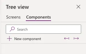
- Select New component
- Rename your component to something relevant like SVGDonut
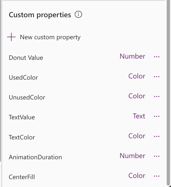
- In the Custom Properties panel, select New custom property. Repeat this 7 times and configure the following properties.
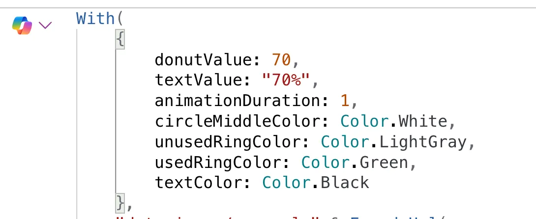
- Replace the values in the With section of the image property and map them to your component property values.
Learn more about YAML and integrating with Components