
A reusable Power Platform snippet
Toast notifications
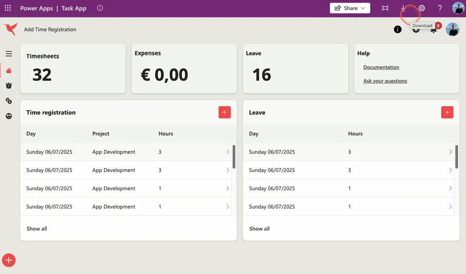
This snippet shows you how to build toast notifications for Canvas apps.
 Power Apps
- Last updated
- Jul 7, 2025
- Category
- Community snippet
From idea to implementation
Make it your own.
Check this snippet's prerequisites, permissions, and licensing before using it. The documentation below comes directly from the snippet README.
This snippet shows you how to build toast notifications for Canvas apps. In this example, we will use a component so that the functionalities are reusable on different screens within your Canvas app.
Authors
| Snippet | Author |
|---|---|
| Arjan Rijsdijk | GitHub - Bluesky - LinkedIn |
Minimal path to awesome
Colors
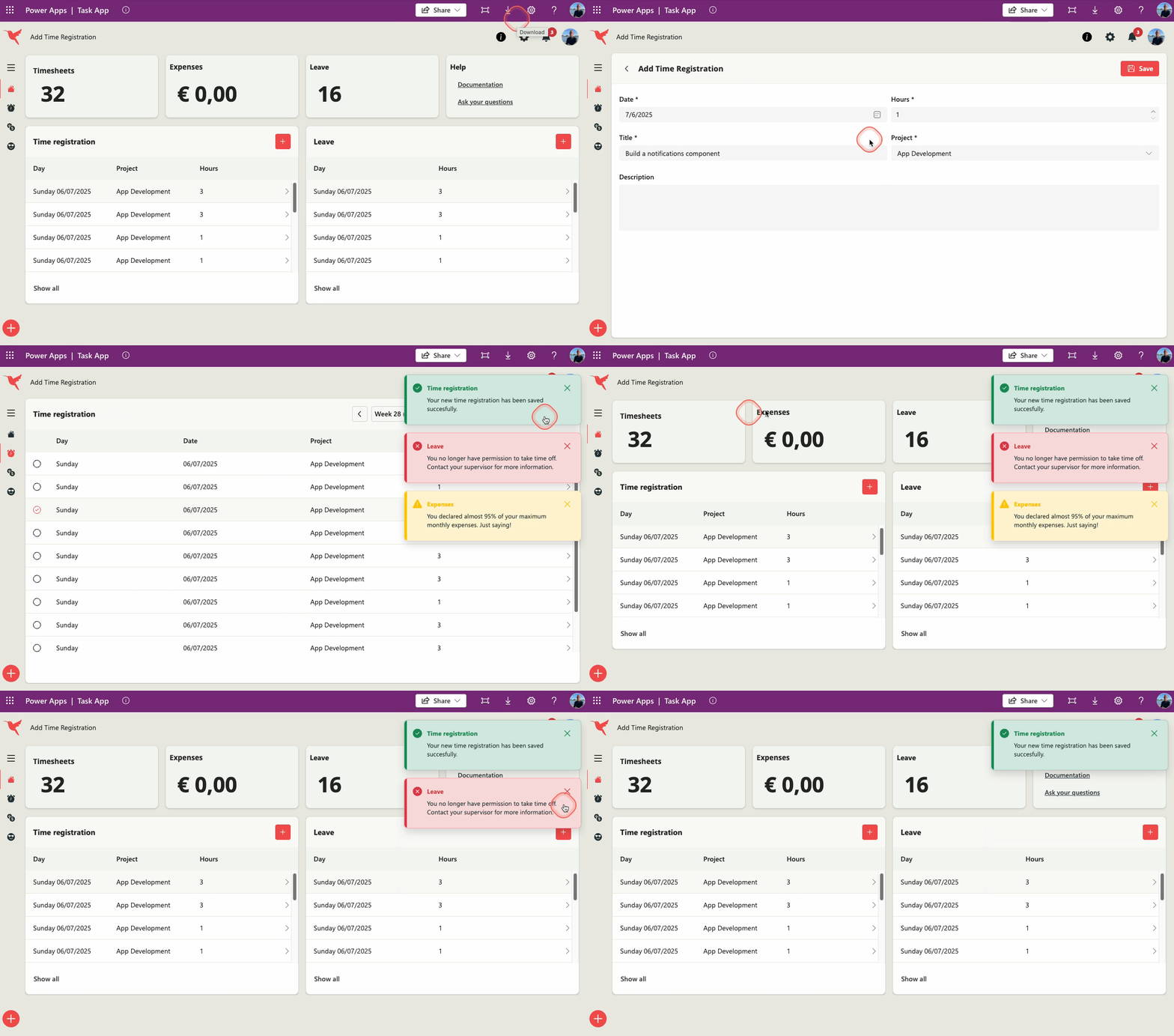
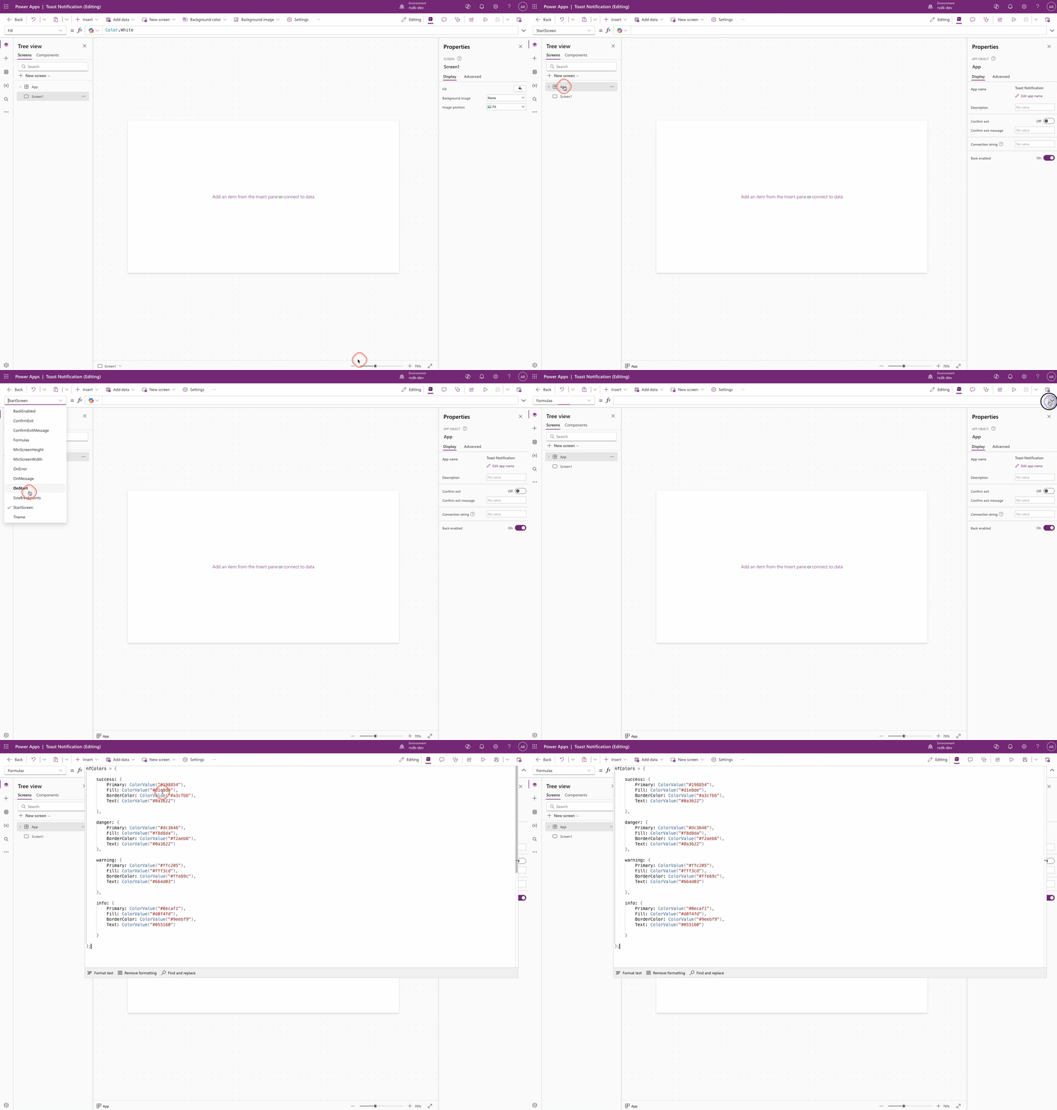
Go to the Formulas property (on App level) and copy the code below
nfColors = {

    success: {
        Primary: ColorValue("#198854"),
        Fill: ColorValue("#d1e8de"),
        BorderColor: ColorValue("#a3cfbb"),
        Text: ColorValue("#0a3622")

    },

    danger: {
        Primary: ColorValue("#dc3646"),
        Fill: ColorValue("#f8d8da"),
        BorderColor: ColorValue("#f2aeb6"),
        Text: ColorValue("#0a3622")
    },

    warning: {
        Primary: ColorValue("#ffc205"),
        Fill: ColorValue("#fff3cd"),
        BorderColor: ColorValue("#ffe69c"),
        Text: ColorValue("#664d03")

    },

    info: {
        Primary: ColorValue("#0ecaf1"),
        Fill: ColorValue("#d0f4fd"),
        BorderColor: ColorValue("#9eebf9"),
        Text: ColorValue("#055160")

    }

};
Example data
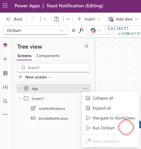
Go to the OnStart property (on App level) and copy the code below
Collect(
    colNotifications,
    {
        ID: GUID(),
        Title: "Success notification",
        Text: "This is a notification of type Success",
        Severity: "success",
        isVisible: true
    },
    {
        ID: GUID(),
        Title: "Danger notification",
        Text: "This is a notification of type Danger",
        Severity: "danger",
        isVisible: true
    },
    {
        ID: GUID(),
        Title: "Warning notification",
        Text: "This is a notification of type Warning",
        Severity: "warning",
        isVisible: true
    },
    {
        ID: GUID(),
        Title: "Info notification",
        Text: "This is a notification of type Info",
        Severity: "info",
        isVisible: true
    }
)
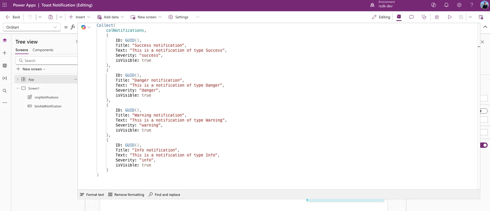
Don't forget to run OnStart, so that the collection will be created
Component
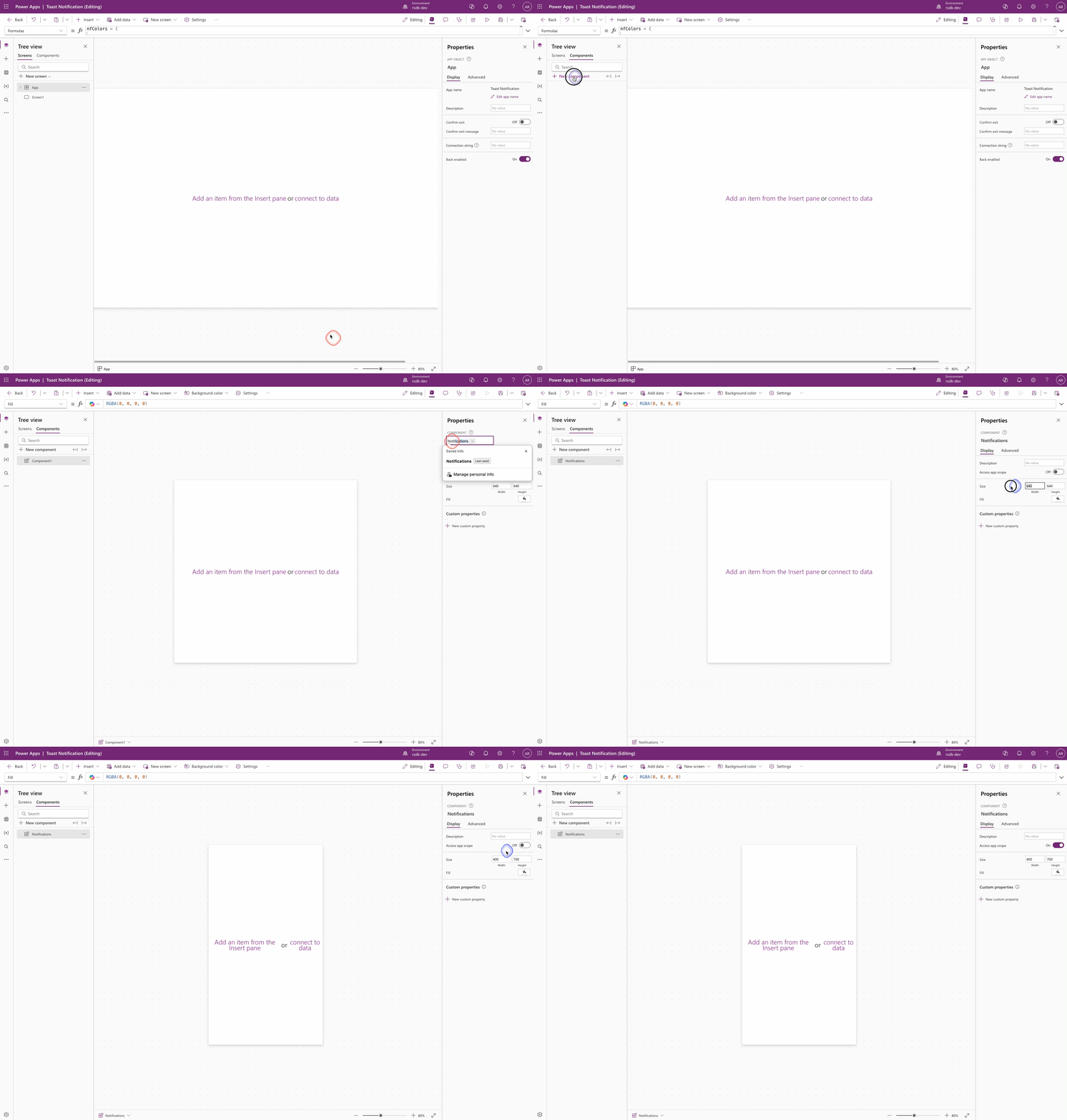
- Go to your canvas app in Power Apps
- Go to Tree view and click Components
- Click New component
- Name your component
- Set the width and height to 400 x 700
- Enable the Access app scope option
Code
Open the just created component and paste the YAML code below.
- galNotifications:
    Control: Gallery@2.15.0
    Variant: Vertical
    Properties:
      Height: =Parent.Height
      Items: =colNotifications
      TemplatePadding: =16
      TemplateSize: |
        =104
      Width: =Parent.Width
    Children:
      - conNotification:
          Control: GroupContainer@1.3.0
          Variant: ManualLayout
          Properties:
            BorderColor: |-
              =Switch(
                  ThisItem.Severity,

                  "success",
                  nfColors.success.BorderColor,

                  "danger",
                  nfColors.danger.BorderColor,

                  "warning",
                  nfColors.warning.BorderColor,

                  nfColors.info.BorderColor
              )
            BorderThickness: =1
            DropShadow: =DropShadow.Regular
            Fill: |-
              =Switch(
                  ThisItem.Severity,

                  "success",
                  nfColors.success.Fill,

                  "danger",
                  nfColors.danger.Fill,

                  "warning",
                  nfColors.warning.Fill,

                  nfColors.info.Fill
              )
            Height: =Parent.TemplateHeight
            Width: =Parent.TemplateWidth
          Children:
            - btnNotificationHide:
                Control: Button@0.0.45
                Properties:
                  Appearance: ='ButtonCanvas.Appearance'.Transparent
                  FontColor: |-
                    =Switch(
                        ThisItem.Severity,

                        "success",
                        nfColors.success.Primary,

                        "danger",
                        nfColors.danger.Primary,

                        "warning",
                        nfColors.warning.Primary,

                        nfColors.info.Primary
                    )
                  Height: =24
                  Icon: ="Dismiss"
                  IconStyle: ='ButtonCanvas.IconStyle'.Filled
                  Layout: ='ButtonCanvas.Layout'.IconOnly
                  Width: =24
                  X: =Parent.Width - 40
                  Y: =16
            - lblNotificationText:
                Control: Text@0.0.51
                Properties:
                  AutoHeight: =true
                  FontColor: |-
                    =Switch(
                        ThisItem.Severity,

                        "success",
                        nfColors.success.Text,

                        "danger",
                        nfColors.danger.Text,

                        "warning",
                        nfColors.warning.Text,

                        nfColors.info.Text
                    )
                  Height: =24
                  Size: =13
                  Text: =ThisItem.Text
                  VerticalAlign: =VerticalAlign.Middle
                  Weight: ='TextCanvas.Weight'.Regular
                  Width: |+
                    =Parent.Width - 96

                  X: =48
                  Y: =40
            - lblNotificationTitle:
                Control: Text@0.0.51
                Properties:
                  FontColor: |-
                    =Switch(
                        ThisItem.Severity,

                        "success",
                        nfColors.success.Primary,

                        "danger",
                        nfColors.danger.Primary,

                        "warning",
                        nfColors.warning.Primary,

                        nfColors.info.Primary
                    )
                  Height: =24
                  Size: =13
                  Text: =ThisItem.Title
                  VerticalAlign: =VerticalAlign.Middle
                  Weight: ='TextCanvas.Weight'.Bold
                  Width: |+
                    =Parent.Width - 96

                  X: =48
                  Y: =16
            - icoNotification:
                Control: Icon@0.0.7
                Properties:
                  Height: =24
                  Icon: |-
                    =Switch(
                        ThisItem.Severity,

                        "success",
                        "CheckmarkCircle",

                        "danger",
                        "DismissCircle",

                        "warning",
                        "Warning",

                        "Info"
                    )
                  IconColor: |-
                    =Switch(
                        ThisItem.Severity,

                        "success",
                        nfColors.success.Primary,

                        "danger",
                        nfColors.danger.Primary,

                        "warning",
                        nfColors.warning.Primary,

                        nfColors.info.Primary
                    )
                  IconStyle: ='Icon.IconStyle'.Filled
                  Width: =24
                  X: =16
                  Y: =16
            - recNotification:
                Control: Rectangle@2.3.0
                Properties:
                  Fill: |-
                    =Switch(
                        ThisItem.Severity,

                        "success",
                        nfColors.success.Primary,

                        "danger",
                        nfColors.danger.Primary,

                        "warning",
                        nfColors.warning.Primary,

                        nfColors.info.Primary
                    )
                  Height: =104
                  Width: =6
Or you can use this YAML-file
Related
For a complete guide check out the toast notifications article on LinkedIn
Disclaimer
THIS CODE IS PROVIDED AS IS WITHOUT WARRANTY OF ANY KIND, EITHER EXPRESS OR IMPLIED, INCLUDING ANY IMPLIED WARRANTIES OF FITNESS FOR A PARTICULAR PURPOSE, MERCHANTABILITY, OR NON-INFRINGEMENT.