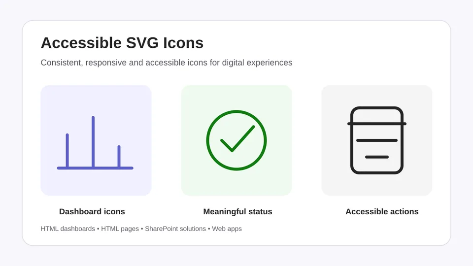
Creates and improves self-contained SVG icons for HTML dashboards, HTML pages, SharePoint solutions, web applications, and other digital interfaces.
Before drawing, the skill inspects available HTML, CSS, existing iconography, audience, interface purpose, design tokens, interaction requirements, themes, and viewport constraints. It decides whether an icon is useful, classifies it as decorative, informative, or interactive, and returns an icon plan before implementation markup.
The skill supports line and solid variants, responsive sizing, currentColor, light and dark themes, forced-colour modes, keyboard focus, pointer targets, non-colour status cues, and accessible naming. It can also audit existing SVG and HTML for accessibility, visual consistency, small-size legibility, and remote dependencies.
Creates, improves, and audits accessible SVG icons for HTML dashboards, HTML pages, SharePoint solutions, web applications, and other digital interfaces. Use it when you need a consistent icon system, want to replace emoji or inconsistent icons, or need to review SVG and surrounding HTML for accessibility, responsive behaviour, and theme support.
What you get
- A pre-design review of the available HTML, CSS, existing icons, audience, interface purpose, design tokens, interaction requirements, themes, and viewport constraints
- A recommendation on whether an icon will improve comprehension, hierarchy, wayfinding, scannability, status recognition, or action recognition
- An icon plan covering meaning, purpose classification, visible text, line or solid treatment, target sizes, accessible naming, theme strategy, and interaction requirements
- Implementation-ready SVG, HTML, CSS, or component code
- Decorative, informative, and interactive icon patterns with appropriate assistive-technology treatment
- Responsive sizing and checks at 16, 20, 24, and 32 CSS pixels
- Light, dark, and forced-colour theme support using
currentColorand semantic tokens - Keyboard focus, pointer-target, contrast, and non-colour status guidance
- Line and solid variants that follow one consistent visual system
- An audit and validation summary for existing SVG and HTML
When to use
Ask Copilot to:
- "Create four consistent inline SVG icons for these dashboard KPI cards."
- "Replace the emoji on this HTML page with responsive SVG icons that inherit the page theme."
- "Convert this clickable SVG into an accessible native button without changing its appearance."
- "Audit the icons in this dashboard for accessibility, consistency, dark-mode readiness, and remote dependencies."
- "Check whether these success, warning, and error icons communicate meaning without colour."
SharePoint Skill
| Solution | Author(s) |
|---|---|
| accessible-svg-icons | Richard Plantt | GitHub |
Version history
| Version | Date | Comments |
|---|---|---|
| 1.0 | October 2026 | Initial Release |
Disclaimer
THIS CODE IS PROVIDED AS IS WITHOUT WARRANTY OF ANY KIND, EITHER EXPRESS OR IMPLIED, INCLUDING ANY IMPLIED WARRANTIES OF FITNESS FOR A PARTICULAR PURPOSE, MERCHANTABILITY, OR NON-INFRINGEMENT.
Package
Ready to install
The ZIP contains only the upload-ready inner skill folder.
eccb2a423440d54c86bc9e5d0bc8b9b8606f1279a486a6f69db3d73dd9a2f14cView SKILL.md
---
name: accessible-svg-icons
description: create, improve, or audit accessible svg icons for html dashboards, html pages, sharepoint solutions, web applications, and other digital interfaces. use when a user asks to generate inline svg markup, replace emoji or inconsistent icons, create icon systems, add accessible names, distinguish decorative from meaningful icons, improve contrast or theme support, make icons responsive, or review existing svg and html for accessibility and consistency.
---

# Accessible SVG Icons

Create SVG icons that are understandable, consistent, responsive, and usable with assistive technology. Return self-contained markup that fits the user's target environment.

## Required outcomes

Create or improve SVG iconography while maintaining:

- a modern and consistent visual style;
- responsive vector rendering;
- WCAG 2.2 accessibility considerations;
- light, dark, and high-contrast theme support;
- intentional line and solid variants;
- clear meaning at small sizes;
- safe, maintainable inline HTML and CSS; and
- consistency with the experience's existing design system.

Use SVG icons to improve comprehension, hierarchy, wayfinding, and scannability. Do not add icons simply to decorate every section.

## Required workflow

Do not design or replace icons until the validation and planning steps below are complete.

### 1. Inspect the available context

Review all supplied material that applies: complete HTML and CSS; existing icons and their visual style; experience purpose and intended audience; KPI cards and summary metrics; controls and navigation; status and feedback messages; theme rules; CSS custom properties; and available space across viewport sizes.

If required context is unavailable, use conservative defaults instead of inventing an elaborate icon system. State the missing context and assumptions.

### 2. Validate whether an icon is needed

For each proposed location, determine whether the icon improves comprehension, hierarchy, wayfinding, scannability, status recognition, or action recognition.

Do not add an icon when it adds decoration without useful meaning, competes with important content, duplicates a visible label without improving scanning, uses an unfamiliar metaphor, or makes a dense interface harder to understand.

### 3. Classify the purpose

Classify every icon before creating markup:

- **Decorative**: repeats adjacent visible information and adds no new meaning.
- **Informative**: communicates information not already provided nearby.
- **Interactive**: appears inside a button, link, filter, menu, navigation item, or other actionable control.

### 4. Establish the visual system

Determine line, solid, or paired treatment; viewBox grid; stroke width; line caps and joins; corner treatment; optical weight; target sizes at 16, 20, 24, and 32 CSS pixels; theme tokens; small-size simplification; and existing design-system conventions.

Use one coherent icon family. Do not mix line and solid icons randomly. Use line icons by default for navigation and general actions. Use solid icons selectively for emphasis, active states, alerts, or compact status indicators.

### 5. Validate meaning and uniqueness

- Prefer familiar metaphors over ambiguous symbols.
- Map each icon to one clear meaning in context.
- Do not use the same icon for unrelated meanings in the same HTML file.
- Keep similar concepts visually distinguishable.
- Provide visible text for important meaning when required.
- Do not copy protected brand logos or third-party trademarks as generic interface icons.

Apply this priority: meaning and familiarity; accessibility; consistency with existing icons; legibility at the intended size; visual simplicity; aesthetic fit.

### 6. Validate accessibility and interaction

Identify the visible text equivalent, accessible-name source, semantic parent control, keyboard and focus requirements, non-colour cues, pointer-target size, and contrast requirements before drawing.

Interactive controls must provide a complete pointer target of at least 24 by 24 CSS pixels. Prefer 32 by 32 or 44 by 44 CSS pixels when layout permits.

### 7. Validate theme and responsive behaviour

Identify CSS-controlled dimensions; `rem`, `em`, or custom-property sizing; whether `flex-shrink: 0` is needed; light and dark theme tokens; `prefers-color-scheme` behaviour when appropriate; forced-colour behaviour; and appearance at 16, 20, 24, and 32 CSS pixels.

Use `currentColor` by default so icons inherit colour from their component or semantic token. Do not disable forced-colour adaptation across the icon system.

### 8. Return an icon plan before SVG markup

For new or replacement icons, first return a concise plan containing: location; reason the icon is useful; intended meaning; purpose classification; visible text equivalent; line or solid treatment; target sizes; accessible-name treatment; colour and theme strategy; and parent control and target size when interactive.

If an icon fails validation, recommend visible text, spacing, hierarchy, or another non-icon treatment instead.

### 9. Create or revise the SVG

Only after steps 1 through 8 are complete, create or revise the markup.

### 10. Validate the implementation

Review the finished SVG, surrounding HTML, and CSS against the final checklist before responding.

## SVG construction rules

- Use a valid `viewBox` on every SVG.
- Use simple geometry that remains recognisable at the intended size.
- Keep visual weight, corner treatment, stroke width, and proportions consistent across an icon set.
- Use `width="1em"` and `height="1em"` for icons intended to scale with text unless the target system requires fixed dimensions.
- Use `currentColor` for strokes or fills when the icon should inherit text or theme colour.
- Use `fill="none"` for stroke icons unless a filled region is intentional.
- Use `stroke-linecap="round"` and `stroke-linejoin="round"` for rounded line icons.
- Avoid embedded scripts, event handlers, remote resources, external stylesheets, and unnecessary metadata.
- Avoid hard-coded colour when theme inheritance or design tokens are available.
- Do not mix outline and filled styles within one icon set unless the difference communicates a state and is documented.
- Do not distort official product icons, logos, or trademarks. When the user supplies an official asset, preserve its approved geometry and follow its usage terms.

## Accessibility rules

### Decorative icons

Use this pattern when nearby text already communicates the icon's meaning:

```html
<svg aria-hidden="true" focusable="false" viewBox="0 0 24 24" width="1em" height="1em">
  <!-- paths -->
</svg>
```

- Do not add a redundant `aria-label` or `<title>`.
- Ensure the icon cannot receive keyboard focus.

### Informative icons

Use a concise accessible name when the SVG conveys information not otherwise available:

```html
<svg role="img" aria-labelledby="icon-title" viewBox="0 0 24 24" width="1em" height="1em">
  <title id="icon-title">Warning</title>
  <!-- paths -->
</svg>
```

- Give every referenced `<title>` a unique ID within the page or component.
- Describe the meaning, not the visual appearance. Prefer “Overdue” to “Red clock”.
- If adjacent visible text already provides the same meaning, treat the SVG as decorative instead.

### Interactive icons

- Put interaction semantics on the native control, not on the SVG.
- Use a `<button>` or `<a>` with an accessible name and put a decorative SVG inside it.
- Provide visible text when practical. For icon-only controls, provide an `aria-label` on the control.
- Keep the SVG `aria-hidden="true"` and `focusable="false"` inside the control.
- Preserve a visible keyboard focus indicator.
- Do not add `tabindex`, click handlers, or button roles directly to a non-interactive SVG when a native control can be used.

```html
<button type="button" class="icon-button" aria-label="Download report">
  <svg aria-hidden="true" focusable="false" viewBox="0 0 24 24" width="1em" height="1em">
    <!-- paths -->
  </svg>
</button>
```

## Colour, contrast, and state

- Never rely on colour alone to distinguish status or meaning. Combine colour with a recognisable shape, visible label, pattern, or text.
- Use the surrounding text colour through `currentColor` when appropriate.
- Preserve contrast in default, hover, focus, active, selected, disabled, light, dark, and high-contrast states that apply to the target experience.
- Do not use colour names in accessible labels unless the colour itself is the information the user requested.
- For disabled controls, keep the state understandable without removing the accessible name.

## SharePoint and constrained HTML environments

For SharePoint HTML pages and similar sandboxed environments:

- Prefer self-contained inline SVG.
- Do not depend on a third-party icon CDN, outbound API call, remote script, or remote SVG fetch.
- Keep styles local to the page or component and use existing theme variables when the supplied code exposes them.
- Do not claim that an SVG is supported in a specific SharePoint surface without checking the supplied implementation context.
- Preserve SharePoint Framework conventions when editing an SPFx component instead of replacing the component architecture with standalone HTML.

## Creating an icon set

When creating multiple icons:

1. Establish one visual system: canvas size, stroke or fill style, stroke width, corner treatment, and optical size.
2. Use a consistent `viewBox`, normally `0 0 24 24`, unless the source system requires another grid.
3. Keep similar concepts visually distinct.
4. Include visible labels for unfamiliar or business-specific concepts.
5. Return a short inventory naming each icon, its purpose, and whether it is decorative, informative, or interactive.

## Auditing existing SVG or HTML

When reviewing supplied code:

- Identify duplicate accessible names.
- Find decorative icons exposed to assistive technology.
- Find meaningful icons without an accessible name or equivalent visible text.
- Find interactive SVG without a native interactive parent.
- Find fixed colours that break theme or contrast behaviour.
- Find missing or inconsistent `viewBox`, width, height, stroke, fill, linecap, or linejoin values.
- Find meaning communicated through colour alone.
- Find embedded scripts, remote dependencies, or unnecessary metadata.
- Correct issues directly when the user asks for an update. Otherwise, provide corrected snippets for each issue.

## Line and solid variants

### Line variant

Use `fill="none"`, `stroke="currentColor"`, consistent stroke width, and round line caps and joins unless matching an established system. Confirm paths remain understandable at 16, 20, 24, and 32 CSS pixels.

### Solid variant

Use `fill="currentColor"`, remove unnecessary strokes, preserve the line variant's viewBox and approximate silhouette, prevent enclosed areas from visually closing at small sizes, and reserve solid treatment for emphasis, selection, or status.

## Responsive behaviour

- Include a viewBox on every SVG.
- Prefer CSS-controlled width and height using `rem`, `em`, or custom properties.
- Preserve aspect ratio and do not stretch dimensions independently.
- Use `flex-shrink: 0` when shrinking makes an icon unreadable.
- Test at 16, 20, 24, and 32 CSS pixels.
- Keep important labels as semantic HTML outside the SVG. Do not use SVG text for interface labels.

## Colour, themes, and contrast

- Define default semantic values in `:root` when the output owns its CSS.
- Override tokens through an existing theme attribute or class.
- Support `prefers-color-scheme` when appropriate.
- In forced-colour mode, use suitable system colours such as `CanvasText`, `ButtonText`, `LinkText`, `Highlight`, or `HighlightText`.
- Meaningful graphical objects and essential interface icons must have at least 3:1 contrast against adjacent colours.
- Check applicable default, hover, focus, active, selected, disabled, success, warning, and error states.
- Validate light and dark modes independently.
- Fix insufficient contrast through semantic tokens rather than editing every SVG path.
- Do not claim that the whole experience conforms to WCAG 2.2 solely because its icons pass review.

## Context-specific requirements

### Buttons and links

Use a semantic parent, put the accessible name on that control, treat the nested SVG as decorative, include visible text when possible, make any tooltip available through pointer hover and keyboard focus, and preserve a visible focus state.

### KPI cards

Choose an icon that reinforces the metric; treat it as decorative when the heading supplies the same meaning; add visible trend or status text; avoid colour-only performance signals; and keep icon size and placement consistent without overpowering the value.

### Filters and navigation

Keep visible labels when possible. Use familiar metaphors. Apply `aria-expanded` to disclosure controls, `aria-pressed` only to toggle buttons, and `aria-current` to the current destination when appropriate. Do not indicate active or selected state through colour alone.

### Charts and data visualisations

Do not store critical values inside decorative icons. Preserve a text summary or accessible data table. Distinguish series with labels, shapes, line styles, or patterns as well as colour. Keep chart controls keyboard accessible and expose hover information through keyboard focus when applicable.

## Expected output

Return outputs in this order:

1. **SVG or implementation code** in a fenced code block using the appropriate language.
2. **Usage note** stating:
   - icon purpose and classification;
   - accessible-name treatment;
   - sizing and theme behaviour;
   - any assumption or environment-specific limitation.
3. **Validation summary** with short pass/fail notes for semantics, keyboard use when interactive, colour independence, contrast/theme readiness, responsiveness, and self-containment.

For multiple icons, add a compact icon inventory before the code.

## Validation checklist

Before responding, verify:

- [ ] The icon purpose is classified.
- [ ] The SVG has a valid `viewBox`.
- [ ] Decorative icons are hidden from assistive technology.
- [ ] Informative icons have a concise, non-duplicate accessible name or equivalent visible text.
- [ ] Interactive icons sit inside a native control with an accessible name.
- [ ] Keyboard focus remains visible for interactive controls.
- [ ] Meaning does not depend on colour alone.
- [ ] Theme and scaling behaviour are appropriate for the target context.
- [ ] The icon set uses a consistent visual language.
- [ ] Markup contains no script, remote dependency, or unnecessary metadata.
- [ ] The output is implementation-ready and includes a usage note.

## References

Load [references/patterns.md](references/patterns.md) when examples or implementation patterns are needed.
Load [references/test-prompts.md](references/test-prompts.md) when testing or demonstrating the skill.
References
- agentskills.io specification
The specification that SharePoint AI skills follow for installation and discovery.
Discuss this skill
Ask a question, share how you used it, or suggest an improvement with the community.
Open GitHub Discussions