 Preview unavailable
The idea behind the sample
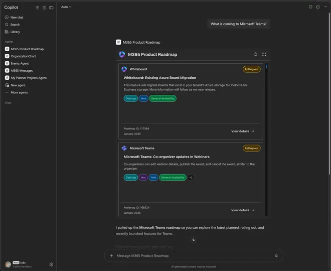
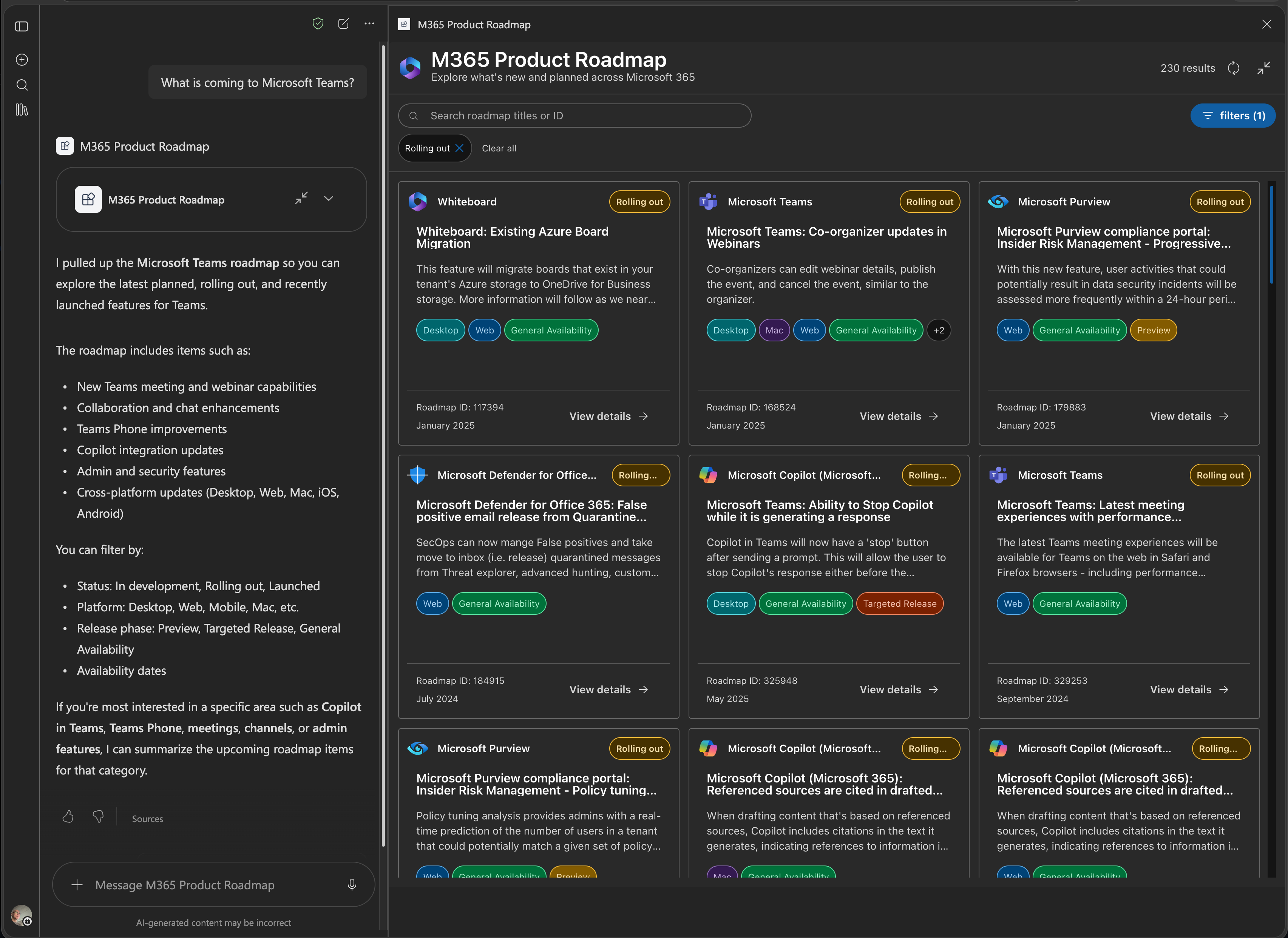
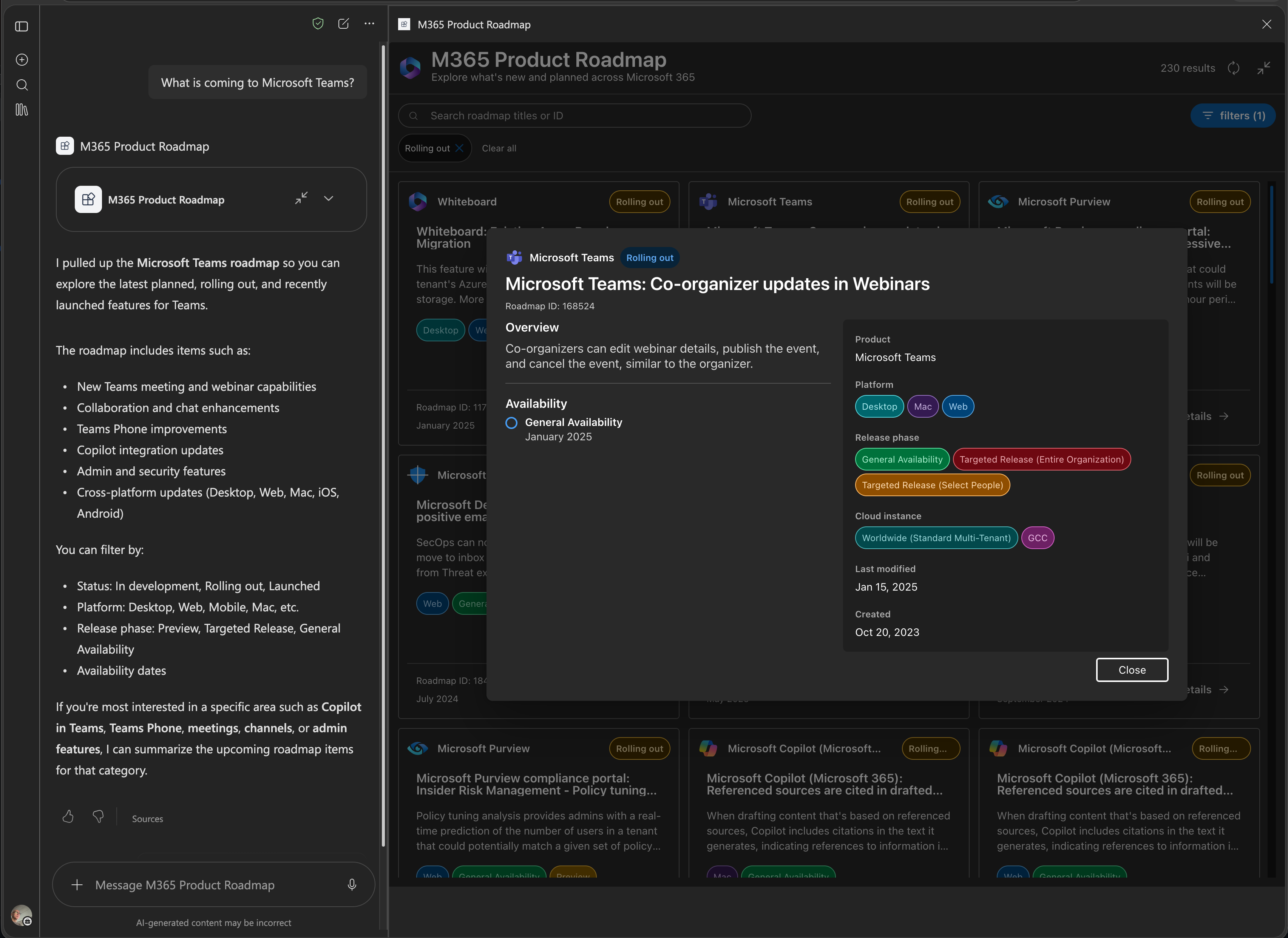
M365 Product Roadmap is a SharePoint Framework 1.24 Copilot UX component that helps users discover and explore Microsoft 365 roadmap features through the public Microsoft Release Communications (MRC) MCP server. The component provides both compact inline views and fullscreen responsive card grids for browsing upcoming Microsoft 365 releases.
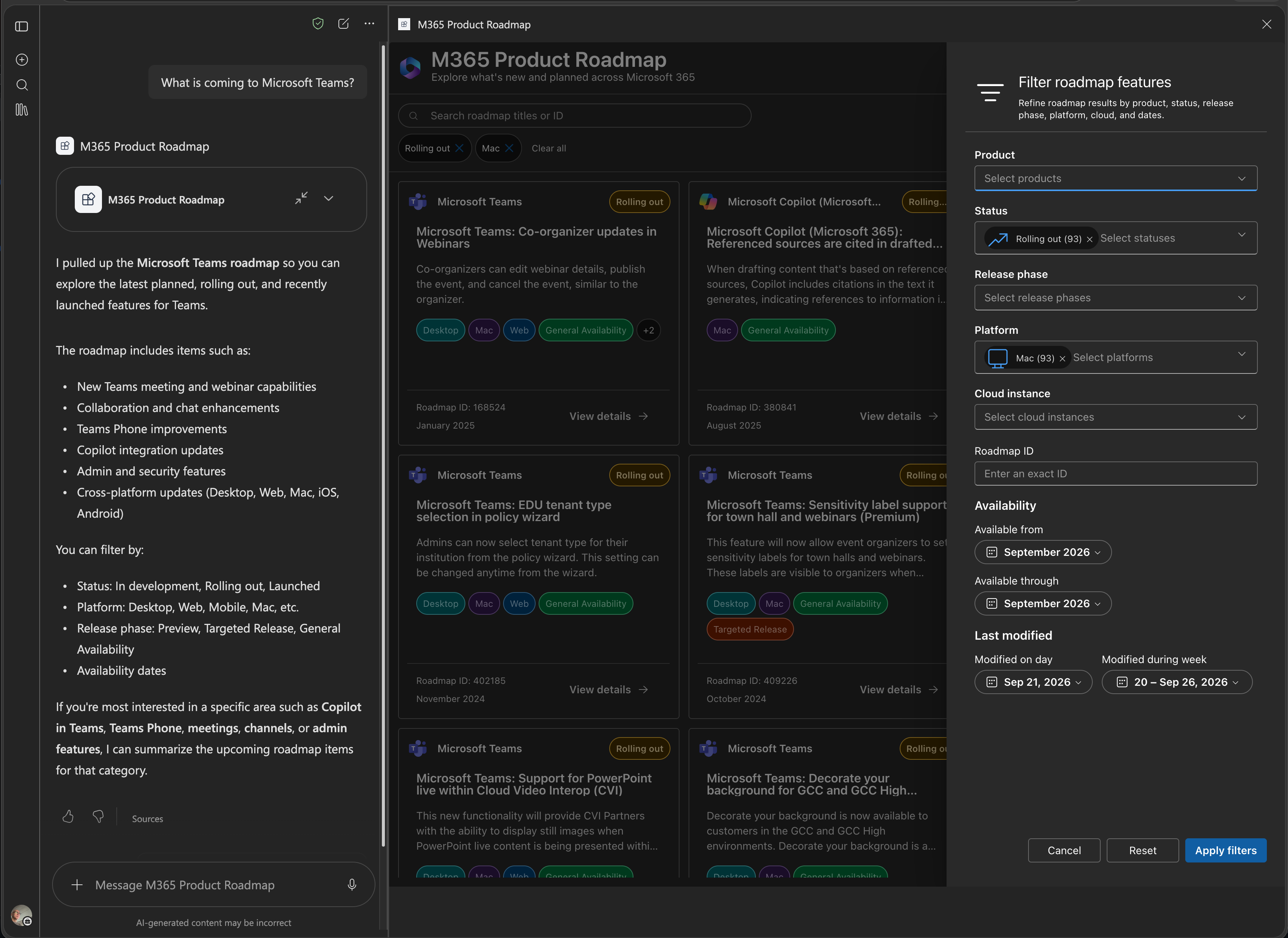
The component supports advanced filtering and search capabilities including debounced search, product picker, status dropdown, exact roadmap ID input, and multi-select filters for release phase, platform, and cloud. It features lazy-loading detail dialogs with overview information, rollout timelines, metadata, and direct links to Microsoft source documentation.
Built with React and TypeScript using the SharePoint Framework 1.24, the component leverages @spteck/react-controls-v2 for UI controls and @emotion/css for styling with Fluent design tokens. It demonstrates best practices for integrating Copilot components with remote MCP endpoints, including offset paging with deduplication, stale-request protection, and light/dark theme support.
Make it your own
Start with the author's setup instructions, explore the implementation, and adapt the pattern to your environment. Sample code stays in its original repository, together with its requirements, license and contribution history.
Read the source documentationA closer look
 Preview unavailable
 Preview unavailable
 Preview unavailable
Keep exploring
- Build agents for Microsoft Copilot — Extend Microsoft Copilot with declarative agents, plugins, and connectors.
- Overview of the SharePoint Framework — Learn about the SharePoint Framework client-side development model.
- Microsoft Copilot — Microsoft Copilot combines large language models with organizational context and extensibility.