
 Preview unavailable
The idea behind the sample
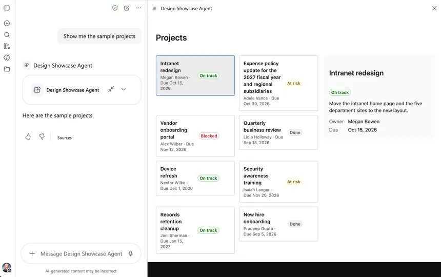
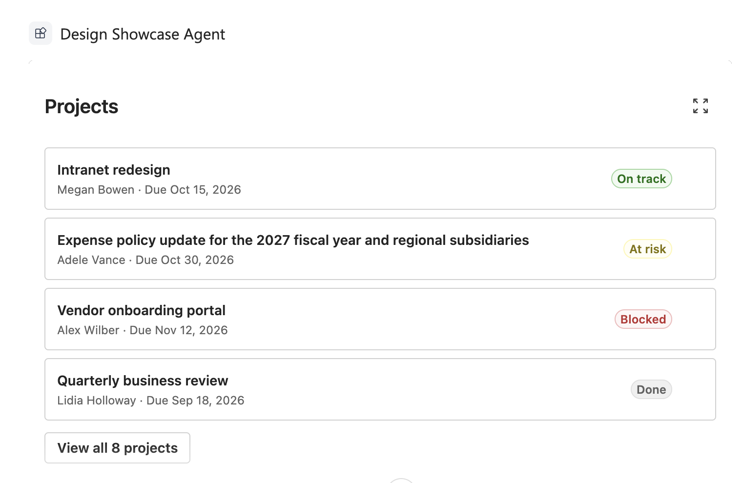
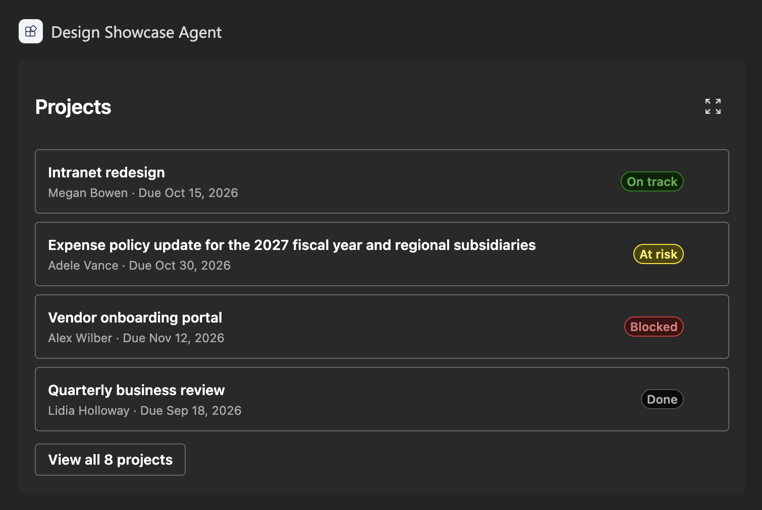
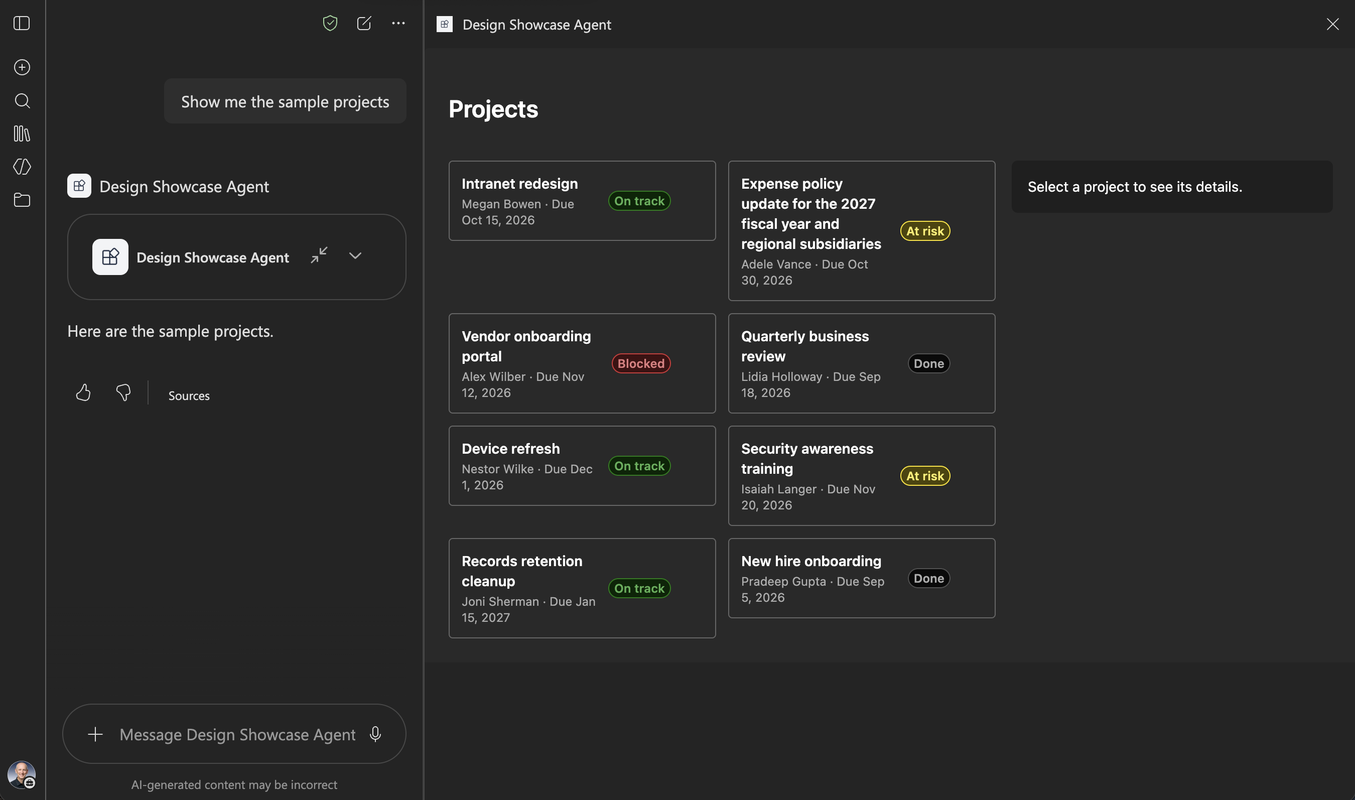
The finished solution for the article Theme and design for the Copilot canvas. The DesignShowcase component shows sample project cards built with Fluent UI. It follows the Copilot light and dark themes, adapts its layout to the inline and fullscreen display modes and to the width of the canvas, and keeps the selected card when the display mode changes.
The component uses bundled sample data. It makes no network calls and requests no API permissions; the solution package is the only thing to deploy.
Make it your own
Start with the author's setup instructions, explore the implementation, and adapt the pattern to your environment. Sample code stays in its original repository, together with its requirements, license and contribution history.
Read the source documentationA closer look
 Preview unavailable
 Preview unavailable
 Preview unavailable
Keep exploring
- Theme and design for the Copilot canvas — Follow the Copilot theme and adapt a Copilot UX component to the inline and fullscreen display modes.
- Display modes in SharePoint Copilot components — How the inline and fullscreen display modes work in SharePoint Copilot components.
- Overview of the SharePoint Framework — The SharePoint Framework (SPFx) is a page and web part model that provides full support for client-side SharePoint development.