
From the contributor
How to use this sample
Summary
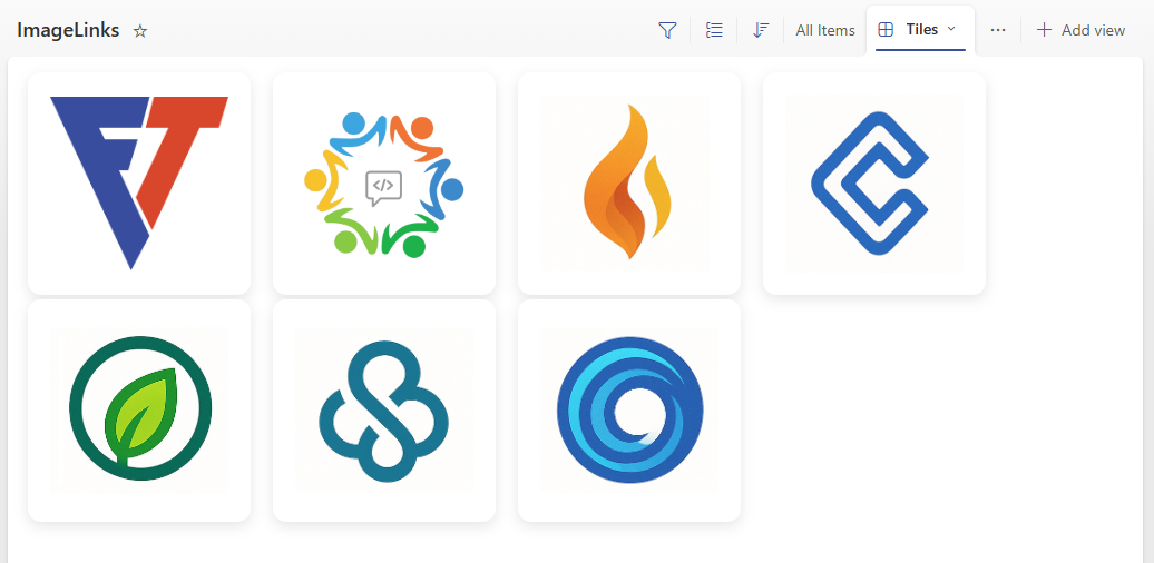
This sample displays images in a visually appealing tile layout with modern styling using SharePoint's Gallery view. Each image tile is clickable and navigates to a URL specified in another column. The tiles feature rounded corners, shadow effects, and a clean design that works well for image galleries, catalogs, or showcase layouts.
Note: This is a view formatter (tile formatter) that should be applied to a Gallery view, not a column formatter.
View requirements
- Create a view based on
Gallerylayout - Apply this formatter to the tile view
| Type | Internal Name | Required | Purpose |
|---|---|---|---|
| Single line of text | Title | Yes | Accessibility alt text |
| Hyperlink or Picture | ImageURL | Yes | Image URL |
| Hyperlink or Picture | URL | No | Contains the target link |
[!NOTE]
If images from external sites are specified forImageURL, HTML field security must be set. For more information see: Allow or restrict the ability to embed content on SharePoint pages.
Sample
| Solution | Author(s) |
|---|---|
| image-card-tiles.json | Nanddeep Nachan, Smita Nachan |
Version history
| Version | Date | Comments |
|---|---|---|
| 1.0 | August 11, 2025 | Initial release |
Disclaimer
THIS CODE IS PROVIDED AS IS WITHOUT WARRANTY OF ANY KIND, EITHER EXPRESS OR IMPLIED, INCLUDING ANY IMPLIED WARRANTIES OF FITNESS FOR A PARTICULAR PURPOSE, MERCHANTABILITY, OR NON-INFRINGEMENT.
How it works
This formatter creates a modern tile-based layout for displaying images in a SharePoint list or library gallery view with the following features:
Structure:
- Container: A flex container with rounded corners and shadow effect
- Clickable Link: The entire tile is wrapped in an anchor tag that links to the URL column
- Image Display: Images are displayed using
object-fit: containto maintain aspect ratio - Responsive Design: The tiles maintain consistent dimensions while adapting to different screen sizes
Key Features:
- Modern Styling: Clean design with rounded corners, shadows, and proper spacing
- Accessibility: Includes proper alt text from the Title column
- Link Integration: Seamlessly integrates with URL columns for navigation
- Consistent Layout: Fixed tile dimensions ensure uniform appearance
- Visual Feedback: Hover and focus states provide user interaction feedback
Browser Compatibility:
This formatter uses modern CSS properties including flexbox, object-fit, and box-shadow, which are supported in all modern browsers.
Additional notes
Customization Options:
- Tile dimensions: Adjust the height and width properties at the top level (currently set to 100px height and 180px width)
- Border radius: Modify the
border-radiusvalue on line 11 to change the rounded corner effect (currently 12px) - Shadow effect: Customize the
box-shadowon line 12 for different shadow styles - Spacing: Adjust the
marginproperty on line 16 to change spacing between tiles (currently 10px) - Link behavior: Change the
targetattribute on line 24 to control how links open:"_blank"- Opens in a new window/tab (current setting)"_self"- Opens in the same window
- Image fit: Modify the
object-fitproperty on line 46 to control how images are displayed within the tile:"contain"- Shows the entire image (current setting)"cover"- Fills the tile, may crop image"fill"- Stretches image to fill tile
Column References:
[$URL]: References the URL column containing the target link[$ImageURL]: References the image URL from the image column[$Title]: References the title column for accessibility alt text