
From the contributor
How to use this sample
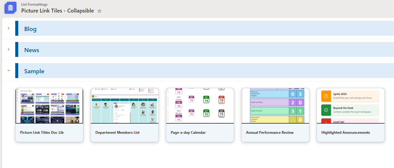
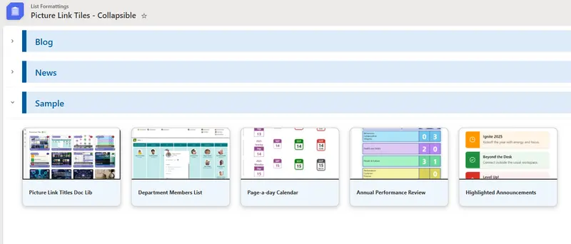
# Picture Link Tiles - Collapsible
Summary
Currently, Gallery view allows formatting of group headers, but it does not support built-in or JSON-based expand and collapse behavior like List view. This sample demonstrates how to render list items as cards, where you can choose which field values are displayed within each card and define target links.
View requirements
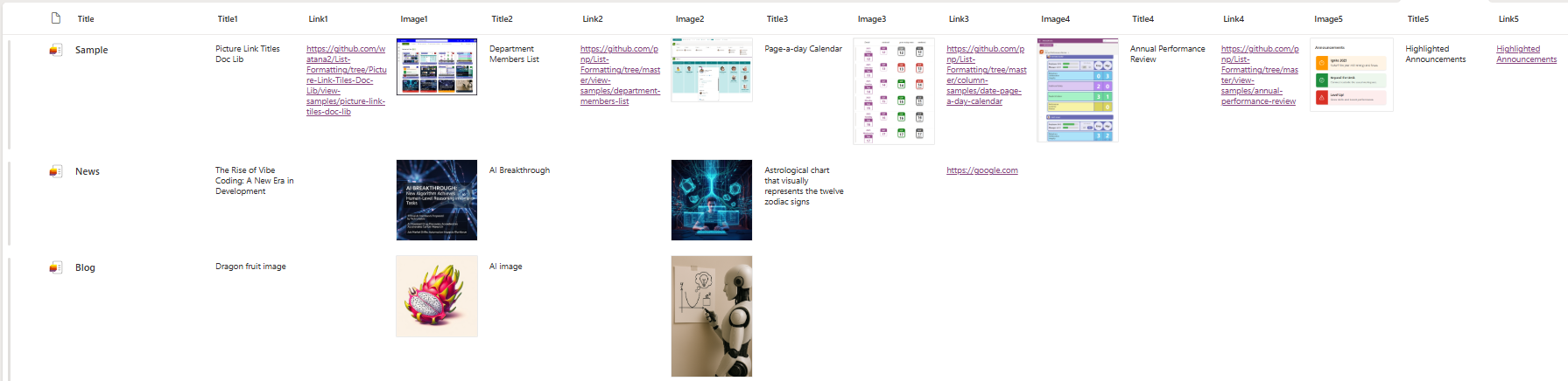
| Column Name | Type | Setting |
|---|---|---|
| Title | Single line of text | Group by column |
| Title1 | Single line of text | |
| Title2 | Single line of text | |
| Title3 | Single line of text | |
| Title4 | Single line of text | |
| Title5 | Single line of text | |
| Link1 | Hyperlink | |
| Link2 | Hyperlink | |
| Link3 | Hyperlink | |
| Link4 | Hyperlink | |
| Link5 | Hyperlink | |
| Image1 | Image | |
| Image2 | Image | |
| Image3 | Image | |
| Image4 | Image | |
| Image5 | Image |
[!NOTE] All columns must be included in the view and grouped by the
Titlecolumn.
Sample
| Solution | Author(s) |
|---|---|
| picture-link-tiles-collapsible.json | Watana |
Version history
| Version | Date | Comments |
|---|---|---|
| 1.0 | January 7, 2026 | Initial release. |
Disclaimer
THIS CODE IS PROVIDED AS IS WITHOUT WARRANTY OF ANY KIND, EITHER EXPRESS OR IMPLIED, INCLUDING ANY IMPLIED WARRANTIES OF FITNESS FOR A PARTICULAR PURPOSE, MERCHANTABILITY, OR NON-INFRINGEMENT.