
From the contributor
How to use this sample
Summary
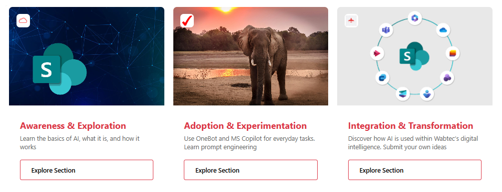
This sample uses SharePoint List Formatting to display list items as modern card tiles with a prominent image header, icon overlay, and call-to-action button.
Each card features a fixed 365x400px layout with an image background, branded icon badge, title/description content area, and an "Explore Section" button that opens external links.
View Requirements
Create a list with the following columns:
| Internal Name | Type | Description |
|---|---|---|
| Title | Single line of text | Card title/heading |
| Description | Multiple lines of text | Card description/summary |
| Image | Single of text | Main card background image (upload image siteassets) |
| IconUrl | Single line of text | Small icon for the overlay badge (upload image/url siteassets) |
| Url | Hyperlink | Target URL for the "Explore Section" button |
How it Works
- Image Header: The main image (
Imagecolumn) serves as a 220px tall background header - Icon Overlay: A circular white badge in the top-left displays the icon from
IconUrl - Content Area: White content section displays the
Titlein red (#dc3545) andDescriptionin gray - Action Button: "Explore Section" button links to the URL specified in the
Urlcolumn - Fixed Dimensions: Each card maintains consistent 365x400px sizing with 20px right margin
- External Links: All URLs open in new tabs/windows for better user experience
Design Features
- Modern Card Design: Clean, professional appearance with rounded corners
- Responsive Layout: Fixed-width cards that work well in grid arrangements
- Brand Colors: Red accent color (#dc3545) for titles and button borders
- Accessibility: Proper contrast ratios and semantic HTML structure
- Interactive Elements: Hover-friendly button styling
Sample
| Solution | Author(s) |
|---|---|
| interactive-content-card.json | Sai Bandaru |
Version history
| Version | Date | Comments |
|---|---|---|
| 1.0 | September 16, 2025 | Initial release |
Disclaimer
THIS CODE IS PROVIDED AS IS WITHOUT WARRANTY OF ANY KIND, EITHER EXPRESS OR IMPLIED, INCLUDING ANY IMPLIED WARRANTIES OF FITNESS FOR A PARTICULAR PURPOSE, MERCHANTABILITY, OR NON-INFRINGEMENT.
Additional Notes
- Image Requirements: Use high-quality images (minimum 365px wide) for best results
- Icon Format: PNG or SVG icons work best for the overlay badge (24x24px display size)
- URL Validation: Ensure all URLs are properly formatted and accessible
- Performance: Consider image optimization for faster loading times
- Customization: Modify colors, spacing, and button text in the JSON as needed
- Mobile Friendly: Fixed-width design works well on desktop and tablet devices
Customization Options
You can easily customize this formatter by modifying:
- Colors: Change the red accent color (#dc3545) to match your brand
- Button Text: Update "Explore Section" to your preferred call-to-action
- Dimensions: Adjust card width/height and image header size
- Border Radius: Modify the 8px border-radius for different corner styles
- Spacing: Adjust padding and margins for tighter or looser layouts