
From the contributor
How to use this sample
Summary
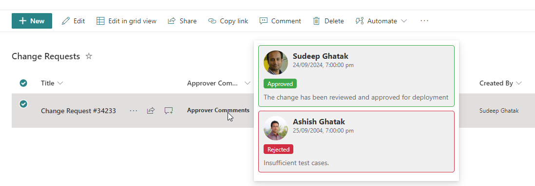
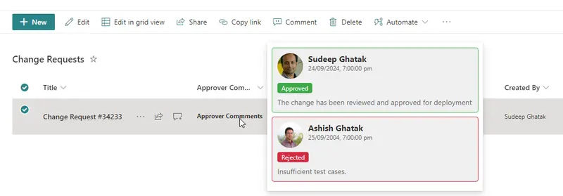
The approval hover card provides an intuitive, streamlined way for users to quickly access key details about an approval details without navigating away from their current task or screen.
View requirements
- This format can be applied to any column type. In the example it has been applied on ApproverComments.
| Internal Name | Type | Notes |
|---|---|---|
| Approver1Comments | Single line of text | |
| Approver2Comments | Single line of text | |
| Approver1Response | Choice | "Approved","Rejected","Pending" |
| Approver2Response | Choice | "Approved","Rejected","Pending" |
| Approver1 | Person or Group | |
| Approver2 | Person or Group | |
| Approver1RespondedOn | Date and Time | |
| Approver2RespondedOn | Date and Time |
Sample
| Solution | Author(s) |
|---|---|
| generic-custom-hover-card-approvers.json | Sudeep Ghatak |
Version history
| Version | Date | Comments |
|---|---|---|
| 1.0 | September 24, 2024 | Initial release |
Disclaimer
THIS CODE IS PROVIDED AS IS WITHOUT WARRANTY OF ANY KIND, EITHER EXPRESS OR IMPLIED, INCLUDING ANY IMPLIED WARRANTIES OF FITNESS FOR A PARTICULAR PURPOSE, MERCHANTABILITY, OR NON-INFRINGEMENT.