
Back to view formats
View formattingSharePoint Online

Content Navigator

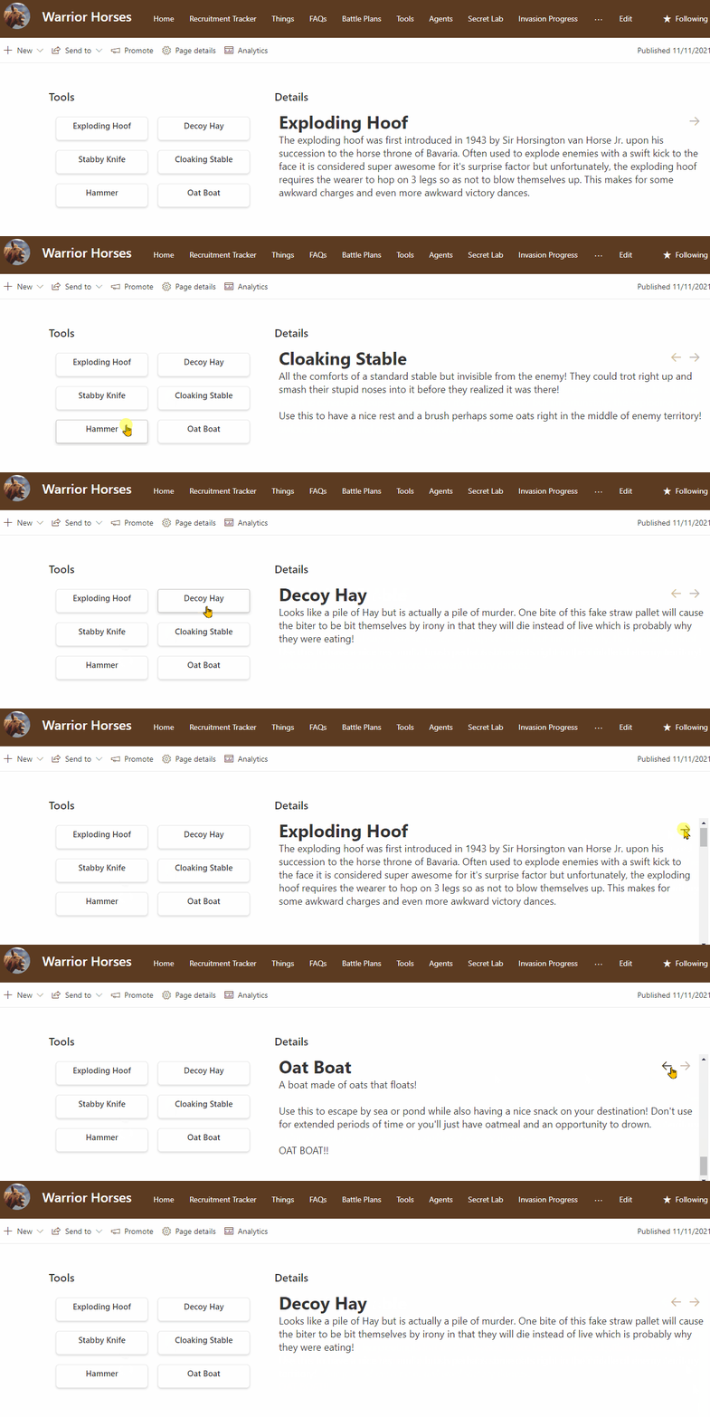
Demonstrates the use of the id attribute to create linkable anchors.

Content Navigator formatting preview
Sample preview · View original animation

Copy. Apply. Make it yours.

Get this format

2 definitions

Review the requirements below, then paste this JSON into the matching formatting panel. Show me where.

Use your list's internal column names and replace any tenant-specific URLs or flow IDs. Formatting is presentation, not a way to secure data.

View formatting
Download JSON
{
  "$schema": "https://developer.microsoft.com/json-schemas/sp/v2/tile-formatting.schema.json",
  "height": 53,
  "width": 254,
  "hideSelection": true,
  "fillHorizontally": true,
  "formatter": {
    "elmType": "div",
    "attributes": {
      "class": "sp-card-container"
    },
    "children": [
      {
        "elmType": "a",
        "attributes": {
          "class": "sp-card-defaultClickButton",
          "role": "presentation",
          "href": "='#tool_' + @rowIndex"
        }
      },
      {
        "elmType": "div",
        "attributes": {
          "class": "ms-bgColor-white sp-css-borderColor-neutralLight sp-card-borderHighlight sp-card-subContainer"
        },
        "children": [
          {
            "elmType": "div",
            "attributes": {
              "class": "sp-card-lastTextColumnContainer"
            },
            "children": [
              {
                "elmType": "p",
                "attributes": {
                  "title": "[$Title]",
                  "class": "ms-fontColor-neutralPrimary sp-card-content sp-card-highlightedContent"
                },
                "txtContent": "=if ([$Title] == '', '–', [$Title])",
                "style": {
                  "text-align": "center"
                }
              }
            ]
          }
        ]
      }
    ]
  }
}

From the contributor

How to use this sample

Summary

This sample demonstrates the use of the id attribute to create linkable anchors. The list is intended to have 2 views (Content and Links) using the 2 view formats supplied. Each view can be added to a page as a separate list webpart. No connections are required. Clicking on an item in the links view webpart will navigate to the item in the content view webpart. Additionally, previous and next buttons are included in the content view for internal navigation.
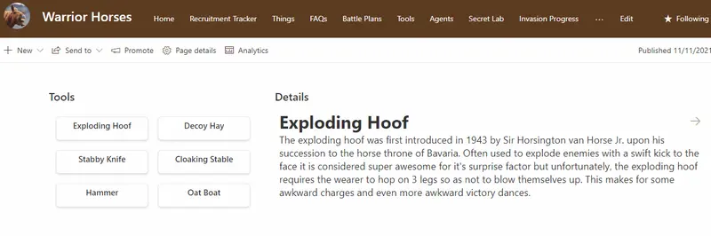
screenshot of the sample

The sample utilizes the @rowIndex magic string to generate the anchor links. This means that you can add additional items and the formats will continue to work as expected. The order is determined by the order of the views (which needs to be the same).

View requirements

Type Internal Name Required
Single line of text Title Yes
Multiple line of text Content Yes

Sample

Solution Author(s)
content-navigator.json Chris Kent
content-navigator-links.json Chris Kent

Version history

Version Date Comments
1.0 April 15, 2022 Initial release

Disclaimer

THIS CODE IS PROVIDED AS IS WITHOUT WARRANTY OF ANY KIND, EITHER EXPRESS OR IMPLIED, INCLUDING ANY IMPLIED WARRANTIES OF FITNESS FOR A PARTICULAR PURPOSE, MERCHANTABILITY, OR NON-INFRINGEMENT.