
From the contributor
How to use this sample
Summary
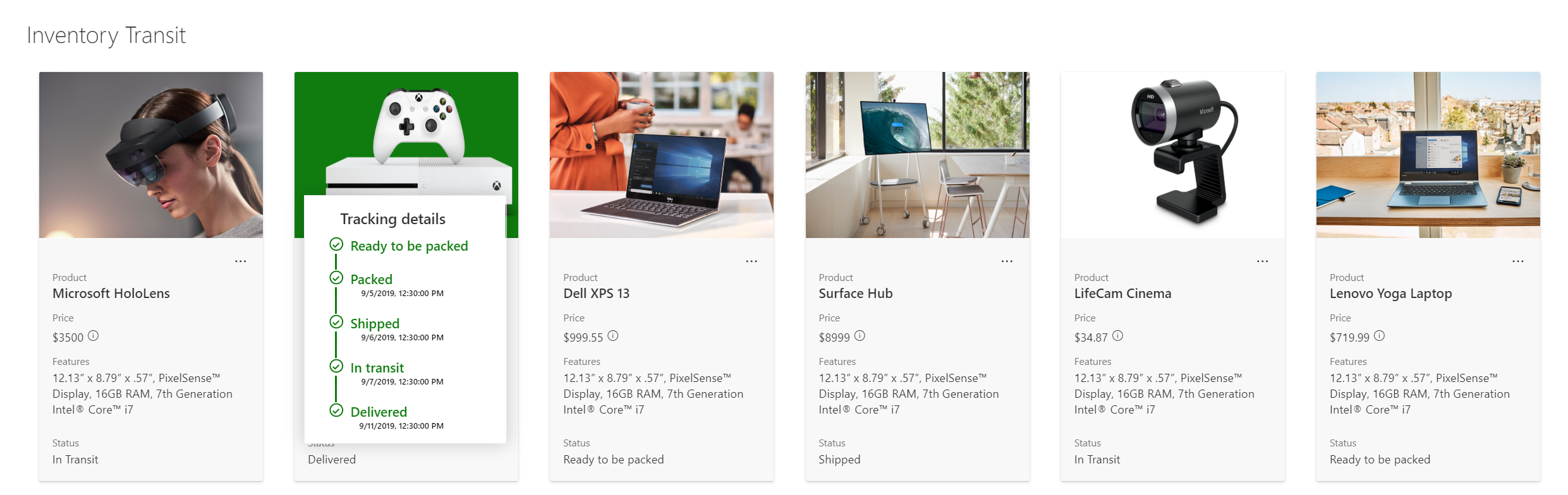
A custom card is shown on hover of an item. The hover card shows additional details about an item's status.
View requirements
- This format can be applied to any column type though the example is based on -
| Column Name | Type |
|---|---|
| Status | Choice |
| Product ID | Single Line Text |
| PackedDate | Date and Time |
| ShippedDate | Date and Time |
| InTransitStartDate | Date and Time |
| DeliveredDate | Date and Time |
| Product Photo | Picture |
Sample
| Solution | Author(s) |
|---|---|
| custom-hover-card.json | Niket Jain |
Version history
| Version | Date | Comments |
|---|---|---|
| 1.0 | April 08, 2020 | Initial release |
Disclaimer
THIS CODE IS PROVIDED AS IS WITHOUT WARRANTY OF ANY KIND, EITHER EXPRESS OR IMPLIED, INCLUDING ANY IMPLIED WARRANTIES OF FITNESS FOR A PARTICULAR PURPOSE, MERCHANTABILITY, OR NON-INFRINGEMENT.
Additional notes
This sample uses icons from the Office UI Fabric
An additional version using Abstract Tree Syntax (AST) is also provided for environments where the Excel-style expressions are not supported.