
From the contributor
How to use this sample
Summary
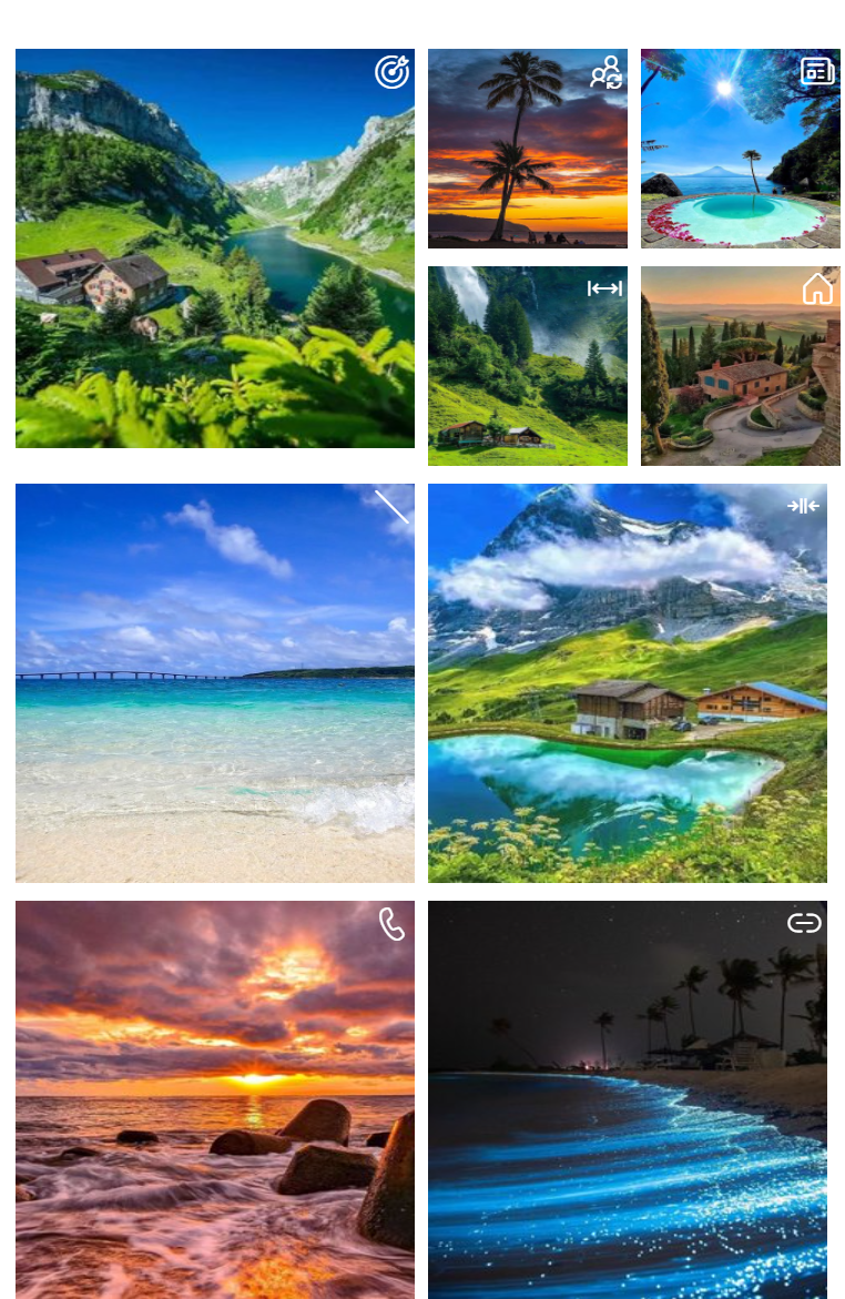
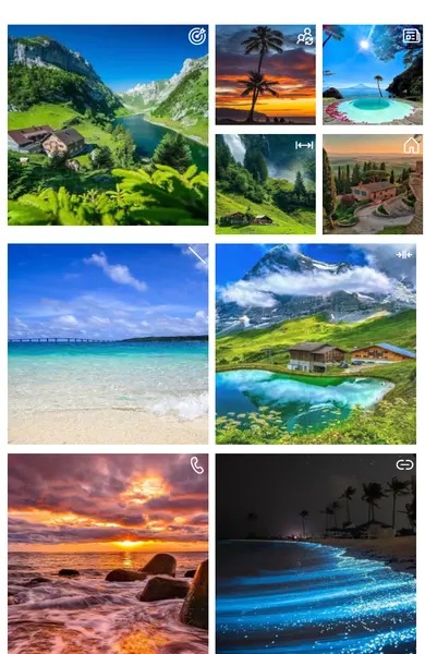
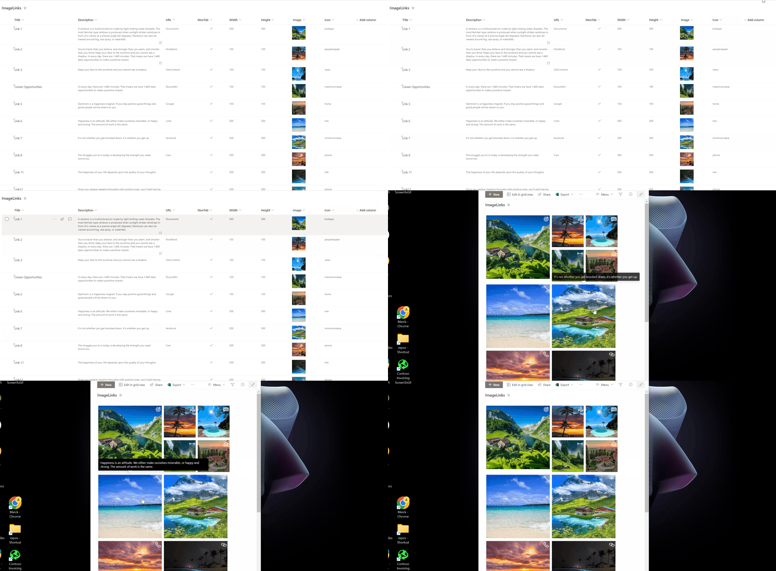
Displays images in a grid layout with customisable height and width. The sample was inspired by the chevron-shape-format by André Lage. On click of each post, the link specified by the URL is opened. On hover on each image the description of the image is shown. Optionally an icon is displayed on the top right of the image.
This sample includes two formatting options:
- image-grid.json - Original row formatter for displaying images in a grid layout
[!CAUTION] This sample (image-grid.json) uses the
floatstyle, which is now deprecated. As a result, it may not work as expected.
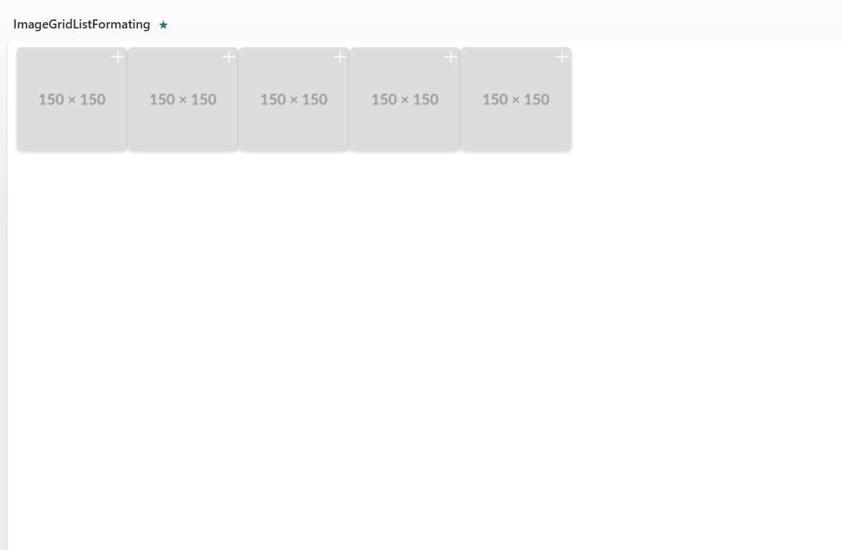
- Image-grid-horizontally.json - Tile formatter designed for Gallery view type to display images horizontally
View requirements
This sample provides two different formatting approaches:
Option 1: Row Formatter (image-grid.json)
Use this format with standard list views. Note: Due to recent changes in Microsoft Lists, this format may not display images horizontally as expected in some scenarios.
- Apply the formatting using Format current view option
- The format expect the following fields:
| Type | Internal Name | Required | Notes |
|---|---|---|---|
| Multiple line of text | Description | Yes | |
| Single line of text | Icon | No | Set the icon name for Fluent UI Icons. |
| Hyperlink | URL | Yes | |
| Yes/No | NewTab | No | This field is used to open the link the same tab or new tab. |
| Number | Width | No | If not set, the default width is set to 100px. |
| Number | Height | No | If not set, the default height is set to 100px. |
| Image | Image | Yes |
Option 2: Tile Formatter (Image-grid-horizontally.json) - Recommended
Use this format with Gallery view type for optimal horizontal image display.
- Change the view type to Gallery
- Apply the tile formatting using Format this gallery option
- Uses fixed dimensions (160px width, 150px height) for consistent display
- The format expect the following fields:
| Type | Internal Name | Required | Notes |
|---|---|---|---|
| Multiple line of text | Description | Yes | Displayed in hover card |
| Single line of text | Icon | No | Set the icon name for Fluent UI Icons. |
| Hyperlink | URL | Yes | |
| Yes/No | NewTab | No | This field is used to open the link the same tab or new tab. |
| Image | Image | Yes |
Technologies Used
- SharePoint
- List (used to store the image data)
- View Formatting (JSON used to style the list into the familiar Instagram output)
Prerequisites
You must have a valid SharePoint Online license and permission to create lists.
You must have a modern SharePoint site where you can store the data for the app.
Format the view and copy and paste the JSON provided.
Sample
| Solution | Author(s) |
|---|---|
| image-grid.json | Reshmee Auckloo |
| Image-grid-horizontally.json | Valeras Narbutas |
Version history
| Version | Date | Comments |
|---|---|---|
| 1.0 | May 20, 2023 | Initial release |
| 2.0 | July 30, 2025 | Updated to include tile formatter for Gallery view type |
Disclaimer
THIS CODE IS PROVIDED AS IS WITHOUT WARRANTY OF ANY KIND, EITHER EXPRESS OR IMPLIED, INCLUDING ANY IMPLIED WARRANTIES OF FITNESS FOR A PARTICULAR PURPOSE, MERCHANTABILITY, OR NON-INFRINGEMENT.
Additional notes
The following issues and pull request are related to the deprecation of the float style:
- Deprecating float style prop in custom formatter by tpodugu-ms · Pull Request #10169 · SharePoint/sp-dev-docs
- List View Formatting - Flex behavior on rowFormatter not functioning row to row · Issue #10008 · SharePoint/sp-dev-docs
- Image-grid is not displaying horizontally · Issue #885 · pnp/List-Formatting