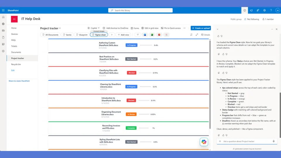
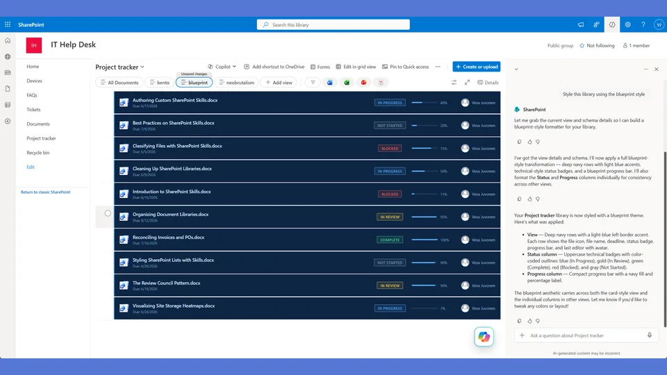
Blueprint engineering-drawing style tokens for the list-styling skill. Monochromatic blue palette with double-ring rubber-stamp badges and an ultra-compact two-line spec-sheet card layout.
Overdue is the only red element — the rest stays in the blueprint blue family. Use when the user says 'blueprint,' 'technical drawing,' 'engineering,' 'schematic,' or 'spec sheet.'
A SharePoint list style modeled on engineering drawings and technical spec sheets. Monochromatic blue palette, double-ring rubber-stamp status badges, and an ultra-compact card layout with a blue left-edge accent. The most information-dense style in the collection.
What you get
- Design tokens for a monochromatic blue palette with double-ring badge treatment
- The most compact
rowFormatterin the collection — spec-sheet density with a blue left edge - Status badges styled as rubber-stamp rings — visually distinct from every other style
- Overdue is the only element that turns red — everything else stays in the blue system
Using this style
This is a style token skill — it provides design tokens and a reference rowFormatter, but does not apply them on its own. Pair it with the list-styling skill, which reads the tokens from this skill and adapts the row template to your library's actual columns.
Typical flow:
- Install both this skill and list-styling into your SharePoint Skills library.
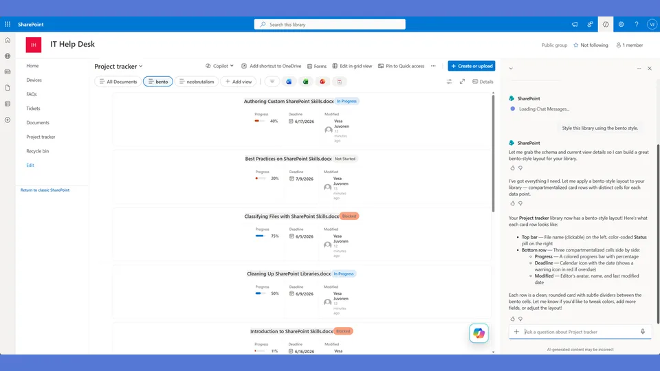
- From a Copilot agent, ask: "Style this library using the blueprint style."
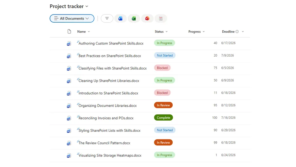
Looking for sample content to try it on? The list-styling demo ships with ten short Word documents and the exact Status, Progress, and Deadline column setup the row template expects.
When to use this style
Audience: engineering teams, design ops, technical-spec libraries, anywhere the content already reads like a specification sheet. Tone: precise, monochromatic blue, information-dense — every row a small drafting plate.
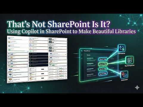
Demo video
SharePoint Skill
| Solution | Author(s) |
|---|---|
| style-blueprint | Zach Rosenfield | GitHub | LinkedIn |
Version history
| Version | Date | Comments |
|---|---|---|
| 1.0 | May 2026 | Initial Release |
Disclaimer
THIS CODE IS PROVIDED AS IS WITHOUT WARRANTY OF ANY KIND, EITHER EXPRESS OR IMPLIED, INCLUDING ANY IMPLIED WARRANTIES OF FITNESS FOR A PARTICULAR PURPOSE, MERCHANTABILITY, OR NON-INFRINGEMENT.
Package
Ready to install
The ZIP contains only the upload-ready inner skill folder.
View SKILL.md
---
name: style-blueprint
description: Blueprint engineering-drawing style tokens and row template for the list-styling skill. Monochromatic blue palette, double-ring rubber-stamp status badges, ultra-compact spec-sheet card with a blue left edge. The most compact card in the library — no sidebar, no banner. Overdue is the only element that turns red. Use when the user says "blueprint," "technical drawing," "engineering," "schematic," "spec sheet," or similar.
---

# Blueprint — Style Tokens + Row Template

Monochromatic blue. Technical. Precise. Every card is a spec-sheet entry on an engineering drawing. Status badges are rubber stamps with double-ring borders. This is the most compact card in the library.

**Layout philosophy: Ultra-compact spec sheet with a blue left edge.** No sidebar, no banner — just a clean two-line card with a 4px blue left border. Line one is the document name. Line two is the stamp, progress bar, percentage, and due date — all on one row. The only color break in the entire list is overdue red. Everything else is blue, from the darkest ink to the palest wash.

---

## Color Palette

| Swatch | Hex | Semantic Role |
|---|---|---|
| 1 | `#1e3a8a` | ink — primary text, left edge, darkest blue |
| 2 | `#1e40af` | stamp — rubber stamp borders and text |
| 3 | `#2563eb` | date — date text, secondary info |
| 4 | `#3b82f6` | fill — progress bar fill |
| 5 | `#60a5fa` | label — subtle labels like "DUE" |
| 6 | `#93c5fd` | rule — card border, grid lines |
| 7 | `#dbeafe` | wash — progress track, lightest blue |
| 8 | `#ffffff` | paper — card background |
| 9 | `#dc2626` | alert — overdue ONLY, the single non-blue |

**CRITICAL:** Swatches 1–8 are ALL BLUE. Swatch 9 (red) is used ONLY for overdue states. There are no per-status color variations — every status looks the same monochromatic blue. The stamp text itself differentiates statuses. Overdue is the one dramatic break from the blueprint palette.

---

## Badge Tokens (Rubber Stamp)

The stamp uses a double-ring border: an outer div with a 2px border and 1px padding, wrapping an inner span with a 1px border. This creates the classic certification/rubber-stamp impression.

- outer_border: `2px solid #1e40af`
- outer_padding: `1px` (gap between rings)
- inner_border: `1px solid #1e40af`
- inner_padding: `2px 8px`
- font-size: `10px`
- font-weight: `700`
- text-transform: `uppercase`
- color: `#1e40af`
- background: `transparent` (stamps are outlines, not fills)
- border-radius: `0px` (sharp corners — technical, angular)

### status_colors

| Value | stamp_border | stamp_text | background |
|---|---|---|---|
| Draft | `#1e40af` | `#1e40af` | transparent |
| In Review | `#1e40af` | `#1e40af` | transparent |
| Revising | `#1e40af` | `#1e40af` | transparent |
| Approved | `#1e40af` | `#1e40af` | transparent |
| Published | `#1e40af` | `#1e40af` | transparent |
| _fallback | `#1e40af` | `#1e40af` | transparent |
| OVERDUE (any) | `#dc2626` | `#dc2626` | transparent |

**CRITICAL:** Every status uses the SAME blue. The stamp text is the only differentiator. Overdue overrides ANY status — when a deadline has passed, the stamp turns red regardless of status value. This is intentionally monochromatic.

---

## Progress Bar Tokens

- progress_track_height: `4px` (ultra-thin — compact)
- progress_track_bg: `#dbeafe` (wash)
- progress_track_border: `none`
- progress_track_radius: `1px`
- progress_fill_color: `#3b82f6` (single blue — NO color changes by percentage)
- progress_fill_radius: `1px`
- progress_label_font_size: `13px`
- progress_label_font_weight: `700`
- progress_label_color: `#1e3a8a` (ink)

**CRITICAL:** Progress fill is ALWAYS `#3b82f6` regardless of percentage. No low/mid/high color shifts. Blueprint is monochromatic.

---

## Deadline Tokens

- deadline_icon: none (no emoji — use text label "DUE" instead)
- due_label: `DUE`
- due_label_font_size: `10px`
- due_label_color_normal: `#60a5fa` (label)
- due_label_color_overdue: `#dc2626` (alert)
- date_font_size: `12px`
- date_normal_color: `#2563eb` (date)
- date_normal_weight: `500`
- date_overdue_color: `#dc2626` (alert)
- date_overdue_weight: `700`
- overdue_label: `OVERDUE` (text only — no emoji, no fire, no icons)
- overdue_label_font_size: `10px`
- overdue_label_color: `#dc2626`

**CRITICAL:** No emoji anywhere in the blueprint style. No 🔥, no 🗓️, no ✨. Text labels only. This is a technical drawing, not a party.

---

## Row Card Tokens

- card_border: `1px solid #93c5fd` (rule)
- card_border_left: `4px solid #1e3a8a` (ink — the blue left edge)
- card_border_radius: `2px` (barely rounded — sharp, technical)
- card_background: `#ffffff` (paper)
- card_margin_bottom: `4px` (tight stacking)
- card_padding: `8px 14px` (compact)
- card_shadow: `none` (clean, flat — no shadows on a blueprint)
- gap_between_lines: `4px`
- overdue_border: `1px solid #dc2626`
- overdue_border_left: `4px solid #dc2626`

**CRITICAL:** No shadows. Blueprints are flat technical drawings. The 4px left edge is the ONLY structural accent — it's a thin spec-sheet margin line, not a sidebar.

---

## Row Template Layout

Ultra-compact two-line spec sheet with blue left edge.

```
┌──────────────────────────────────────────────────────┐
▌ API Guide.docx                                       │
▌ ╔═APPROVED═╗  ━━━━━━━━━━━░░░░  75%   DUE 5/15/26   │
└──────────────────────────────────────────────────────┘

Overdue variant:
┌──────────────────────────────────────────────────────┐  ← red border
▌ API Guide.docx                                       │
▌ ╔═APPROVED═╗  ━━━━━━━━━━━░░░░  75%   DUE 5/15 OVERDUE│
└──────────────────────────────────────────────────────┘
```

Key differences from every other style:
- NO banner (unlike Retro's colored top banner)
- NO sidebar (unlike Neobrutalism's left panel)
- NO shadows (unlike both Retro and Neobrutalism)
- NO emoji (unlike every other style)
- NO per-status colors (unlike every other style)
- Two lines total — the most compact card in the library
- Double-ring stamp border — unique to Blueprint

---

## rowFormatter JSON

**Adapt before applying.** The column names below (`[$Status]`, `[$Progress]`, `[$Deadline]`) are example placeholders — replace them with the actual internal column names from the user's list. Note: Blueprint has no per-status color expressions, so there are no status value strings to remap. Follow list-styling Step 3.

```json
{
  "$schema": "https://developer.microsoft.com/json-schemas/sp/v2/view-formatting.schema.json",
  "hideSelection": false,
  "hideColumnHeaders": true,
  "rowFormatter": {
    "elmType": "div",
    "style": {
      "display": "flex",
      "flex-direction": "column",
      "border": "=if([$Deadline] < @now, '1px solid #dc2626', '1px solid #93c5fd')",
      "border-left": "=if([$Deadline] < @now, '4px solid #dc2626', '4px solid #1e3a8a')",
      "border-radius": "2px",
      "background-color": "#ffffff",
      "margin-bottom": "4px",
      "padding": "8px 14px",
      "gap": "4px"
    },
    "children": [
      {
        "elmType": "div",
        "style": {
          "font-size": "13px",
          "font-weight": "700",
          "color": "#1e3a8a",
          "line-height": "1.2"
        },
        "txtContent": "=if([$FileLeafRef] == '', [$Title], [$FileLeafRef])"
      },
      {
        "elmType": "div",
        "style": {
          "display": "flex",
          "align-items": "center",
          "gap": "12px"
        },
        "children": [
          {
            "elmType": "div",
            "style": {
              "display": "inline-flex",
              "padding": "1px",
              "border": "=if([$Deadline] < @now, '2px solid #dc2626', '2px solid #1e40af')"
            },
            "children": [
              {
                "elmType": "span",
                "txtContent": "[$Status]",
                "style": {
                  "display": "inline-block",
                  "padding": "2px 8px",
                  "border": "=if([$Deadline] < @now, '1px solid #dc2626', '1px solid #1e40af')",
                  "font-size": "10px",
                  "font-weight": "700",
                  "text-transform": "uppercase",
                  "color": "=if([$Deadline] < @now, '#dc2626', '#1e40af')",
                  "white-space": "nowrap",
                  "background-color": "transparent"
                }
              }
            ]
          },
          {
            "elmType": "div",
            "style": {
              "flex": "1",
              "height": "4px",
              "background-color": "#dbeafe",
              "border-radius": "1px",
              "overflow": "hidden",
              "min-width": "60px"
            },
            "children": [
              {
                "elmType": "div",
                "style": {
                  "width": "=toString([$Progress]) + '%'",
                  "height": "100%",
                  "background-color": "#3b82f6",
                  "border-radius": "1px"
                }
              }
            ]
          },
          {
            "elmType": "span",
            "txtContent": "=toString([$Progress]) + '%'",
            "style": {
              "font-size": "13px",
              "font-weight": "700",
              "color": "#1e3a8a",
              "min-width": "32px"
            }
          },
          {
            "elmType": "div",
            "style": {
              "display": "flex",
              "align-items": "center",
              "gap": "4px"
            },
            "children": [
              {
                "elmType": "span",
                "txtContent": "DUE",
                "style": {
                  "font-size": "10px",
                  "font-weight": "600",
                  "color": "=if([$Deadline] < @now, '#dc2626', '#60a5fa')",
                  "text-transform": "uppercase"
                }
              },
              {
                "elmType": "span",
                "txtContent": "=toLocaleDateString([$Deadline])",
                "style": {
                  "font-size": "12px",
                  "font-weight": "=if([$Deadline] < @now, '700', '500')",
                  "color": "=if([$Deadline] < @now, '#dc2626', '#2563eb')"
                }
              },
              {
                "elmType": "span",
                "txtContent": "=if([$Deadline] < @now, 'OVERDUE', '')",
                "style": {
                  "font-size": "10px",
                  "font-weight": "700",
                  "color": "#dc2626",
                  "text-transform": "uppercase"
                }
              }
            ]
          }
        ]
      }
    ]
  }
}
```

---

## Checklist — "Is This Actually a Blueprint?"

- ✅ Full rowFormatter — NOT default column grid
- ✅ Ultra-compact TWO-LINE layout — the shortest card in the library
- ✅ NO banner, NO sidebar, NO panel — just a clean spec sheet
- ✅ 4px blue left edge (`#1e3a8a`) — a margin line, NOT a sidebar
- ✅ Double-ring rubber stamp badges (outer 2px + inner 1px border)
- ✅ ALL stamps are the same monochromatic blue — no per-status color variation
- ✅ Stamp background is TRANSPARENT — outlines only, like a real ink stamp
- ✅ Progress bar is 4px thin (half the height of other styles)
- ✅ Progress fill is ALWAYS `#3b82f6` — no color changes by percentage
- ✅ NO emoji anywhere — no 🔥, no 🗓️, no ✨, no 🎯
- ✅ Text labels only: "DUE" and "OVERDUE"
- ✅ NO shadows — flat, clean, technical
- ✅ Border-radius 2px — barely rounded, sharp and precise
- ✅ 4px margin between cards — tight stacking
- ✅ Entire palette is swatches 1–8 (all blue) from the blueprint palette
- ✅ Overdue is the ONLY red (`#dc2626`) — left edge, stamp, date, and label all flip to red
- ✅ Overdue card border turns red on ALL sides — impossible to miss
- ✅ Silhouette test: two flat lines with a left edge looks NOTHING like a banner card or sidebar card

---

## Responsive / mobile

- **≤ 720 px**: the high-density inline metadata wraps to a second line under the title. Keep the blue left-edge accent at full height.
- **≤ 480 px**: drop the swatch ramp from 8 swatches to ~3 in practice — primary, accent, overdue red. Hide tertiary chips entirely; never shrink chip text below 12 px on mobile.
- **Hero text step-down**: 16 px → 14 px on mobile. The style relies on tight stacking, not large text.

## Implementation notes

### Palette trim

The shipped palette ships nine blue swatches (1–9). In practice, swatches 4–6 are largely interchangeable to the eye and can be collapsed when re-skinning. A safe minimum set is **swatch 1 (primary)**, **swatch 7 (accent)**, and the **overdue red `#dc2626`**. Anything beyond that is connoisseur territory — use only when the list has 5+ distinct status values that genuinely need separation.

### Rubber-stamp double-ring fallback

The double-ring rubber-stamp badge depends on a nested element pattern (inner ring + outer ring). If the second ring's offset or `clip-path` is dropped by a SharePoint theme or modern view renderer:

- Fall back to a single solid ring at the outer color, with the inner space filled by a lighter tint of the same swatch.
- Keep the uppercase status text inside — the ring is decoration; the label carries the meaning.
- Never substitute a pill — it breaks the silhouette test.
References
- agentskills.io specification
The specification that SharePoint AI skills follow for installation and discovery.
- List Styling Engine
The companion skill that applies these style tokens to a SharePoint list.
- Demo video
Walkthrough of the list-styling engine and supporting style token skills.
Discuss this skill
Ask a question, share how you used it, or suggest an improvement with the community.
Open GitHub Discussions