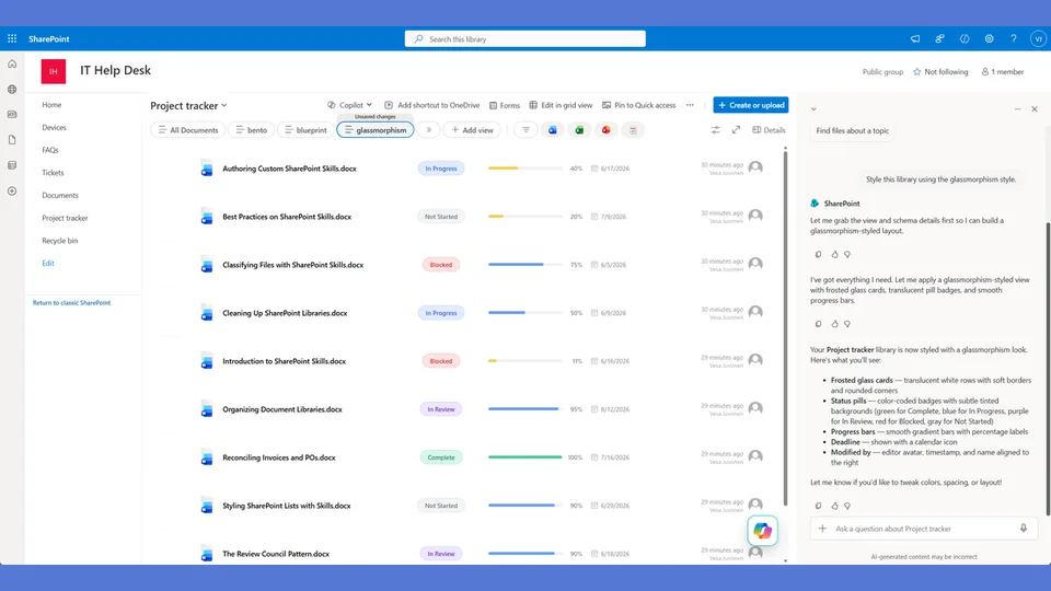
Glassmorphism style tokens for the list-styling skill. Soft pill badges with no borders, thin bars, and an airy modern aesthetic inspired by frosted-glass UI.
Use when the user says 'glassmorphism,' 'frosted glass,' 'glass look,' or 'soft modern.'
A SharePoint list style built around floating surfaces and negative space. Soft diffused shadows, barely-visible borders, 16px rounded corners, pill-shaped badges, and generous padding. Looks like a modern SaaS dashboard — not SharePoint.
What you get
- Design tokens for soft shadows, pill badges, and a single-column floating card layout
- A
rowFormatterwhere content stacks vertically — name, metadata row, full-width thin progress bar - Overdue treatment is whispered ("overdue" in lowercase italic), not shouted
- The opposite of Neobrutalism — no hard borders, no offsets, no uppercase
Using this style
This is a style token skill — it provides design tokens and a reference rowFormatter, but does not apply them on its own. Pair it with the list-styling skill, which reads the tokens from this skill and adapts the row template to your library's actual columns.
Typical flow:
- Install both this skill and list-styling into your SharePoint Skills library.
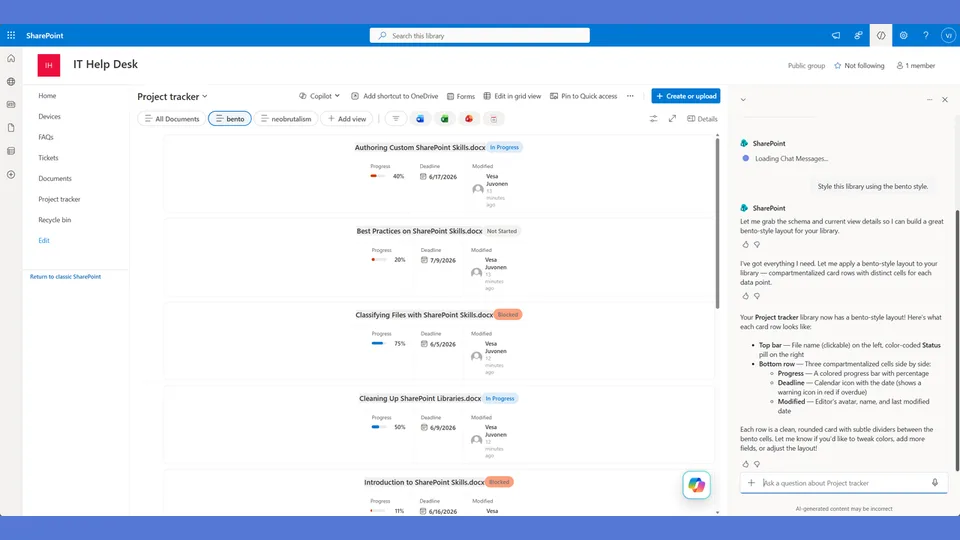
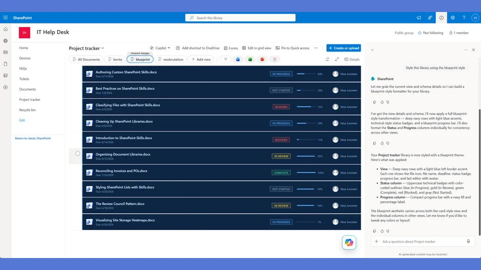
- From a Copilot agent, ask: "Style this library using the glassmorphism style."
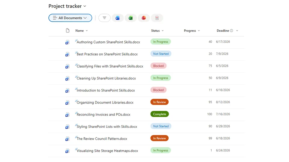
Looking for sample content to try it on? The list-styling demo ships with ten short Word documents and the exact Status, Progress, and Deadline column setup the row template expects.
When to use this style
Audience: leadership dashboards, marketing sites, modern SaaS-style hubs where SharePoint shouldn't look like SharePoint. Tone: soft, floaty, generous whitespace — the opposite of dense and gridded.
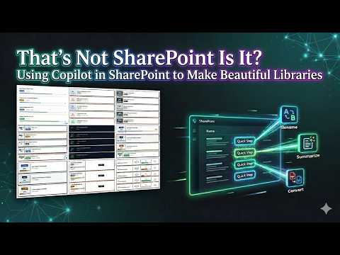
Demo video
SharePoint Skill
| Solution | Author(s) |
|---|---|
| style-glassmorphism | Zach Rosenfield | GitHub | LinkedIn |
Version history
| Version | Date | Comments |
|---|---|---|
| 1.0 | May 2026 | Initial Release |
Disclaimer
THIS CODE IS PROVIDED AS IS WITHOUT WARRANTY OF ANY KIND, EITHER EXPRESS OR IMPLIED, INCLUDING ANY IMPLIED WARRANTIES OF FITNESS FOR A PARTICULAR PURPOSE, MERCHANTABILITY, OR NON-INFRINGEMENT.
Package
Ready to install
The ZIP contains only the upload-ready inner skill folder.
87ea760f9e7e0d70c449edcb74a89ddea15bfd3d5a72c54eef753eae94432022View SKILL.md
---
name: style-glassmorphism
description: Glassmorphism (Frosted Glass) style tokens and row template for the list-styling skill. Floating cards with soft diffused shadows, no hard borders, pill badges, thin progress bars, maximum whitespace. Layout is a single-column centered card — no sidebar split. Use when the user says "glassmorphism," "frosted glass," "glass look," "soft modern," "airy," "floating," or similar.
---

# Glassmorphism — Style Tokens + Row Template

Light, floating, airy. Soft shadows, no hard borders, pills, thin bars. Each row is a floating card with centered stacked content — no sidebar.

**Layout philosophy: Single-column stacked card.** No sidebar split. Glassmorphism is about floating surfaces and negative space. The card is a single panel with content flowing vertically — name at top, metadata in a horizontal row, progress bar spanning full width. Everything breathes.

## Badge Tokens

- padding: `5px 16px`
- border-radius: `14px`
- font-size: `12px`
- font-weight: `600`
- text-transform: `none`

### status_colors

| Value | bg | text | border |
|---|---|---|---|
| Draft | `#6b7280` | `#ffffff` | `0px` |
| In Review | `#3b82f6` | `#ffffff` | `0px` |
| Revising | `#f97316` | `#ffffff` | `0px` |
| Approved | `#22c55e` | `#ffffff` | `0px` |
| Published | `#16a34a` | `#ffffff` | `0px` |
| _fallback | `#9ca3af` | `#ffffff` | `0px` |

## Progress Bar Tokens

- progress_track_height: `6px`
- progress_track_bg: `#e5e7eb`
- progress_track_border: `0px`
- progress_track_radius: `3px`
- progress_fill_radius: `3px`
- progress_color_low: `#ef4444`
- progress_color_mid: `#3b82f6`
- progress_color_high: `#22c55e`
- progress_label_font_size: `12px`
- progress_label_font_weight: `500`
- progress_label_color: `#6b7280`

## Deadline Tokens

- deadline_icon: `` (none — too heavy for glass)
- date_font_size: `13px`
- date_normal_color: `#6b7280`
- date_normal_weight: `400`
- date_overdue_color: `#ef4444`
- date_overdue_weight: `600`
- date_sublabel_color: `#9ca3af`
- overdue_label: `overdue` (lowercase — whispered, not shouted)

## Row Card Tokens

- card_border: `1px solid #e5e7eb` (barely visible)
- card_border_radius: `16px` (very rounded — floating feel)
- card_background: `#ffffff`
- card_margin_bottom: `12px`
- card_shadow: `0px 4px 20px #0000000d` (soft diffused — the opposite of hard offset)
- card_padding: `20px 24px`
- overdue_card_border: `1px solid #fecaca` (soft red tint — not aggressive)
- overdue_card_shadow: `0px 4px 20px #ef44441a` (soft red glow)

---

## Row Template Layout

Single-column floating card. No sidebar. Everything stacks vertically with generous spacing.

```
    ╭──────────────────────────────────────────────────╮
    │                                                  │
    │   Document Name                                  │
    │                                                  │
    │   [In Review]  ·  📎 5/15/2026  ·  On Track     │
    │                                                  │
    │   ░░░░░░░░░░░░░░░███████████████░░░░░░  72%     │
    │                                                  │
    ╰──────────────────────────────────────────────────╯
       ↑ soft diffused shadow, 16px rounded corners, barely-there border
```

## rowFormatter JSON

**Adapt before applying.** The column names below (`[$Status]`, `[$Progress]`, `[$Deadline]`) are example placeholders — replace them with the actual internal column names from the user's list. Also update every status value string ('Draft', 'In Review', 'Revising', etc.) to match the user's actual Choice values. Follow list-styling Step 3.

```json
{
  "$schema": "https://developer.microsoft.com/json-schemas/sp/v2/view-formatting.schema.json",
  "hideSelection": false,
  "hideColumnHeaders": true,
  "rowFormatter": {
    "elmType": "div",
    "style": {
      "display": "flex",
      "flex-direction": "column",
      "gap": "14px",
      "padding": "20px 24px",
      "border": "=if([$Deadline] < @now, '1px solid #fecaca', '1px solid #e5e7eb')",
      "border-radius": "16px",
      "background-color": "#ffffff",
      "margin-bottom": "12px",
      "box-shadow": "=if([$Deadline] < @now, '0px 4px 20px #ef44441a', '0px 4px 20px #0000000d')",
      "min-height": "80px"
    },
    "children": [
      {
        "elmType": "div",
        "style": {
          "font-size": "16px",
          "font-weight": "600",
          "color": "#1f2937",
          "line-height": "1.3"
        },
        "txtContent": "=if([$FileLeafRef] == '', [$Title], [$FileLeafRef])"
      },
      {
        "elmType": "div",
        "style": {
          "display": "flex",
          "align-items": "center",
          "gap": "12px",
          "flex-wrap": "wrap"
        },
        "children": [
          {
            "elmType": "span",
            "txtContent": "[$Status]",
            "style": {
              "display": "inline-block",
              "padding": "5px 16px",
              "border-radius": "14px",
              "font-size": "12px",
              "font-weight": "600",
              "white-space": "nowrap",
              "color": "#ffffff",
              "background-color": "=if([$Status] == 'Draft', '#6b7280', if([$Status] == 'In Review', '#3b82f6', if([$Status] == 'Revising', '#f97316', if([$Status] == 'Approved', '#22c55e', if([$Status] == 'Published', '#16a34a', '#9ca3af')))))"
            }
          },
          {
            "elmType": "span",
            "txtContent": "·",
            "style": { "color": "#d1d5db", "font-size": "16px" }
          },
          {
            "elmType": "span",
            "txtContent": "=toLocaleDateString([$Deadline])",
            "style": {
              "font-size": "13px",
              "font-weight": "=if([$Deadline] < @now, '600', '400')",
              "color": "=if([$Deadline] < @now, '#ef4444', '#6b7280')"
            }
          },
          {
            "elmType": "span",
            "txtContent": "=if([$Deadline] < @now, '· overdue', '')",
            "style": {
              "font-size": "12px",
              "font-weight": "500",
              "color": "#ef4444",
              "font-style": "italic"
            }
          }
        ]
      },
      {
        "elmType": "div",
        "style": {
          "display": "flex",
          "align-items": "center",
          "gap": "10px",
          "width": "100%"
        },
        "children": [
          {
            "elmType": "div",
            "style": {
              "flex": "1",
              "height": "6px",
              "background-color": "#e5e7eb",
              "border-radius": "3px",
              "overflow": "hidden"
            },
            "children": [
              {
                "elmType": "div",
                "style": {
                  "width": "=toString([$Progress]) + '%'",
                  "height": "100%",
                  "border-radius": "3px",
                  "background-color": "=if([$Progress] < 30, '#ef4444', if([$Progress] < 66, '#3b82f6', '#22c55e'))"
                }
              }
            ]
          },
          {
            "elmType": "span",
            "txtContent": "=toString([$Progress]) + '%'",
            "style": {
              "font-size": "12px",
              "font-weight": "500",
              "color": "#6b7280",
              "min-width": "32px",
              "text-align": "right"
            }
          }
        ]
      }
    ]
  }
}
```

---

## Checklist — "I Can't Believe That's SharePoint"

- ✅ Full rowFormatter — NOT default column grid
- ✅ Single-column stacked card layout — NO sidebar (this is the layout differentiator)
- ✅ 16px rounded corners — cards feel like they're floating
- ✅ Soft diffused shadow (0px 4px 20px) — NOT hard offset
- ✅ Barely-visible 1px border — NOT bold
- ✅ Pill-shaped status badges with zero borders
- ✅ Title Case text on badges — not uppercase
- ✅ Metadata in a horizontal row with dot separators (·)
- ✅ Full-width thin progress bar (6px) — spans entire card
- ✅ Overdue is whispered ("overdue" lowercase italic) not shouted
- ✅ Overdue card gets soft red-tinted shadow and border — not aggressive
- ✅ Generous padding (20px 24px) — everything breathes
- ✅ No emoji, no icons — pure typography
- ✅ The layout is the OPPOSITE of Neobrutalism — no split, no sidebar, no heaviness
- ✅ Feels like a modern SaaS app, not SharePoint

---

## Responsive / mobile

- **≤ 480 px**: reduce card padding from `20px 24px` to `12px 16px`. Keep the 16 px border-radius — it carries the style identity.
- Hide the deadline sublabel under 480 px; keep the date itself.
- Do not shrink the soft shadow further on mobile — it is already the lightest treatment; instead, if rendering is throttled, drop it entirely (see fallback below).
- **Touch targets**: ≥ 44 × 44 px on any clickable element — the generous padding usually satisfies this naturally.

## Implementation notes

### Soft-shadow fallback

Older SharePoint themes and some Modern view renderers strip multi-layer `box-shadow` values. When that happens, the cards lose their floating effect and merge into the page.

- Detect this in QA by checking whether the shadow renders in the preview pane. If it doesn't, **add a 1 px hairline border** in `rgba(0,0,0,0.06)` to the card — just enough to re-establish the card edge without breaking the floaty tone.
- Do not switch to a hard `box-shadow` offset — that turns the style into a different style.

### The lowercase "overdue" is intentional

The overdue treatment in this style is the lowercase italic word `overdue`, not an emoji and not a red badge. **Do not "fix" it to uppercase or add a warning icon.** The style's whole proposition is that nothing shouts — even bad news is whispered. A consumer who finds this too subtle should pick a different style, not edit this one.
References
- agentskills.io specification
The specification that SharePoint AI skills follow for installation and discovery.
- List Styling Engine
The companion skill that applies these style tokens to a SharePoint list.
- Demo video
Walkthrough of the list-styling engine and supporting style token skills.
Discuss this skill
Ask a question, share how you used it, or suggest an improvement with the community.
Open GitHub Discussions