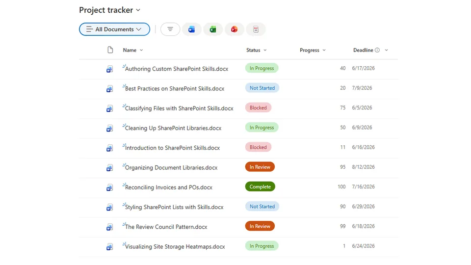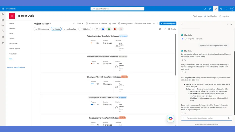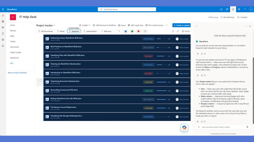
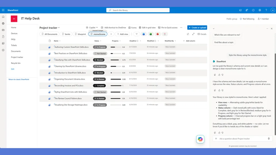
Monochrome style tokens for the list-styling skill. A single slate-blue hue from light to dark replaces traffic-light colors — a calm corporate look that fits established design systems.
Use when the user says 'monochrome,' 'single color,' 'one hue,' 'corporate design system,' 'all blue,' or 'tonal.'
A SharePoint list style built entirely in a single slate hue. The progress percentage is the dominant visual element — displayed large on the left — with all other metadata stacked beside it. Clean, corporate, tonal. Works in any context where saturated color would feel out of place.
What you get
- Design tokens using a single slate palette with tonal variations for status and progress
- A
rowFormatterwhere the large progress number anchors the left side and metadata stacks to its right - Status badges differentiated by tint depth rather than color — cohesive, not flat
- A style that integrates seamlessly with SharePoint's default chrome without clashing
Using this style
This is a style token skill — it provides design tokens and a reference rowFormatter, but does not apply them on its own. Pair it with the list-styling skill, which reads the tokens from this skill and adapts the row template to your library's actual columns.
Typical flow:
- Install both this skill and list-styling into your SharePoint Skills library.
- From a Copilot agent, ask: "Style this library using the monochrome style."
Looking for sample content to try it on? The list-styling demo ships with ten short Word documents and the exact Status, Progress, and Deadline column setup the row template expects.
When to use this style
Audience: corporate, finance, legal, and executive views where saturated color would feel out of place. Tone: tonal, restrained, percentage-led — a single slate hue doing all the work.
Demo video
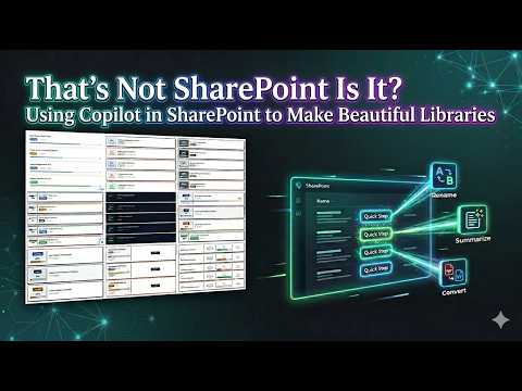
SharePoint Skill
| Solution | Author(s) |
|---|---|
| style-monochrome | Zach Rosenfield | GitHub | LinkedIn |
Version history
| Version | Date | Comments |
|---|---|---|
| 1.0 | May 2026 | Initial Release |
Disclaimer
THIS CODE IS PROVIDED AS IS WITHOUT WARRANTY OF ANY KIND, EITHER EXPRESS OR IMPLIED, INCLUDING ANY IMPLIED WARRANTIES OF FITNESS FOR A PARTICULAR PURPOSE, MERCHANTABILITY, OR NON-INFRINGEMENT.
Package
Ready to install
The ZIP contains only the upload-ready inner skill folder.
View SKILL.md
---
name: style-monochrome
description: Monochrome style tokens and row template for the list-styling skill. Single-hue slate design with a left-aligned large progress number as the hero element, all metadata stacked beside it. Layout uses the progress percentage as the dominant visual element. Use when the user says "monochrome," "single color," "corporate," "tonal," "minimal," or similar.
---

# Monochrome — Style Tokens + Row Template

Single-hue, restrained, corporate. Everything is slate blue. The progress percentage is the HERO — displayed enormous on the left, with metadata stacked to its right. Shade = stage.

**Layout philosophy: Hero number + stacked metadata.** The progress percentage is displayed huge (32px) on the left side of the card as the primary visual anchor. Status, name, and deadline stack vertically to its right. The big number makes each card instantly scannable.

## Badge Tokens

- padding: `5px 14px`
- border-radius: `6px`
- font-size: `11px`
- font-weight: `600`
- text-transform: `uppercase`

### status_colors (shade ramp — lightest = earliest)

| Value | bg | text | border |
|---|---|---|---|
| Draft | `#cbd5e1` | `#334155` | `0px` |
| In Review | `#64748b` | `#ffffff` | `0px` |
| Revising | `#475569` | `#ffffff` | `0px` |
| Approved | `#334155` | `#ffffff` | `0px` |
| Published | `#1e293b` | `#ffffff` | `0px` |
| _fallback | `#e2e8f0` | `#475569` | `0px` |

## Row Card Tokens

- card_border: `1px solid #e2e8f0`
- card_border_radius: `6px`
- card_background: `#ffffff`
- card_margin_bottom: `6px`
- card_shadow: `none`
- left_accent_width: `4px` (thin left border in status shade)
- hero_number_size: `32px`
- hero_number_weight: `800`

---

## Row Template Layout

Hero progress number on the left, metadata stacked right.

```
┃ ┌────────────────────────────────────────────────────┐
┃ │                                                    │
┃ │   72%     API Guide.docx                           │
┃ │           [In Review]  ·  5/15/2026                │
┃ │           ████████████████████░░░░░░               │
┃ │                                                    │
┃ └────────────────────────────────────────────────────┘
↑ 4px left accent in status shade color
```

## rowFormatter JSON

**Adapt before applying.** The column names below (`[$Status]`, `[$Progress]`, `[$Deadline]`) are example placeholders — replace them with the actual internal column names from the user's list. Also update every status value string ('Draft', 'In Review', 'Revising', etc.) to match the user's actual Choice values. Follow list-styling Step 3.

```json
{
  "$schema": "https://developer.microsoft.com/json-schemas/sp/v2/view-formatting.schema.json",
  "hideSelection": false,
  "hideColumnHeaders": true,
  "rowFormatter": {
    "elmType": "div",
    "style": {
      "display": "flex",
      "align-items": "center",
      "border": "1px solid #e2e8f0",
      "border-left": "=if([$Status] == 'Draft', '4px solid #cbd5e1', if([$Status] == 'In Review', '4px solid #64748b', if([$Status] == 'Revising', '4px solid #475569', if([$Status] == 'Approved', '4px solid #334155', if([$Status] == 'Published', '4px solid #1e293b', '4px solid #e2e8f0')))))",
      "border-radius": "6px",
      "background-color": "#ffffff",
      "margin-bottom": "6px",
      "padding": "16px 20px",
      "gap": "20px",
      "min-height": "80px"
    },
    "children": [
      {
        "elmType": "div",
        "style": {
          "min-width": "72px",
          "display": "flex",
          "align-items": "center",
          "justify-content": "center"
        },
        "children": [
          {
            "elmType": "span",
            "txtContent": "=toString([$Progress]) + '%'",
            "style": {
              "font-size": "32px",
              "font-weight": "800",
              "color": "=if([$Status] == 'Draft', '#94a3b8', if([$Status] == 'In Review', '#64748b', if([$Status] == 'Revising', '#475569', if([$Status] == 'Approved', '#334155', if([$Status] == 'Published', '#1e293b', '#94a3b8')))))",
              "line-height": "1"
            }
          }
        ]
      },
      {
        "elmType": "div",
        "style": {
          "flex": "1",
          "display": "flex",
          "flex-direction": "column",
          "gap": "8px"
        },
        "children": [
          {
            "elmType": "div",
            "style": {
              "font-size": "14px",
              "font-weight": "600",
              "color": "#1e293b"
            },
            "txtContent": "=if([$FileLeafRef] == '', [$Title], [$FileLeafRef])"
          },
          {
            "elmType": "div",
            "style": {
              "display": "flex",
              "align-items": "center",
              "gap": "10px"
            },
            "children": [
              {
                "elmType": "span",
                "txtContent": "[$Status]",
                "style": {
                  "display": "inline-block",
                  "padding": "4px 12px",
                  "border-radius": "6px",
                  "font-size": "11px",
                  "font-weight": "600",
                  "text-transform": "uppercase",
                  "white-space": "nowrap",
                  "color": "=if([$Status] == 'Draft', '#334155', '#ffffff')",
                  "background-color": "=if([$Status] == 'Draft', '#cbd5e1', if([$Status] == 'In Review', '#64748b', if([$Status] == 'Revising', '#475569', if([$Status] == 'Approved', '#334155', if([$Status] == 'Published', '#1e293b', '#e2e8f0')))))"
                }
              },
              {
                "elmType": "span",
                "txtContent": "·",
                "style": { "color": "#cbd5e1", "font-size": "16px" }
              },
              {
                "elmType": "span",
                "txtContent": "=toLocaleDateString([$Deadline])",
                "style": {
                  "font-size": "12px",
                  "font-weight": "=if([$Deadline] < @now, '700', '400')",
                  "color": "=if([$Deadline] < @now, '#1e293b', '#64748b')"
                }
              },
              {
                "elmType": "span",
                "txtContent": "=if([$Deadline] < @now, '— overdue', '')",
                "style": {
                  "font-size": "11px",
                  "font-weight": "700",
                  "color": "#1e293b"
                }
              }
            ]
          },
          {
            "elmType": "div",
            "style": {
              "width": "100%",
              "height": "4px",
              "background-color": "#e2e8f0",
              "border-radius": "2px",
              "overflow": "hidden"
            },
            "children": [
              {
                "elmType": "div",
                "style": {
                  "width": "=toString([$Progress]) + '%'",
                  "height": "100%",
                  "border-radius": "2px",
                  "background-color": "=if([$Status] == 'Draft', '#94a3b8', if([$Status] == 'In Review', '#64748b', if([$Status] == 'Revising', '#475569', if([$Status] == 'Approved', '#334155', if([$Status] == 'Published', '#1e293b', '#94a3b8')))))"
                }
              }
            ]
          }
        ]
      }
    ]
  }
}
```

---

## Checklist — "I Can't Believe That's SharePoint"

- ✅ Full rowFormatter — NOT default column grid
- ✅ HERO PROGRESS NUMBER (32px, 800 weight) on the left — instantly scannable
- ✅ Hero number color matches the status shade (darker = further along)
- ✅ 4px left accent border in the status shade color
- ✅ All colors from ONE slate-blue hue family — zero red, green, or amber
- ✅ Progress bar fill color matches the status shade (not traffic lights)
- ✅ Overdue is shown through bold text + "— overdue" suffix, NOT red (stays monochrome)
- ✅ No emoji, no icons — pure typography
- ✅ No shadow — flat, corporate, restrained
- ✅ Metadata flows as: name → badge + date inline → progress bar
- ✅ Most restrained style — the opposite of Retro's loudness

---

## Responsive / mobile

- **Hero progress number** scales `56 px → 40 px → 32 px` across breakpoints `≥ 1024 px → ≤ 600 px → ≤ 375 px`. The number must remain the dominant element at every breakpoint.
- **≤ 480 px**: collapse "name → badge + date inline → progress bar" to a tighter vertical stack; keep the hero number on the left.
- **No emoji / no icons** rule continues on mobile — do not add icons to compensate for lost color.
- **Touch targets**: ≥ 44 × 44 px on the row card itself.

## Implementation notes

### Mapping non-linear lifecycles to the shade ramp

The slate shade ramp assumes a **linear progression** — lightest shade for the earliest state, darkest for the final state. Real lifecycles often aren't linear (parallel branches, revert paths, holds). Map them as follows:

- **Parallel branches that resolve to the same outcome** (e.g. `In Review (Legal)` and `In Review (Finance)`): assign the same shade to both. The style is tonal — multiple states sharing one shade is fine.
- **Revert / paused states** (e.g. `Active → Paused → Active → Closed`): map `Paused` to the **same shade as the most recent forward state**, and add a thin 1 px dashed outline only. Do not pick a brighter shade — the intent of monochrome is tonal restraint, not state-traffic-lights.
- **Terminal failure states** (e.g. `Cancelled`, `Rejected`): use the darkest shade and italicise the label. Still no red; the italic carries the signal.

If the list has more than five distinct states, the shade ramp will start to feel ambiguous — pick a different style (Bento or Figma-clean handle 5+ states more legibly).
References
- agentskills.io specification
The specification that SharePoint AI skills follow for installation and discovery.
- List Styling Engine
The companion skill that applies these style tokens to a SharePoint list.
- Demo video
Walkthrough of the list-styling engine and supporting style token skills.
Discuss this skill
Ask a question, share how you used it, or suggest an improvement with the community.
Open GitHub Discussions