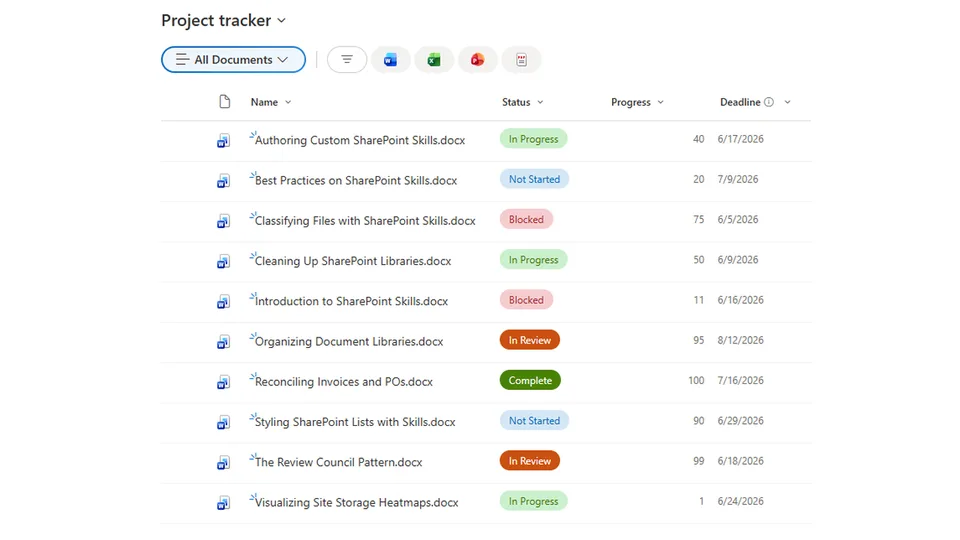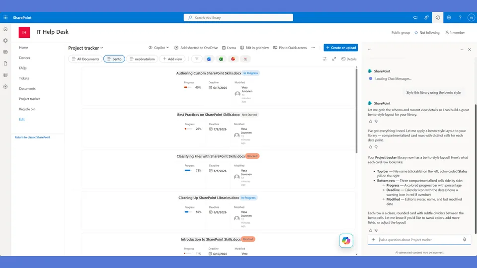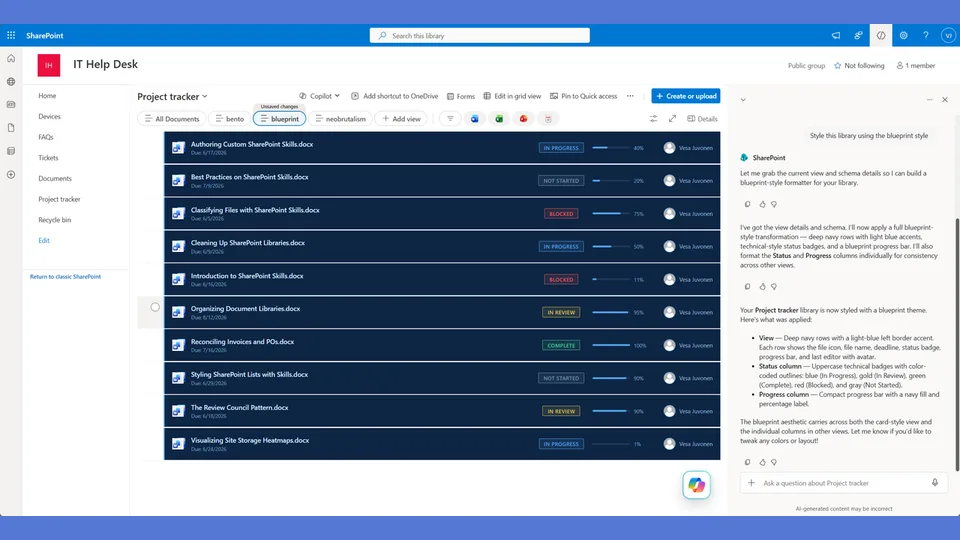
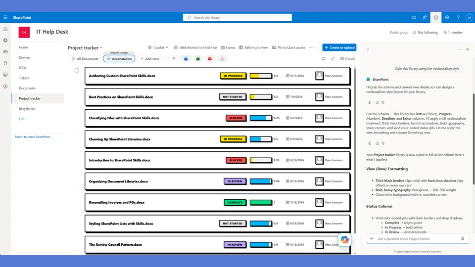
Neobrutalism style tokens for the list-styling skill. Built on thick black borders, saturated colors, uppercase text, and hard offset shadows. Each row becomes a two-panel card with a metadata sidebar and a main content panel.
Overdue items flip the shadow and border to red — an unmistakable signal that doesn't require reading the date. Use when the user says 'neobrutalism,' 'brutalist,' 'bold borders,' or 'chunky style.'
A SharePoint list style built on thick black borders, saturated colors, uppercase text, and hard offset shadows. Every row becomes a two-panel card: a metadata sidebar on the left, main content on the right. Overdue items flip the shadow and border to red. Bold, graphic, impossible to ignore.
What you get
- Design tokens for 3px solid black borders, hard 4px offset box-shadows, and saturated status colors
- A full
rowFormattercard with a metadata sidebar (name, status badge, progress bar, deadline) and a main content panel - ON TRACK / AT RISK indicator alongside the status badge
- Overdue items get red border + red shadow — an unmistakable signal that doesn't require reading the date
Using this style
This is a style token skill — it provides design tokens and a reference rowFormatter, but does not apply them on its own. Pair it with the list-styling skill, which reads the tokens from this skill and adapts the row template to your library's actual columns.
Typical flow:
- Install both this skill and list-styling into your SharePoint Skills library.
- From a Copilot agent, ask: "Style this library using the neobrutalism style."
Looking for sample content to try it on? The list-styling demo ships with ten short Word documents and the exact Status, Progress, and Deadline column setup the row template expects.
When to use this style
Audience: internal comms, campaign sites, anything that needs to stop someone scrolling past. Tone: loud, graphic, uppercase — impossible to ignore, intentionally not subtle.
Demo video
SharePoint Skill
| Solution | Author(s) |
|---|---|
| style-neobrutalism | Zach Rosenfield | GitHub | LinkedIn |
Version history
| Version | Date | Comments |
|---|---|---|
| 1.0 | May 2026 | Initial Release |
Disclaimer
THIS CODE IS PROVIDED AS IS WITHOUT WARRANTY OF ANY KIND, EITHER EXPRESS OR IMPLIED, INCLUDING ANY IMPLIED WARRANTIES OF FITNESS FOR A PARTICULAR PURPOSE, MERCHANTABILITY, OR NON-INFRINGEMENT.
Package
Ready to install
The ZIP contains only the upload-ready inner skill folder.
View SKILL.md
---
name: style-neobrutalism
description: Neobrutalism style tokens and row template for the list-styling skill. Bold black borders, saturated colors, uppercase text, chunky progress bars, sharp edges, card-based row layout with sidebar metadata panel. The row template replaces the entire row with a two-panel card. Use when the user says "neobrutalism," "brutalist," "bold borders," "chunky style," or similar.
---

# Neobrutalism — Style Tokens + Row Template

Bold, graphic, raw. Thick black borders. Saturated colors. Uppercase. Card-based row layout with metadata sidebar.

**This style uses a full rowFormatter — it replaces the entire row layout, not just individual columns.**

## Badge Tokens

- padding: `4px 12px`
- border-radius: `3px`
- font-size: `11px`
- font-weight: `700`
- text-transform: `uppercase`

### status_colors

| Value | bg | text | border |
|---|---|---|---|
| Draft | `#9ca3af` | `#000000` | `2px solid #000000` |
| In Review | `#2563eb` | `#ffffff` | `2px solid #000000` |
| Revising | `#f59e0b` | `#000000` | `2px solid #000000` |
| Approved | `#16a34a` | `#ffffff` | `2px solid #000000` |
| Published | `#16a34a` | `#ffffff` | `2px solid #000000` |
| _fallback | `#e5e7eb` | `#000000` | `2px solid #000000` |

## Progress Bar Tokens

- progress_track_height: `10px`
- progress_track_bg: `#e5e7eb`
- progress_track_border: `2px solid #000000`
- progress_track_radius: `2px`
- progress_fill_radius: `0px`
- progress_color_low: `#ef4444`
- progress_color_mid: `#f59e0b`
- progress_color_high: `#22c55e`
- progress_label_font_size: `14px`
- progress_label_font_weight: `800`
- progress_label_color: `#1f2937`

## Deadline Tokens

- deadline_icon: `📅`
- date_font_size: `13px`
- date_normal_color: `#1f2937`
- date_normal_weight: `700`
- date_overdue_color: `#dc2626`
- date_overdue_weight: `800`
- date_sublabel: `DEADLINE`
- date_sublabel_color: `#6b7280`
- date_sublabel_font_size: `10px`

## Row Card Tokens

- card_border: `3px solid #000000`
- card_border_radius: `0px`
- card_background: `#ffffff`
- card_margin_bottom: `8px`
- card_shadow: `4px 4px 0px #000000`
- sidebar_width: `280px`
- sidebar_border_right: `3px solid #000000`
- sidebar_background: `#f9fafb`
- sidebar_padding: `16px`
- main_padding: `16px`
- overdue_card_border_color: `#dc2626`
- overdue_card_shadow: `4px 4px 0px #dc2626`

---

## Row Template Layout

The Neobrutalism rowFormatter creates a two-panel card for each item:

```
┌──────────────────────────────────────────────────────────┐
│ ┌─────────────┐ ┌──────────────────────────────────────┐ │
│ │  SIDEBAR     │ │  MAIN CONTENT                        │ │
│ │              │ │                                      │ │
│ │  Doc Name    │ │  (Weekly tracking columns,           │ │
│ │  [Status]    │ │   additional metadata,               │ │
│ │              │ │   or detail content)                  │ │
│ │  Progress    │ │                                      │ │
│ │  ████░░ 72%  │ │                                      │ │
│ │              │ │                                      │ │
│ │  📅 5/15/26  │ │                                      │ │
│ │  DEADLINE    │ │                                      │ │
│ └─────────────┘ └──────────────────────────────────────┘ │
└──────────────────────────────────────────────────────────┘
   ↑ 3px black border + hard offset shadow (4px 4px 0px black)
```

### Sidebar contains:
1. **Document/Item name** — bold, 15px, black
2. **Status badge** — styled per badge tokens (black border, uppercase, saturated color)
3. **Progress section** — label "Progress" + bar + percentage (large, bold)
4. **Deadline section** — 📅 icon + date + DEADLINE/OVERDUE sublabel

### Main content contains:
- Whatever additional columns exist (weekly tracking, notes, owner, etc.)
- If no additional columns, the main area shows the item description or remains minimal

### Overdue treatment:
- Card border changes from black to red (`#dc2626`)
- Card shadow changes from black to red
- Creates an unmistakable "this is overdue" signal without needing to read the date

---

## rowFormatter JSON

**Adapt before applying.** The column names below (`[$Status]`, `[$Progress]`, `[$Deadline]`) are example placeholders — replace them with the actual internal column names from the user's list. Also update every status value string ('Draft', 'In Review', 'Revising', etc.) to match the user's actual Choice values. Follow list-styling Step 3.

```json
{
  "$schema": "https://developer.microsoft.com/json-schemas/sp/v2/view-formatting.schema.json",
  "hideSelection": false,
  "hideColumnHeaders": true,
  "rowFormatter": {
    "elmType": "div",
    "style": {
      "display": "flex",
      "border": "=if([$Deadline] < @now, '3px solid #dc2626', '3px solid #000000')",
      "border-radius": "0px",
      "background-color": "#ffffff",
      "margin-bottom": "8px",
      "box-shadow": "=if([$Deadline] < @now, '4px 4px 0px #dc2626', '4px 4px 0px #000000')",
      "overflow": "hidden",
      "min-height": "120px"
    },
    "children": [
      {
        "elmType": "div",
        "style": {
          "width": "280px",
          "min-width": "280px",
          "border-right": "3px solid #000000",
          "background-color": "#f9fafb",
          "padding": "16px",
          "display": "flex",
          "flex-direction": "column",
          "gap": "10px"
        },
        "children": [
          {
            "elmType": "div",
            "style": {
              "font-size": "15px",
              "font-weight": "800",
              "color": "#000000",
              "line-height": "1.2"
            },
            "txtContent": "=if([$FileLeafRef] == '', [$Title], [$FileLeafRef])"
          },
          {
            "elmType": "div",
            "style": {
              "display": "flex",
              "align-items": "center",
              "gap": "8px"
            },
            "children": [
              {
                "elmType": "span",
                "txtContent": "[$Status]",
                "style": {
                  "display": "inline-block",
                  "padding": "4px 12px",
                  "border-radius": "3px",
                  "font-size": "11px",
                  "font-weight": "700",
                  "text-transform": "uppercase",
                  "white-space": "nowrap",
                  "border": "2px solid #000000",
                  "color": "=if([$Status] == 'Draft', '#000000', if([$Status] == 'In Review', '#ffffff', if([$Status] == 'Revising', '#000000', if([$Status] == 'Approved', '#ffffff', if([$Status] == 'Published', '#ffffff', '#000000')))))",
                  "background-color": "=if([$Status] == 'Draft', '#9ca3af', if([$Status] == 'In Review', '#2563eb', if([$Status] == 'Revising', '#f59e0b', if([$Status] == 'Approved', '#16a34a', if([$Status] == 'Published', '#16a34a', '#e5e7eb')))))"
                }
              },
              {
                "elmType": "span",
                "txtContent": "=if([$Deadline] < @now, '⚠️ AT RISK', '✅ ON TRACK')",
                "style": {
                  "font-size": "11px",
                  "font-weight": "700",
                  "color": "=if([$Deadline] < @now, '#dc2626', '#16a34a')"
                }
              }
            ]
          },
          {
            "elmType": "div",
            "style": {
              "display": "flex",
              "flex-direction": "column",
              "gap": "4px"
            },
            "children": [
              {
                "elmType": "div",
                "style": {
                  "display": "flex",
                  "justify-content": "space-between",
                  "align-items": "center"
                },
                "children": [
                  {
                    "elmType": "span",
                    "txtContent": "Progress",
                    "style": {
                      "font-size": "11px",
                      "font-weight": "600",
                      "color": "#6b7280",
                      "text-transform": "uppercase"
                    }
                  },
                  {
                    "elmType": "span",
                    "txtContent": "=toString([$Progress]) + '%'",
                    "style": {
                      "font-size": "14px",
                      "font-weight": "800",
                      "color": "=if([$Progress] < 30, '#dc2626', if([$Progress] < 66, '#f59e0b', '#16a34a'))"
                    }
                  }
                ]
              },
              {
                "elmType": "div",
                "style": {
                  "width": "100%",
                  "height": "10px",
                  "background-color": "#e5e7eb",
                  "border": "2px solid #000000",
                  "border-radius": "2px",
                  "overflow": "hidden"
                },
                "children": [
                  {
                    "elmType": "div",
                    "style": {
                      "width": "=toString([$Progress]) + '%'",
                      "height": "100%",
                      "border-radius": "0px",
                      "background-color": "=if([$Progress] < 30, '#ef4444', if([$Progress] < 66, '#f59e0b', '#22c55e'))"
                    }
                  }
                ]
              }
            ]
          },
          {
            "elmType": "div",
            "style": {
              "display": "flex",
              "flex-direction": "column",
              "gap": "2px"
            },
            "children": [
              {
                "elmType": "div",
                "style": {
                  "display": "flex",
                  "align-items": "center",
                  "gap": "4px"
                },
                "children": [
                  {
                    "elmType": "span",
                    "txtContent": "📅",
                    "style": { "font-size": "13px" }
                  },
                  {
                    "elmType": "span",
                    "txtContent": "=toLocaleDateString([$Deadline])",
                    "style": {
                      "font-size": "13px",
                      "font-weight": "=if([$Deadline] < @now, '800', '700')",
                      "color": "=if([$Deadline] < @now, '#dc2626', '#1f2937')"
                    }
                  }
                ]
              },
              {
                "elmType": "span",
                "txtContent": "=if([$Deadline] < @now, '⚠️ OVERDUE', 'DEADLINE')",
                "style": {
                  "font-size": "10px",
                  "font-weight": "=if([$Deadline] < @now, '700', '400')",
                  "color": "=if([$Deadline] < @now, '#dc2626', '#6b7280')",
                  "text-transform": "uppercase"
                }
              }
            ]
          }
        ]
      },
      {
        "elmType": "div",
        "style": {
          "flex": "1",
          "padding": "16px",
          "display": "flex",
          "align-items": "center",
          "justify-content": "center",
          "min-height": "100px"
        },
        "children": [
          {
            "elmType": "div",
            "style": {
              "display": "flex",
              "flex-direction": "column",
              "gap": "4px",
              "align-items": "center"
            },
            "children": [
              {
                "elmType": "button",
                "txtContent": "Open Item →",
                "customRowAction": { "action": "defaultClick" },
                "style": {
                  "background-color": "#000000",
                  "color": "#ffffff",
                  "border": "2px solid #000000",
                  "border-radius": "3px",
                  "padding": "8px 20px",
                  "font-size": "12px",
                  "font-weight": "700",
                  "text-transform": "uppercase",
                  "cursor": "pointer"
                }
              }
            ]
          }
        ]
      }
    ]
  }
}
```

### Adapting the rowFormatter

**For document libraries:** Use `[$FileLeafRef]` for the file name. The template above handles both lists (`[$Title]`) and libraries (`[$FileLeafRef]`) with a conditional.

**For lists with additional columns:** Replace the "Open Item" button area with actual column content. For example, if there's an Owner column, add it to the sidebar. If there are weekly tracking columns, render them as cards in the main content area.

**For weekly tracking columns:** If the list has multi-line text columns for weekly updates (e.g., "Mar 23 - Mar 29"), render them as mini-cards in the main content area with tinted backgrounds, following this pattern:
- Card background: `#fef9c3` (light yellow tint)
- Card border: `2px solid #000000`
- Card border-radius: `0px`
- Header text: bold, showing the progress change
- Detail text: bulleted items from the column value

---

## Checklist — "I Can't Believe That's SharePoint"

- ✅ Full rowFormatter card layout — NOT default column grid
- ✅ Two-panel design: metadata sidebar + main content
- ✅ 3px solid black border on the card
- ✅ Hard offset box-shadow (4px 4px 0px black) — NO diffused shadows
- ✅ Shadow and border turn RED for overdue items
- ✅ Status badge with black border inside the sidebar
- ✅ ON TRACK / AT RISK indicator next to status
- ✅ Full-width progress bar with black border in sidebar
- ✅ Progress percentage is LARGE (14px) and color-coded
- ✅ Composed deadline with 📅 icon + date + DEADLINE/OVERDUE sublabel
- ✅ "Open Item" button in main area (or weekly tracking cards)
- ✅ Every text element is UPPERCASE or BOLD — nothing is lightweight
- ✅ The overall card design is immediately recognizable as Neobrutalism
- ✅ Someone seeing this would say "that can't be SharePoint"

---

## Responsive / mobile

- **≤ 720 px**: the 280 px metadata sidebar collapses **below** the main content. Switch the row container to `flex-direction: column` and set both panels to `width: 100%`. The hard black border stays continuous around the full card.
- **≤ 480 px**: drop the uppercase ON TRACK / AT RISK sublabel beside the status badge — the badge alone carries the state. Keep the progress percentage large; this style needs at least one big number visible on mobile.
- **Hero text step-down**: status badge from 14 px → 12 px is acceptable; do not go smaller or the uppercase loses readability.
- **Touch targets**: the "Open Item" button must be ≥ 44 × 44 px on mobile — widen its padding rather than shrinking text.

## Implementation notes

### Hard-shadow clipping at row edges

The signature hard 4 px offset `box-shadow` is fragile in two situations:

- **Adjacent rows with tight spacing**: when list row spacing drops below 8 px, the shadow of row N clips into the border of row N + 1. **Require list row spacing ≥ 12 px** when applying this style.
- **SharePoint's table-style row containers**: some Modern view variants clip the right and bottom shadow at the row container edge. Two fixes — use whichever the renderer allows:
  1. Set `overflow: visible` on the row wrapper (preferred).
  2. Drop the shadow offset to 3 px so it fits inside the row's default padding (acceptable trade-off).

Do not remove the shadow — it carries the style identity. Soft-shadow fallback is **not** a neobrutalism solution; pick a different style if the renderer refuses hard offsets.
References
- agentskills.io specification
The specification that SharePoint AI skills follow for installation and discovery.
- List Styling Engine
The companion skill that applies these style tokens to a SharePoint list.
- Demo video
Walkthrough of the list-styling engine and supporting style token skills.
Discuss this skill
Ask a question, share how you used it, or suggest an improvement with the community.
Open GitHub Discussions