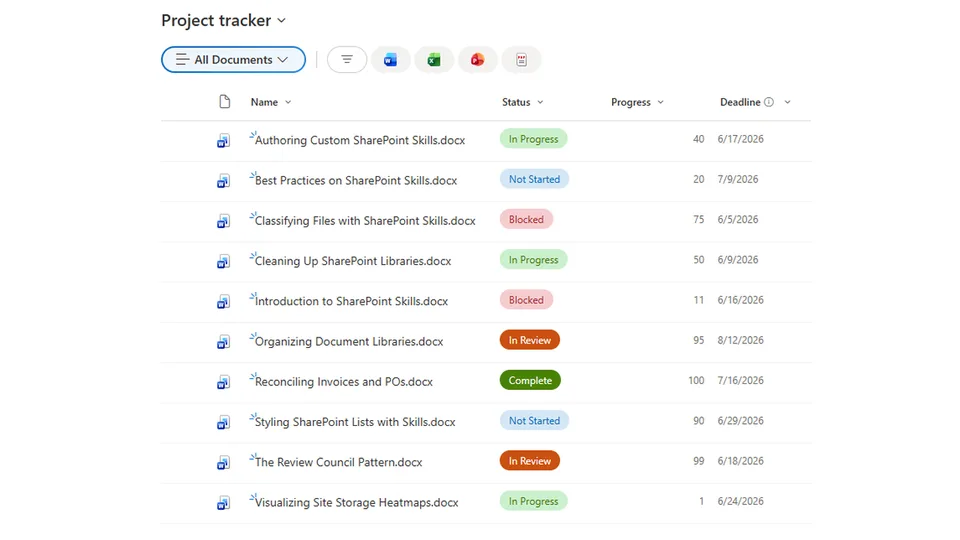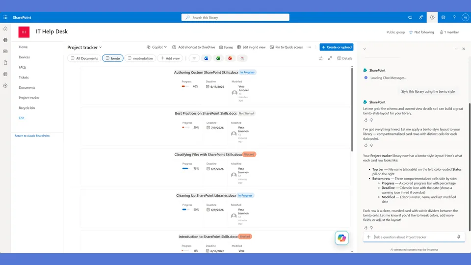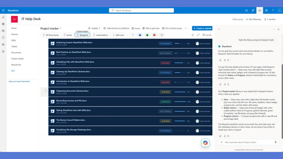
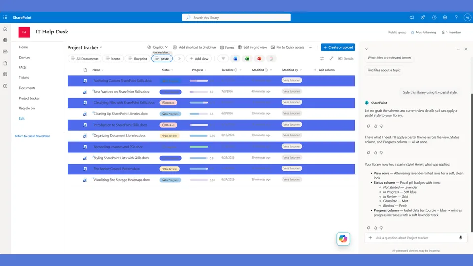
Pastel style tokens for the list-styling skill. Soft candy colors with light tinted badge backgrounds and dark text — friendly and approachable without sacrificing legibility.
Use when the user says 'pastel,' 'soft colors,' 'candy,' 'light badges,' 'friendly style,' or 'approachable.'
A SharePoint list style using soft candy colors and inverted badges. Each card has a tinted left panel that matches the item's status hue, with warm pastel tones throughout. Friendly, approachable, and a strong visual contrast to the corporate defaults.
What you get
- Design tokens for soft pastel status colors with inverted badge treatment (light background, dark text)
- A
rowFormatterwith a status-hued left panel that shifts color based on the item's current status - Rounded corners and gentle shadows — approachable rather than aggressive
- A style that works well on team sites, project trackers, and any context where warmth matters
Using this style
This is a style token skill — it provides design tokens and a reference rowFormatter, but does not apply them on its own. Pair it with the list-styling skill, which reads the tokens from this skill and adapts the row template to your library's actual columns.
Typical flow:
- Install both this skill and list-styling into your SharePoint Skills library.
- From a Copilot agent, ask: "Style this library using the pastel style."
Looking for sample content to try it on? The list-styling demo ships with ten short Word documents and the exact Status, Progress, and Deadline column setup the row template expects.
When to use this style
Audience: HR, people teams, community sites, onboarding hubs, and any internal space that should feel welcoming. Tone: warm, candy-colored, approachable — corporate defaults softened, not abandoned.
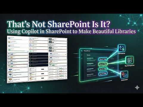
Demo video
SharePoint Skill
| Solution | Author(s) |
|---|---|
| style-pastel | Zach Rosenfield | GitHub | LinkedIn |
Version history
| Version | Date | Comments |
|---|---|---|
| 1.0 | May 2026 | Initial Release |
Disclaimer
THIS CODE IS PROVIDED AS IS WITHOUT WARRANTY OF ANY KIND, EITHER EXPRESS OR IMPLIED, INCLUDING ANY IMPLIED WARRANTIES OF FITNESS FOR A PARTICULAR PURPOSE, MERCHANTABILITY, OR NON-INFRINGEMENT.
Package
Ready to install
The ZIP contains only the upload-ready inner skill folder.
View SKILL.md
---
name: style-pastel
description: Pastel style tokens and row template for the list-styling skill. Soft candy colors, inverted badges (light bg + dark text), rounded cards with a tinted left panel that matches the status hue. Friendly and approachable. Use when the user says "pastel," "soft colors," "candy," "friendly," "approachable," or similar.
---

# Pastel — Style Tokens + Row Template

Soft, friendly, candy-colored. Inverted badges (light tint bg, dark colored text). Each card has a soft tinted left panel matching the status hue — the whole left side blushes with the status color.

**Layout philosophy: Tinted panel card.** A soft-colored left panel (about 80px wide) shows the progress percentage in the status's dark color. The panel's background is the status's lightest tint. The rest of the card is white with stacked metadata. Feels warm and inviting.

## Badge Tokens (inverted — light bg, dark text)

- padding: `5px 14px`
- border-radius: `10px`
- font-size: `12px`
- font-weight: `600`
- text-transform: `none`

### status_colors

| Value | bg | text | border | panel_tint |
|---|---|---|---|---|
| Draft | `#f1f5f9` | `#64748b` | `1px solid #e2e8f0` | `#f1f5f9` |
| In Review | `#dbeafe` | `#1d4ed8` | `1px solid #bfdbfe` | `#dbeafe` |
| Revising | `#fff7ed` | `#c2410c` | `1px solid #fed7aa` | `#fff7ed` |
| Approved | `#dcfce7` | `#15803d` | `1px solid #bbf7d0` | `#dcfce7` |
| Published | `#d1fae5` | `#047857` | `1px solid #a7f3d0` | `#d1fae5` |
| _fallback | `#f3f4f6` | `#6b7280` | `1px solid #e5e7eb` | `#f3f4f6` |

## Row Card Tokens

- card_border: `1px solid #e5e7eb`
- card_border_radius: `12px`
- card_background: `#ffffff`
- card_margin_bottom: `10px`
- card_shadow: `0px 2px 8px #0000000a`
- panel_width: `80px`
- overdue_panel_tint: `#fef2f2`
- overdue_panel_text: `#dc2626`

---

## Row Template Layout

Tinted left panel with hero number, white right side with metadata.

```
╭───────┬──────────────────────────────────────────────╮
│       │                                              │
│  72%  │  API Guide.docx                              │
│       │  [In Review]  ·  📅 5/15/2026                │
│ (blue │  ░░░░░░░░██████████████████████░░░░░░░░░     │
│ tint) │                                              │
╰───────┴──────────────────────────────────────────────╯
  ↑ panel bg is lightest tint of status hue
```

## rowFormatter JSON

**Adapt before applying.** The column names below (`[$Status]`, `[$Progress]`, `[$Deadline]`) are example placeholders — replace them with the actual internal column names from the user's list. Also update every status value string ('Draft', 'In Review', 'Revising', etc.) to match the user's actual Choice values. Follow list-styling Step 3.

```json
{
  "$schema": "https://developer.microsoft.com/json-schemas/sp/v2/view-formatting.schema.json",
  "hideSelection": false,
  "hideColumnHeaders": true,
  "rowFormatter": {
    "elmType": "div",
    "style": {
      "display": "flex",
      "border": "1px solid #e5e7eb",
      "border-radius": "12px",
      "background-color": "#ffffff",
      "margin-bottom": "10px",
      "box-shadow": "0px 2px 8px #0000000a",
      "overflow": "hidden",
      "min-height": "90px"
    },
    "children": [
      {
        "elmType": "div",
        "style": {
          "width": "80px",
          "min-width": "80px",
          "display": "flex",
          "align-items": "center",
          "justify-content": "center",
          "background-color": "=if([$Deadline] < @now, '#fef2f2', if([$Status] == 'Draft', '#f1f5f9', if([$Status] == 'In Review', '#dbeafe', if([$Status] == 'Revising', '#fff7ed', if([$Status] == 'Approved', '#dcfce7', if([$Status] == 'Published', '#d1fae5', '#f3f4f6'))))))"
        },
        "children": [
          {
            "elmType": "span",
            "txtContent": "=toString([$Progress]) + '%'",
            "style": {
              "font-size": "22px",
              "font-weight": "700",
              "color": "=if([$Deadline] < @now, '#dc2626', if([$Status] == 'Draft', '#64748b', if([$Status] == 'In Review', '#1d4ed8', if([$Status] == 'Revising', '#c2410c', if([$Status] == 'Approved', '#15803d', if([$Status] == 'Published', '#047857', '#6b7280'))))))"
            }
          }
        ]
      },
      {
        "elmType": "div",
        "style": {
          "flex": "1",
          "padding": "14px 18px",
          "display": "flex",
          "flex-direction": "column",
          "gap": "8px"
        },
        "children": [
          {
            "elmType": "div",
            "style": {
              "font-size": "14px",
              "font-weight": "600",
              "color": "#1f2937"
            },
            "txtContent": "=if([$FileLeafRef] == '', [$Title], [$FileLeafRef])"
          },
          {
            "elmType": "div",
            "style": {
              "display": "flex",
              "align-items": "center",
              "gap": "10px",
              "flex-wrap": "wrap"
            },
            "children": [
              {
                "elmType": "span",
                "txtContent": "[$Status]",
                "style": {
                  "display": "inline-block",
                  "padding": "4px 12px",
                  "border-radius": "10px",
                  "font-size": "12px",
                  "font-weight": "600",
                  "white-space": "nowrap",
                  "color": "=if([$Status] == 'Draft', '#64748b', if([$Status] == 'In Review', '#1d4ed8', if([$Status] == 'Revising', '#c2410c', if([$Status] == 'Approved', '#15803d', if([$Status] == 'Published', '#047857', '#6b7280')))))",
                  "background-color": "=if([$Status] == 'Draft', '#f1f5f9', if([$Status] == 'In Review', '#dbeafe', if([$Status] == 'Revising', '#fff7ed', if([$Status] == 'Approved', '#dcfce7', if([$Status] == 'Published', '#d1fae5', '#f3f4f6')))))",
                  "border": "=if([$Status] == 'Draft', '1px solid #e2e8f0', if([$Status] == 'In Review', '1px solid #bfdbfe', if([$Status] == 'Revising', '1px solid #fed7aa', if([$Status] == 'Approved', '1px solid #bbf7d0', if([$Status] == 'Published', '1px solid #a7f3d0', '1px solid #e5e7eb')))))"
                }
              },
              {
                "elmType": "span",
                "txtContent": "·",
                "style": { "color": "#d1d5db", "font-size": "14px" }
              },
              {
                "elmType": "span",
                "txtContent": "📅",
                "style": { "font-size": "12px" }
              },
              {
                "elmType": "span",
                "txtContent": "=toLocaleDateString([$Deadline])",
                "style": {
                  "font-size": "12px",
                  "font-weight": "=if([$Deadline] < @now, '600', '400')",
                  "color": "=if([$Deadline] < @now, '#dc2626', '#6b7280')"
                }
              },
              {
                "elmType": "span",
                "txtContent": "=if([$Deadline] < @now, '· overdue', '')",
                "style": {
                  "font-size": "11px",
                  "font-weight": "500",
                  "color": "#dc2626"
                }
              }
            ]
          },
          {
            "elmType": "div",
            "style": {
              "width": "100%",
              "height": "6px",
              "background-color": "#f1f5f9",
              "border-radius": "3px",
              "overflow": "hidden"
            },
            "children": [
              {
                "elmType": "div",
                "style": {
                  "width": "=toString([$Progress]) + '%'",
                  "height": "100%",
                  "border-radius": "3px",
                  "background-color": "=if([$Progress] < 30, '#fca5a5', if([$Progress] < 66, '#93c5fd', '#86efac'))"
                }
              }
            ]
          }
        ]
      }
    ]
  }
}
```

---

## Checklist — "I Can't Believe That's SharePoint"

- ✅ Full rowFormatter — NOT default column grid
- ✅ TINTED LEFT PANEL that changes color per status — the whole panel blushes
- ✅ Panel shows progress percentage in the status's dark color
- ✅ Overdue panel turns soft pink (#fef2f2) with red text
- ✅ INVERTED badges — light tinted bg + dark text + tinted border (not solid fill)
- ✅ Title Case on badges — not uppercase
- ✅ Soft rounded card corners (12px) — friendly, not sharp
- ✅ Progress bar fills are PASTEL (light pink, light blue, light green)
- ✅ 📅 icon on deadlines
- ✅ Overdue is lowercase "overdue" — soft, not alarming
- ✅ Gentle shadow, not hard offset
- ✅ Different from all others: tinted panel (not sidebar/stripe/stacked/compartments/hero number)

---

## Responsive / mobile

- **≤ 480 px**: the 80 px (now 96 px — see below) tinted left panel collapses to a **top stripe** running the full card width, with the percentage centered above the title.
- **≤ 720 px**: card padding steps down from `16px 20px` to `12px 16px`. Keep border-radius at 12 px; it carries the style.
- **Touch targets**: pastel is friendly, so consumers tap more. Every interactive element ≥ 44 × 44 px on mobile.
- **Hero text**: percentage number can step from 28 px → 22 px on mobile; do not go below 22 px or it loses presence.

## Implementation notes

### Widen the tinted panel — 80 px clips `100%`

The shipped reference uses an 80 px left panel. A three-digit progress value (`100%`) clips at that width when the digit weight is bold. **Set the panel to 96 px**, or set the number child to `flex-wrap: nowrap; overflow: visible` so the `%` glyph is allowed to bleed slightly out of the panel boundary. Do not shrink the font; the percentage must stay legible at desktop reading distance.

### Pastel contrast audit (pinned)

Pastel BG / text pairs are easy to fail — these have been checked at WebAIM and meet WCAG AA or better. Re-verify whenever a token changes.

| Panel BG | Text | Ratio | WCAG |
|---|---|---|---|
| Pink `#FDE2E4` | `#9B2C3F` | ≈ 6.8 : 1 | **AA** |
| Blue `#E0F2FE` | `#0C4A6E` | ≈ 8.3 : 1 | **AAA** |
| Green `#DCFCE7` | `#166534` | ≈ 7.1 : 1 | **AAA** |
| Yellow `#FEF9C3` | `#854D0E` | ≈ 6.2 : 1 | **AA** |
| Lavender `#EDE9FE` | `#5B21B6` | ≈ 7.4 : 1 | **AAA** |

Never pair a pastel BG with a tint of the same hue for text — the contrast collapses. Always pair with a saturated counterpart of the same family.
References
- agentskills.io specification
The specification that SharePoint AI skills follow for installation and discovery.
- List Styling Engine
The companion skill that applies these style tokens to a SharePoint list.
- Demo video
Walkthrough of the list-styling engine and supporting style token skills.
Discuss this skill
Ask a question, share how you used it, or suggest an improvement with the community.
Open GitHub Discussions