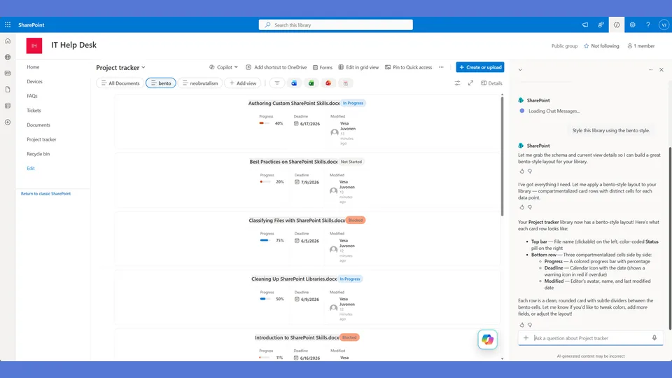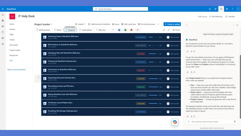
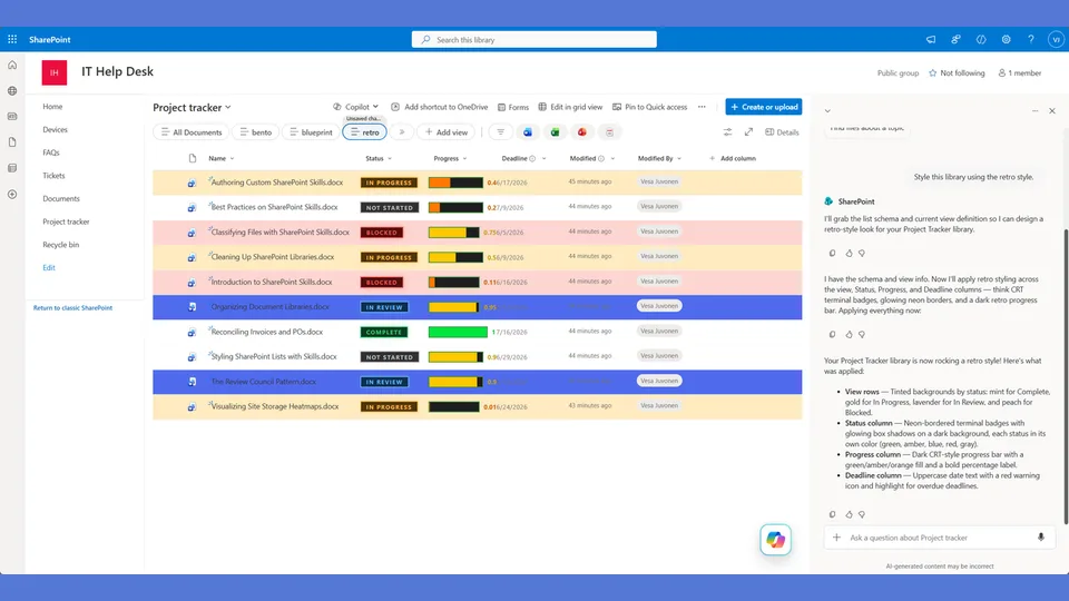
Retro Memphis style tokens for the list-styling skill. Hot pink, electric blue, yellow, and teal with colored borders — bold, playful, and unapologetically nostalgic.
Use when the user says 'retro,' 'memphis,' '80s,' '90s,' 'colorful,' 'playful,' or 'bright colors.'
A SharePoint list style channeling 80s and 90s Memphis design — bright contrasting colors, colored hard shadows, and a bold status-colored top banner on each card. The progress percentage is displayed large below the banner. Playful, energetic, and nothing like SharePoint.
What you get
- Design tokens for bright saturated colors, colored box-shadows, and a stacked vertical card layout
- A
rowFormatterwith a status-colored top banner strip and large progress number below it - Hard offset shadows tinted to match the status color — the shadow IS part of the design
- A deliberately opposite layout from the sidebar-based styles — everything stacks vertically
Using this style
This is a style token skill — it provides design tokens and a reference rowFormatter, but does not apply them on its own. Pair it with the list-styling skill, which reads the tokens from this skill and adapts the row template to your library's actual columns.
Typical flow:
- Install both this skill and list-styling into your SharePoint Skills library.
- From a Copilot agent, ask: "Style this library using the retro style."
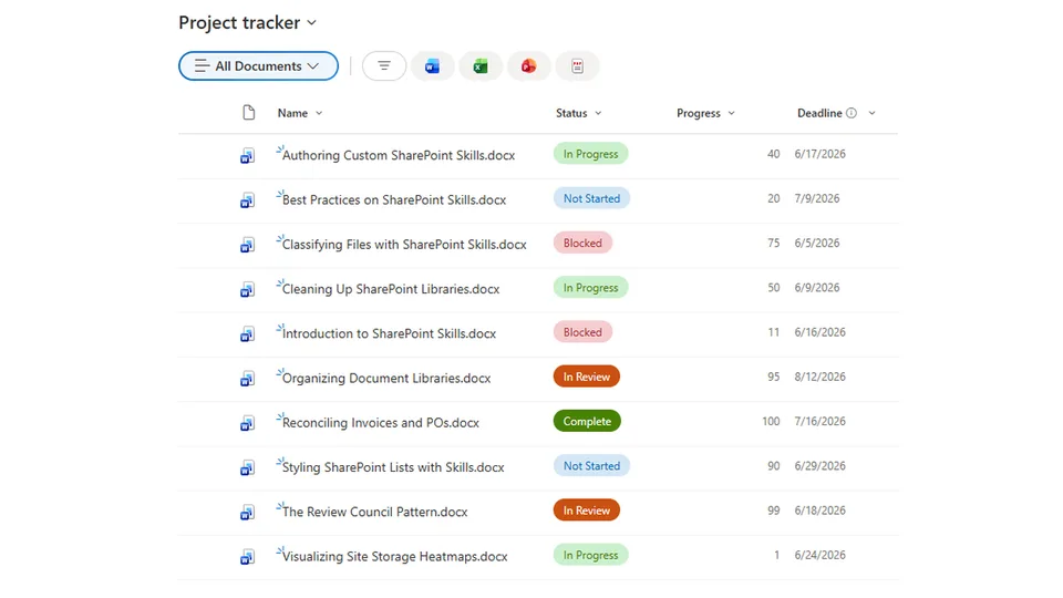
Looking for sample content to try it on? The list-styling demo ships with ten short Word documents and the exact Status, Progress, and Deadline column setup the row template expects.
When to use this style
Audience: creative teams, events, internal campaigns, and any moment that earns a nostalgic wink. Tone: playful Memphis design — loud, energetic, and proudly not corporate.
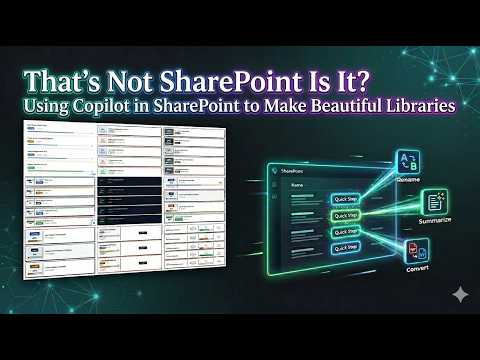
Demo video
SharePoint Skill
| Solution | Author(s) |
|---|---|
| style-retro | Zach Rosenfield | GitHub | LinkedIn |
Version history
| Version | Date | Comments |
|---|---|---|
| 1.0 | May 2026 | Initial Release |
Disclaimer
THIS CODE IS PROVIDED AS IS WITHOUT WARRANTY OF ANY KIND, EITHER EXPRESS OR IMPLIED, INCLUDING ANY IMPLIED WARRANTIES OF FITNESS FOR A PARTICULAR PURPOSE, MERCHANTABILITY, OR NON-INFRINGEMENT.
Package
Ready to install
The ZIP contains only the upload-ready inner skill folder.
9dd8691aed5fa52e3f782b963b7de9f08920bea0a92d148207efabba8840752fView SKILL.md
---
name: style-retro
description: Retro Memphis style tokens and row template for the list-styling skill. Bright contrasting colors, colored shadows, playful stacked card with a status-colored top banner and large progress number. Layout is a stacked vertical card with a bold colored header strip — NOT a sidebar layout. Use when the user says "retro," "memphis," "80s," "90s," "colorful," "playful," "fun style," or similar.
---

# Retro Memphis — Style Tokens + Row Template

Bright, playful, LOUD. Every status is a different color. Colored shadows. Stacked vertical card with a bold colored banner. This is the fun one.

**Layout philosophy: Stacked vertical card with colored banner.** The top third of the card is a bold status-colored banner containing the document name in large white text. Below it, a white content area with the status badge, a large progress percentage, and deadline info. The banner color changes per status — the card's personality changes with every item. This is structurally different from Neobrutalism's horizontal sidebar split.

## Badge Tokens

- padding: `5px 14px`
- border-radius: `20px` (full pill — playful, round, fun)
- font-size: `12px`
- font-weight: `700`
- text-transform: `uppercase`

### status_colors

| Value | bg | text | border | banner_color |
|---|---|---|---|---|
| Draft | `#fbbf24` | `#1f2937` | `2px solid #d97706` | `#fbbf24` |
| In Review | `#3b82f6` | `#ffffff` | `2px solid #7c3aed` | `#3b82f6` |
| Revising | `#f472b6` | `#ffffff` | `2px solid #db2777` | `#f472b6` |
| Approved | `#2dd4bf` | `#1f2937` | `2px solid #0d9488` | `#2dd4bf` |
| Published | `#a78bfa` | `#ffffff` | `2px solid #7c3aed` | `#a78bfa` |
| _fallback | `#e5e7eb` | `#374151` | `2px solid #9ca3af` | `#e5e7eb` |

> CRITICAL: The banner_color IS the status bg color — the entire top of the card floods with the status hue. Draft cards have a yellow top. In Review cards have a blue top. Revising cards have a hot pink top. Every card in the list is a different color.

## Progress Bar Tokens

- progress_track_height: `10px`
- progress_track_bg: `#fef3c7` (warm yellow tint)
- progress_track_border: `2px solid #d97706`
- progress_track_radius: `5px`
- progress_fill_radius: `3px`
- progress_color_low: `#f472b6` (HOT PINK — not red)
- progress_color_mid: `#3b82f6` (ELECTRIC BLUE — not amber)
- progress_color_high: `#2dd4bf` (TEAL — not green)
- progress_label_font_size: `28px` (HUGE — the hero element)
- progress_label_font_weight: `800`
- progress_label_color: `#7c3aed` (PURPLE)

## Deadline Tokens

- deadline_icon: `🗓️`
- date_font_size: `13px`
- date_normal_color: `#374151`
- date_normal_weight: `600`
- date_overdue_color: `#db2777` (HOT PINK — not red)
- date_overdue_weight: `800`
- date_sublabel_color: `#7c3aed` (PURPLE)
- overdue_label: `🔥 OVERDUE`

## Row Card Tokens

- card_border: `3px solid` (color matches status shadow_color)
- card_border_radius: `12px` (rounded — playful)
- card_background: `#ffffff`
- card_margin_bottom: `12px`
- card_shadow: `6px 6px 0px` (large hard offset — COLORED per status)
- banner_height: (auto — wraps content with padding)
- banner_padding: `16px 20px`
- content_padding: `16px 20px`
- overdue_border_color: `#db2777`
- overdue_shadow_color: `#db2777`

---

## Row Template Layout

Stacked vertical card with a status-colored banner on top.

```
    ╭──────────────────────────────────────────────────╮
    │▓▓▓▓▓▓▓▓▓▓▓▓▓▓▓▓▓▓▓▓▓▓▓▓▓▓▓▓▓▓▓▓▓▓▓▓▓▓▓▓▓▓▓▓▓▓│
    │▓▓  API Guide.docx                             ▓▓│ ← status-colored
    │▓▓▓▓▓▓▓▓▓▓▓▓▓▓▓▓▓▓▓▓▓▓▓▓▓▓▓▓▓▓▓▓▓▓▓▓▓▓▓▓▓▓▓▓▓▓│   banner
    │                                                  │
    │  [IN REVIEW]  🎯 ON TRACK     72%    🗓️ 5/15/26 │ ← white content
    │                                                  │
    │  ░░████████████████████████████████░░░░░░░░░░░   │ ← warm yellow
    │                                                  │   track + amber
    ╰──────────────────────────────────────────────────╯   border
       ▓▓▓▓▓▓ ← 6px colored offset shadow
```

Key difference from Neobrutalism: Neobrutalism is a HORIZONTAL split (sidebar left, content right). Retro is a VERTICAL split (banner top, content bottom). Even the silhouettes are different.

## rowFormatter JSON

**Adapt before applying.** The column names below (`[$Status]`, `[$Progress]`, `[$Deadline]`) are example placeholders — replace them with the actual internal column names from the user's list. Also update every status value string ('Draft', 'In Review', 'Revising', etc.) to match the user's actual Choice values. Follow list-styling Step 3.

```json
{
  "$schema": "https://developer.microsoft.com/json-schemas/sp/v2/view-formatting.schema.json",
  "hideSelection": false,
  "hideColumnHeaders": true,
  "rowFormatter": {
    "elmType": "div",
    "style": {
      "display": "flex",
      "flex-direction": "column",
      "border": "=if([$Deadline] < @now, '3px solid #db2777', if([$Status] == 'Draft', '3px solid #d97706', if([$Status] == 'In Review', '3px solid #7c3aed', if([$Status] == 'Revising', '3px solid #db2777', if([$Status] == 'Approved', '3px solid #0d9488', if([$Status] == 'Published', '3px solid #7c3aed', '3px solid #9ca3af'))))))",
      "border-radius": "12px",
      "background-color": "#ffffff",
      "margin-bottom": "12px",
      "box-shadow": "=if([$Deadline] < @now, '6px 6px 0px #db2777', if([$Status] == 'Draft', '6px 6px 0px #d97706', if([$Status] == 'In Review', '6px 6px 0px #7c3aed', if([$Status] == 'Revising', '6px 6px 0px #db2777', if([$Status] == 'Approved', '6px 6px 0px #0d9488', if([$Status] == 'Published', '6px 6px 0px #7c3aed', '6px 6px 0px #9ca3af'))))))",
      "overflow": "hidden"
    },
    "children": [
      {
        "elmType": "div",
        "style": {
          "padding": "16px 20px",
          "background-color": "=if([$Deadline] < @now, '#db2777', if([$Status] == 'Draft', '#fbbf24', if([$Status] == 'In Review', '#3b82f6', if([$Status] == 'Revising', '#f472b6', if([$Status] == 'Approved', '#2dd4bf', if([$Status] == 'Published', '#a78bfa', '#e5e7eb'))))))",
          "display": "flex",
          "align-items": "center",
          "gap": "10px"
        },
        "children": [
          {
            "elmType": "div",
            "style": {
              "font-size": "16px",
              "font-weight": "800",
              "color": "=if([$Status] == 'Draft', '#1f2937', if([$Status] == 'Approved', '#1f2937', '#ffffff'))",
              "flex": "1",
              "line-height": "1.3"
            },
            "txtContent": "=if([$FileLeafRef] == '', [$Title], [$FileLeafRef])"
          },
          {
            "elmType": "span",
            "txtContent": "=if([$Deadline] < @now, '🔥', '✨')",
            "style": {
              "font-size": "20px"
            }
          }
        ]
      },
      {
        "elmType": "div",
        "style": {
          "padding": "16px 20px",
          "display": "flex",
          "flex-direction": "column",
          "gap": "12px"
        },
        "children": [
          {
            "elmType": "div",
            "style": {
              "display": "flex",
              "align-items": "center",
              "gap": "14px",
              "flex-wrap": "wrap"
            },
            "children": [
              {
                "elmType": "span",
                "txtContent": "[$Status]",
                "style": {
                  "display": "inline-block",
                  "padding": "5px 14px",
                  "border-radius": "20px",
                  "font-size": "12px",
                  "font-weight": "700",
                  "text-transform": "uppercase",
                  "white-space": "nowrap",
                  "border": "=if([$Status] == 'Draft', '2px solid #d97706', if([$Status] == 'In Review', '2px solid #7c3aed', if([$Status] == 'Revising', '2px solid #db2777', if([$Status] == 'Approved', '2px solid #0d9488', if([$Status] == 'Published', '2px solid #7c3aed', '2px solid #9ca3af')))))",
                  "color": "=if([$Status] == 'Draft', '#1f2937', if([$Status] == 'In Review', '#ffffff', if([$Status] == 'Revising', '#ffffff', if([$Status] == 'Approved', '#1f2937', if([$Status] == 'Published', '#ffffff', '#374151')))))",
                  "background-color": "=if([$Status] == 'Draft', '#fbbf24', if([$Status] == 'In Review', '#3b82f6', if([$Status] == 'Revising', '#f472b6', if([$Status] == 'Approved', '#2dd4bf', if([$Status] == 'Published', '#a78bfa', '#e5e7eb')))))"
                }
              },
              {
                "elmType": "span",
                "txtContent": "=if([$Deadline] < @now, '🔥 AT RISK', '🎯 ON TRACK')",
                "style": {
                  "font-size": "11px",
                  "font-weight": "700",
                  "color": "=if([$Deadline] < @now, '#db2777', '#0d9488')"
                }
              },
              {
                "elmType": "span",
                "txtContent": "=toString([$Progress]) + '%'",
                "style": {
                  "font-size": "28px",
                  "font-weight": "800",
                  "color": "#7c3aed",
                  "margin-left": "auto"
                }
              }
            ]
          },
          {
            "elmType": "div",
            "style": {
              "width": "100%",
              "height": "10px",
              "background-color": "#fef3c7",
              "border": "2px solid #d97706",
              "border-radius": "5px",
              "overflow": "hidden"
            },
            "children": [
              {
                "elmType": "div",
                "style": {
                  "width": "=toString([$Progress]) + '%'",
                  "height": "100%",
                  "border-radius": "3px",
                  "background-color": "=if([$Progress] < 30, '#f472b6', if([$Progress] < 66, '#3b82f6', '#2dd4bf'))"
                }
              }
            ]
          },
          {
            "elmType": "div",
            "style": {
              "display": "flex",
              "align-items": "center",
              "gap": "6px"
            },
            "children": [
              {
                "elmType": "span",
                "txtContent": "🗓️",
                "style": { "font-size": "13px" }
              },
              {
                "elmType": "span",
                "txtContent": "=toLocaleDateString([$Deadline])",
                "style": {
                  "font-size": "13px",
                  "font-weight": "=if([$Deadline] < @now, '800', '600')",
                  "color": "=if([$Deadline] < @now, '#db2777', '#374151')"
                }
              },
              {
                "elmType": "span",
                "txtContent": "=if([$Deadline] < @now, '🔥 OVERDUE', 'DEADLINE')",
                "style": {
                  "font-size": "10px",
                  "font-weight": "=if([$Deadline] < @now, '700', '500')",
                  "color": "=if([$Deadline] < @now, '#db2777', '#7c3aed')",
                  "text-transform": "uppercase"
                }
              }
            ]
          }
        ]
      }
    ]
  }
}
```

---

## Checklist — "I Can't Believe That's SharePoint"

- ✅ Full rowFormatter — NOT default column grid
- ✅ VERTICAL STACKED layout with colored banner on top — NOT a sidebar (structurally different from Neobrutalism)
- ✅ Banner background FLOODS with the status color — yellow, blue, pink, teal, or lavender
- ✅ Document name is white-on-color in the banner — bold and prominent
- ✅ ✨ sparkle emoji in banner (🔥 for overdue) — playful decorative element
- ✅ Card border AND shadow color change per status — colored, NEVER black
- ✅ 6px hard offset colored shadows (bigger than Neobrutalism's 4px)
- ✅ Rounded corners (12px) — playful, not sharp
- ✅ Pill-shaped status badges (20px radius) with colored borders
- ✅ Progress percentage is HUGE (28px) and PURPLE — pushed to the right
- ✅ Progress bar track is warm yellow (#fef3c7) with amber border
- ✅ Progress fills are PINK → BLUE → TEAL (not red → amber → green)
- ✅ Deadline sublabel is PURPLE, overdue is HOT PINK with 🔥
- ✅ Every status gets its own distinct hue — no repeats
- ✅ Overdue cards: banner turns hot pink, border/shadow turn hot pink, 🔥 replaces ✨
- ✅ The list looks like a bag of candy exploded — in a good way
- ✅ Silhouette test: banner-on-top looks NOTHING like sidebar-on-left (Neobrutalism)

---

## Responsive / mobile

- **≤ 600 px**: drop the colored `box-shadow` offset from 4 px to 2 px so it doesn't clip the next card.
- **≤ 480 px**: the banner stays full-width — it carries the identity. Stack the metadata (progress + deadline) vertically below it.
- **Hero text**: the large progress percentage below the banner steps `32 px → 24 px` on mobile. Do not go below 24 px.
- **Touch targets**: ≥ 44 × 44 px on the row card.

## Implementation notes

### Status-tinted shadows render inconsistently

The colored `box-shadow` (hot pink for overdue, banner color elsewhere) is **not portable**:

- **Chrome / Edge**: render the offset and color correctly.
- **Safari**: occasionally mutes saturation on `box-shadow` colors, so the pink reads more salmon than hot.
- **Older SharePoint themes**: strip multi-layer or colored `box-shadow` entirely.

**Provide a fallback that does not depend on the shadow**: the colored top banner must always render — it is the primary identity element. The shadow is decoration. When QA shows the shadow is missing in a target environment, do not add a different decoration; let the banner do the work.

### The pink/blue/teal progress palette is intentional — explain it once

Consumers used to traffic-light progress (red < 30% → amber → green ≥ 70%) will see a 95 % card filled in **teal** and assume the style is broken. It is not. Retro Memphis progress goes **pink → blue → teal** by design — each value gets its own distinct hue, the way 80s Memphis palettes worked.

When applying this style for the first time in a tenant, surface this fact in a single sentence to the user: *"Progress in Retro Memphis uses pink → blue → teal instead of red → amber → green — that's intentional."*
References
- agentskills.io specification
The specification that SharePoint AI skills follow for installation and discovery.
- List Styling Engine
The companion skill that applies these style tokens to a SharePoint list.
- Demo video
Walkthrough of the list-styling engine and supporting style token skills.
Discuss this skill
Ask a question, share how you used it, or suggest an improvement with the community.
Open GitHub Discussions