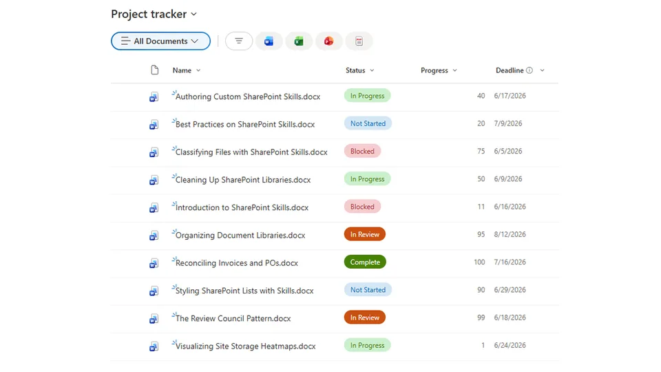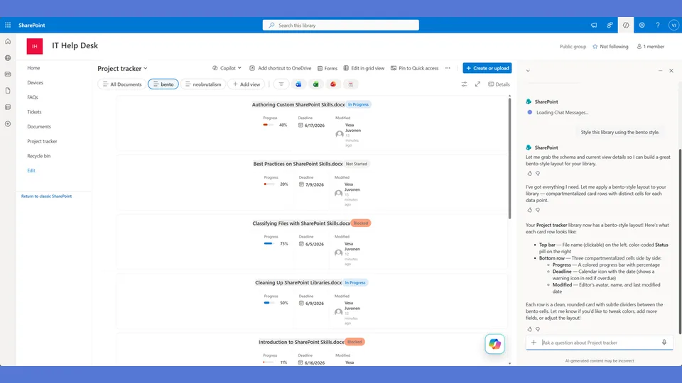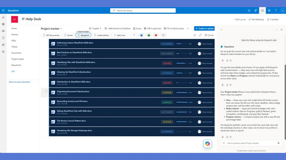
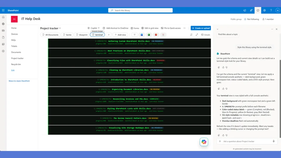
Terminal/hacker style tokens for the list-styling skill. Dark badges with neon green accents and matrix-style progress bars — a developer-friendly aesthetic for ops dashboards and engineering boards.
Use when the user says 'terminal,' 'hacker,' 'dark mode,' 'matrix,' 'developer style,' or 'green on black.'
A SharePoint list style built like a dark-mode CLI dashboard. Dark cards with neon green and cyan text, a terminal prompt icon on each row, and status displayed as CLI-style output. Loved by developers and anyone who wants their SharePoint to look like a hacking scene.
What you get
- Design tokens for a dark background palette with neon green, cyan, and amber status accents
- A
rowFormatterwith terminal prompt styling — each row reads like command output - Status values rendered as CLI-style labels rather than visual badges
- Sharp corners, monospace-inspired typography, and zero decorative softness
Using this style
This is a style token skill — it provides design tokens and a reference rowFormatter, but does not apply them on its own. Pair it with the list-styling skill, which reads the tokens from this skill and adapts the row template to your library's actual columns.
Typical flow:
- Install both this skill and list-styling into your SharePoint Skills library.
- From a Copilot agent, ask: "Style this library using the terminal style."
Looking for sample content to try it on? The list-styling demo ships with ten short Word documents and the exact Status, Progress, and Deadline column setup the row template expects.
When to use this style
Audience: developer teams, dev rel portals, engineering ops, and technical hubs — the people who feel at home in a CLI. Not a good fit for general staff or external-facing pages. Tone: dark, neon, CLI-styled — a small inside joke for a technical audience.
Demo video
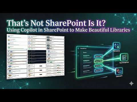
SharePoint Skill
| Solution | Author(s) |
|---|---|
| style-terminal | Zach Rosenfield | GitHub | LinkedIn |
Version history
| Version | Date | Comments |
|---|---|---|
| 1.0 | May 2026 | Initial Release |
Disclaimer
THIS CODE IS PROVIDED AS IS WITHOUT WARRANTY OF ANY KIND, EITHER EXPRESS OR IMPLIED, INCLUDING ANY IMPLIED WARRANTIES OF FITNESS FOR A PARTICULAR PURPOSE, MERCHANTABILITY, OR NON-INFRINGEMENT.
Package
Ready to install
The ZIP contains only the upload-ready inner skill folder.
View SKILL.md
---
name: style-terminal
description: Terminal / Hacker style tokens and row template for the list-styling skill. Dark cards with neon text, green/cyan accents, sharp corners, terminal prompt icon, status displayed like CLI output. Use when the user says "terminal," "hacker," "dark mode," "matrix," "developer," "CLI," or similar.
---

# Terminal — Style Tokens + Row Template

Dark backgrounds, neon text, sharp corners. Each row is a dark card that looks like terminal output. Status values render like CLI flags. The progress bar glows neon green.

**Layout philosophy: Dark card with terminal aesthetic.** The entire card has a dark background (#0f172a). All text is bright colored on dark. Status renders like a CLI flag in brackets. The prompt character `>` appears before the document name. Everything feels like you're reading `ls -la` output.

## Badge Tokens

- padding: `4px 12px`
- border-radius: `2px`
- font-size: `11px`
- font-weight: `700`
- text-transform: `uppercase`

### status_colors

| Value | bg | text | border |
|---|---|---|---|
| Draft | `#374151` | `#9ca3af` | `1px solid #4b5563` |
| In Review | `#1e3a5f` | `#38bdf8` | `1px solid #0ea5e9` |
| Revising | `#422006` | `#fb923c` | `1px solid #f97316` |
| Approved | `#052e16` | `#4ade80` | `1px solid #22c55e` |
| Published | `#022c22` | `#34d399` | `1px solid #10b981` |
| _fallback | `#1f2937` | `#6b7280` | `1px solid #374151` |

## Row Card Tokens

- card_background: `#0f172a` (near-black navy)
- card_border: `1px solid #1e293b`
- card_border_radius: `4px` (slightly rounded — terminals have some softness)
- card_margin_bottom: `4px` (tight spacing — dense like terminal output)
- card_shadow: `none`
- card_padding: `14px 18px`
- prompt_char: `>`
- prompt_color: `#4ade80`
- filename_color: `#e2e8f0`
- separator_color: `#334155`
- overdue_border: `1px solid #ef4444`
- overdue_glow: `0px 0px 8px #ef444433` (subtle red glow for overdue)

---

## Row Template Layout

Dark card with terminal-style content. Single row of data like CLI output.

```
┌──────────────────────────────────────────────────────────┐
│                                                          │
│  > API Guide.docx     [IN REVIEW]   ████░░ 72%  5/15   │
│                                                          │
└──────────────────────────────────────────────────────────┘
  ↑ dark bg (#0f172a), neon text, overdue cards get red glow
```

## rowFormatter JSON

**Adapt before applying.** The column names below (`[$Status]`, `[$Progress]`, `[$Deadline]`) are example placeholders — replace them with the actual internal column names from the user's list. Also update every status value string ('Draft', 'In Review', 'Revising', etc.) to match the user's actual Choice values. Follow list-styling Step 3.

```json
{
  "$schema": "https://developer.microsoft.com/json-schemas/sp/v2/view-formatting.schema.json",
  "hideSelection": false,
  "hideColumnHeaders": true,
  "rowFormatter": {
    "elmType": "div",
    "style": {
      "display": "flex",
      "flex-direction": "column",
      "gap": "8px",
      "padding": "14px 18px",
      "background-color": "#0f172a",
      "border": "=if([$Deadline] < @now, '1px solid #ef4444', '1px solid #1e293b')",
      "border-radius": "4px",
      "margin-bottom": "4px",
      "box-shadow": "=if([$Deadline] < @now, '0px 0px 8px #ef444433', 'none')",
      "min-height": "60px"
    },
    "children": [
      {
        "elmType": "div",
        "style": {
          "display": "flex",
          "align-items": "center",
          "gap": "14px",
          "flex-wrap": "wrap"
        },
        "children": [
          {
            "elmType": "span",
            "txtContent": ">",
            "style": {
              "font-size": "14px",
              "font-weight": "700",
              "color": "#4ade80"
            }
          },
          {
            "elmType": "div",
            "style": {
              "flex": "2",
              "font-size": "14px",
              "font-weight": "600",
              "color": "#e2e8f0"
            },
            "txtContent": "=if([$FileLeafRef] == '', [$Title], [$FileLeafRef])"
          },
          {
            "elmType": "span",
            "txtContent": "[$Status]",
            "style": {
              "display": "inline-block",
              "padding": "4px 12px",
              "border-radius": "2px",
              "font-size": "11px",
              "font-weight": "700",
              "text-transform": "uppercase",
              "white-space": "nowrap",
              "color": "=if([$Status] == 'Draft', '#9ca3af', if([$Status] == 'In Review', '#38bdf8', if([$Status] == 'Revising', '#fb923c', if([$Status] == 'Approved', '#4ade80', if([$Status] == 'Published', '#34d399', '#6b7280')))))",
              "background-color": "=if([$Status] == 'Draft', '#374151', if([$Status] == 'In Review', '#1e3a5f', if([$Status] == 'Revising', '#422006', if([$Status] == 'Approved', '#052e16', if([$Status] == 'Published', '#022c22', '#1f2937')))))",
              "border": "=if([$Status] == 'Draft', '1px solid #4b5563', if([$Status] == 'In Review', '1px solid #0ea5e9', if([$Status] == 'Revising', '1px solid #f97316', if([$Status] == 'Approved', '1px solid #22c55e', if([$Status] == 'Published', '1px solid #10b981', '1px solid #374151')))))"
            }
          },
          {
            "elmType": "span",
            "txtContent": "=toString([$Progress]) + '%'",
            "style": {
              "font-size": "14px",
              "font-weight": "700",
              "color": "#4ade80",
              "min-width": "40px",
              "text-align": "right"
            }
          },
          {
            "elmType": "span",
            "txtContent": "=toLocaleDateString([$Deadline])",
            "style": {
              "font-size": "12px",
              "font-weight": "=if([$Deadline] < @now, '700', '400')",
              "color": "=if([$Deadline] < @now, '#ef4444', '#64748b')"
            }
          },
          {
            "elmType": "span",
            "txtContent": "=if([$Deadline] < @now, '[OVERDUE]', '')",
            "style": {
              "font-size": "11px",
              "font-weight": "700",
              "color": "#ef4444"
            }
          }
        ]
      },
      {
        "elmType": "div",
        "style": {
          "width": "100%",
          "height": "4px",
          "background-color": "#1e293b",
          "border-radius": "0px",
          "overflow": "hidden"
        },
        "children": [
          {
            "elmType": "div",
            "style": {
              "width": "=toString([$Progress]) + '%'",
              "height": "100%",
              "background-color": "=if([$Progress] < 30, '#ef4444', if([$Progress] < 66, '#38bdf8', '#4ade80'))"
            }
          }
        ]
      }
    ]
  }
}
```

---

## Checklist — "I Can't Believe That's SharePoint"

- ✅ Full rowFormatter — NOT default column grid
- ✅ DARK BACKGROUND (#0f172a) on every card — this IS the style
- ✅ Neon green `>` prompt character before every document name
- ✅ Light text on dark (#e2e8f0) for filenames
- ✅ Status badges have dark bg + neon colored text (inverted from normal)
- ✅ Progress percentage is neon green (#4ade80)
- ✅ Progress bar track is dark (#1e293b), fills glow neon (red → cyan → green)
- ✅ Zero border-radius on progress bar — hard edges
- ✅ Overdue shows `[OVERDUE]` in brackets like a CLI flag
- ✅ Overdue cards get a subtle red glow (box-shadow)
- ✅ Tight 4px spacing between cards — dense like terminal output
- ✅ No emoji anywhere — terminals don't have emoji
- ✅ Only style with dark cards — immediately distinguishable from everything else

---

## Responsive / mobile

- **≤ 600 px**: collapse the secondary metadata column under the terminal prompt icon. Keep the `>` prompt visible at every breakpoint — it carries the identity.
- **≤ 480 px**: hide the bracketed flags except `[OVERDUE]`; status colour does the work.
- **Hero text**: monospace 14 px on desktop — do not step down further. Mono fonts at < 13 px become unreadable on small screens.
- **Touch targets**: ≥ 44 × 44 px. Tight 4 px row spacing satisfies density but the row card itself stays tappable.

## Implementation notes

### Neon contrast on dark (pinned)

The terminal palette is genuinely AAA on its dark background — the neon isn't decorative, it's measured.

| Foreground | Background | Ratio | WCAG |
|---|---|---|---|
| Neon green `#39FF7A` | Dark `#0F0F12` | ≈ 9.1 : 1 | **AAA** |
| Cyan `#5BE7FF` | Dark `#0F0F12` | ≈ 11.4 : 1 | **AAA** |
| Salmon `#FF7A7A` (used for `[OVERDUE]`) | Dark `#0F0F12` | ≈ 5.1 : 1 | **AA** (normal text) |
| Muted grey `#8A8F98` (chrome) | Dark `#0F0F12` | ≈ 4.6 : 1 | **AA Large** only — use for non-essential text |

Re-verify in [WebAIM](https://webaim.org/resources/contrastchecker/) if any neon token is changed.

### Audience scope (also in README)

This style is explicitly **developer / technical-audience**. Use it for engineering portals, dev rel sites, SRE / ops dashboards. Do not use it for general staff sites, HR / people sites, or external-facing pages — the dark + neon combination reads as "unfinished" or "broken" to a non-technical audience. If the requesting user isn't sure, default to a different style and offer Terminal as an alternative; never default into it.
References
- agentskills.io specification
The specification that SharePoint AI skills follow for installation and discovery.
- List Styling Engine
The companion skill that applies these style tokens to a SharePoint list.
- Demo video
Walkthrough of the list-styling engine and supporting style token skills.
Discuss this skill
Ask a question, share how you used it, or suggest an improvement with the community.
Open GitHub Discussions