
From the contributor
How to use this sample
Summary
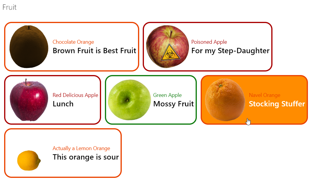
Provides an example of customizing your format based on the item's content type. When an item's ContentType is Apple and the apple type is "Green" then green is used in the format. If it's Apple with a different type, red is used. Otherwise, orange is used.
The rowFormatter property is used to fully customize the display of rows to create a simple view of list items while easily allowing users to click on the item for additional details. The colors used for each item are applied using the Office UI Fabric color classes for themes. These classes are then applied conditionally based on an item's content type.
Both ContentType and ContentTypeId are always available (even when not explicitly part of your view) and can be referenced. However, ContentTypeId is the List ContentType's Id and will be specific to the list and will require updating this value to apply the format to other sites/lists.
ContentType is available as long as it is NOT part of the view. This is a known limitation in List Formatting.
List requirements
The list has enabled mangement of Content Types and 2 custom content types have been added. Additionally, the format expects images that correspond with the choice values to be located in the Documents library on the site within the Fruit folder. Sample images have been included.
Apple Content Type
| Type | Internal Name | Required |
|---|---|---|
| Single line of text | Title | Yes |
| Choice | AppleType | Yes |
AppleType Choices
- Red Delicious
- Poisoned
- Green
Note: Only Green is used within the format, all other choices are not important but are provided for those trying to recreate the sample exactly
Orange Content Type
| Type | Internal Name | Required |
|---|---|---|
| Single line of text | Title | Yes |
| Choice | OrangeType | Yes |
OrangeType Choices
- Navel
- Chocolate
- Actually a Lemon
Note: the specific choices are not important but are provided for those trying to recreate the sample exactly
View requirements
| Type | Internal Name | Required |
|---|---|---|
| Single line of text | Title | Yes |
| Choice | AppleType | Yes |
| Choice | OrangeType | Yes |
Provisioning
Included with this sample is FruitTemplate.xml this is a PnP Provisioning template that will automatically add the Site Columns, ContentTypes, Images, and List with the format applied. This is not required, but it is a lot easier to see the sample in action immediately since it let's you skip manually creating everything.
You will need to have SharePoint PnP PowerShell for Online installed. Then you can simply run the following commands from a directory where the template and the Fruit folder are located:
Connect-PnPOnline https://mytenant.sharepoint.com/sites/mysite
Invoke-PnPSiteTemplate -Path FruitTemplate.xml
Sample
| Solution | Author(s) |
|---|---|
| contenttype-variations.json | Chris Kent |
Version history
| Version | Date | Comments |
|---|---|---|
| 1.0 | December 19, 2018 | Initial release |
| 1.1 | January 9, 2019 | Adjusted image src to use @currentWeb |
Disclaimer
THIS CODE IS PROVIDED AS IS WITHOUT WARRANTY OF ANY KIND, EITHER EXPRESS OR IMPLIED, INCLUDING ANY IMPLIED WARRANTIES OF FITNESS FOR A PARTICULAR PURPOSE, MERCHANTABILITY, OR NON-INFRINGEMENT.
Additional notes
Using the customRowAction with an action of defaultClick creates a great way to make your list into a master view with details easily accessible. This sample wraps the entire row in a button so that you can click anywhere in the row to open the information panel for the item
The image's src attribute uses the @currentWeb token to ensure that regardless of where the format is rendered, the images will be pulled from the fruit folder in the Documents library for the site.