
From the contributor
How to use this sample
Summary
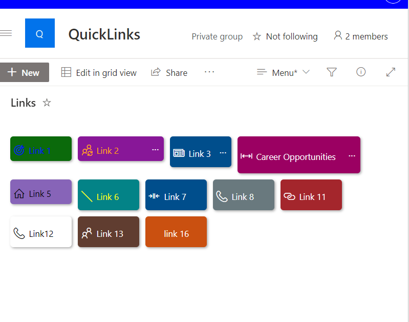
This sample has been inspired by menu-link-tiles by André Lage. It includes a Button style menu similar to Quick Links Button style with additional features such as using width , height, color and fontColor, and also includes customCardProps to show a custom hover card with the description of a tile.
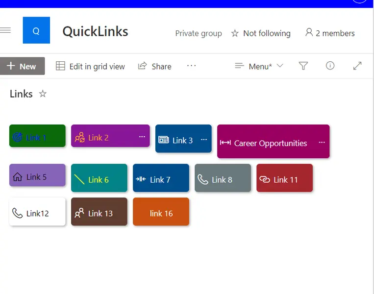
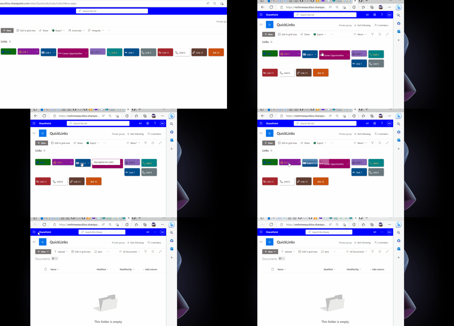
Also, this sample is responsive.
View requirements
- The format expect the following fields:
| Type | Internal Name | Required | Notes |
|---|---|---|---|
| Single line of text | Title | Yes | |
| Multiple line of text | Description | No | |
| Single line of text | BackgroundColor | No | Select one of this pre defined case-sensitive colors - (empty/null, Green, Red, Cyan, CyanBlue, Gray, MagentaPink, BlueMagenta, Orange, OrangeYellow, RedOrange). |
| Single line of text | FontColor | No | Set the HTML color code or color name (e.g. #CD5C5C, pink). If not set, the color is white. |
| Single line of text | Icon | No | Set the icon name for Fluent UI Icons. |
| Hyperlink | URL | Yes | |
| Yes/No | NewTab | No | This field is used to open the link the same tab or new tab. |
| Number | Width | No | If not set, the default width is set to 100px. |
| Number | Height | No | If not set, the default width is set to 40px. |
Edit View requirements
- Sort by the
Modifiedcolumn in descending order
Sample
| Solution | Author(s) |
|---|---|
| menu-link-button.json | Reshmee Auckloo |
Version history
| Version | Date | Comments |
|---|---|---|
| 1.0 | May 03, 2023 | Initial release |
Disclaimer
THIS CODE IS PROVIDED AS IS WITHOUT WARRANTY OF ANY KIND, EITHER EXPRESS OR IMPLIED, INCLUDING ANY IMPLIED WARRANTIES OF FITNESS FOR A PARTICULAR PURPOSE, MERCHANTABILITY, OR NON-INFRINGEMENT.