Create a New SPFx Project
The SPFx Toolkit provides two main ways to create SPFx projects:
-
Scaffolding Form - Create a project from scratch using a guided interface
Use this option when you want full control over your project structure, component types, and configuration. Ideal for new solutions or when you need a clean starting point as per your requirements. -
Sample Gallery - Start with a sample from the community
Use this option when you want to speed up development by starting from a sample, or learn from working examples. Ideal for rapid prototyping, learning, or when you need a solution similar to an existing sample.
Scaffolding Form (Create from Scratch)
Section titled “Scaffolding Form (Create from Scratch)”Use a form-based UI to scaffold a new SPFx project without manually running the Yeoman generator.
Getting Started
Section titled “Getting Started”You can create a new SPFx project in two ways:
Option 1: From the Welcome View
- Click “Create a new project” in the SPFx Toolkit welcome view (visible when no SPFx project is open).
Option 2: From the Command Palette
- Open the Command Palette (
Ctrl+Shift+P/Cmd+Shift+P). - Run
SPFx Toolkit: Create new project.
Both options will launch a view that guides you through the project setup process.
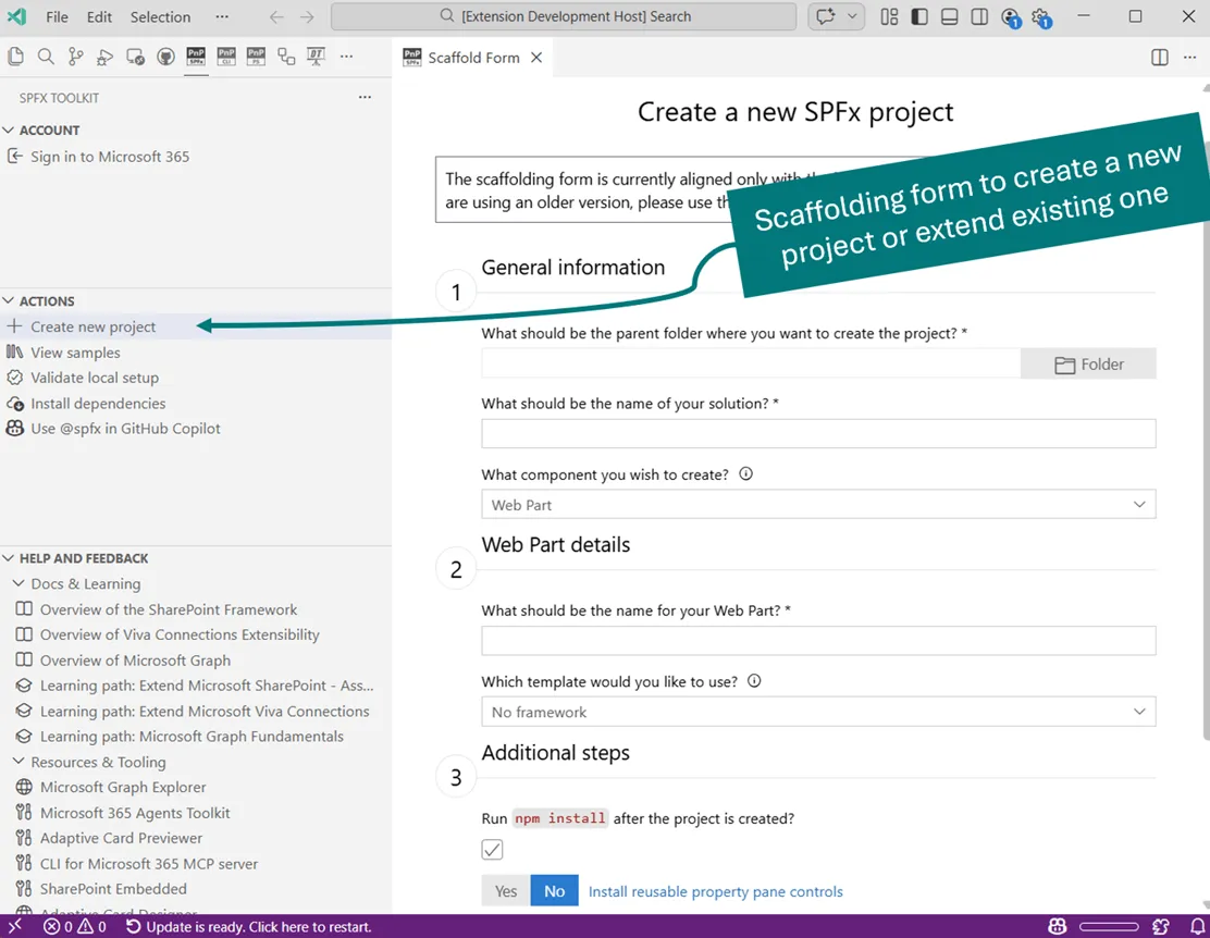
Step 1: General Information
Section titled “Step 1: General Information”For New Projects:
Section titled “For New Projects:”-
Select Parent Folder
- Click the “Folder” button to browse and select where your project will be created.
- The selected path will appear in the text field.
-
Enter Solution Name
- Provide a unique name for your SPFx solution.
- The toolkit will validate that the name doesn’t already exist in the selected folder.
-
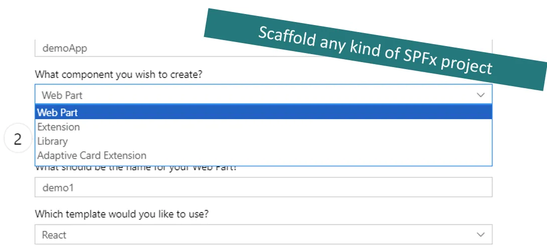
Choose Component Type
- Select from available component types:
- Web Part - SharePoint Framework (SPFx) client-side web parts are built with modern tools and frameworks, and can be deployed to modern and classic SharePoint pages. They are the building blocks of pages that appear on a SharePoint site. They also enable extending Microsoft Teams tabs, providing powerful ways to enhance both SharePoint and Teams.
- Extension - SharePoint Framework (SPFx) Extensions let you enhance SharePoint user experience by customizing toolbars, list views, forms, and notifications. They work with frameworks like React and Angular, and include four main types: Application Customizers, Field Customizers, Command Sets, and Form Customizers.
- Adaptive Card Extension - ACEs are the primary way to extend Viva Connections and SharePoint. They use the Adaptive Card Framework with a JSON schema to create a unified UI, managed by Microsoft, allowing you to focus on business logic.
- Library - SharePoint Framework (SPFx) library is a component that allows you to create and share reusable code across multiple components within a tenant, providing a way to manage and reference common functionality.
- Select from available component types:
For Adding Components to Existing Projects:
Section titled “For Adding Components to Existing Projects:”- Component type selection (same options as above).
- The folder path and solution name are automatically detected.
Step 2: Component Details
Section titled “Step 2: Component Details”-
Component Name
- Enter a unique name for your component.
- For existing projects, the toolkit validates the name doesn’t conflict with existing components.
-
Framework Selection (Web Parts only)
- No framework - Use any library or write pure JavaScript for maximum flexibility.
- React - Popular library for building dynamic and responsive UI components.
- Minimal - Lightweight setup with minimal dependencies for straightforward functionality.
-
Extension Type (Extensions only)
- Application Customizer - Adds scripts to the page, and accesses well-known HTML element placeholders and extends them with custom renderings.
- Field Customizer - Provides modified views to data for fields within a list.
- ListView Command Set - Extends the SharePoint command surfaces to add new actions, and provides client-side code that you can use to implement behaviors.
- Form Customizer - Provides a way to associate and override default new, edit and view form experience of list and libraries with custom forms by associating component to content type.
- Search Query Modifier - Modifies search queries to enhance search results.
-
Template Selection (Adaptive Card Extensions only)
- Generic Card Template - A flexible template that can be customized for various use cases, displaying general information and content in an adaptive card format.
- Search Query Modifier - A template designed to modify and enhance search queries, improving the relevance and accuracy of search results displayed in adaptive cards.
- Data Visualization Card Template - A template focused on presenting data visualizations, such as charts and graphs, within adaptive cards to provide clear and insightful data representations.
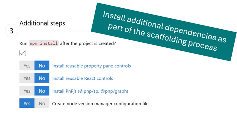
Step 3: Additional Steps (New Projects Only)
Section titled “Step 3: Additional Steps (New Projects Only)”Install core and optional dependencies to enhance your development experience:
Package Installation Options
Section titled “Package Installation Options”- Run npm install after creation (enabled by default) - Installs dependencies after project creation.
- Install Reusable property pane controls (disabled by default) - Installs reusable property pane controls for SharePoint Framework solutions.
- Install PnP Reusable React Controls (Web Parts only, disabled by default) - Installs ready-to-use React components for SharePoint.
- Install PnPjs (
@pnp/sp,@pnp/graph) (disabled by default) - Installs a collection of fluent libraries for consuming SharePoint, Graph, and Office 365 REST APIs in a type-safe way. - Add React & ReactDOM (Application Customizers only, disabled by default) - Adds React support for extension development.
- Create Node Version Manager Configuration File (disabled by default) - Creates
.nvmrcor.node-versionbased on your system configuration.
Step 4: Create Project
Section titled “Step 4: Create Project”-
Review Configuration
- Ensure all required fields are filled (marked with *).
- The “Create” button will be enabled when validation passes.
-
Submit
- Click “Create a new SPFx project” or “Add a new SPFx component”.
- A progress indicator will show while the project is being created.
- VS Code will automatically open the new project when complete.
Important Note
Section titled “Important Note”As of now, creating new projects supports only the latest version of SharePoint Framework (SPFx). If you need to create a project with an older version, please use the SharePoint Yeoman generator directly in the terminal.
Sample Gallery (Start with a sample)
Section titled “Sample Gallery (Start with a sample)”Kickstart your project with examples from the Microsoft 365 & Power Platform community. The Sample Gallery provides access to real-world SPFx solutions that you can use as starting points for your own projects.
Getting Started
Section titled “Getting Started”You can open the sample gallery in three ways:
Option 1: From the Welcome View
- Open the SharePoint Framework Toolkit welcome view (visible when no SPFx project is open).
- Click View samples action.
Option 2: From the Command Palette
- Open the Command Palette (
Ctrl+Shift+P/Cmd+Shift+P). - Type
SPFx: Open SharePoint Framework Samples galleryand select it.
Option 3: From Existing Projects
- Navigate to the Actions section in the SPFx Toolkit sidebar.
- Click View samples action.
All options will open the sample gallery in a new view where you can browse and filter available samples.
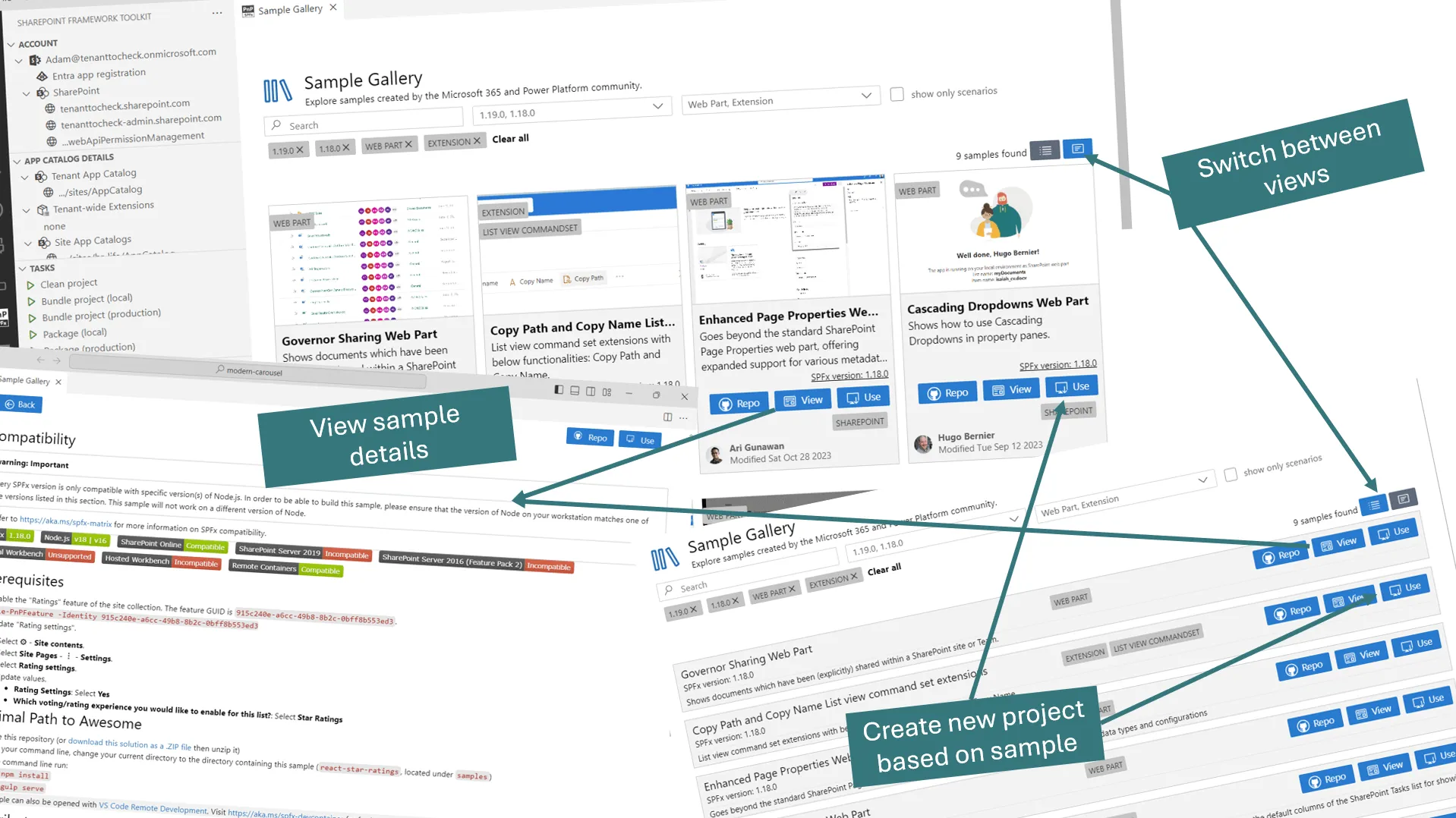
Step 1: Browse and Filter Samples
Section titled “Step 1: Browse and Filter Samples”View Options
Section titled “View Options”- Layout Selection - Toggle between list view and grid view using the view switcher in the top toolbar.
Filter and Search
Section titled “Filter and Search”Apply filters to find the perfect sample for your needs:
- Search - Search samples by name, author or keywords.
- SPFx Version Filter - Filter by compatible SharePoint Framework version.
- Component Type Filter - Filter by component type: Web Parts, Extensions, ACEs, etc.
- Show only scenarios - Filter by scenarios.
Step 2: Review Sample Details
Section titled “Step 2: Review Sample Details”- Sample Information - Click on View button on any sample card to view detailed information. Review the sample description, features and compatibility with your SPFx version.
- Source Code Access - Click on Repo button to access and review source code. Review the code structure and implementation patterns.
Step 3: Create Project from Sample
Section titled “Step 3: Create Project from Sample”- Use Sample - Click on “Use” to download and configure the sample.
- Configure Project Settings
- Select Parent Folder - Browse and select where your project will be created.
- Project Name - Provide a unique name for your SPFx solution.
- Click “Enter” to begin the setup process.
- A progress indicator will show while the sample is being downloaded and configured.
Once you choose a sample and confirm the project name and location, the Toolkit performs several automated steps to prepare your project environment:
- Downloads and extracts the sample to your chosen folder.
- Renames and configures the project files.
- Runs
npm installto set up dependencies. - Opens the new project in VS Code.